Terrazzo-look countertop in a color-driven kitchen and bathroom
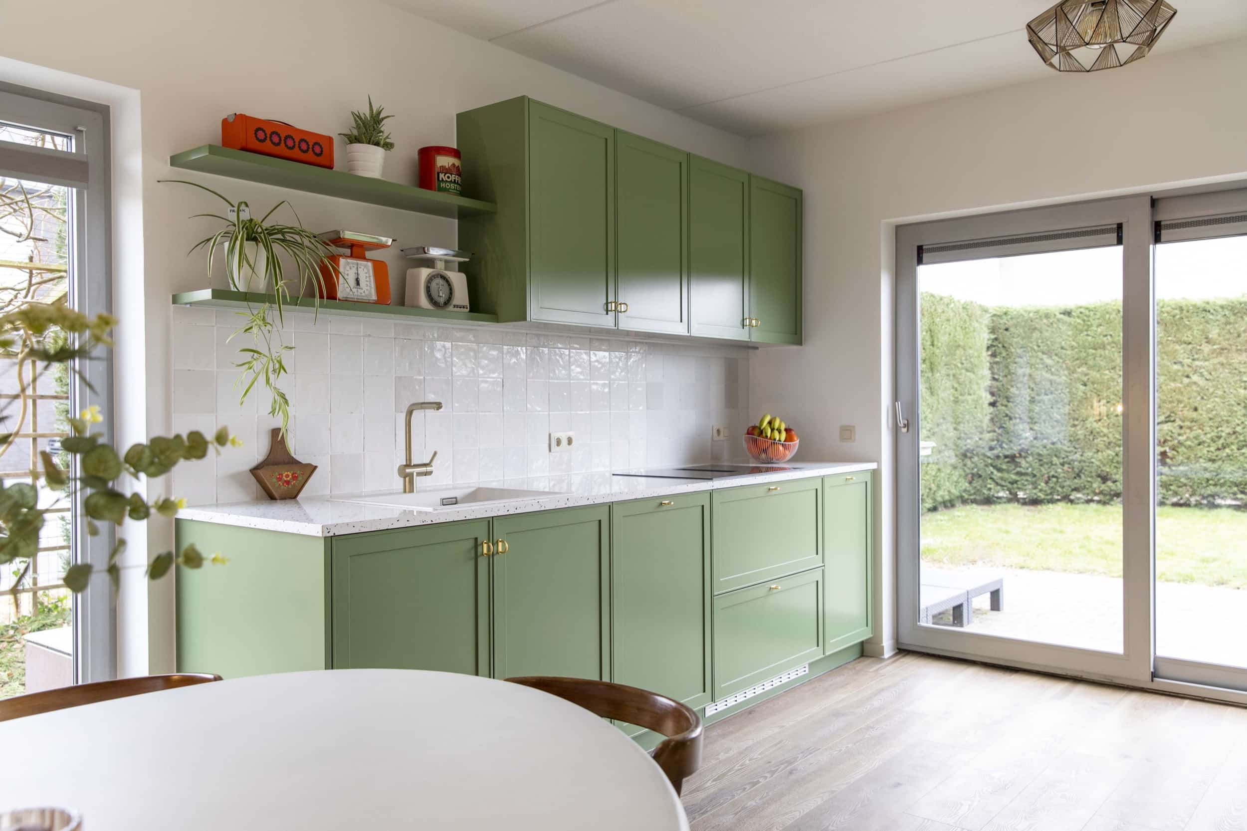
Green cabinetry, gold pulls, and a white terrazzo look countertop set the tone as soon as the kitchen comes into view. The surface is not a flat white block; it carries beige and black speckle that changes as light moves across it. That pattern gives the room a lively base without interrupting the clean lines of the cabinets and the pale wall tiles beside the sink.
Kitchen surfaces that hold the eye
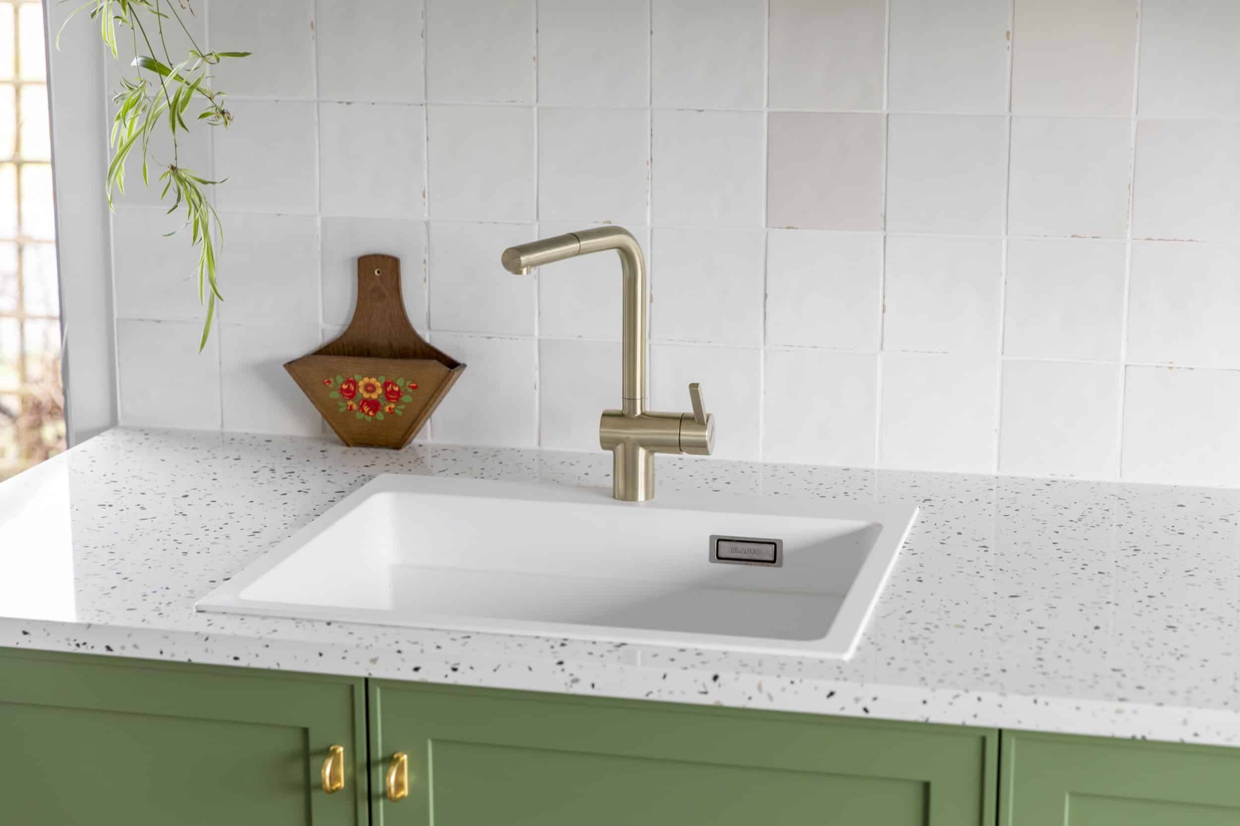
The kitchen is where the terrazzo look countertop does most of its work. It sits between the green fronts and the softer beige-white tones, tying the palette together with a surface that reads as both calm and detailed. The speckled field is strongest at the edges and near the working zone, where the close-up images show the material around the sink and tap. Those details make the countertop feel used, not decorative only.
Seen from a wider angle, the kitchen reads in layers: green units, a white counter line, and a bright wall plane behind the worktop. Gold-colored handles interrupt the green fronts with a small metallic note, while the terrazzo-look kitchen surfaces keep the room from becoming too uniform. The result is not a single statement slab, but a surface that carries color around it and lets the cabinetry stay readable.
Pattern, edge, and working zone
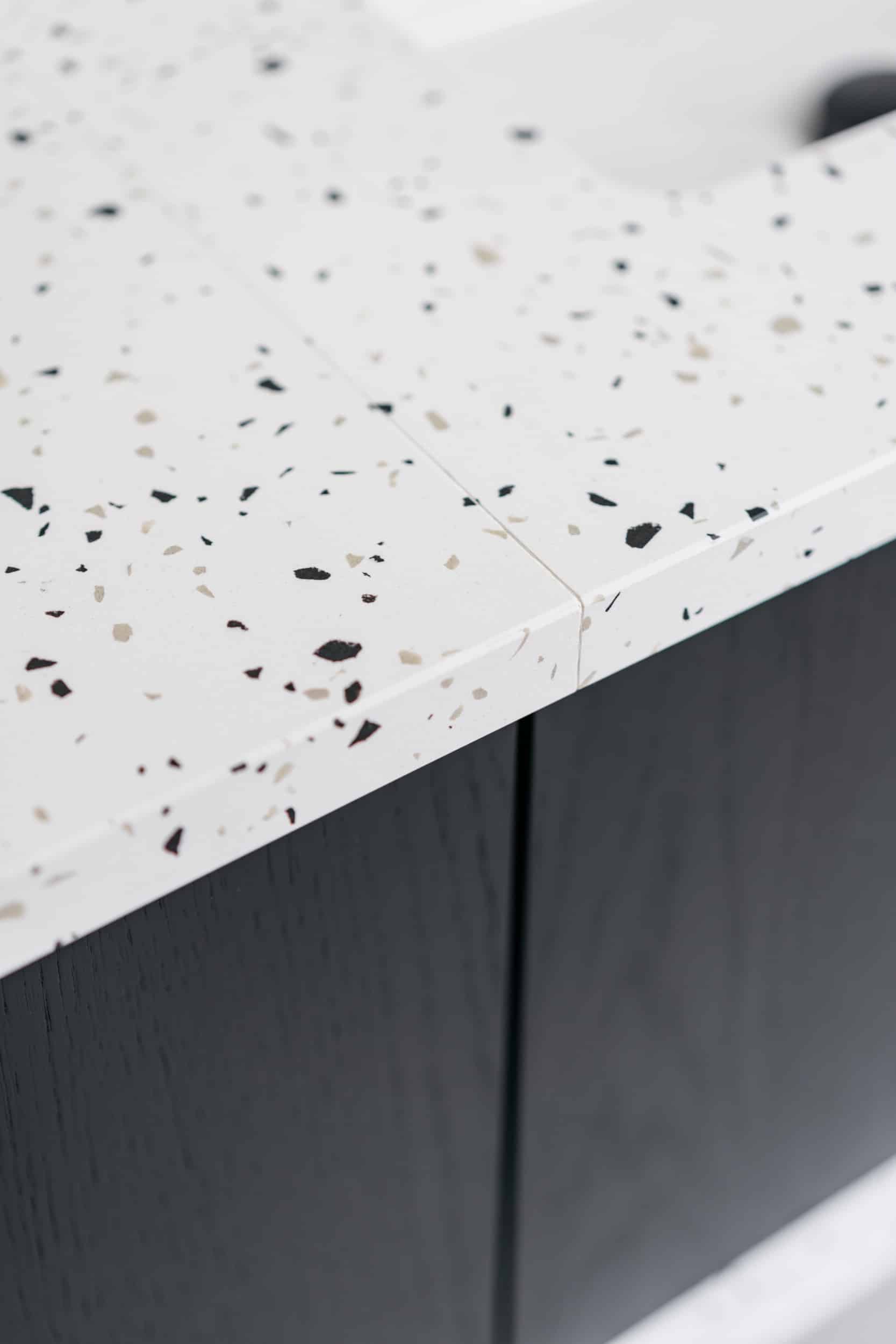
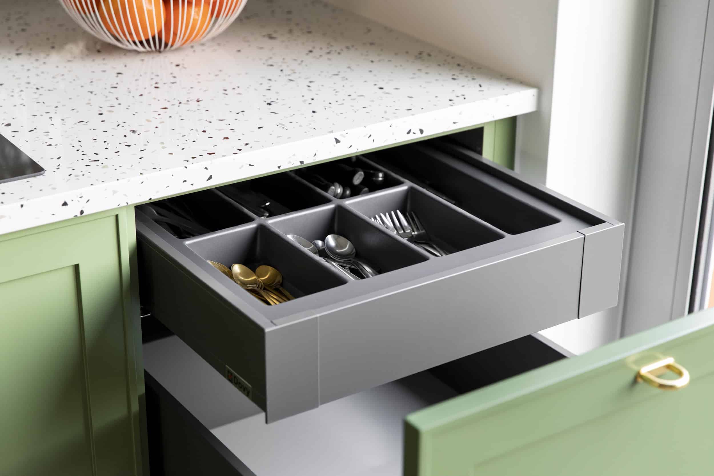
The terrazzo-look kitchen surfaces show their character most clearly where the drawer fronts meet the worktop and where the sink cut-out breaks the plane. The white stone-like base is dotted with small beige and black fragments, and that mix continues across the visible joins. In the photo set, the material appears on the countertop, the backsplash-like vertical areas, and the sink zone, creating one continuous visual thread through the kitchen without relying on strong contrast alone.
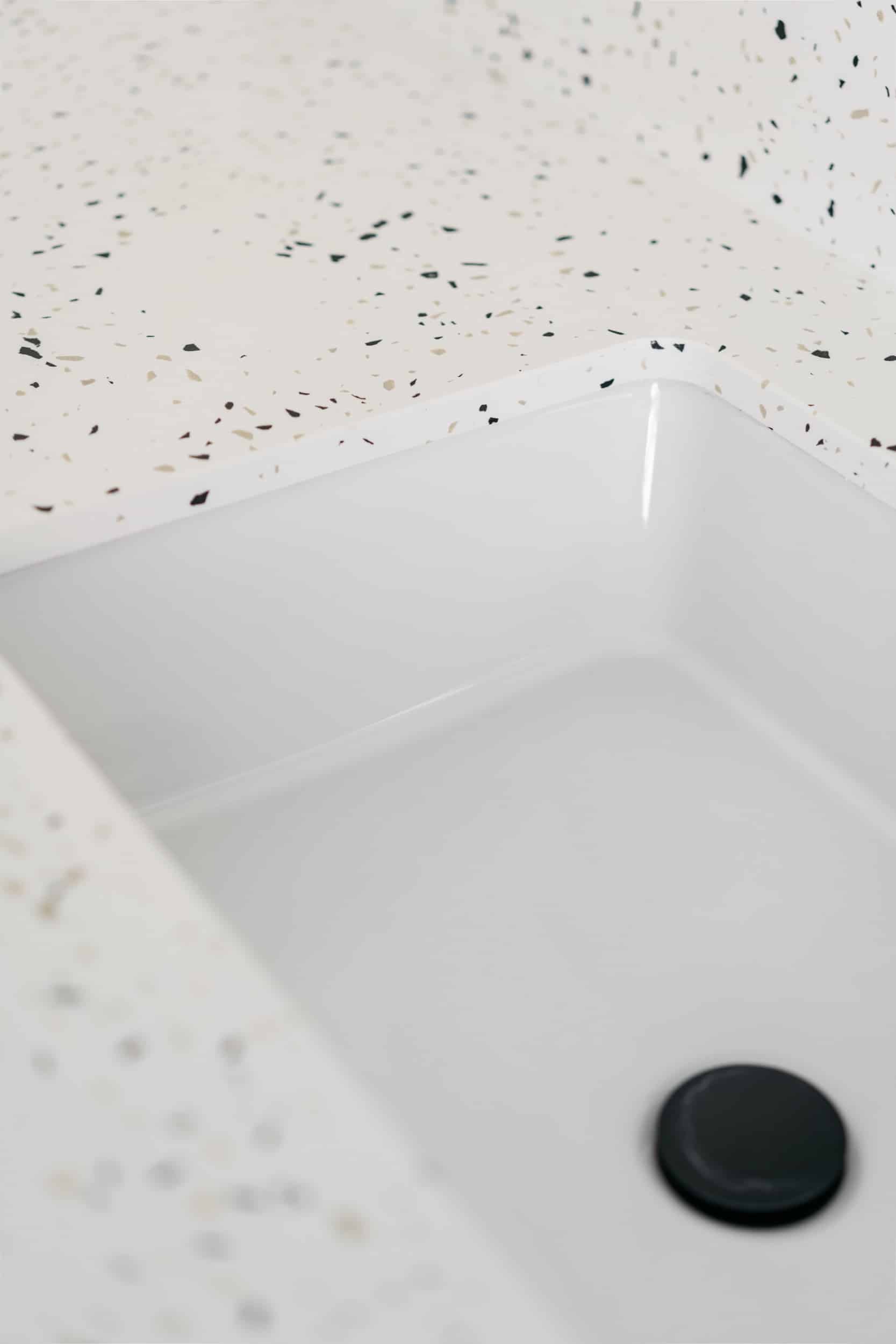
A closer view of the tap and basin area shows how the white terrazzo composite sits next to plain white wall tile and straight grout lines. That pairing keeps the patterned surface grounded. The speckle is busy enough to register from a distance, but not so dense that it overwhelms the room. It gives the kitchen a clear material identity while still leaving room for the green joinery and the muted beige-white backdrop.
One material, two rooms
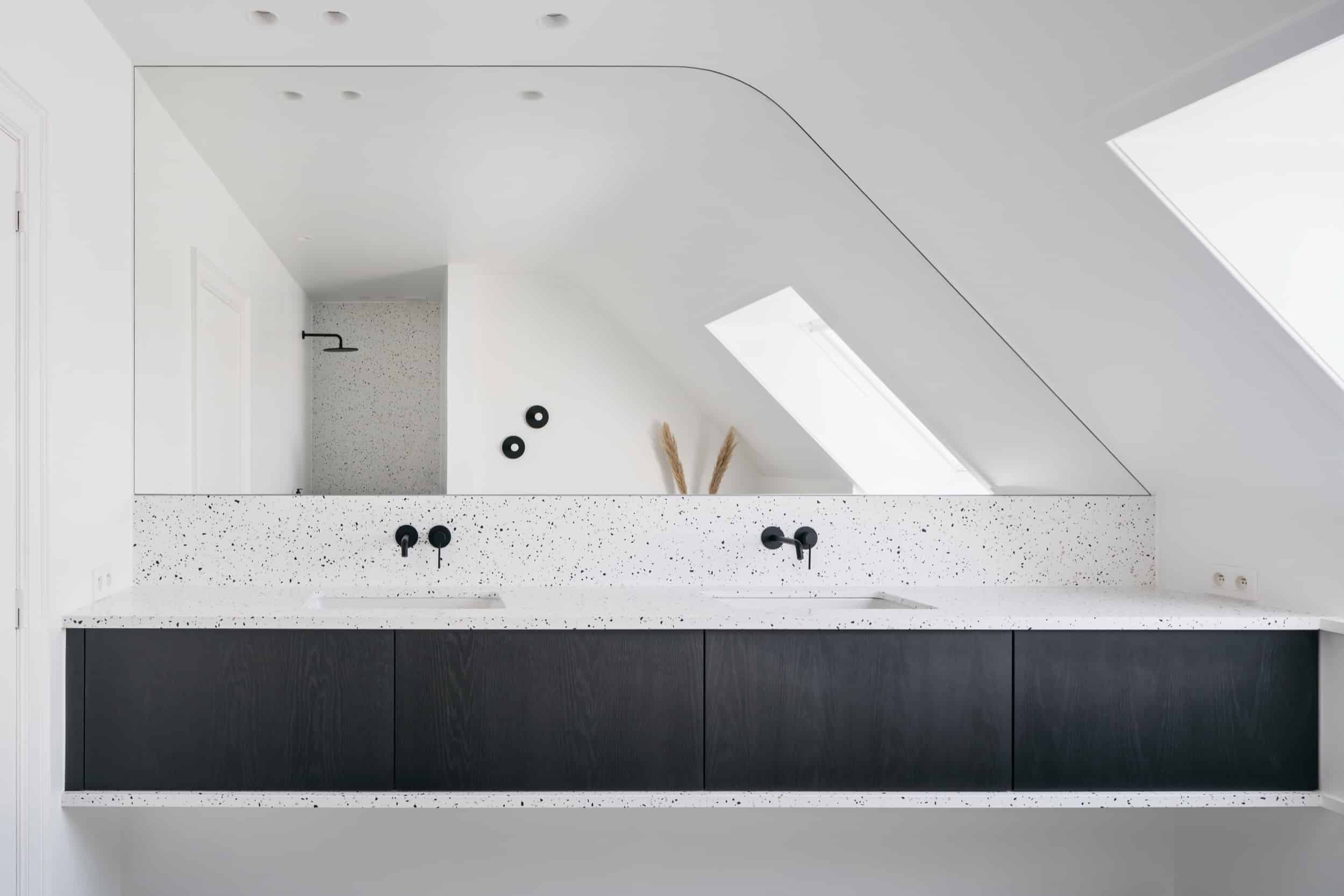
The same white terrazzo composite returns in the bathroom, but the setting changes how it reads. Here the light surface meets dark cabinet fronts and slim black taps, so the pattern becomes quieter and more graphic. The speckled finish is still visible in the close-ups, especially along edges and rounded corners, yet the darker furniture pulls the eye downward. That shift makes the bathroom feel more restrained than the kitchen, even though the material is the same.
In the bathroom, the terrazzo bathroom finish acts as a counterpoint to the matte-looking dark fronts. The black tapware keeps the line of sight sharp, and the pale surface spreads the light across the room in a thin reflective way. The images suggest a compact, controlled arrangement: surfaces, joins, and fixtures are all close together, so the finish has to carry both texture and clarity. It does so by staying light while still showing the beige and black fragments.
How the finish changes with the light
Some images catch the bathroom surface at an angle, where the terrazzo bathroom finish reads as a soft field rather than a busy pattern. At the corners and curved edges, the texture becomes more legible. The transition from white surface to dark cabinet front creates a clean division, and the black taps repeat that line without adding visual clutter. In this room, the material does not try to dominate; it supports the layout and keeps the surfaces readable.
That same restraint helps the material move from one room to another without feeling repetitive. The kitchen uses the terrazzo look countertop as the more animated part of the composition, while the bathroom places the same surface beside darker fittings and more minimal lines. Both rooms depend on the material’s speckled finish, but each gives it a different role. One is the visual center of a colorful kitchen. The other is a measured backdrop for dark fronts and black plumbing.
Built for daily use, not just display
Beyond the visual effect, the project relies on the practical side of the surface. The material is described as scratch-resistant, stain-resistant, and particularly easy to maintain. That matters in both rooms, where the worktop, sink zone, and bathroom surfaces are part of everyday routines. The finish can take on a visible role without asking for delicate handling, which makes it suitable for spaces that are used intensively.
That practical profile also explains why the material is placed so openly in the kitchen and bathroom. The terrazzo look countertop is not tucked away as a decorative accent; it is the surface people would touch, clean, and work on. Its speckled pattern hides some of the visual noise that comes with daily use, while the white base keeps the room bright. In the bathroom, the terrazzo bathroom finish does the same, but with a quieter tone beside the dark cabinetry.
What stays with you is the way the material carries the project from one room to the next. Green fronts, gold details, pale walls, black taps, and the white terrazzo composite all sit within a narrow range of color, yet each room uses that range differently. The kitchen leans into the contrast between color and pattern. The bathroom leans into shadow and restraint. The same surface works in both because it keeps its texture visible without becoming loud.
For readers comparing materials, this is a clear example of terrazzo-look kitchen surfaces and a matching terrazzo bathroom finish used with intent. The surface is expressive enough to shape the kitchen, but neutral enough to let dark furniture and small metal details take over in the bathroom. That shift gives the project its rhythm: one material, two atmospheres, and a consistent surface language across the home.
Want to see more of Diresco? View the page of Diresco for even more great projects and company information.

NEW 2026 Jubileum Edition The Best Interior Designers Benelux
Order Now €125