









Timeless retro interior with door hardware
The first thing you notice is not a room divider or a cabinet run, but the hardware. Dark metal catches the light on white fronts and timber panels, and that small shift in scale sets the tone for the whole timeless retro interior. The palette stays restrained: pale surfaces, wood grain, stone-look worktops and finishes that read as bronze, iron or raw metal. Nothing here is trying to dominate the frame. The details sit close to the surface and do their work quietly.
Hardware that keeps the line clear
Door hardware, window hardware and cabinet hardware form the thread through the project. The shapes are strict, often square or rounded only where the hand needs it, and the surfaces are left with a rawer look rather than polished sheen. That makes the fittings read as part of the architecture instead of decorative extras. On timber panels, on painted fronts and along long drawer runs, the pieces mark the rhythm of the interior without breaking it up. The result is sober, but never cold.
Several finishes appear across the images: White Bronze, Raw Bronze, Raw Metal and Britannium. Those names describe a narrow family of tones, and visually they move between light metal, oxidised depth and darker bronze look hardware. In a room with white cabinets and wooden fronting, that range is enough to create contrast. The fittings give the surfaces a point of focus, especially where the grain of the wood or the edge of a stone-look top would otherwise take over.
Round rosette handle on timber panels
A round rosette handle appears in close-up on a wooden panel, and the scale matters. The circular plate softens the geometry of the panel, while the handle itself keeps a more compact profile. In another detail, the metal surface shows a rougher texture, almost mottled, which suits the project’s preference for strict lines over gloss. These are not ornamental gestures. They are the parts you touch every day, and the photographs give them enough space to read clearly.
The door details are especially direct. A handle with a round rosette sits against timber, and the surrounding surface remains plain so the fitting can do the visual work. That approach repeats in the cabinet shots: square knobs, linear pulls and dark hardware against pale fronts or wood veneer. It is a small language, but a consistent one. In a timeless retro interior, that consistency matters more than any single standout piece.
Kitchen fronts, stone-look tops and a measured contrast
The kitchen images provide the clearest context for the project. Wooden cabinets stand next to white fronts, and the darker work zone pulls the eye across the room. Stone-look worktops and a heavier, darker background surface sharpen the contrast without introducing busy pattern. The cabinet hardware stays visible enough to anchor the composition, especially on long drawers and paneled doors. Here, the fittings are not an afterthought; they are the punctuation marks that make the kitchen legible.
One image shows a kitchen wall with vertical timber lines, white lower cabinets and an integrated appliance opening. Another sets a kitchen island against built-in equipment and overhead lighting. In both, the hardware keeps to a small scale. Dark knobs and slim pulls prevent the fronts from becoming a flat plane. That restraint gives the interior its order. It also lets the wood, white lacquer and stone-look surfaces stay in dialogue rather than compete for attention.
Cabinet hardware in a low-key palette
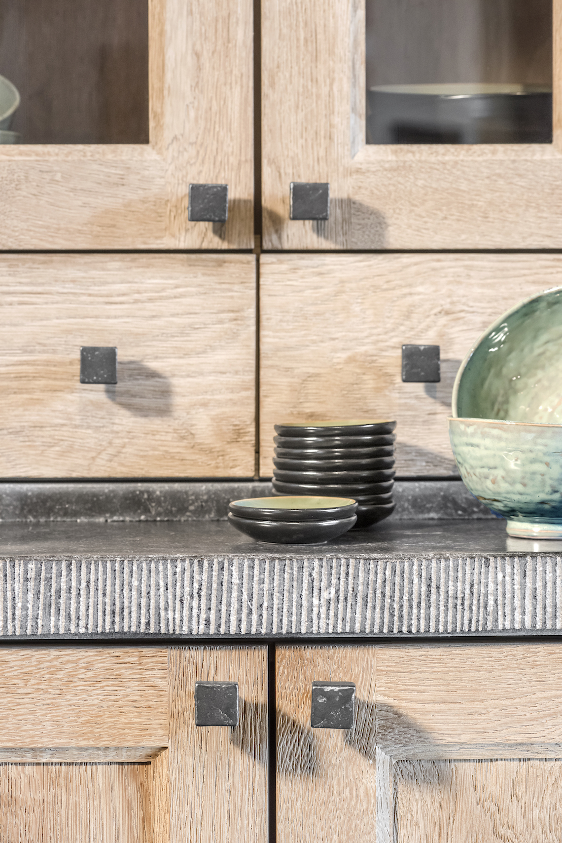
The cabinet hardware appears in several forms: square knobs, compact pulls and dark fittings mounted in a straight line. On close-up photographs, the metal finish reads with a slightly aged texture, which suits the project’s retro reference without pushing it into nostalgia. The pieces are small, but they change the way the kitchen fronts are read. A plain door becomes a measured panel. A drawer run gains a clear edge. Even the glass-fronted cabinets feel more grounded when the hardware sits firmly on the surface.
That same discipline appears in the brighter kitchen views. White upper and lower cabinets hold their clean blocks, but the dark handles stop the composition from feeling too blank. A black or deep bronze look hardware line gives the fronts a measured beat. The eye moves from handle to handle, then to the timber panels and on to the stone-like work surface. The room is built from those intervals. Nothing is overdrawn, and that is exactly why the details register.
Strict lines softened by material change
Across the project, the straightness of the furniture is offset by material changes rather than by extra decoration. Wood grain runs vertically in one cabinet wall and horizontally across another. White surfaces brighten the room, while darker zones near the hob and worktop hold the composition in place. The hardware links those parts together. It is the same idea in each image: keep the line sharp, then use bronze look hardware or raw metal finishes to make the surfaces feel distinct.
The visual references also move between kitchen, detail and living context. That matters, because the project is not limited to one isolated cabinet solution. A handle on a door, a knob on a drawer and a fitting on a window frame all belong to the same interior language. The material palette stays narrow enough to be read at a glance. Hout, stone-look surfaces and metal finishes are doing the heavy lifting, with the fittings acting as the smallest but most persistent layer.
Where the project becomes legible
What gives this timeless retro interior its clarity is the relationship between surface and touchpoint. The cupboards are quiet. The walls and panels stay restrained. Then the eye lands on a dark rosette, a square knob or a handle set against timber, and the room sharpens. That is why the project works well in close-up and in wider kitchen views. The fittings are designed to be read in both ways, as part of the plan and as a detail in the hand.
Even the lighter scenes keep that same logic. White fronts, a darker cooking zone and a visible edge of stone-like material create a measured backdrop for the hardware. The pieces do not seek attention by size. They draw it through position and finish. In that sense, the project shows how door hardware, window hardware and cabinet hardware can carry an interior without altering its restraint. The effect is direct, understated and easy to read across the photographed rooms.
The images leave little doubt about the intended atmosphere of the material set: not polished, not ornate, but controlled enough to let the old references and the clean lines meet on equal terms. Bronze look hardware, raw metal tones and round rosette handle details appear repeatedly, always tied to timber, white lacquer or stone-look surfaces. That repetition is what holds the project together. It gives the interior a clear vocabulary, and it lets each fitting contribute to the room without speaking louder than the architecture around it.
Want to see more of Dauby: exclusive door, window and furniture hardware? View the page of Dauby: exclusive door, window and furniture hardware for even more great projects and company information.




NEW 2026 Jubileum Edition The Best Interior Designers Benelux
Order Now €125


NEW 2026 Jubileum Edition The Best Interior Designers Benelux
Order Now €125


NEW 2026 Jubileum Edition The Best Interior Designers Benelux
Order Now €125


NEW 2026 Jubileum Edition The Best Interior Designers Benelux
Order Now €125


NEW 2026 Jubileum Edition The Best Interior Designers Benelux
Order Now €125


NEW 2026 Jubileum Edition The Best Interior Designers Benelux
Order Now €125


NEW 2026 Jubileum Edition The Best Interior Designers Benelux
Order Now €125


NEW 2026 Jubileum Edition The Best Interior Designers Benelux
Order Now €125


NEW 2026 Jubileum Edition The Best Interior Designers Benelux
Order Now €125


NEW 2026 Jubileum Edition The Best Interior Designers Benelux
Order Now €125


NEW 2026 Jubileum Edition The Best Interior Designers Benelux
Order Now €125


NEW 2026 Jubileum Edition The Best Interior Designers Benelux
Order Now €125


NEW 2026 Jubileum Edition The Best Interior Designers Benelux
Order Now €125


NEW 2026 Jubileum Edition The Best Interior Designers Benelux
Order Now €125


NEW 2026 Jubileum Edition The Best Interior Designers Benelux
Order Now €125


NEW 2026 Jubileum Edition The Best Interior Designers Benelux
Order Now €125


NEW 2026 Jubileum Edition The Best Interior Designers Benelux
Order Now €125


