Trowel floor with a dark, fine-grained finish
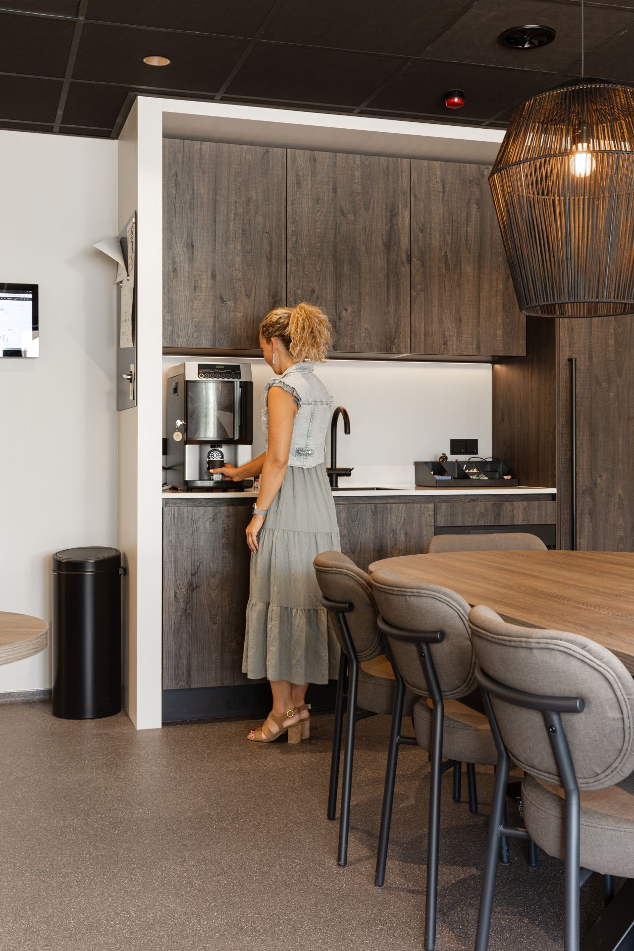
A dark trowel floor sets the tone as soon as the eye reaches the kitchen and living space. The surface is not flat in the visual sense; the fine grain catches light in small shifts, so the floor reads as a dense, speckled field rather than a single plane. That quality gives the mortar floor its practical, workmanlike look without making the room feel heavy. Around it, wood panels and clear wall lines keep the scene legible.
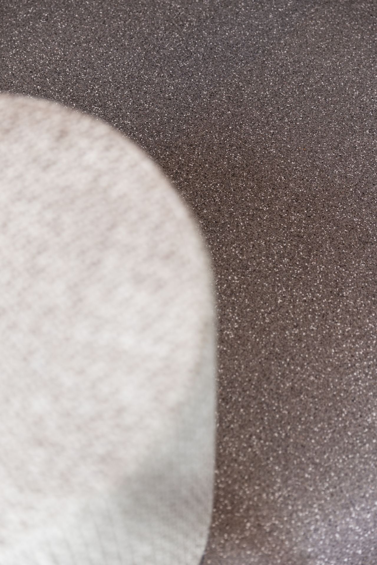
Fine grain texture that stays visible
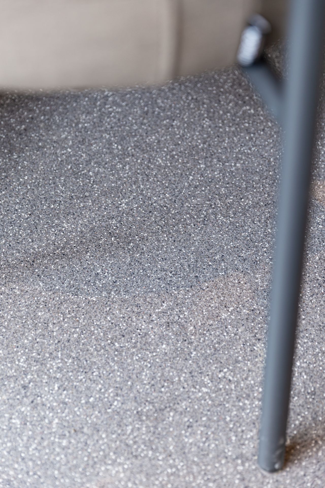
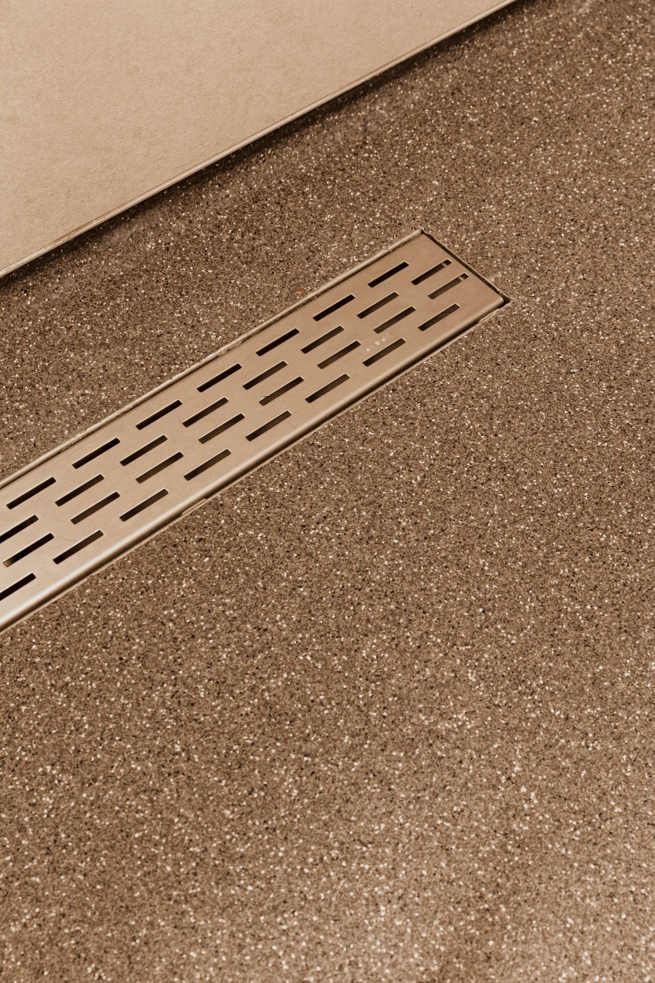
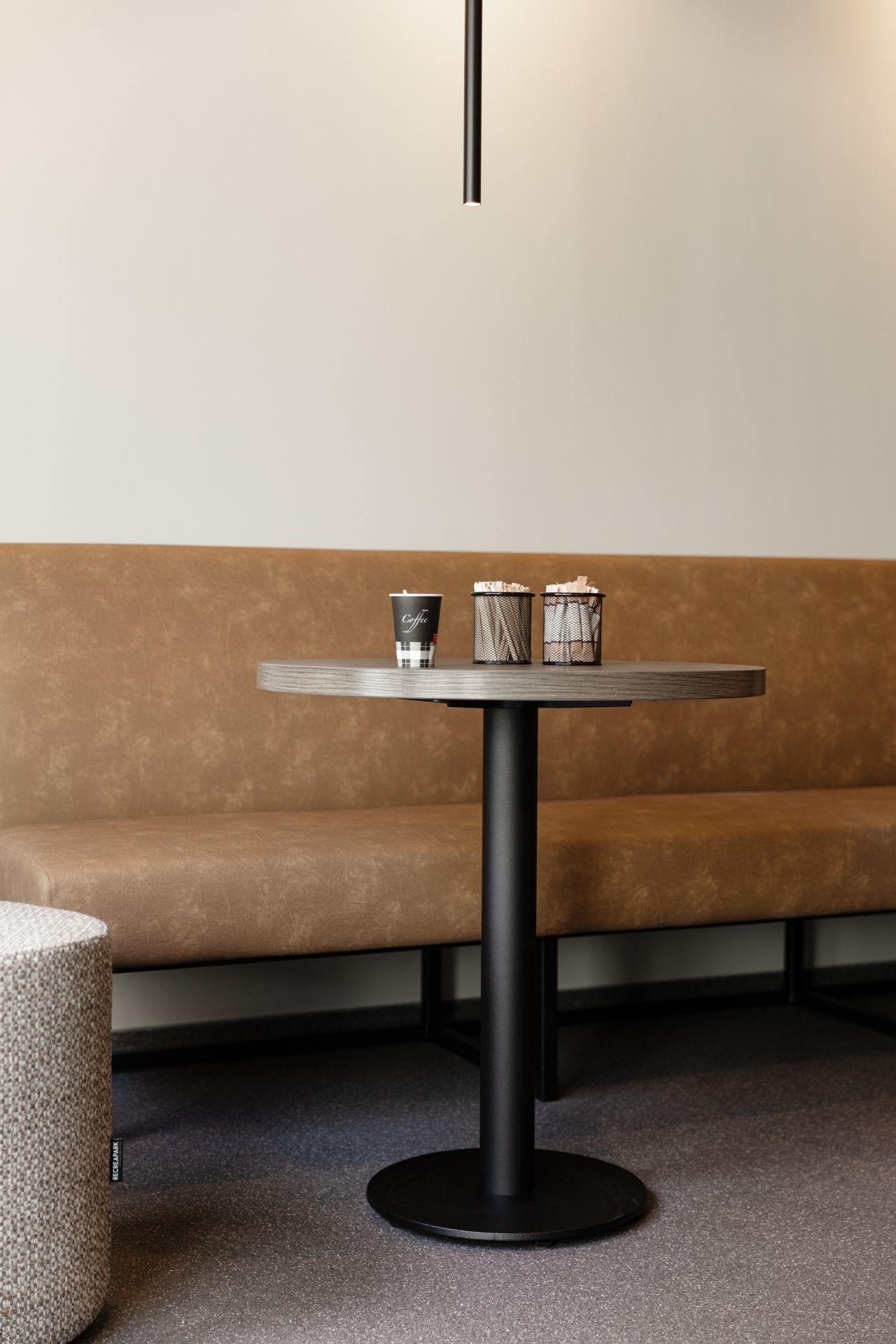
The fine grain texture is the first thing the close-ups make clear. Small stones and mixed particles sit evenly through the surface, creating a soft mottling that becomes more obvious the closer you stand to it. In some images the tone leans warm beige and brown, while the kitchen view shows a darker finish. That variation is part of the appeal of a trowel floor with fine grain texture: it carries movement without relying on pattern or gloss.
Because the floor can be composed in different colours and grain mixes, the finish in this project feels deliberate rather than standardised. The darker choice works well against the pale fittings and wooden fronts nearby. It is a restrained contrast, but it changes how the room reads. Instead of pushing attention upward, the floor anchors the space and gives the cabinetry and wall panels a cleaner edge to sit against.
A dark trowel floor in a kitchen and living area
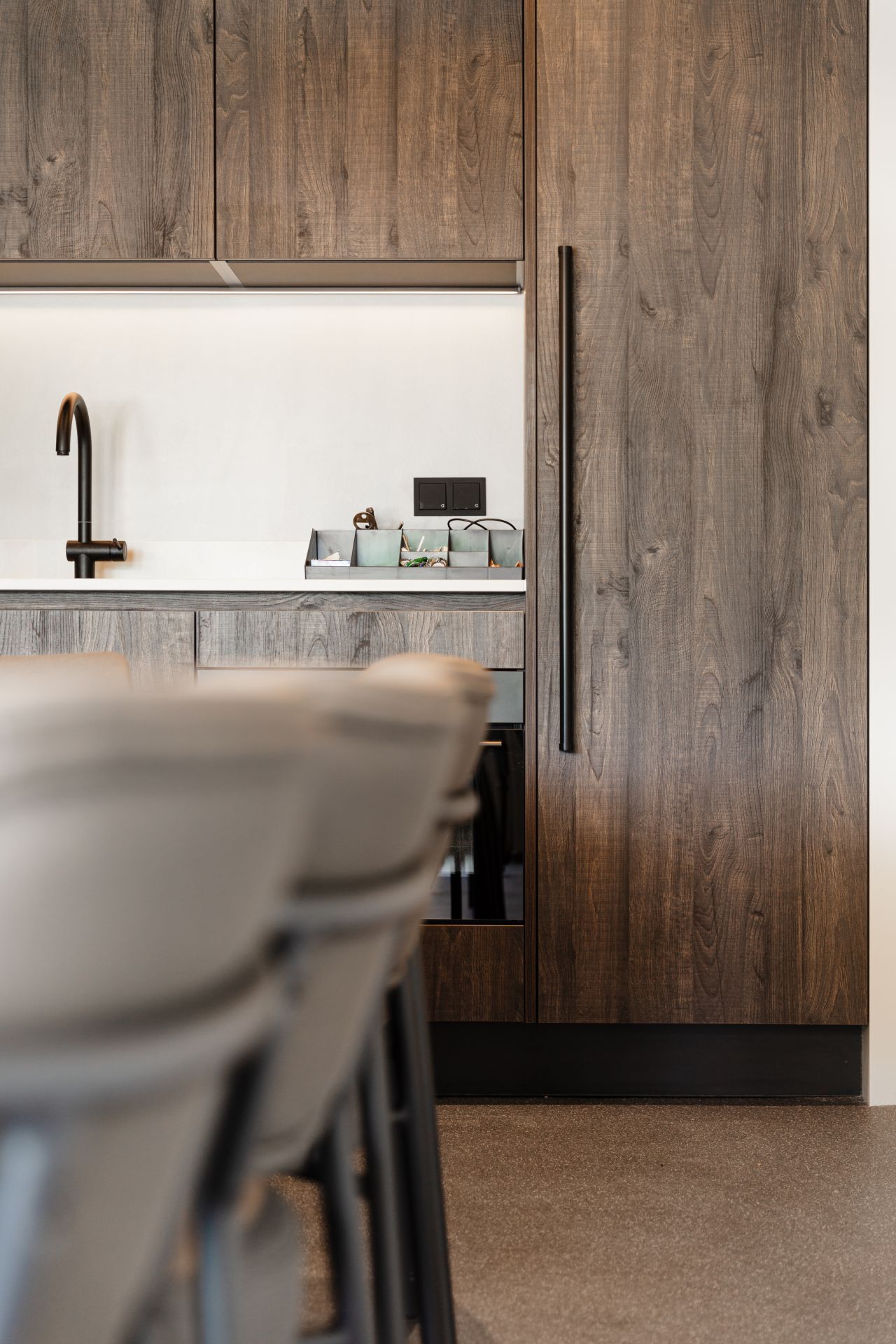
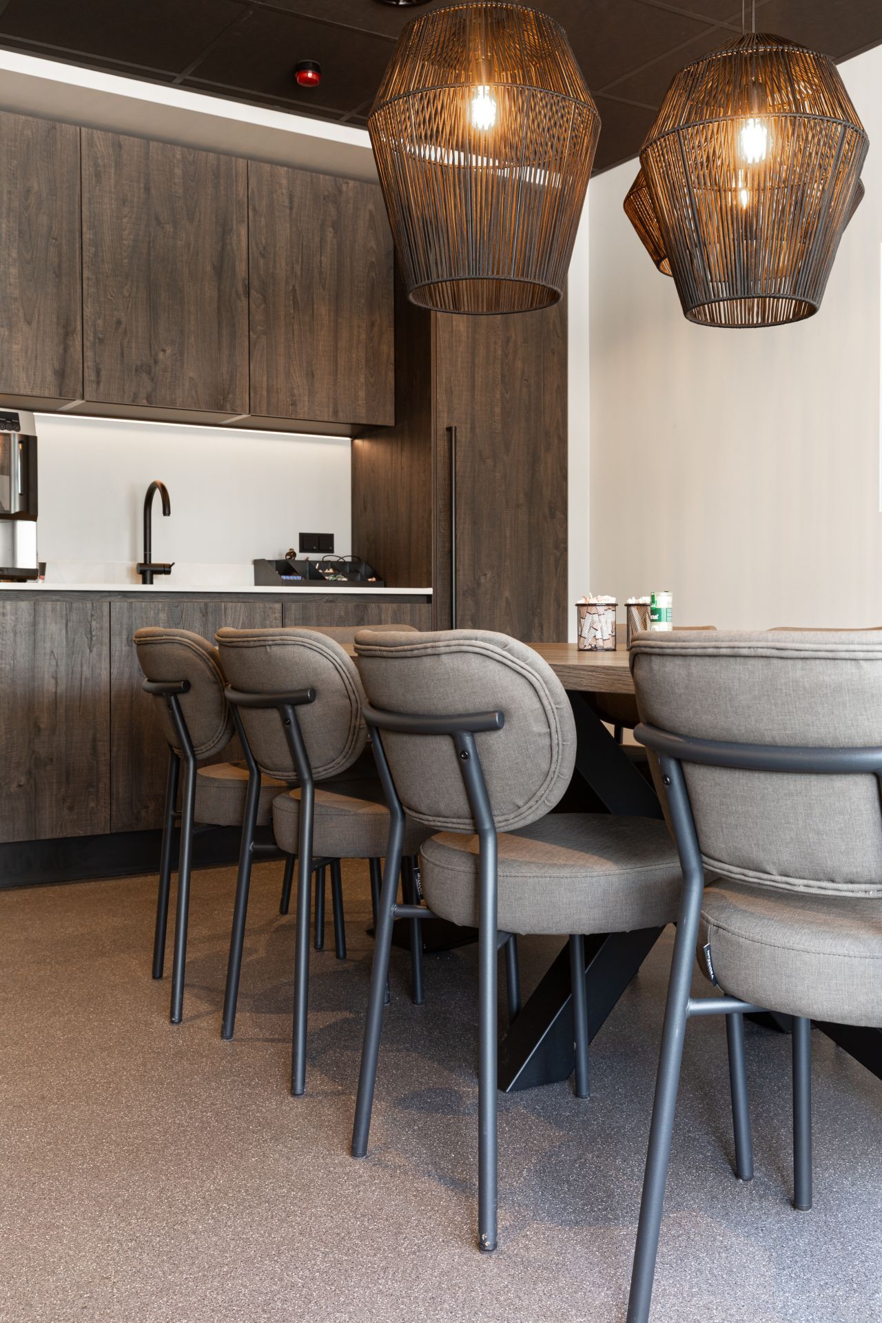
Seen in the kitchen and living area, the dark trowel floor stretches across the room with little visual interruption. The wooden cabinet fronts and wall panels add a visible grain of their own, yet the floor stays distinct because of its more compact, stone-like surface. Overhead, open cage pendants and a cylindrical ceiling light mark the seating and cooking zones without breaking the continuity underfoot. The result is direct and readable: one surface, several uses.
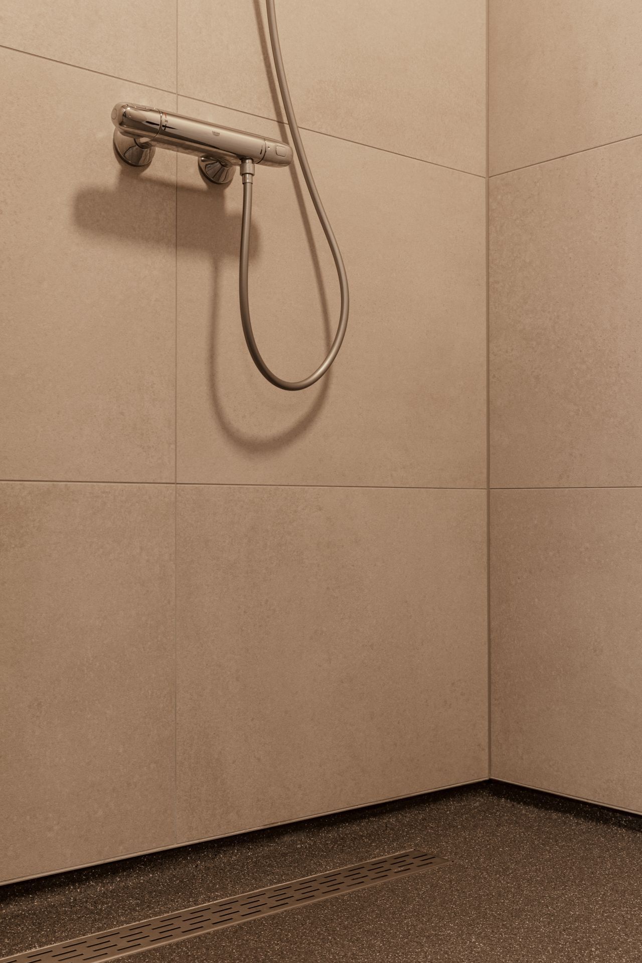
The mortar floor also suits spaces where the eye moves between hard surfaces. Tiles appear in the wet-zone views, while the kitchen side uses timber and painted or coated surfaces. The floor sits between them as a steady base layer. It does not try to copy the wall finishes. Instead, it takes a quieter role and lets the materials above it remain identifiable.
Where the floor meets the wall
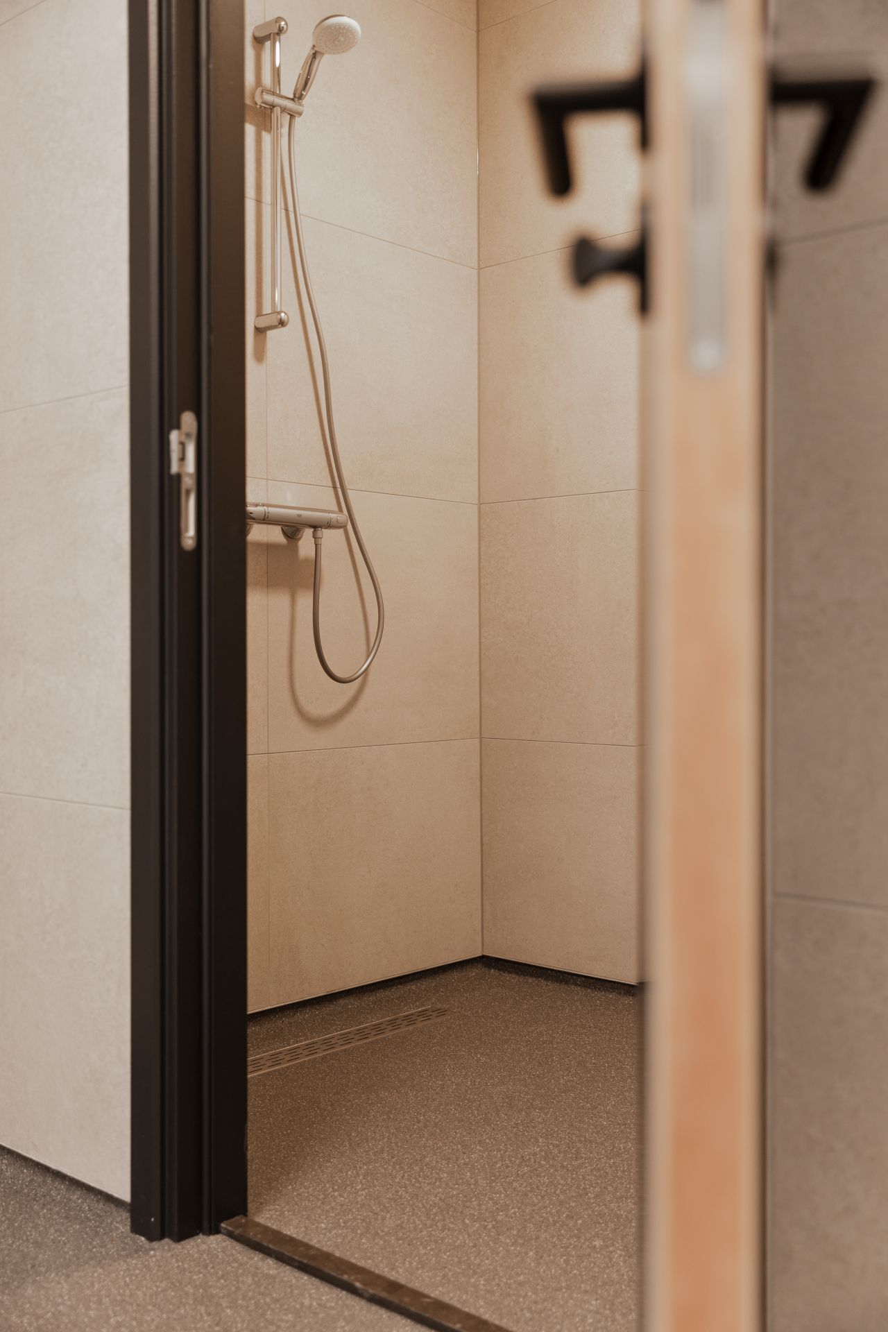
The wall-to-floor finish is crisp in the detail shots. Lines are tight where the floor reaches the wall, and the junction does not drift visually. That matters in a surface like this, because the texture of the trowel floor already brings enough movement. Straight edges give it a frame. In the wet-room images, the same sense of order appears around the tiled wall and the floor below, where the transition stays measured rather than abrupt.
There is no decorative trim calling attention to itself. The strength of the finish lies in the way the edges are handled and in how the floor sits under the surrounding materials. A clean wall-to-floor finish makes the room feel grounded without drawing attention away from the surface itself. It is a small detail, but it shapes how the whole interior is read.
Drain channel detail in a working interior
One of the clearest details is the drain channel set into the floor. The elongated grate cuts across the surface with a practical, linear presence, and the trowel floor continues neatly up to it. This kind of drain channel detail is useful for showing how the surface behaves around openings and interruptions. The floor does not lose its character at the edge of the channel; the mixed grain remains visible right up to the metal line.
In the shower-zone images, the channel sits beside light ceramic wall tiles and fittings mounted above. That pairing makes the floor feel part of a working interior rather than a purely visual finish. The material is described as dirt- and liquid-tight, and the images support that emphasis through the precise junctions and the clean handling around the grate. It is a floor that is meant to be looked at closely.
Suitable for underfloor heating, but still visually grounded
The project text notes that a trowel floor can be used with underfloor heating, and that compatibility belongs to the floor’s broader use in homes and business environments. In this interior, the visual message stays more important than the technical one. The surface reads as firm, dense and steady, with enough variation in the grain to keep it from looking sealed off or blank. That balance suits a room where the floor has to work across more than one zone.
What stands out is how little the floor needs to announce itself. Even with the dark tone, it does not dominate the room. It supports the furniture, the wall panels and the shower fittings by holding the lower plane together. The underfloor heating reference adds one more layer of use, but the visible story remains the same: a trowel floor with a controlled texture and a sober finish.
Material contrast without excess
Wood, tile and trowel floor each keep their own character in the images. The wood shows a clear grain in the cabinet fronts and wall cladding. The tiles in the wet zone are smoother and lighter. Against those surfaces, the mortar floor brings a more granular field with small tonal shifts. That contrast is the project’s strongest visual move, and it works because each material stays legible instead of being pushed into a single effect.
Seen as a whole, the interior uses the floor to tie together rooms with different functions. The kitchen view, the shower detail and the close-ups of the surface all point back to the same material choice. The trowel floor is not only a backdrop; it is the surface that gives the interior its lower register, from the drain channel to the wall junctions and the darker field in the main living zone.
Why this mortar floor reads so clearly in the images
The photographs work because they separate the different qualities of the floor. One image shows the darker field in context, another isolates the grain, and another follows the line of the drain channel. Together they show a mortar floor that is more than a smooth expanse. It has depth in the mix, order in the edges and enough variation in tone to stay interesting under daylight and artificial light.
That clarity is what gives the project its appeal. The surface does not depend on decoration or shine; it holds interest through proportion, texture and the way it meets the rest of the interior. For anyone comparing flooring references, this trowel floor offers a straightforward view of how a robust finish can still feel precise when the details are handled properly.
Want to see more of Willem Designvloeren? View the page of Willem Designvloeren for even more great projects and company information.



NEW 2026 Jubileum Edition The Best Interior Designers Benelux
Order Now €125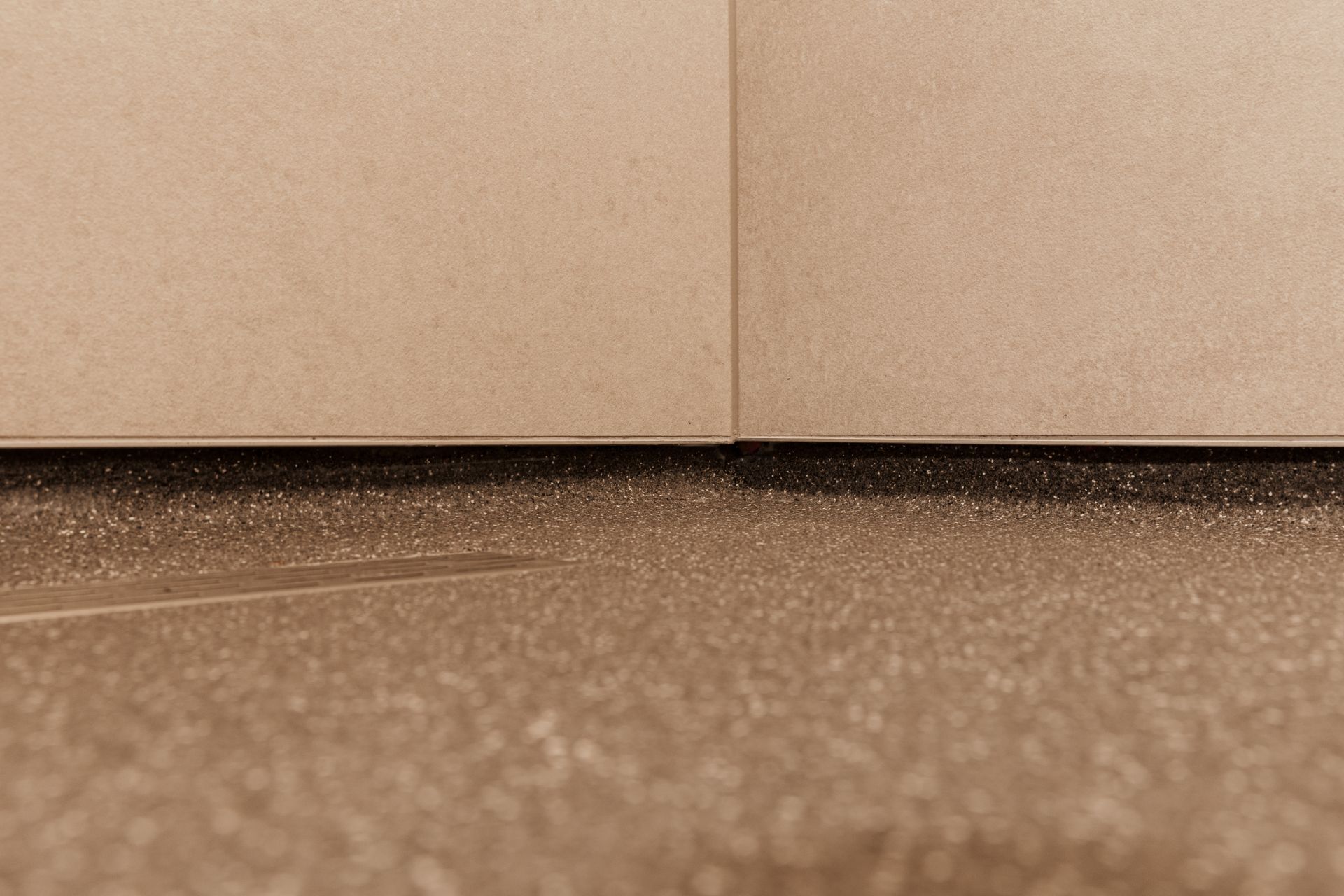
NEW 2026 Jubileum Edition The Best Interior Designers Benelux
Order Now €125