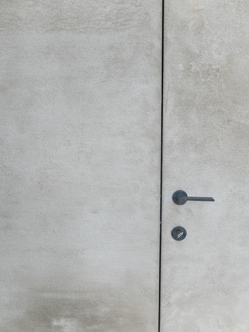
Video: crushed velvet wall finish with depth and warmth
The first thing you notice is the surface itself: a crushed velvet wall finish that shifts quietly as the light moves across it. In the video, the decorative wall painting is explained against a calm showroom backdrop, where the focus stays on the wall rather than the room around it. The finish brings depth and warmth on walls through soft tonal changes and a matte surface that never reads flat.
What the crushed velvet wall finish does in the room
Seen in close view, the crushed velvet wall texture is made up of small irregularities and layered shading. Those marks are not hidden; they are the point of the finish. Off-white, light taupe, and warm brown tones pass into one another in a way that softens the wall plane without making it decorative in a loud sense. The result is a warm matte wall effect that feels quiet, but still visually active.
Because the surface catches light unevenly, it changes over the day. One corner can read smoother and paler, while another picks up a deeper brown note. That variation gives the wall a sense of depth that is easy to read in a living room interior, especially where the wall sits beside a plain wooden panel and a more restrained ceiling line.
How the finish continues from wall to ceiling
The most striking detail in the image is the way the wall and ceiling share the same finish. Instead of stopping at the upper edge, the crushed velvet wall finish carries over the corner and onto the ceiling, so the surface wraps the room in one continuous material language. The join remains crisp, but the texture does the visual work. It keeps the corner from feeling hard or abrupt.
That wall and ceiling same finish also changes the way proportions are read. The ceiling does not separate itself from the wall as a different plane, so the room feels less cut up. The matte layer keeps reflections low, which helps the shaded surface stay legible. In a space with simple lines, that matters: the texture becomes the main event rather than an add-on.
A surface that depends on light, not decoration
The decorative wall painting shown here does not rely on pattern or contrast for effect. Instead, it works through small shifts in tone and texture. The surface looks soft from a distance, then more uneven once you come closer. That change in reading is what gives the finish its depth. It is also why the technique suits rooms where the wall needs presence without looking busy.
In the video explanation, the finish is presented as something that can be discussed and judged in a showroom context, which makes sense for a technique like this. The viewer can focus on the subtle transitions in the material, the matte sheen, and the way the wall receives light. Nothing is overdesigned. The interest comes from the surface itself.
Why the texture reads as warm rather than glossy
Many finishes try to catch the light; this one seems to absorb it first. The crushed velvet wall texture uses a muted sheen, so the wall never turns shiny. That keeps the effect grounded and makes the colour shifts easier to see. The warmer notes sit under the surface rather than on top of it, which gives the room its depth and warmth on walls without pushing the finish toward ornament.
The living room image also shows how well the finish sits beside more restrained materials. A wooden panel appears next to the textured wall, and the contrast is not about drama. It is about surface character. One side is smooth and flat, the other is layered and slightly uneven. Together they make the corner readable, even though both remain quiet in tone.
Subtle variation instead of a fixed pattern
There is no repeating motif here, only variation. The crushed velvet wall finish moves between pale and deeper tones, with tiny irregular marks that keep the surface from feeling printed or mechanical. That is what gives the technique its appeal in interior wall finishes: it creates movement without asking for a bold colour or a strong architectural gesture. The wall can stay calm and still hold attention.
The effect is particularly clear in the corner where the wall meets the ceiling. A straight edge could have made the room feel stiff. Instead, the shared finish lets the texture carry through, so the junction reads as part of the same surface family. It is a small decision, but one that changes the whole room’s visual rhythm.
Seen as a portfolio example, not just an effect
As a project example, the video works because it shows the finish in use rather than isolating it as a sample board. The viewer sees the crushed velvet wall finish in an interior setting, with the wall, ceiling, and adjacent panel all helping to explain how the texture behaves in space. That makes it easier to understand what the surface does when it covers more than one plane.
For anyone comparing decorative wall painting options, this finish offers a clear reference point. It is not about gloss, contrast, or heavy relief. It is about a soft matte wall effect that adds visual depth, holds warm tones, and stays composed in a room with simple lines. The video makes that point by letting the surface do the talking.
Because the texture changes with light, the finish never settles into a single reading. One moment it feels pale and powdery; the next, it leans into taupe and brown. That movement is subtle, but it keeps the wall from disappearing. In a room where the ceiling and wall share the same decorative language, the result is a surface that feels continuous, quiet, and readable from different distances.
Want to see more of Texture Painting? View the page of Texture Painting for even more great projects and company information.