










Villa Brabant: modern villa interior with custom details
The marble-look island sets the tone as soon as you enter the kitchen. Black bar stools line the edge, pendant lights hang low above the worktop, and the wall behind it is built up with vertical ribbing, open shelves and recessed details. It is a room that relies on restraint rather than excess, letting the surfaces, the spacing and the light carry the composition.
That approach runs through the entire modern custom interior. The renovation of a 1960s villa brought the rooms up to date without stripping out the sense of domestic scale. Materials repeat from one zone to the next, so the eye keeps finding the same wood tones, stone-like surfaces and painted walls in new combinations. The result is a home where the transitions are clear, but never abrupt.
A kitchen bar shaped by surface and line
The kitchen reads almost like a piece of fitted furniture. The marble-look countertop stretches across the island and drops into a darker base, which gives the bar a grounded profile. Tall stools sit close to the edge, turning the island into a place for conversation as well as serving. Above it, the pendant lights are more than decoration; they mark the work zone and pull the ceiling lower in visual terms. This is where the modern kitchen design becomes most legible, through proportion rather than spectacle.
Open niches and slim vertical slats break up the cabinet wall and keep the joinery from feeling heavy. The repeated rhythm of those lines appears again in other parts of the house, which is exactly where the project gains its coherence. Instead of introducing a new material in every room, the scheme stays disciplined. That decision gives the high end kitchens feel here its strength: the eye is not distracted by too many competing finishes.
Materials that return from room to room
The designer’s own rule of limiting the number of materials is visible in the way stone, wood and plaster work together. A pale stone-look surface sits beside darker cabinetry. Ribbed timber brings texture without breaking the calm of the room. In the background, the walls stay quiet enough for the resident’s art collection to take a visible role. Frames, canvases and objects are not treated as separate accents; they are placed into the interior as part of the overall composition.
That makes the modern custom interior feel less assembled and more edited. The house does not rely on dramatic contrast to make its point. Instead, each surface repeats at a measured pace, so the kitchen, dining space and living areas read as connected parts of one route through the villa.
The fireplace wall as the anchor of the living room
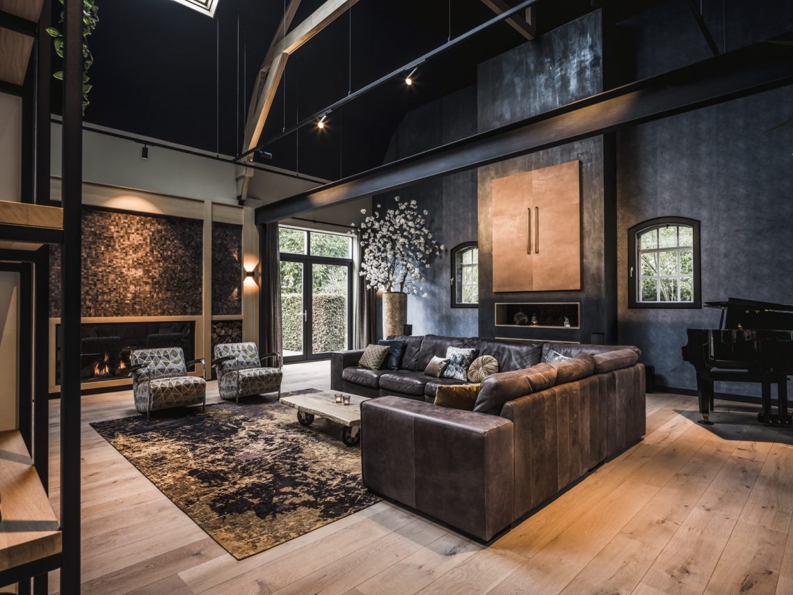
In the living room, the built-in fireplace wall pulls attention immediately. The opening is set into a long, panelled surface, with a darker frame around the fire that sharpens the line of the wall. In front of it, a large corner sofa and a generous rug create a low, broad seating field. The arrangement keeps the room close to the floor and gives the fireplace a clear role as the visual anchor.
Natural light enters from the large windows at the side, softened by full-height curtains. That light works differently from the fire. It spreads across the pale wall surfaces and catches the edges of the furniture, while the fireplace wall holds the darker centre of the room. In several images, the built-in fireplace wall is paired with the same restrained palette seen in the kitchen, reinforcing the idea that the project is built from repeated elements, not isolated statements.
Quiet sightlines, clear movement
One of the strongest decisions in the house is the way the sightlines are kept open. The plan allows the view to travel from one room to another, and then outward again through the windows. That outward connection is not pushed as a feature; it is used as a pause between the fitted elements. The living room, dining area and hall all rely on that same openness, so the interior never feels cut up into separate scenes.
It is also here that the project’s sense of editing becomes most obvious. The designer avoids crowding walls with too many gestures. A niche, a panel, a strip of light or a fireplace opening is usually enough. Because those details are repeated with discipline, the rooms keep their own identity while still reading as part of one modern custom interior.
An entrance that sets the tone before the rooms open up
The entrance area uses timber slats, recessed lighting and a straight stair to establish the first impression. The wall beside the staircase is treated as a vertical surface of rhythm and shadow, while the open balustrade keeps the line of the stairs light. Underfoot, stone-look tiles continue the neutral palette from the rest of the villa. The space feels measured, with every element arranged to guide the movement into the house rather than stop it.
That same attention to route appears in the hallway and on the landing, where built-in storage disappears into the wall and illuminated niches pick out small objects without adding visual noise. The architecture of the interior is doing practical work here. Doors, storage and circulation are all absorbed into the surface, leaving the materials and the light to define the space.
The dining area and the light above it
The dining area is shaped by the table and the pendant lights above it. The fittings hang as a cluster of glowing points, making the room feel more precise without overwhelming it. Around the table, the chairs sit in a tight, readable circle, and the nearby sideboard wall uses open compartments and integrated lighting to echo the same measured order found in the kitchen. The whole zone feels planned as one continuous gesture, not as a leftover corner.
Here, the dining area pendant lights do real spatial work. They mark the table in a room that remains otherwise calm, and they pick up the gold notes seen elsewhere in the house. The effect is subtle, but it keeps the dining space from fading into the background. It belongs to the same visual language as the kitchen and living room, with repeated lines, soft stone tones and controlled highlights.
Art, texture and a steady palette
Because the resident’s art collection is given a clear place in the interior, the walls have to hold their own without competing. That is why the background surfaces are so important. Plaster, timber, tile and stone-like finishes each have a distinct texture, but none of them shouts. The palette stays within beige, brown, black, grey and white, with touches of gold in the lighting and hardware. Those choices keep attention on proportion and placement.
The project description speaks about warmth and domestic scale, and those qualities come through less as mood words than as spatial decisions. Furniture sits low and stable. The materials repeat. Openings between rooms are left readable. Even the art is integrated with the architecture rather than pinned on top of it. That is what gives this modern custom interior its lasting interest: the details are not isolated, they are tied to the way the house is used.
Photography: Peter Baas
Want to see more of Hans Kuijten? View the page of Hans Kuijten for even more great projects and company information.




NEW 2026 Jubileum Edition The Best Interior Designers Benelux
Order Now €125


NEW 2026 Jubileum Edition The Best Interior Designers Benelux
Order Now €125


NEW 2026 Jubileum Edition The Best Interior Designers Benelux
Order Now €125


NEW 2026 Jubileum Edition The Best Interior Designers Benelux
Order Now €125


NEW 2026 Jubileum Edition The Best Interior Designers Benelux
Order Now €125


NEW 2026 Jubileum Edition The Best Interior Designers Benelux
Order Now €125


