






Wall finish with microtopping and crushed velvet look
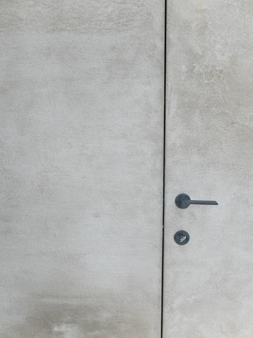
A beige wall finish with a crushed velvet look sets the tone in this interior, while the microtopping surface keeps the room visually tight and measured. The result is not flat. Light picks up the texture in small shifts, so the walls read differently as you move past the niche, the built-in elements, and the rounded light fittings with their gold edge.
Texture that changes with the light
The wall finish with microtopping and crushed velvet look is most visible where the light lands softly across the surface. Fine shadowing breaks up the beige plane, giving the wall a depth that is easier to read in close-up than from a distance. That is where the finish does its work: it keeps the room calm in tone, but never entirely still. The texture shows at the edges of the wall segments and around the transitions to the furniture, where the surface catches the room’s warm light.
Rather than acting as a background only, the crushed velvet wall finish becomes part of the spatial rhythm. The surface sits between the smoother cabinetry fronts and the more solid floor plane, so every material change is visible. In the project images, this is especially clear in the bathroom setting, where beige and natural tones stay close together and let the wall texture remain the main surface detail.
How the finish frames the built-ins
The wall finish for built-ins and interiors continues across the room in a way that supports the custom cabinetry in warm neutral tones. The built-in units follow the same quiet palette, which keeps the vertical wall elements from breaking the visual field too sharply. Instead of competing with the finish, the joinery sits against it and lets the texture remain legible. The contrast comes from surface rather than color: one plane is softly worked, the other more measured and straight.
That relationship is strongest where the cabinetry meets the wall line. A cream-toned top, pale fronts, and the surrounding beige finish stay close in value, so the room depends on texture and proportion rather than strong contrast. This is where the microtopping wall texture becomes useful architecturally. It gives the room a clear surface language without adding noise, and it lets the built-ins read as part of the same composition.
Warm neutral tones in a tight palette
The project stays within a restrained range of warm neutral tones: beige, cream, white, and small brass-gold accents. That narrow palette matters because the wall finish with microtopping and crushed velvet look already brings enough visual detail. When the color field is quiet, the eye notices the shift from matte wall surface to smoother furniture fronts, then to the round accents that punctuate the room. The palette is soft, but it is not washed out; the beige textured wall keeps enough body to hold the space together visually.
In the images, the ton-sur-ton approach is visible in the way the cabinetry, wall, and worktop sit close together in tone. It makes the room read as one continuous surface arrangement, even though the materials change. The effect is subtle, but not vague. The wall texture, the cabinet edges, and the pale floor surfaces each keep their own outline.
Indirect LED in the niche
A niche with indirect LED appears as a narrow line of light built into the wall, and it changes the way the texture is perceived. The light does not flood the room. It traces the recess and gives the surface a second layer of depth, especially where the wall meets the inset opening. Against the beige background, the illuminated edge sharpens the geometry and pulls attention to the wall plane as a designed element rather than a simple backing surface.
The alcove with indirect LED also links the finish to the room’s overall layout. It marks a pause in the wall, a place where the surface opens briefly before closing again around the built-ins. In that section, the microtopping wall texture appears smoother from afar and more tactile up close. The light line makes the finish easier to read and helps separate the niche from the surrounding wall without adding contrast through color.
Round accents that cut across the softness
Round accent lighting with a gold tone introduces a different shape into the room. The fixtures are small, but their circular outline interrupts the straight lines of the cabinetry and wall segments. Because the rim catches the light, the lamp reads almost like a small metal ring fixed to the wall. It gives the beige surface a point of focus and helps the viewer measure the wall’s scale.
Placed against the crushed velvet wall finish, the round lights do more than illuminate. They mark zones within the room and bring out the relief in the surface behind them. The gold edge is restrained, but visible enough to create a warm reflection on the nearby plaster-like finish. That reflection is one of the few stronger highlights in the space, which is why it stands out so clearly against the softer wall treatment.
A bathroom that relies on surface, not decoration
The room shown in the project imagery is a bathroom, but the visual language stays closer to interior detailing than to decorative display. The wall finish with microtopping and crushed velvet look carries most of the atmosphere. Fixtures and joinery remain secondary, allowing the viewer to focus on how the surface behaves around corners, niches, and furniture edges. The room feels defined by material transitions: wall to cabinet, cabinet to worktop, recess to light.
That makes the project useful as a reference for anyone looking at wall finish for built-ins and interiors. The finish is present across larger wall areas, yet it also works at a smaller scale, where a single light fitting or a niche reveals its texture. In the close views, the beige textured wall shows a soft grain and a slight unevenness that keeps the plane from feeling sterile. In the wider views, it supports the room without taking over.
What stays with you is the way the finish holds light. The microtopping wall texture gives the wall a firmer reading, while the crushed velvet wall finish adds the deeper surface variation that shows up in shadows and along edges. Together they shape a room that depends on tone, line, and reflected light rather than on ornament. The built-ins, niche lighting, and round accents all sit within that framework, so the wall remains the main visual field from the first glance to the final detail.
Want to see more of Texture Painting? View the page of Texture Painting for even more great projects and company information.




NEW 2026 Jubileum Edition The Best Interior Designers Benelux
Order Now €125


