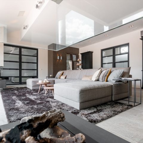
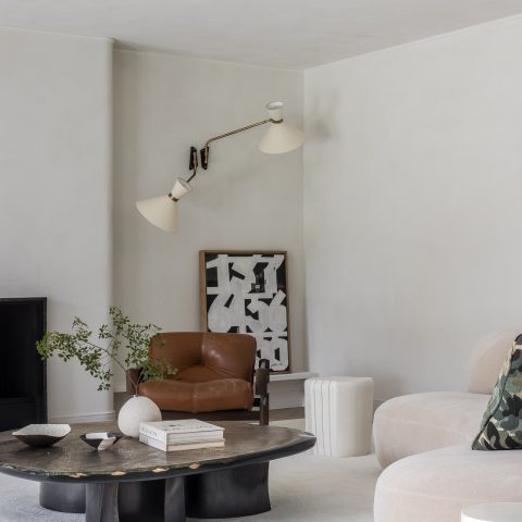
Warm minimalist interior with wood grain custom joinery
Wood grain, pale walls and low, built-in volumes set the tone as soon as you enter. The rooms are quiet, but they are not empty. A built-in shelf structure frames the view, while light floors and dark joinery mark the shifts between living, cooking and the more tucked-away zones of the home. The result is a warm minimalist interior that relies on proportion, openings and material contrast rather than decoration.
Custom wood details and visible grain
Wood is the constant thread here, but it appears in different registers. In one place it reads as a broad cabinet front; in another, as a sculptural corner detail with rounded joints and visible grain. The close-ups show how those edges are handled with care, especially where darker timber meets a lighter wall or a pale floor. That tension keeps the surfaces calm without flattening them. In this warm minimalist interior, wood grain custom joinery gives the rooms their structure.
The image sequence also makes room for restraint. A dark slat wall with a narrow recess pulls storage into the background, while a lighter wall plane leaves the timber to do the visual work. Nothing is overdrawn. Even the smallest transition, such as the meeting point between a plinth, a panel and the floor, carries the same measured approach. That is where the project’s natural interior character becomes most legible: not in a single statement piece, but in the continuity of the details.
Open niches that keep the kitchen light
In the kitchen, open kitchen niches and white shelving break up the darker cabinet runs. They leave room for objects, but they also keep the wall from becoming a closed block. The openings sit against darker wood, so the shelves read as pauses in the composition rather than separate features. Light bounces off the pale surfaces and makes the storage feel lighter than its actual volume. It is a clear example of built-in shelf structure being used to shape both function and sightlines.
The same logic appears in the adjacent living areas, where open niches and cut-outs allow the eye to move through the interior. One frame reveals a broad opening with a book-like shelf structure built into the passage. Another shows a long view through large black-framed openings toward the outside. The house stays present as context, but the emphasis remains on how the joinery organizes the route from one zone to the next. This is where the warm minimalist interior reads most convincingly as a lived-in composition.
Storage that stays inside the wall
Some of the most effective elements are the ones that almost disappear. A narrow opening in the slat wall, a recessed shelf, a cabinet door aligned with the panel joints: these are modest gestures, but they keep the wall surface clear. The result is a room that feels ordered without relying on heavy furniture. In several images, the storage is tucked into wall thickness or under a sloped ceiling, which lets the architecture hold the clutter rather than adding another layer on top.
A stone fireplace accent against soft neutrals
The living area is anchored by a stone fireplace accent, set against pale plaster and a dark fire opening. It gives the room a harder edge, but not a cold one. Nearby, the large window opening pulls in daylight and softens the contrast between the stone and the wood floor. The palette stays close to beige, ecru and brown, with the black frame lines and darker joinery used sparingly. That keeps the eye moving between texture, light and mass instead of landing on one showpiece.
Other views bring in a more intimate scale. A hallway-like transition opens toward the kitchen, with the floor changing tone beneath the sightline. In another shot, a dark wood surface meets a pale wall in a tight corner detail, and the junction is allowed to remain visible. These are small decisions, but they shape the reading of the whole interior. The natural interior does not depend on loose styling; it relies on surfaces that meet cleanly and on materials that can stand close to one another.
Large frames, clear views
The black-framed openings do more than bring in light. They frame the outside like an additional plane in the room, which makes the interior feel more layered. A dark line in the ceiling, likely carrying lighting, cuts across the composition and reinforces the horizontal movement. Below that, the light floor keeps the rooms open. Because the materials stay subdued, the visible structure of the opening becomes part of the design language. It is a quiet way of letting room-to-room sightlines do some of the work.
Stairs, landings and the attic zone in the same language
The stair detail continues the same material logic. Wooden treads run upward against light walls, and the balustrade or slatted front beside them echoes the cabinetry used elsewhere. On the landing and in the attic-zone images, the joinery shifts to fit the roofline: storage is placed under the slope, and the openings are cut to follow the geometry rather than resist it. The result is practical, but also visually calm. Even where the ceiling drops, the warm minimalist interior keeps its order through the timber.
Upstairs, the openings become smaller and more specific. A white door with a rounded top edge sits under sloping roof planes, while another room shows exposed timber beams overhead and a compact furniture front below. These details make the upper level feel integrated with the rest of the project without repeating it mechanically. The same is true in the bathroom image, where a built-in wall unit with round cut-outs and aligned panels extends the project’s material discipline into a more compact setting. It is still custom cabinetry, but adapted to a different scale.
Across the project, the strongest impression comes from how the pieces relate to one another. Wood grain custom joinery, open kitchen niches, the dark slat wall with niche and the stone fireplace accent are not treated as separate moments. They keep returning in different rooms, adjusted to the wall, the ceiling or the opening they have to meet. That repetition is what gives the interior its clarity. Nathalie Deboel’s contribution is visible in that spatial organisation: a sequence of built-in elements that leave the house open, but give each zone a clear edge.
Want to see more of NATHALIE DEBOEL INTERIOR DESIGN? View the page of NATHALIE DEBOEL INTERIOR DESIGN for even more great projects and company information.





NEW 2026 Jubileum Edition The Best Interior Designers Benelux
Order Now €125


NEW 2026 Jubileum Edition The Best Interior Designers Benelux
Order Now €125


NEW 2026 Jubileum Edition The Best Interior Designers Benelux
Order Now €125


NEW 2026 Jubileum Edition The Best Interior Designers Benelux
Order Now €125