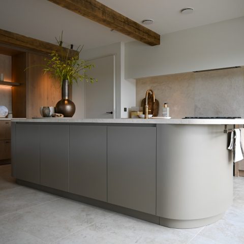
White handleless kitchen with concrete-look countertop
The first thing you notice is the calm surface of the white handleless kitchen. The fronts run in clean, straight lines, with no visible pulls to break the plane. That restraint gives the compact layout a clear reading from one end to the other, while the concrete-look countertop introduces a darker, more tactile band across the room.
Seen up close, the handleless cabinets do more than simplify the look. They keep the joinery quiet and make the white fronts feel like a single continuous field. Against that pale base, the countertop stands out immediately. Its concrete-look finish adds depth without turning the kitchen into a heavy space, and it works well with the grey-black splashback that sits behind the working zone.
White fronts that keep the plan visually light
The layout stays compact, but the proportions are handled with discipline. Tall and low cabinet parts are kept visually calm, so the room does not feel crowded by storage. The white handleless kitchen reads as one composed strip rather than a collection of separate units. That effect is especially clear where the drawer fronts align with the worktop and where the darker side elements remain tucked back in the composition.
Small shifts in tone do most of the work here. White fronts, a grey-black rear wall and the concrete-look countertop create a narrow palette, but the surfaces are not flat in appearance. Light from the windows catches the cabinet edges and the slight texture in the worktop, so the room changes with the day instead of relying on decoration. It is a compact modern kitchen that uses surface and line as its main language.
A sink by the window brings daylight into the work zone
At the window side, the sink sits in a clear pool of light. Horizontal blinds filter the daylight so the working area stays bright without feeling exposed. The faucet and basin are placed where the view and the light meet, which makes the sink zone the most open point in the room. In a small plan, that matters: it gives the kitchen a visual pause before the cabinetry continues again.
The window also softens the stronger contrasts elsewhere. While the concrete-look countertop and dark splashback set a firmer tone, the daylight brings out the lighter parts of the installation. This is where the white handleless kitchen feels most airy. The practical parts remain visible, but they are framed by the window rather than hidden away.
Compact storage with a clear rhythm
The handleless cabinets are not only about appearance. They also support a tighter storage rhythm, with fronts that are easy to wipe and edges that stay visually calm. The built-in oven appears in a niche, set within a darker recess and bordered by white framing. That contrast makes the appliance zone easy to read while keeping it tied to the rest of the kitchen. In a compact modern kitchen, such details stop the room from feeling fragmented.
Across the lower run, the worktop remains the main horizontal line. The concrete-look countertop cuts through the white composition and ties together the sink area, hob zone and storage fronts. You can read the kitchen almost as two layers: the pale cabinet volume below and the darker working strip above it. That separation gives the room order without making it stiff.
Dark contrasts around the hob and splashback
The hob area introduces a stronger visual note. Several burners sit in the countertop, backed by a grey-black surface that rises behind them like a dark panel. The effect is precise rather than decorative. It marks the cooking zone clearly and anchors the white handleless kitchen with a more grounded centre. A close view of the surface shows how the pattern and tone of the concrete-look countertop pick up those darker elements without copying them exactly.
In the details around the hob, the kitchen moves between white, grey and black with a few lighter wood accents visible in the broader scene. Those touches stay secondary, but they keep the palette from becoming flat. The result is a room that relies on measured contrast instead of large gestures. The built-in oven, the splashback and the worktop each carry their own part of that visual rhythm.
Material changes that stay readable
What makes this white handleless kitchen persuasive is the way the materials are allowed to stay legible. White fronts do one job. The concrete-look countertop does another. The darker niche around the oven, the grey-black backsplash and the daylight from the window all mark different zones without crowding the room. Even the small shadow gaps between fronts contribute to that clarity. The kitchen remains compact, but every surface has a clear role.
That clarity is what turns the layout into a practical living space rather than just a tidy composition. The sink by the window, the hob on the worktop and the built-in oven in its niche are all easy to locate at a glance. Nothing here depends on excess detail. Instead, the kitchen works through restraint, through the contrast between white cabinetry and the concrete-look countertop, and through the way light keeps shifting across the room.
Photograph: Schouten
Want to see more of Diepeveen Keukens en Badkamers? View the page of Diepeveen Keukens en Badkamers for even more great projects and company information.




NEW 2026 Jubileum Edition The Best Interior Designers Benelux
Order Now €125


NEW 2026 Jubileum Edition The Best Interior Designers Benelux
Order Now €125