Warm minimalist apartment interior with custom detailing and arches
A marble-look floor sets the tone as soon as the lift lobby opens up. The diamond pattern catches the light before the apartment does, while curved wood niches and hanging lamps sketch the first cues of the warm minimalist apartment interior inside. From there, the route moves toward a sequence of arched openings, softer corners and long sightlines that let the rooms read as connected, without losing their own edges.
Wood, stone and a quieter palette
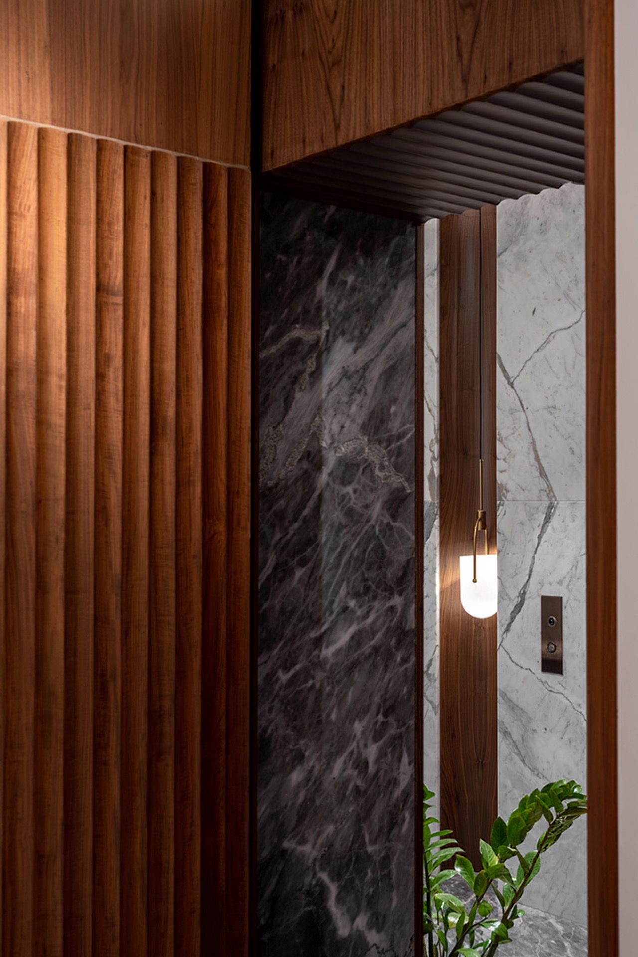
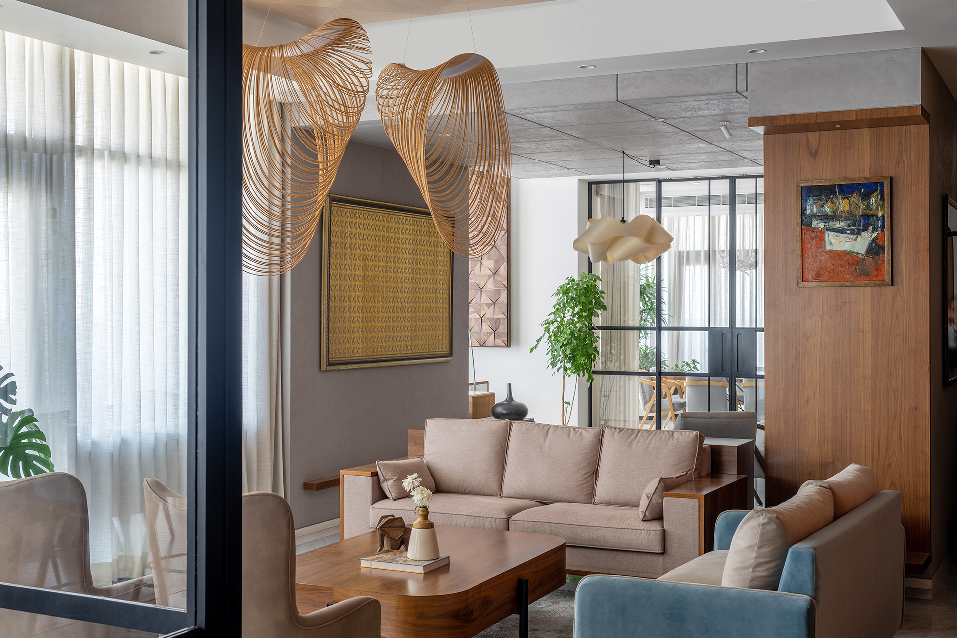
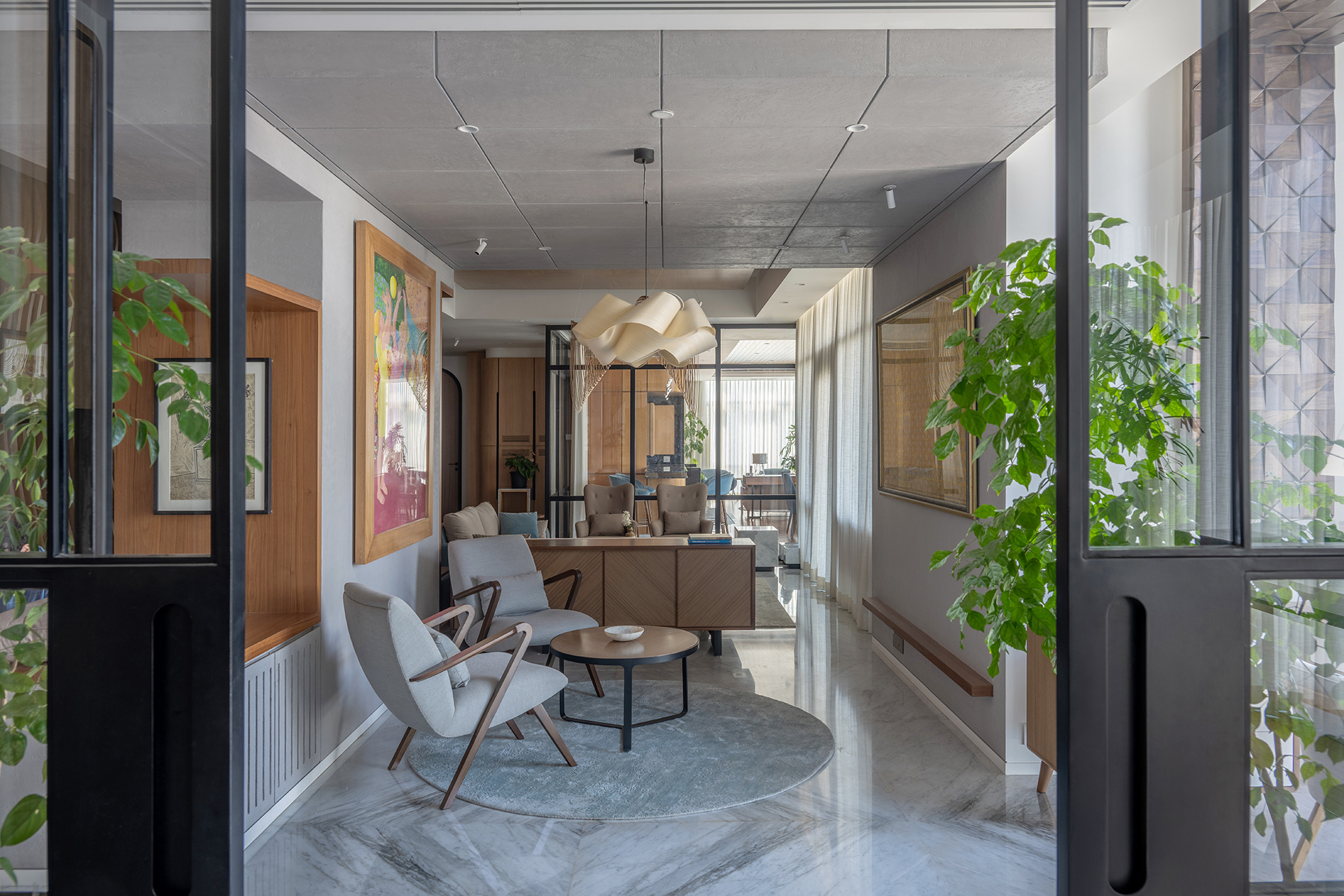
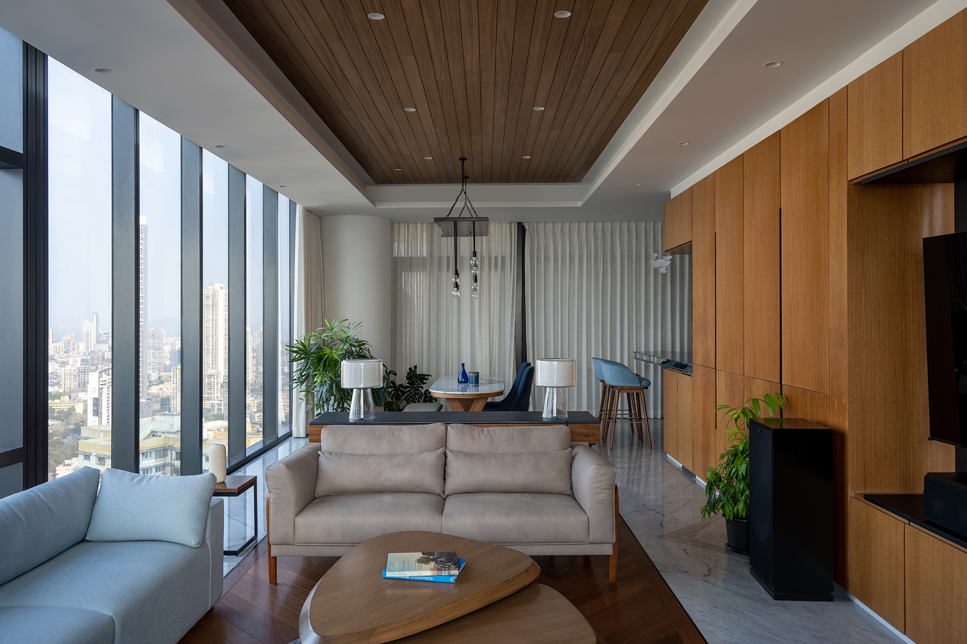
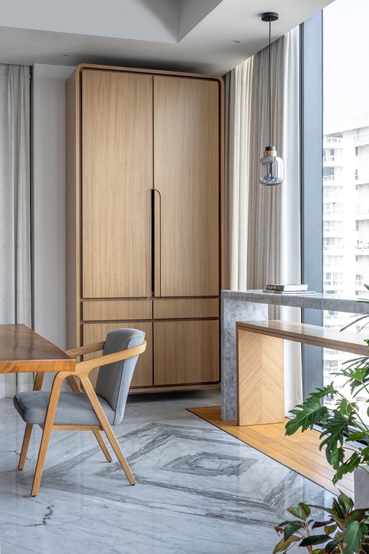
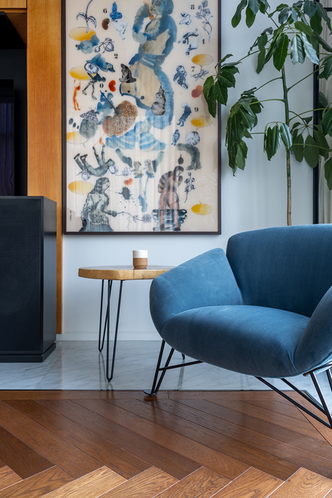
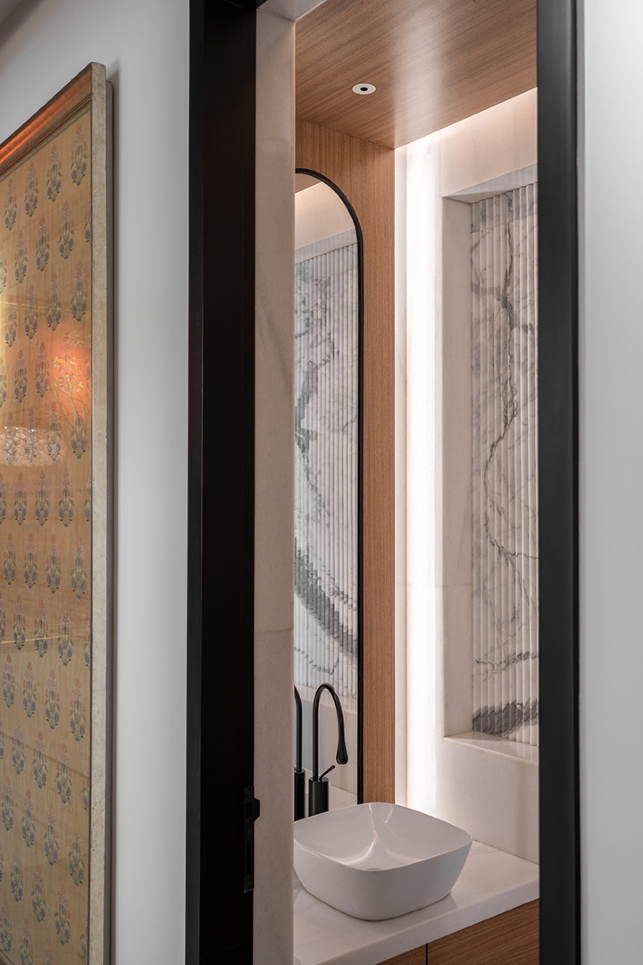
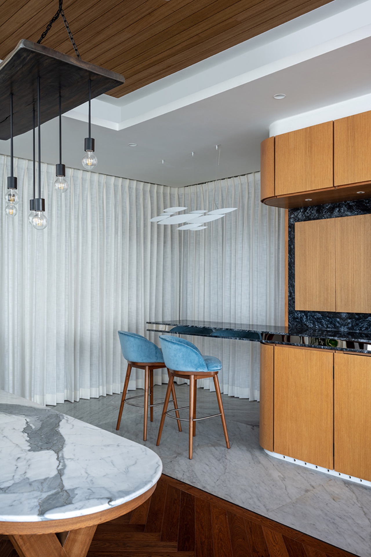
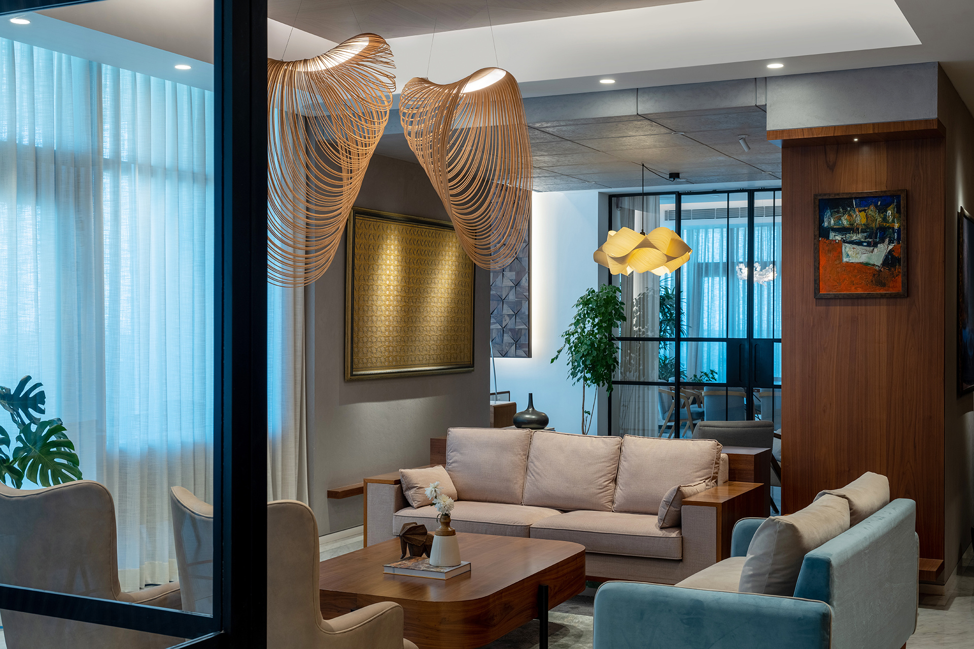
Inside, the palette stays close to grey, cream and earthy blue, with wood pulling the surfaces out of the cold. The contrast is direct: Statuario and Bardiglio marble, light and medium wood veneer, black metal lines. That mix gives the apartment a measured weight, but it never feels hard. The floors shift between marble and wood to mark different zones, and the ceiling and furniture repeat the same material rhythm in a restrained way.
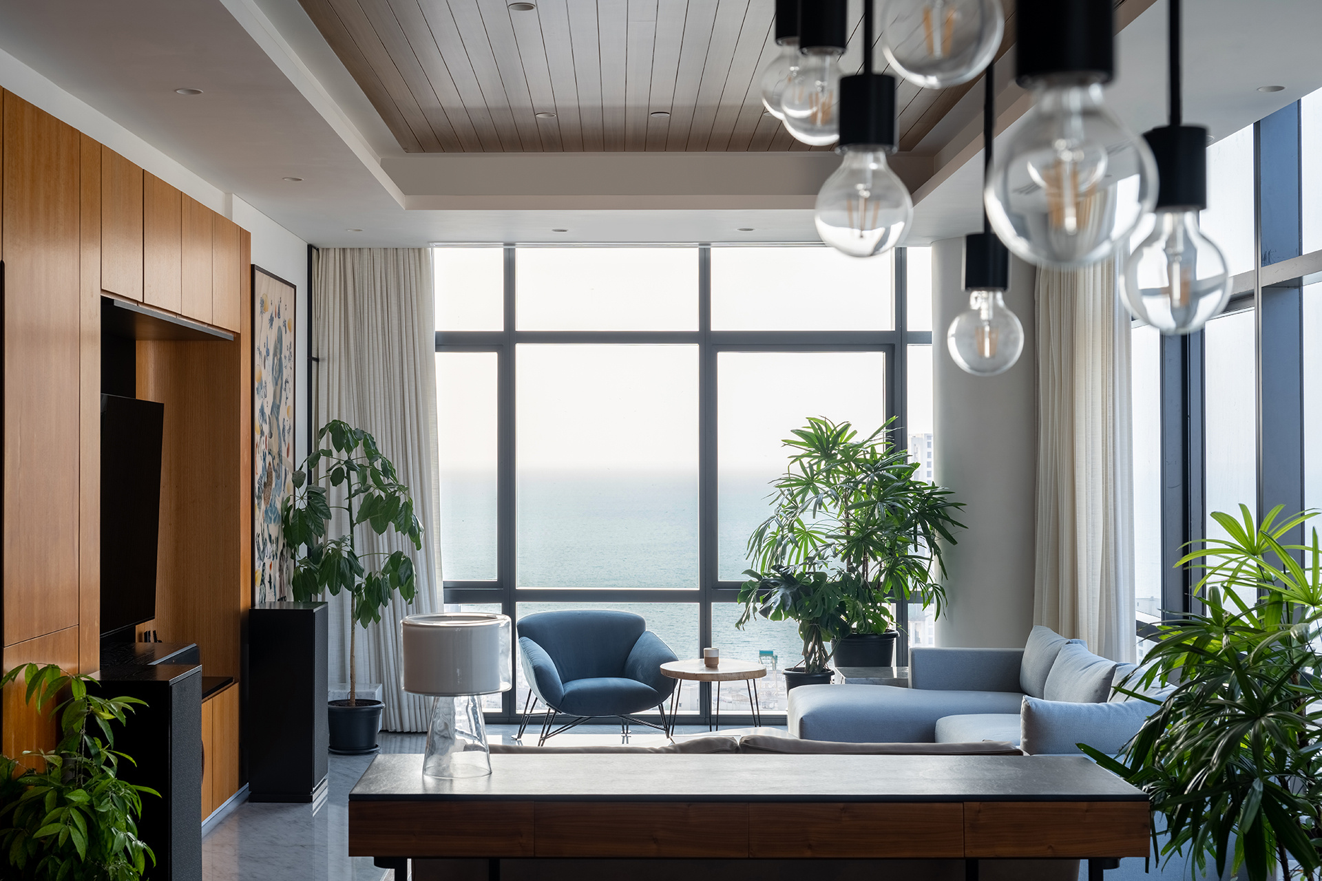
The large glass openings matter here. They bring in broad daylight and keep the rooms visually open toward the views, while curtains soften the edges when privacy is needed. Instead of breaking the plan into closed compartments, the layout allows one room to lead into the next. The result is a warm minimalist apartment interior that relies on proportion, not decoration, to hold attention.
The 3D wood slat wall that does more than one job
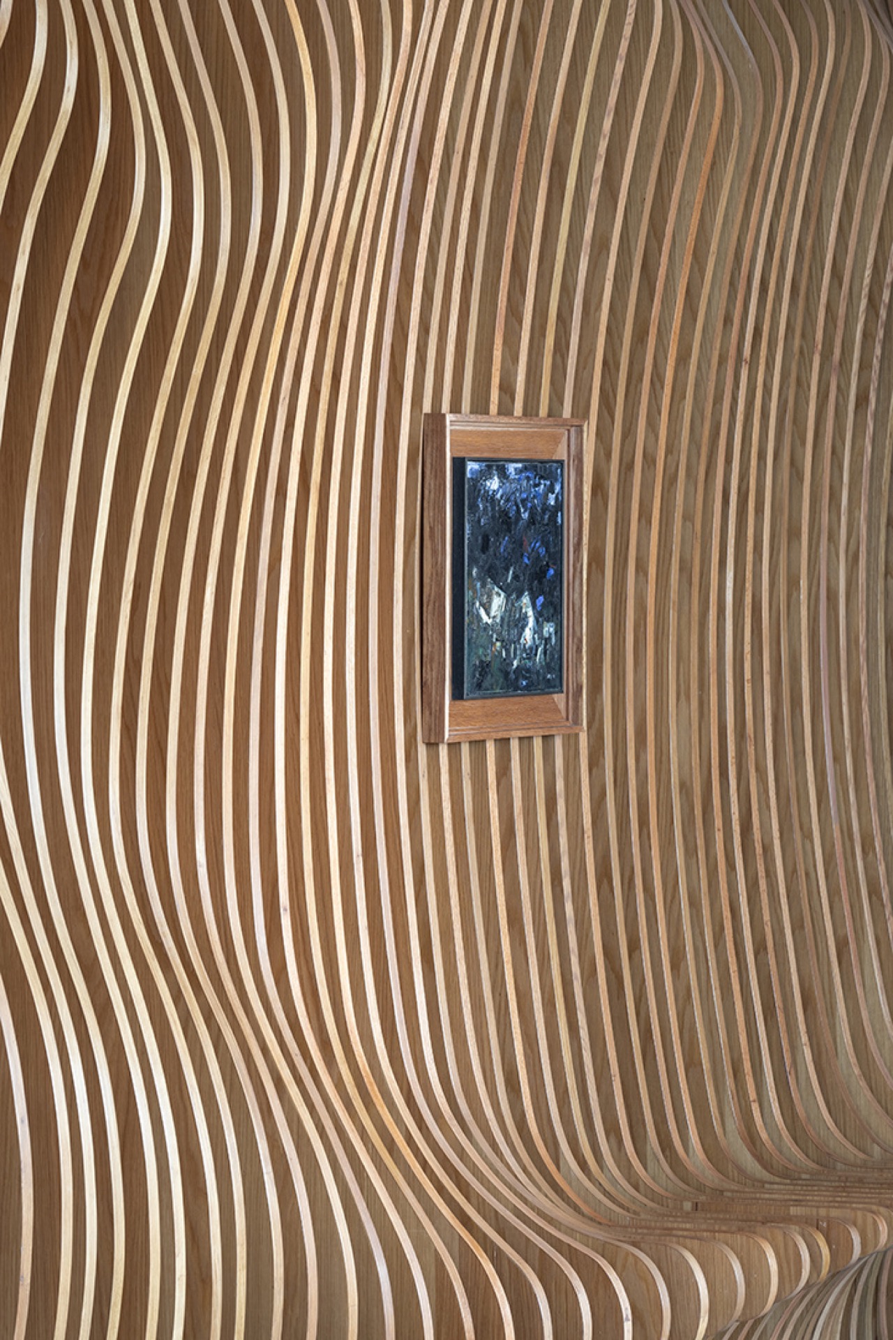
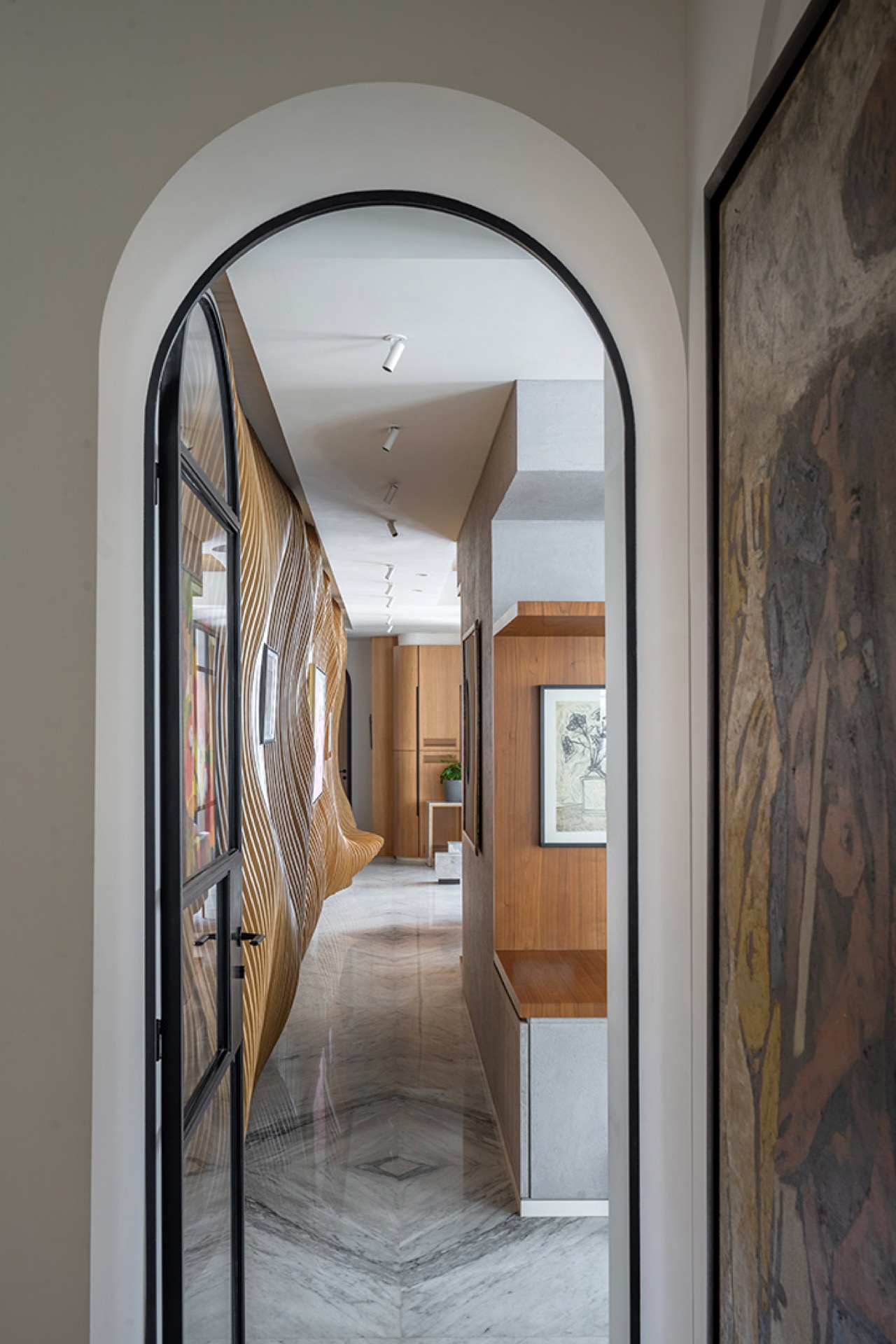
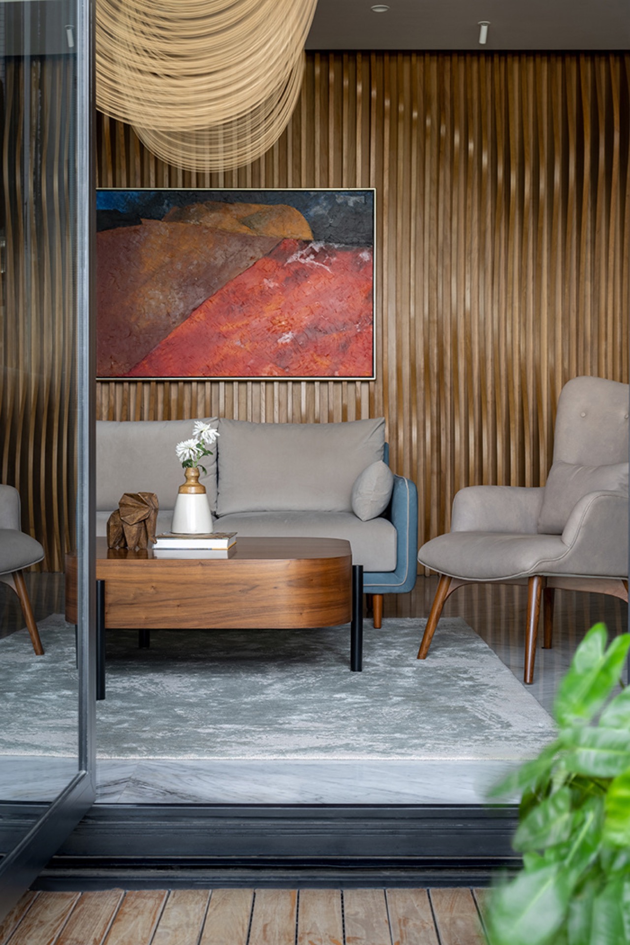
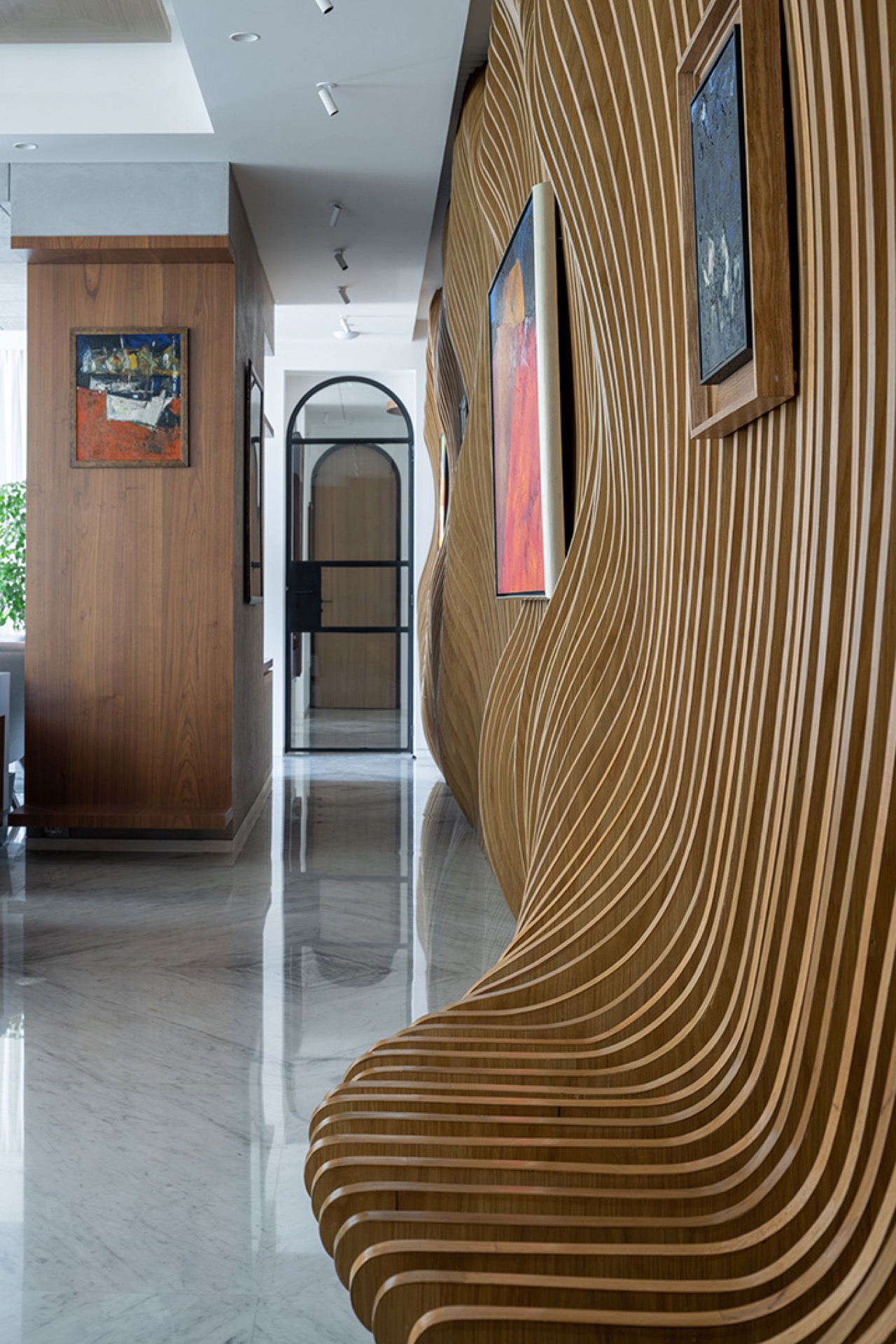
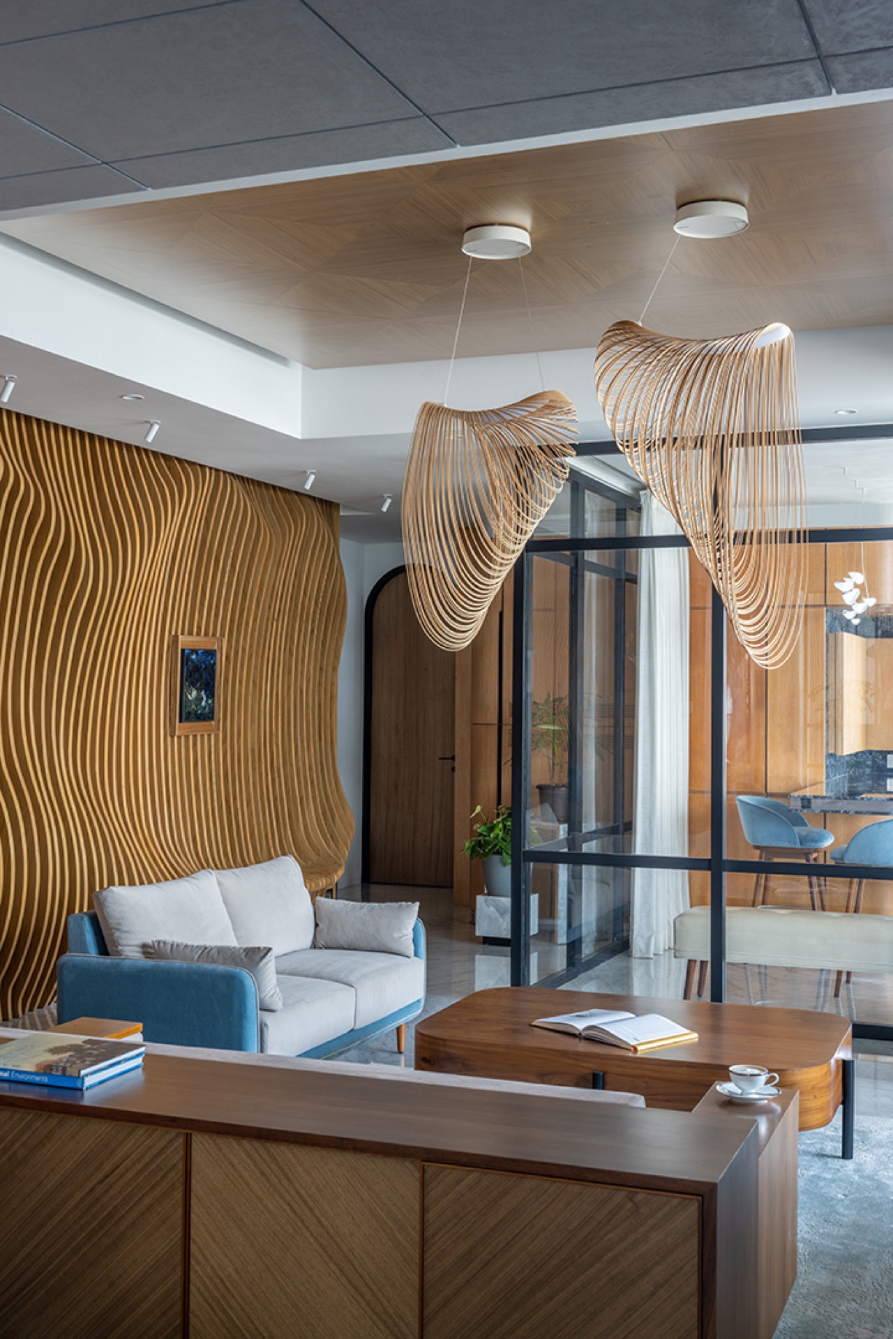
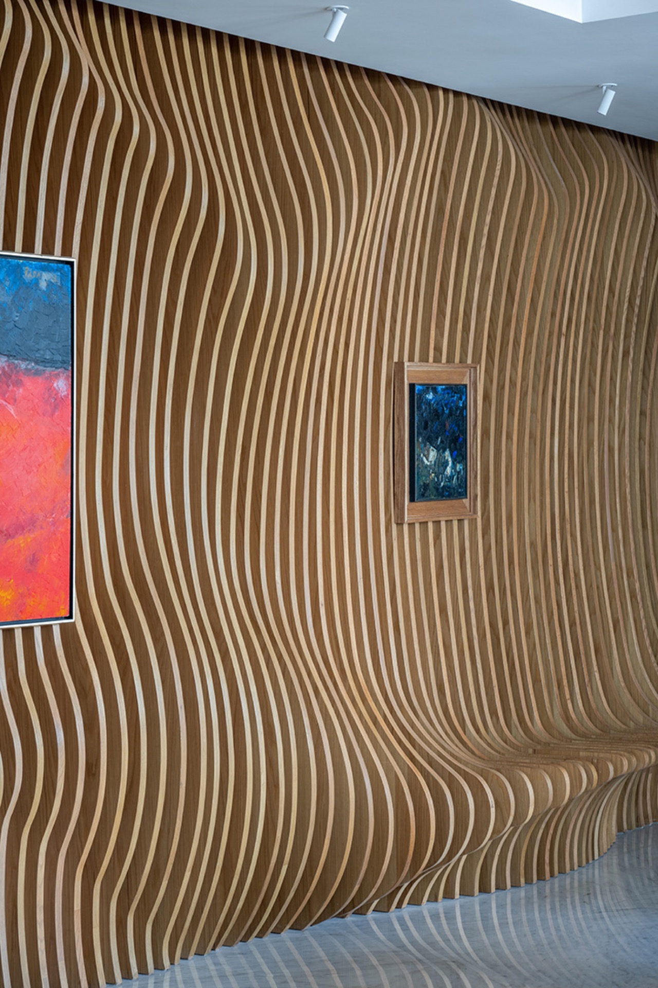
One wall carries the project’s strongest gesture. Built as a parametric surface with meandering recesses, it holds the client’s art in slots of different sizes, then extends into a bench that becomes part of the living room seating. The slatted timber surface reads as a 3D wood slat wall, but its role is broader than a display panel. It organizes the room, absorbs sound and gives the living area a clear focal edge without closing it off.
The recesses are not identical, and that matters. Some hold smaller works, others allow larger pieces to sit deeper in the wall. The bench at the end stretches the composition horizontally, so the eye does not stop at the art niches. It continues across the room, past the seating line and into the glazed edge beyond. In a house shaped by openness, this kind of custom interior detailing keeps the plan from feeling empty.
Arched openings that soften the route through the apartment
Arched openings repeat across the interior and interrupt the straight lines of the plan. They appear in doorways, thresholds and framed transitions, bringing a rounded movement to a space dominated by stone and wood planes. The effect is subtle but constant: corners feel less abrupt, and the apartment reads as a series of connected rooms rather than a corridor of boxes. That repetition of curve becomes part of the apartment’s identity.
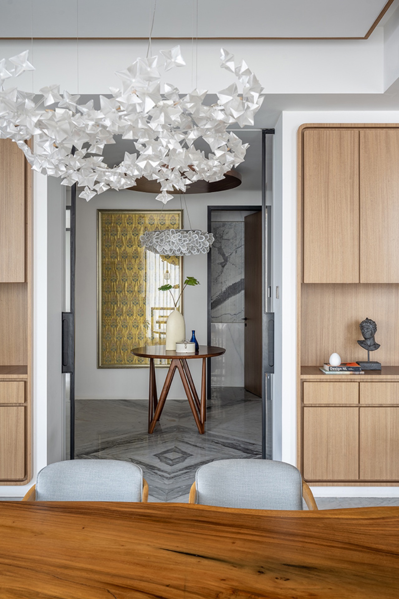
The entrance lobby sets this up with a circular table inlaid with a lotus motif and surrounded by art. Two doors leave from here, one toward the private family dining area and one to the main living room. Even the circulation carries the same measured logic. The marble floor continues in a diamond pattern, and the route between rooms stays legible, with each opening doing a specific job instead of acting as a decorative gesture.
Entrance details with a clear visual sequence
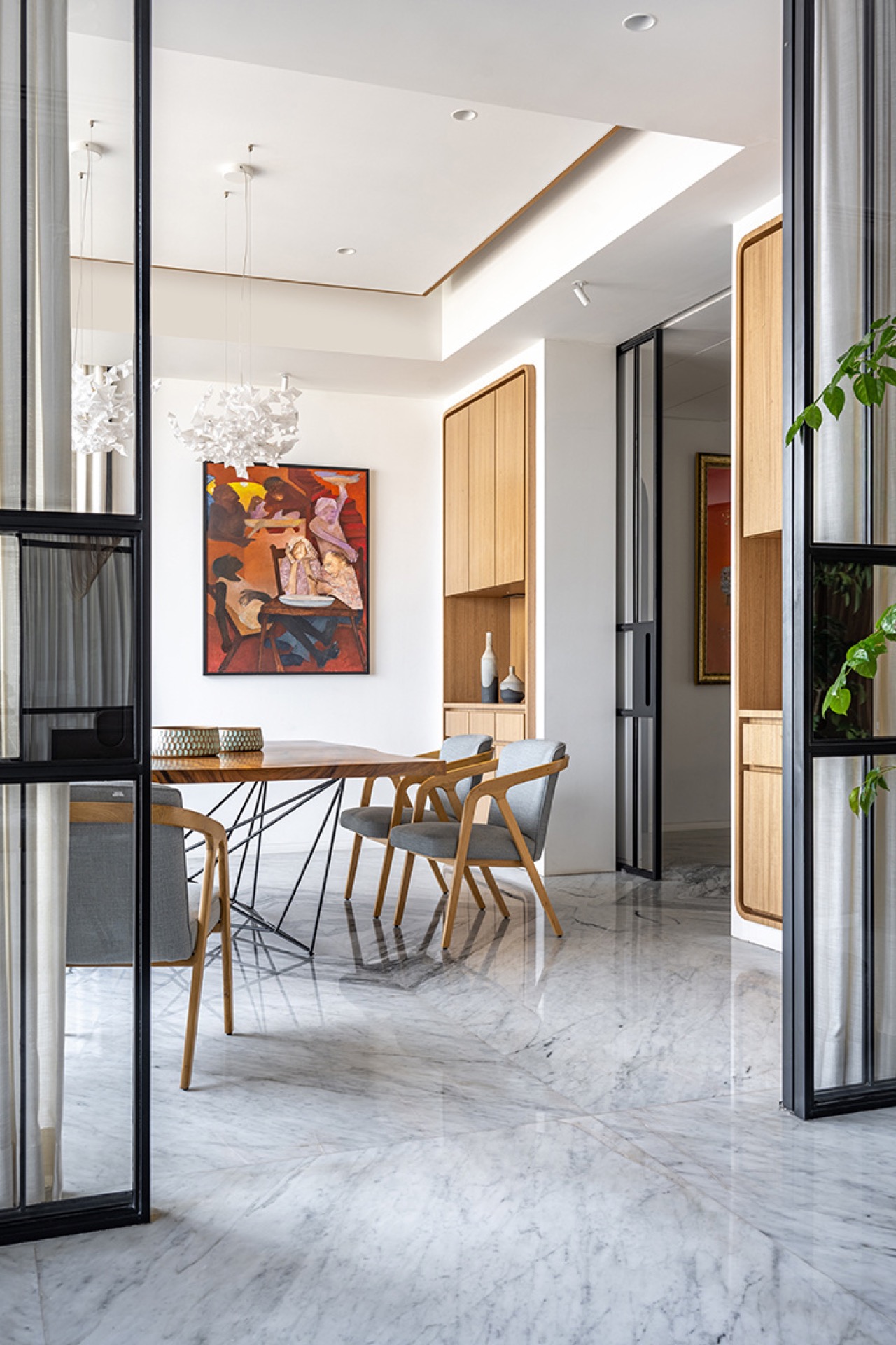
The lift lobby begins with Bardiglio grey marble, then shifts into the apartment through statuario marble that carries the same geometric language into the dining zone. Curved wood-finish niches line the walls, and the hanging lights pick up the vertical rhythm above eye level. These are small moves, but they build a clear sequence: stone underfoot, wood at the walls, light floating above. The apartment never introduces its materials all at once; it lets them arrive in stages.
That staged entrance also explains the rest of the project. The warm minimalist apartment interior is not built on one dominant material, but on a set of recurring cues that return in different rooms. Marble on the floor, wood in the wall treatment, black metal at the edges, and rounded forms that keep the transitions gentle. The effect is steady and calm without becoming bland.
Art niches, acoustics and a built-in bench line
The parametric wall deserves a second reading because its function is layered. It frames the art collection, reduces echo in the living space and creates a bench line where the slats run on. That combination turns a single surface into a working part of the room. The wall does not sit behind the furniture; it participates in how the room is used. The living area gains seating, display and sound control from one continuous gesture.
These kinds of custom interior detailing matter in a family home where formal and private zones need to stay connected. The apartment opens up to the view, but it also protects moments of retreat. Walls curve to guide movement, niches keep artwork at hand, and the material shifts tell you where one use ends and another begins. It is a measured approach to openness, not an absence of boundaries.
Wood and stone in the kitchen and dining zone
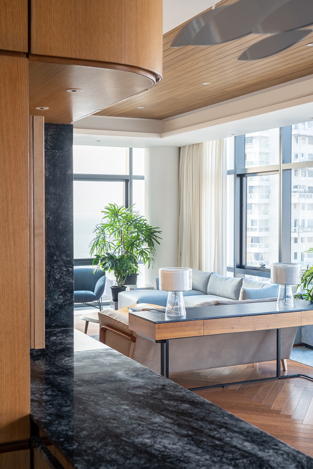
The kitchen and dining areas continue the same material conversation. Wood cabinetry meets stone surfaces, while dark stone accents sharpen the cooking zone. The image set shows a wood and stone kitchen with a clear emphasis on joinery: cabinet fronts, open shelves, integrated lines and a restrained backsplash. Pendant lights hover over the island or bar, adding a sculptural note without competing with the surfaces below.
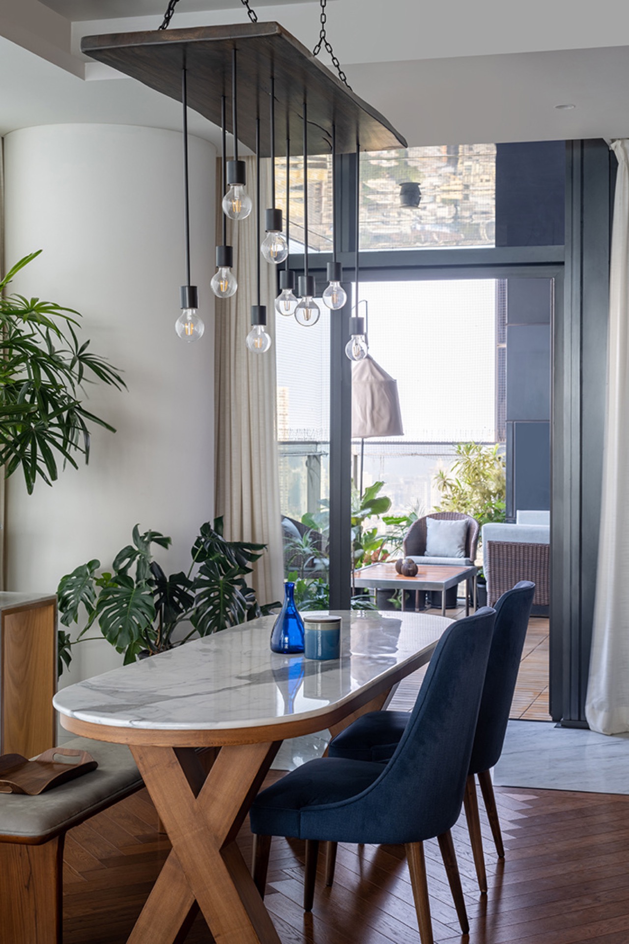
In the dining zone, the furniture sits against the same marble-look floor and controlled lighting. A round table appears in the entry sequence, while deeper in the plan the family dining area remains separate from the main living room. That split keeps the apartment adaptable. Formal gatherings and everyday use can happen in different parts of the plan, linked by the same palette of stone, timber and soft grey walls.
Large glass openings that keep the view present
Several rooms open toward large glass openings, and the effect is strongest when the curtains are drawn back. The view becomes a moving background rather than a framed image. Daylight reaches the floor and catches the marble patterns, then slips across the wood panels and the curved details. Even the sculptural pendant lights stand out more clearly against the glass because the room behind them remains visually open.
That openness is handled carefully. Privacy is preserved through layout and threshold design rather than through heavy partitions. The apartment can read as spacious without giving everything away at once. From one room to the next, the sightlines remain long, but the functions stay distinct. That balance is what gives the project its quiet confidence.
A palette that stays close to the hand
Grays, cream tones and earthy blues run through the apartment like a low register. They keep the architecture from becoming too glossy and allow the art to stand forward on the walls. The black metal details sharpen the softer materials, especially where the plan meets the darker exterior edge. In that sense, the interior does not try to hide contrast; it uses it to make the rooms more readable.
By the time the route returns to the living spaces, the apartment has already introduced its main ideas: marble-look floor patterns, arched openings, a 3D wood slat wall, and long views through glass. Each is repeated just enough to register, but not so much that the space feels forced. The warm minimalist apartment interior stays focused on surfaces that work, spaces that connect and details that carry use as well as form.
Project photography: Kuber Shah
Suppliers: Bardigilo Marble, Statuario Marble, LZF Lamp, colonial Collections, Wood, Modforms, White teak, Luceplan Lights, NM Illume
Want to see more of LMC Architecten? View the page of LMC Architecten for even more great projects and company information.


NEW 2026 Jubileum Edition The Best Interior Designers Benelux
Order Now €125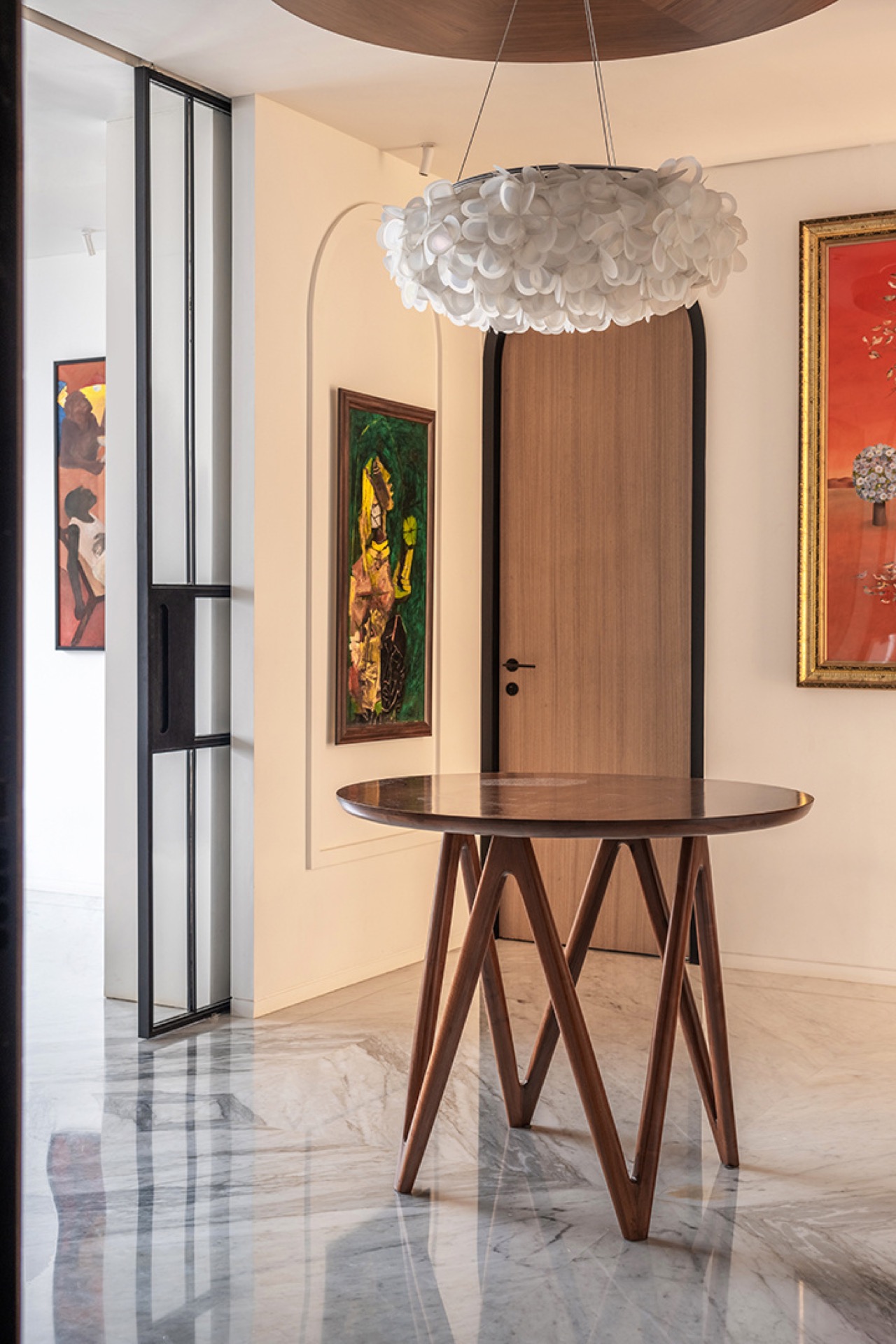
NEW 2026 Jubileum Edition The Best Interior Designers Benelux
Order Now €125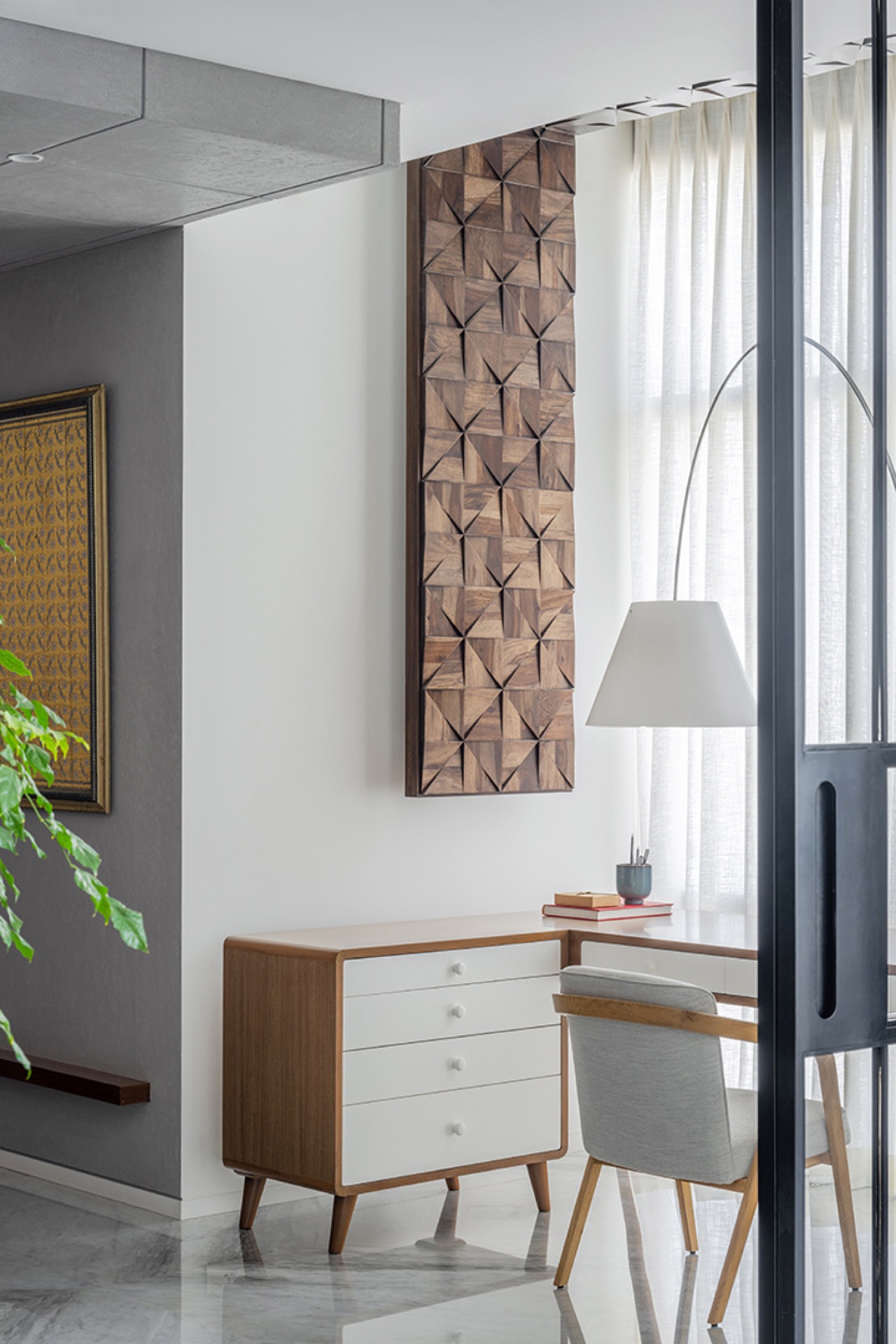
NEW 2026 Jubileum Edition The Best Interior Designers Benelux
Order Now €125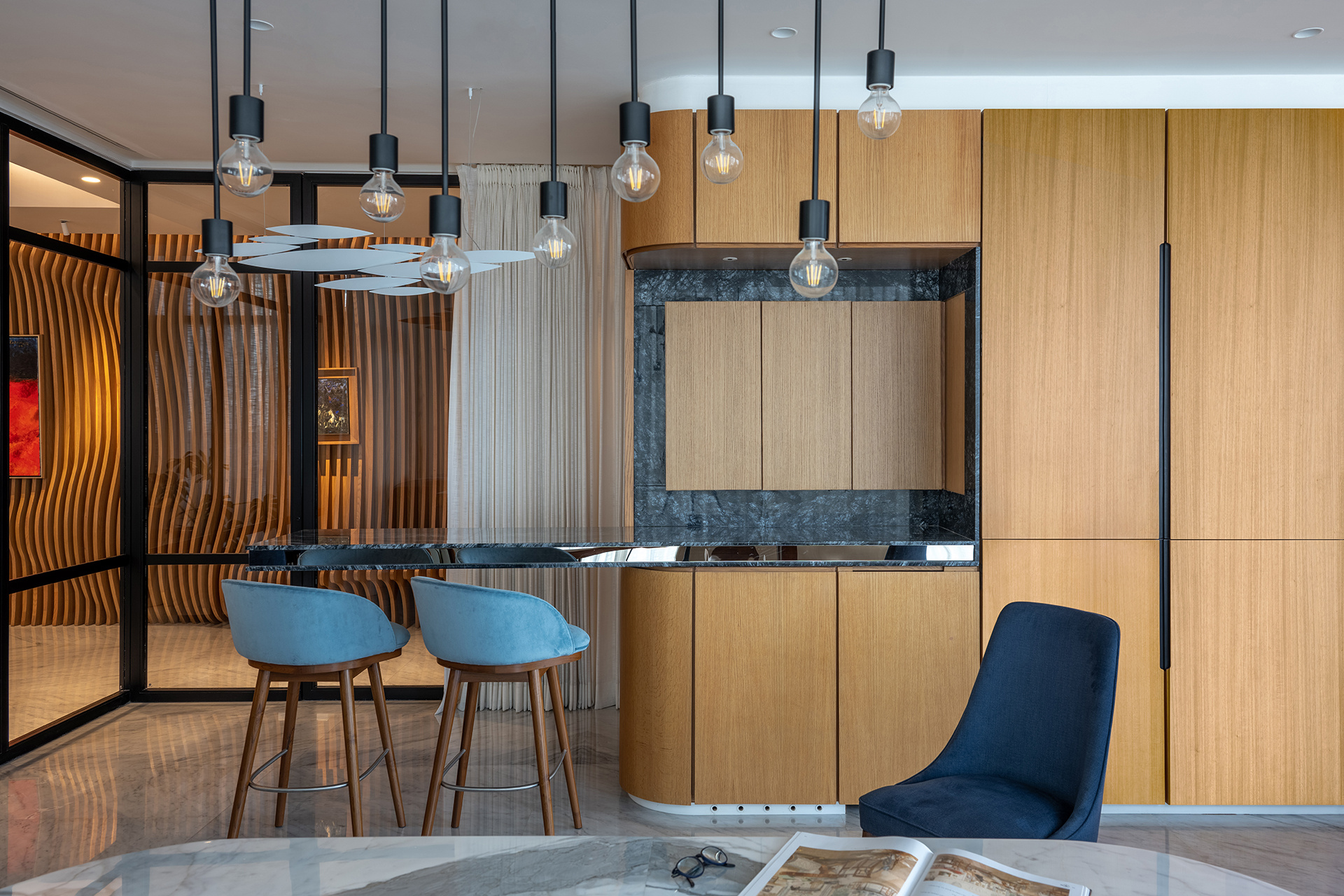
NEW 2026 Jubileum Edition The Best Interior Designers Benelux
Order Now €125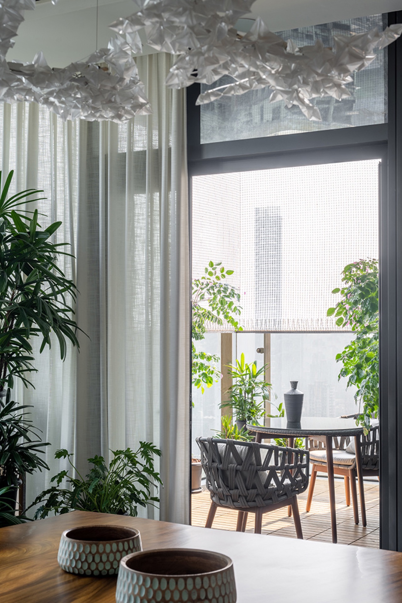
NEW 2026 Jubileum Edition The Best Interior Designers Benelux
Order Now €125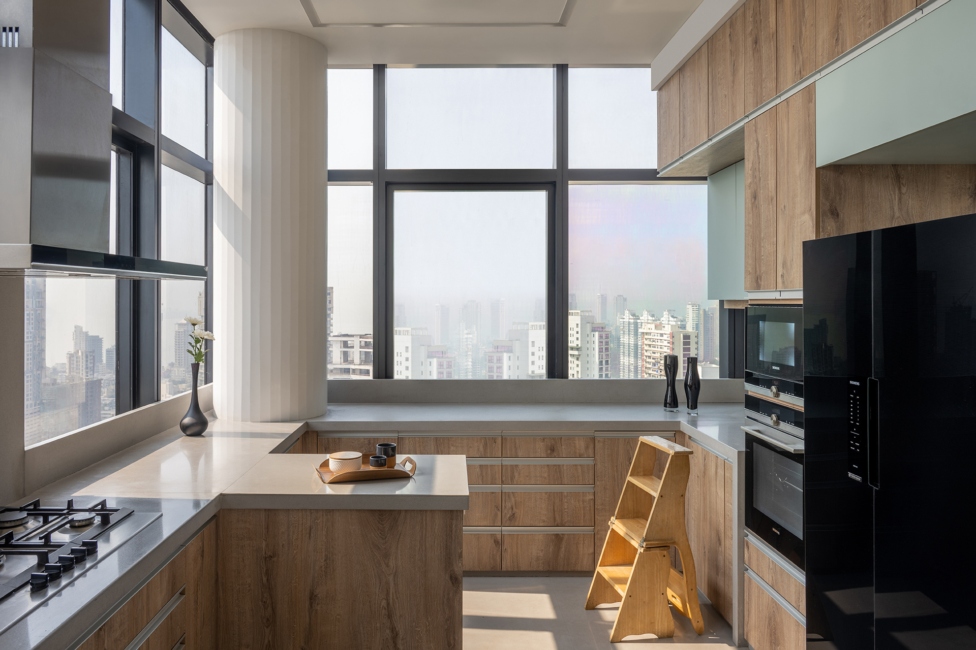
NEW 2026 Jubileum Edition The Best Interior Designers Benelux
Order Now €125