










Colorful modern classic interior
Wood paneling sets the tone from the first room onward. In this modern classic interior, the surfaces shift between painted walls, timber lines, stone floors and blocks of color that register immediately in the eye. A black inset screen, a rounded lamp, and a pale curtain at the window keep the composition from feeling static. Instead, each room introduces a new material move while holding onto the same measured palette.
Wood paneling frames the main living spaces
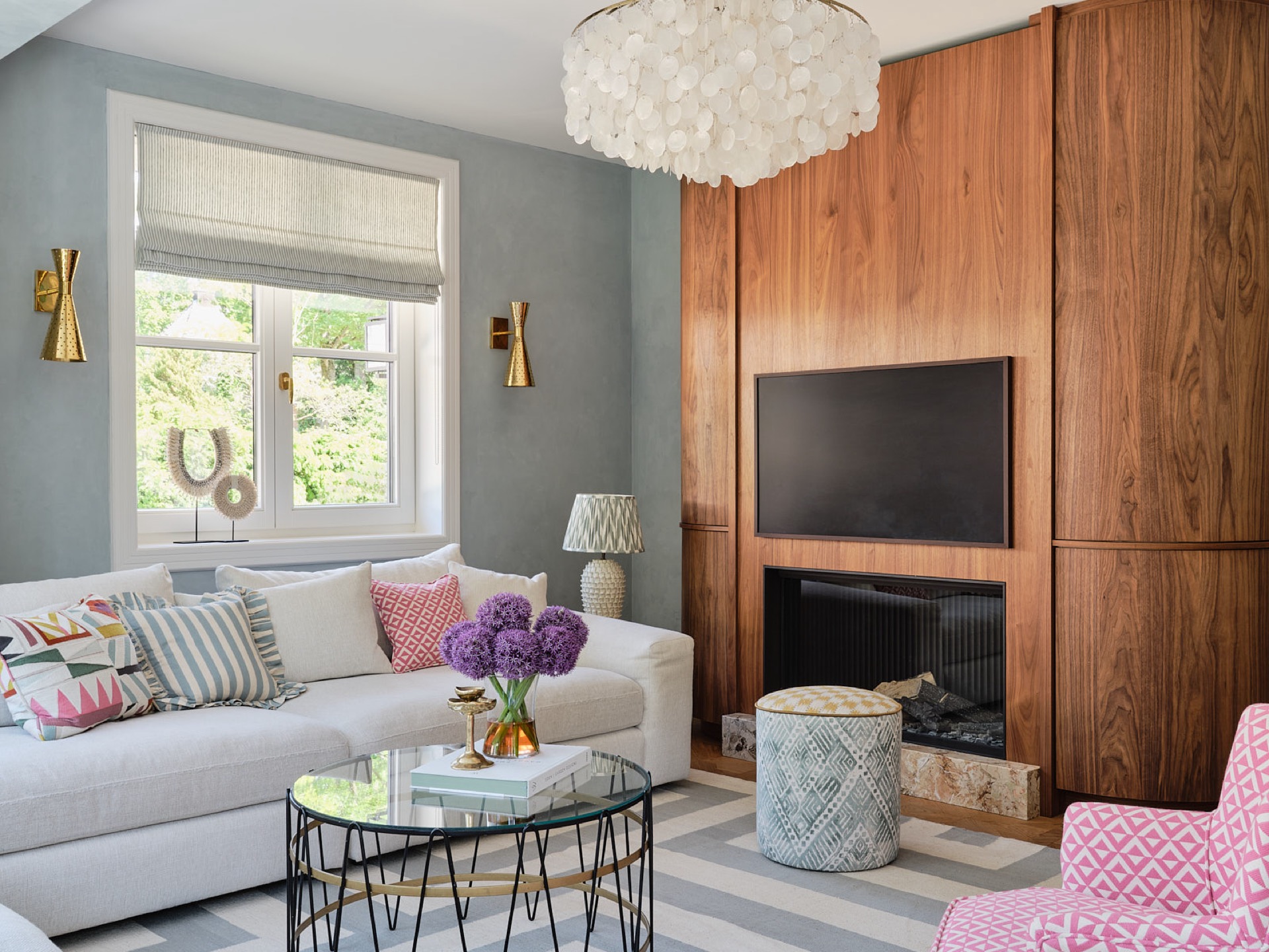
The living areas are organized around a strong wood accent wall with clean vertical lines and built-in openings. One wall holds a recessed niche and a dark screen, while another stretches beside a large window, where grey drapery softens the edge of the glass. The timber does not read as decoration alone; it gives the room a firm edge and defines where seating can gather. In several views, the wood also meets pale plaster and light stone flooring, which keeps the darker elements grounded.
Another angle shows the same approach in a more open setting. A round table sits beside the seating area, and the ceiling fixture above it becomes part of the room’s geometry. The light is not hidden. It hangs as a visible object, with clustered white globes against the ceiling, so the room gains a clear focal point without losing the calm rhythm of the timber wall and the window frame.
Printed wallpaper brings the hallway into the story
Instead of treating the corridor as a neutral passage, the walls carry printed wallpaper accent wall moments that change the pace between rooms. One section uses a beige ground with figurative patterning; another shifts toward red with circular motifs. The result is more graphic than decorative filler. Seen beside the stairs and along the overhang, the paper catches the eye at turns and landings, especially where the light beige floor continues underneath.
The curved opening in the hall adds another layer. Its soft arch cuts through the strong wall planes and links one space to the next without breaking the material language. Nearby, vertical wood panels and paired doors create a stricter rhythm, so the passage alternates between linear surfaces and rounded transitions. That contrast gives the interior its pace: one move is firm, the next is open.
Large windows and drapery soften the heavier materials
Across the sitting and lounge zones, large windows with drapery temper the harder surfaces. Some panels fall in muted grey, others in beige or a deeper red-brown tone. They sit close to the glazing and reduce the brightness without closing off the view. In several images, the curtains frame compact window groupings and wider panes at the same time, which makes the openings feel varied rather than repetitive. The room keeps its brightness, but the light is filtered and slower.
This use of textile is especially visible in the nook-like spaces. A corner with patterned wallpaper meets a window dressed in soft fabric, while a nearby ceiling line remains simple and straight. The drapery works as a visual pause between stone, wood and paint. It is one of the few elements in the house that moves without a hard edge, and that movement is what keeps the more structured materials from becoming too rigid.
Statement lighting marks the gathering areas
Lighting appears as an object rather than a background detail. A statement lighting piece with a cluster of white spheres hangs above the lounge, while another decorative pendant introduces a different scale in the warmer rooms. In the ceiling recesses, the fixtures sit clearly against pale surfaces, so they read as part of the composition rather than a final addition. Their forms echo the rounded arch in the hall and the circular table below, creating repetition without uniformity.
Elsewhere, the light has a more playful edge. A mirrored mosaic-like pendant appears in a window niche, catching the surrounding color and reflecting it back into the room. That small intervention changes the whole corner. Instead of fading into the background, the niche becomes a point where fabric, wall color and lamp surface meet. It is a compact detail, but it shows how the interior relies on distinct objects to keep each space visually active.
A colorful interior built from repeated materials
The palette stays active throughout the house. Powder pink, turquoise, terracotta, cream, bordeaux and black appear in separate rooms, yet the materials repeat: plaster, wood, stone, tile and woven drapery. Because of that repetition, the color feels placed rather than scattered. A turquoise wall beside a stone-like countertop, for example, makes the surface read sharper. In another room, warm pink curtains sit against pale walls and a recessed frame, which gives the opening more depth. This is a modern classic interior that depends on contrast, not excess.
The floors support that approach. Light beige stone or tile appears in the hall and near the stairs, and where a herringbone pattern is visible, it adds direction without becoming ornamental noise. The floor helps connect the rooms, but it never takes over. It simply carries the eye from one material zone to the next while the walls, windows and furniture shift in tone above it.
The bathroom keeps the same language in a tighter frame
The bathroom continues the project’s material logic in a more concentrated setup. A marble look bathroom with twin basins sits beneath a broad mirror, and the veining in the worktop gives the room movement before any fittings do. Gold-toned taps and mirrors reflect the light from the window side, where a blind and a soft curtain control the view. The room is compact compared with the living spaces, but the surfaces are handled with the same discipline: stone texture, reflective glass and a clear horizontal line at the vanity.
Seen this way, the bathroom is not a separate episode. It extends the same interest in surface and proportion that runs through the house. The double basin arrangement, the mirror band and the restrained wall finish all hold to that line. Even here, the interior avoids overstatement. What stands out is the way the materials are kept legible, so the room reads quickly and the details remain visible.
Material contrasts carry the project from room to room
Across the full interior, the strongest moves are the simplest ones: a timber wall against pale plaster, a printed wall beside an open stair, a curtain edge in front of a large pane of glass. These pairings give the rooms their structure. The house does not rely on one dominant gesture. It shifts between enclosed and open, linear and curved, matte and reflective. That is what makes the project memorable from image to image. Each room introduces its own note, but the materials keep speaking the same language.
As a whole, the villa presents a colorful interior with enough restraint to let each finish stand on its own. The woodwork, wallpaper, drapery, lighting and bathroom surfaces all appear in distinct roles, and none is forced to carry the entire project. That measured approach gives the rooms clarity. The result is a series of interiors that feel related through material and proportion, not through repetition of form.
Pierre Frey, Eginstill, Apparatus, Echt Parket, Manuel Canovas
Photography – Space Content Studio
Want to see more of Studio Sophie? View the page of Studio Sophie for even more great projects and company information.





NEW 2026 Jubileum Edition The Best Interior Designers Benelux
Order Now €125


NEW 2026 Jubileum Edition The Best Interior Designers Benelux
Order Now €125


