Modern villa with stone-look finishes
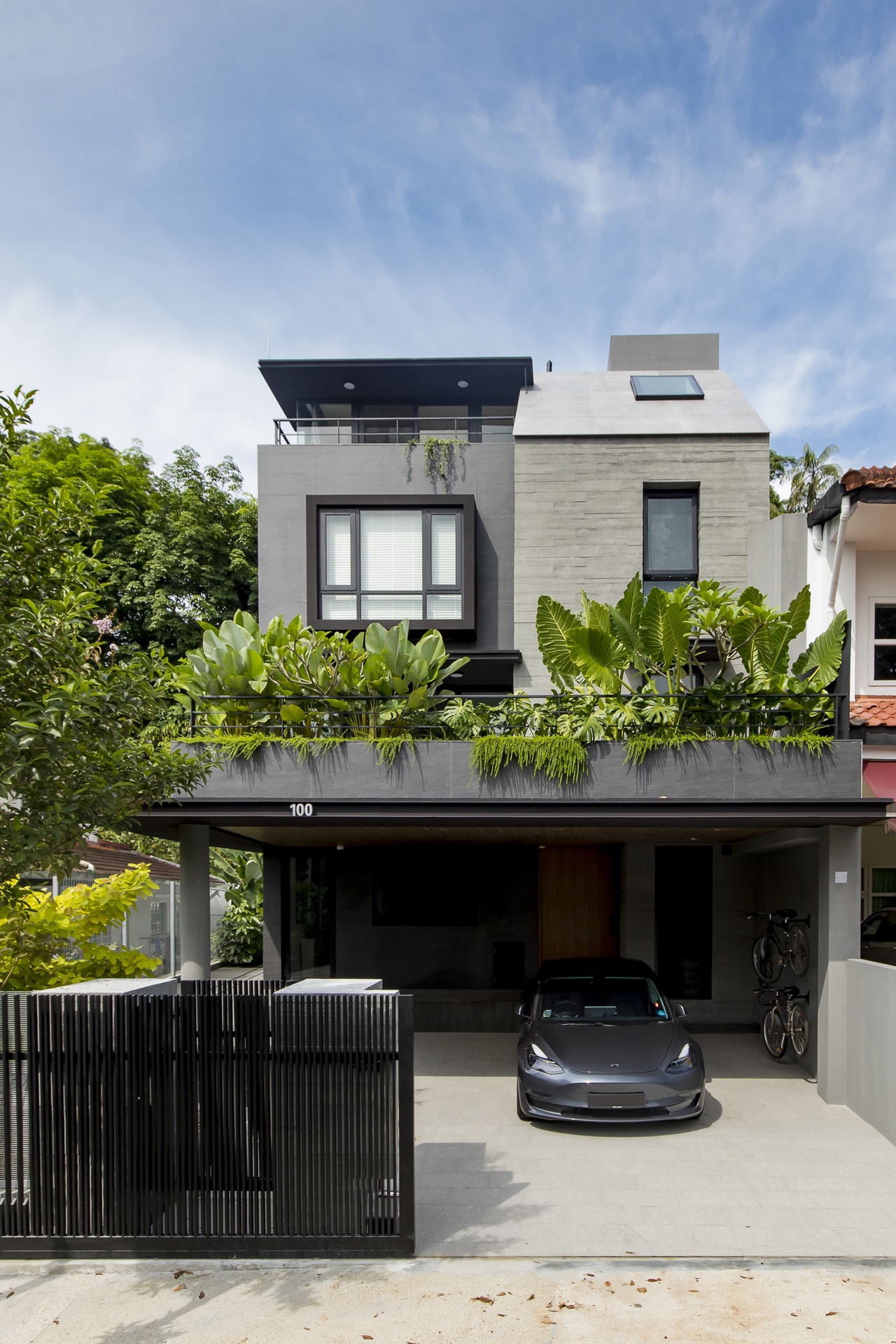
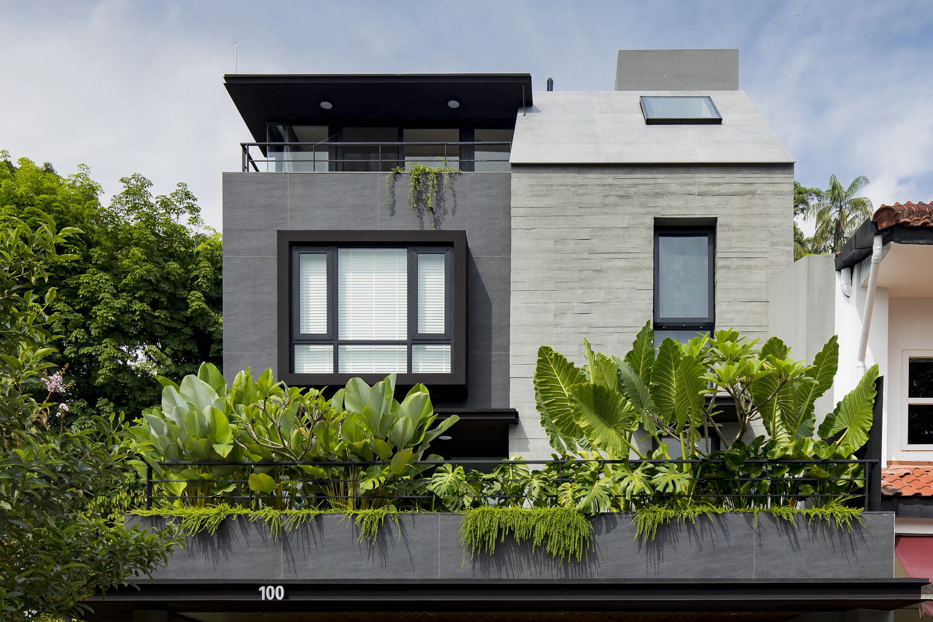
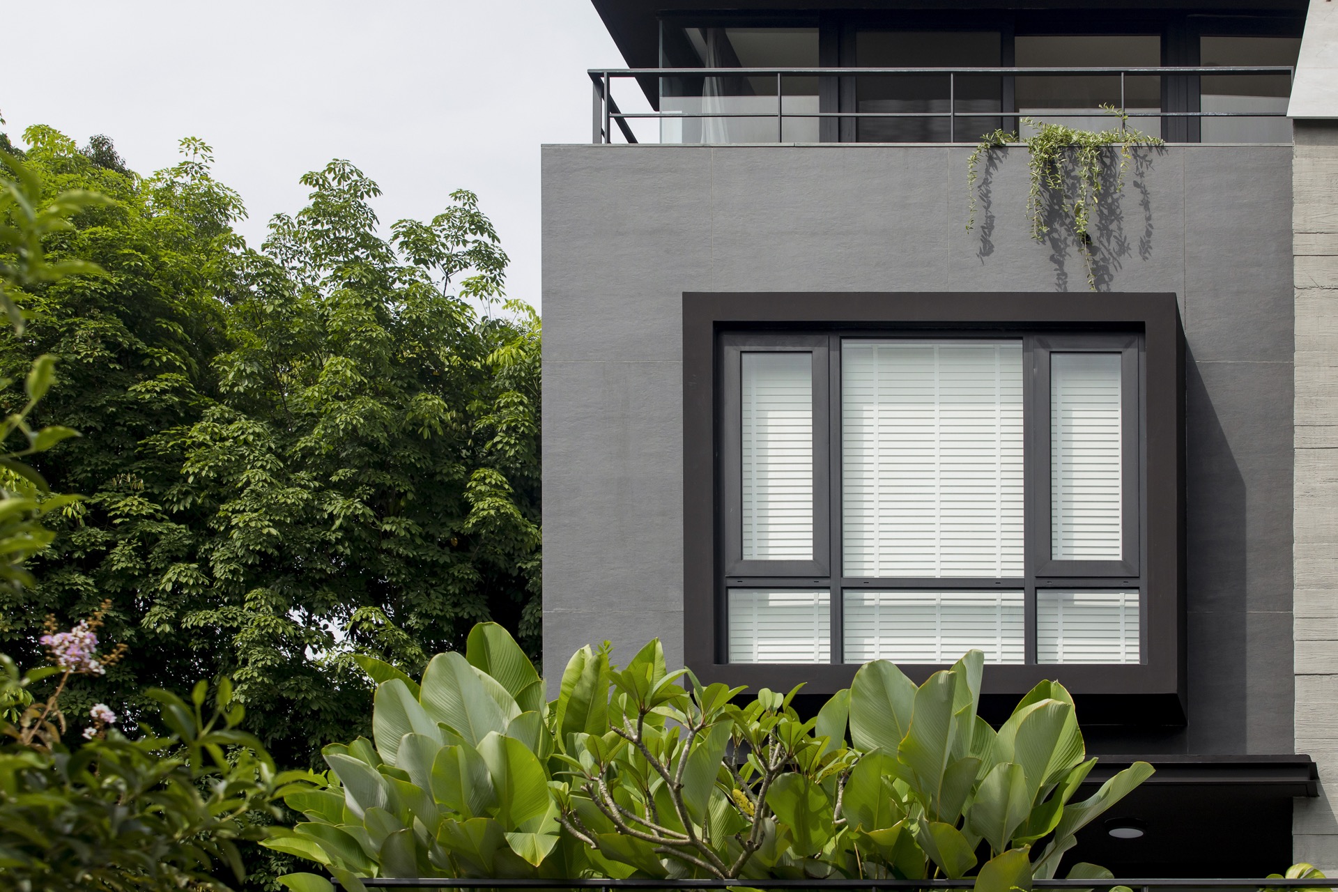
Dark and pale panels give the house its first read, with long horizontal joints and deep window frames cutting across the walls. The result is a modern villa with stone-look finishes that relies on surface and shadow rather than ornament. A planted border runs along the base, while the roof edge sits back under a projecting overhang with small round lights below. From the street, the composition feels layered and precise, with the exterior material changing in tone as the volume turns.
Contrasting panels shape the outer shell
The front and side elevations are built from a mix of dark and light stone-like surfaces, which makes the volume read in blocks rather than a single mass. Dark window surrounds sharpen the openings, and the glazed sections bring reflections into the façade throughout the day. The outside skin is described as maintenance-friendly and resistant to UV and moisture, but what stands out visually is the way the panels hold their tone against strong light. That low maintenance exterior stone look is carried across the main body of the house without visual interruption.
At roof level, a second finish introduces a more cement-like note. It softens the upper edge and separates the roof plane from the darker wall areas below. The overhang projects far enough to cast a firm shadow line, and the underside is punctuated by round recessed lights. These small details matter because they keep the roof from disappearing into the background. Instead, it becomes part of the composition, linking the modern villa exterior stone panels to the cleaner lines above.
Glazing, joints and planted edges
Large panes of glass cut through the masonry-like surfaces and open the interiors to the outside. The dark frames make each opening read clearly, almost like a grid laid onto the façade. Along the base, a long planting strip softens the straight edge of the building. It is a simple move, but it changes the way the house meets the ground. The vegetation sits low, so the stone-like cladding remains dominant, yet the border breaks up the hard line where wall and paving meet.
Seen in close-up, the exterior is less about spectacle than about surface control. Fine joints, horizontal lines and slightly different greys give the walls depth without busy patterning. This is where the contrasting dark and light facade becomes more than a color choice: it organizes the elevation into planes that catch light in different ways. The building keeps a restrained profile, but the material shifts make the outer shell feel active as you move around it.
A kitchen built around a dark stone counter
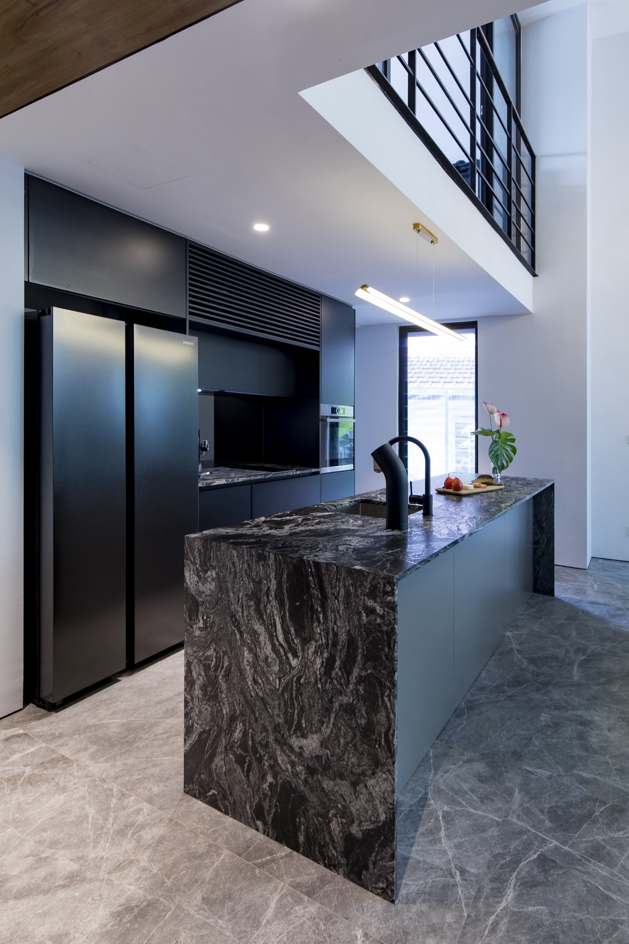
Inside, the kitchen moves to a darker register. A long, L-shaped worktop in a stone-like finish anchors the room, while the cabinetry stays smooth and straight-edged around it. The counter reads as the main horizontal plane, giving the space a clear working zone without unnecessary visual noise. Behind it, the surrounding fronts stay quiet so the surface can do the work. The effect is practical, but it is also visually disciplined, with the dark stone countertop kitchen becoming the strongest line in the room.
Light falls across the kitchen from the adjacent openings, touching the counter and the matte cabinet fronts in different ways. Recessed or concealed lighting above the work area adds a thin glow in the background, which keeps the dark surface from flattening out. The room does not rely on decoration. It uses material contrast instead: a dark counter, paler surrounding surfaces, and a clear geometry that keeps the eye moving along the edges.
Straight fronts and a compact working zone
The kitchen layout reads as compact and controlled. Tall units rise in a row, while the lower run and island-like counter create a working strip in front. The stone-look top has enough visual weight to hold the room together, especially against the smoother, lighter cabinet finishes around it. Nothing here competes for attention. The architecture of the room comes from proportion, surface finish and the way the counter draws a clean boundary between preparation area and storage.
Marble-look bathroom walls and a glass shower
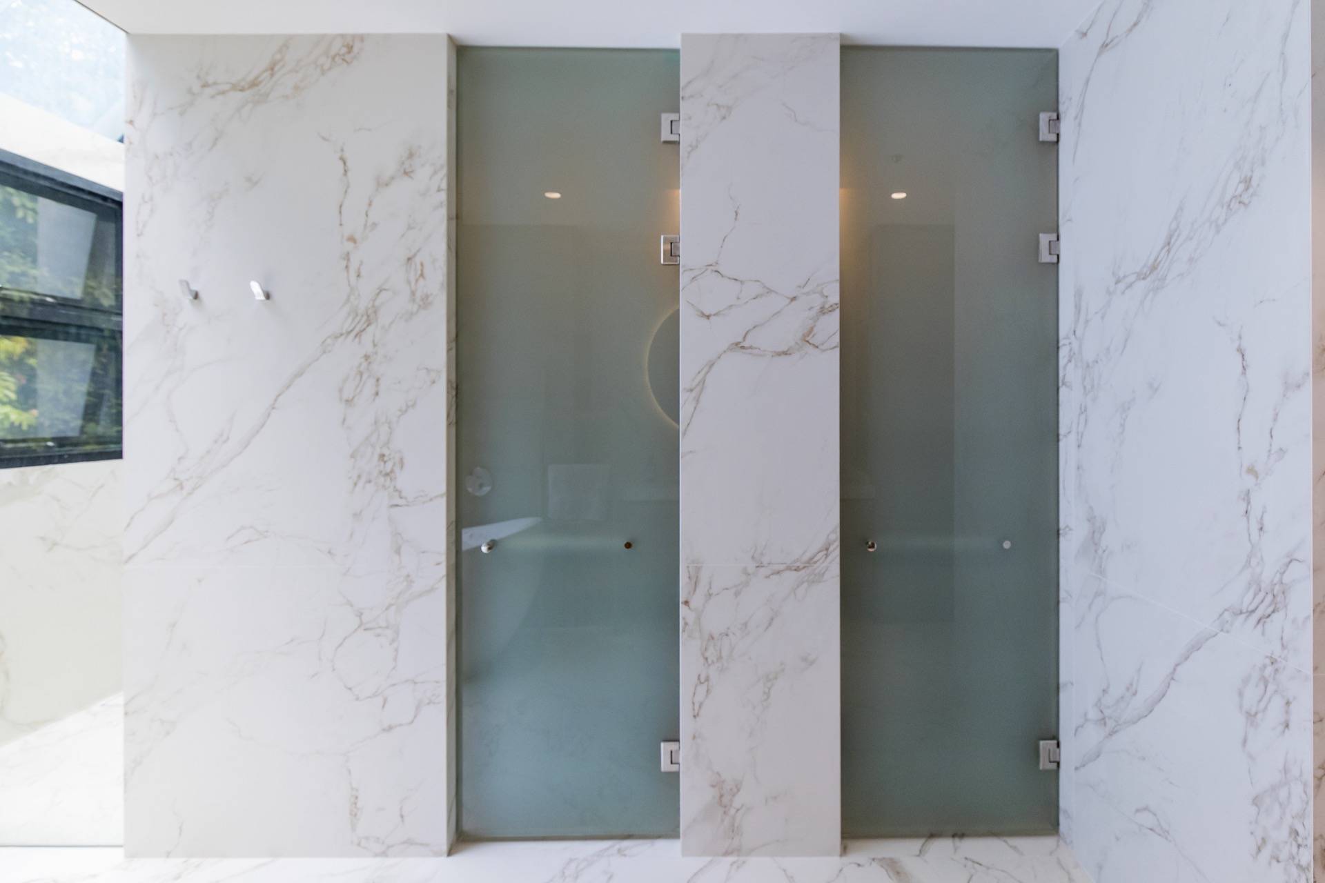
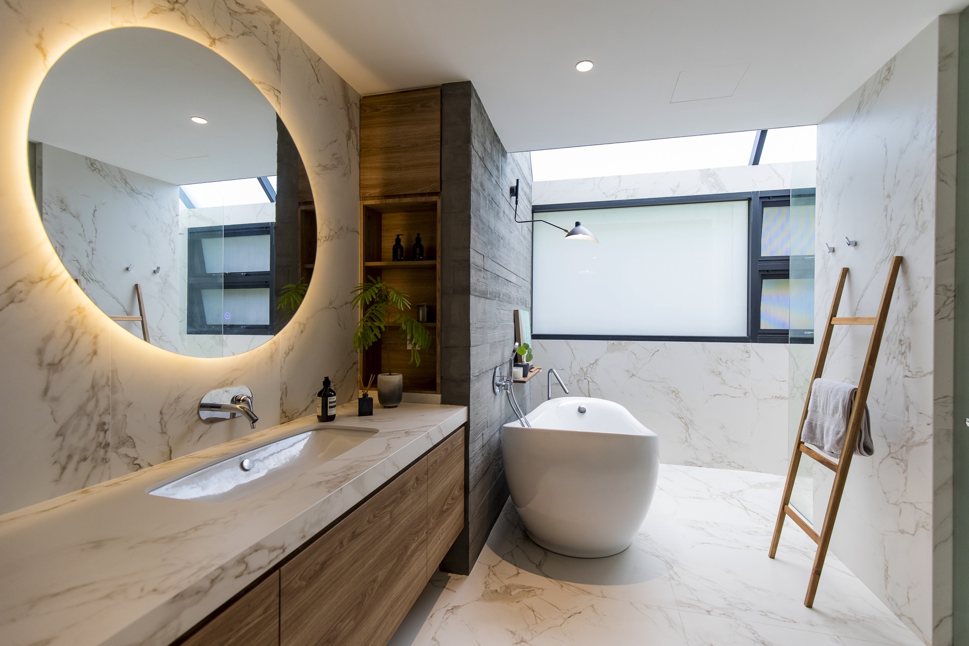
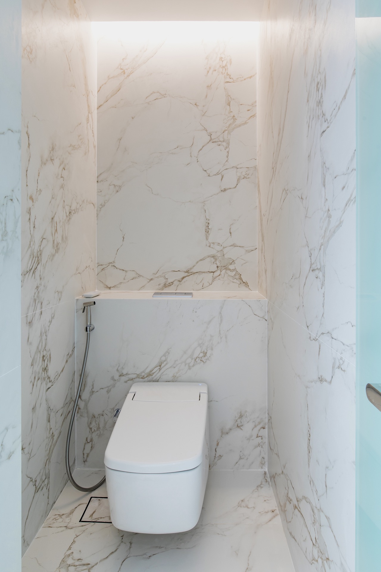
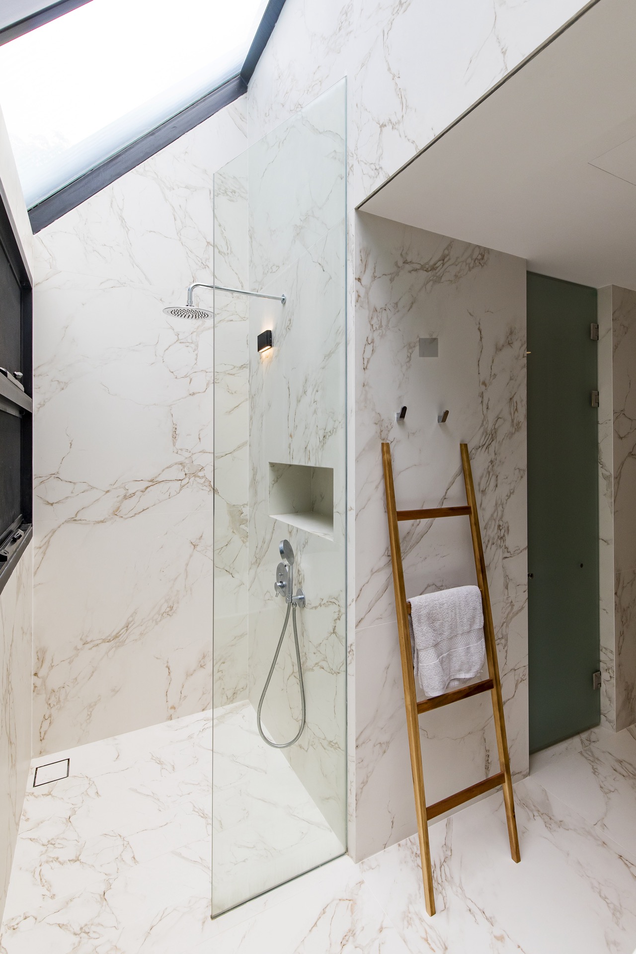
The bathroom shifts again, this time toward a lighter stone palette. Walls and floor carry a marble-like pattern with soft beige and white veining, giving the room a more reflective surface than the kitchen. A glass walk-in shower sits within that field, its transparent panel keeping the room open. Because the enclosure is clear, the wall finish stays visible across the full depth of the room. The marble look bathroom walls are not treated as decoration; they become the main backdrop for the fittings.
Inside the shower zone, a rain shower head hangs against the veined surface, and the glass edge draws a crisp vertical line beside it. The toilet is visible in one of the bathroom views, which reinforces how compact and carefully arranged the space is. In another image, a blue-tinted glass panel interrupts the pale surfaces and adds a cooler note to the room. The contrast is small, but it gives the bathroom a clearer structure, especially where the glass meets the stone-like finish.
Round mirror, wood fronts and a quieter wash area
A second bathroom view introduces a round mirror with integrated indirect light above a washbasin with wood-fronted cabinetry. The mirror brings a softer shape into a room otherwise defined by straight lines and veined slabs. Below it, the vanity rests against the marble-like surface, which keeps the washing zone tied to the rest of the room. The wood fronts add a different texture, but they do not overpower the stone finish. The composition stays calm because each element has a clear role and a clear edge.
What ties the kitchen and bathrooms together is the way the interior surfaces handle use without giving up their visual presence. The dark kitchen counter, the pale stone-like bathroom walls and the glass walk-in shower all depend on the same logic: let the material do the work, keep the forms plain, and allow light to mark the transitions. Across the house, the exterior and interior speak the same language. It is a modern villa with stone-look finishes, but the effect comes from restraint, not from repetition.
Photography: Kyoob Architects
Want to see more of Cosentino België? View the page of Cosentino België for even more great projects and company information.



NEW 2026 Jubileum Edition The Best Interior Designers Benelux
Order Now €125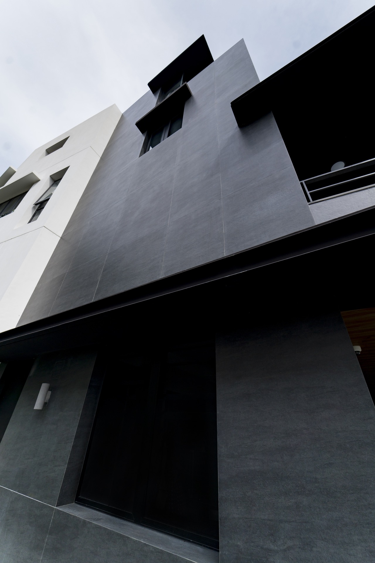
NEW 2026 Jubileum Edition The Best Interior Designers Benelux
Order Now €125