Interior with vertical garden wall and custom joinery
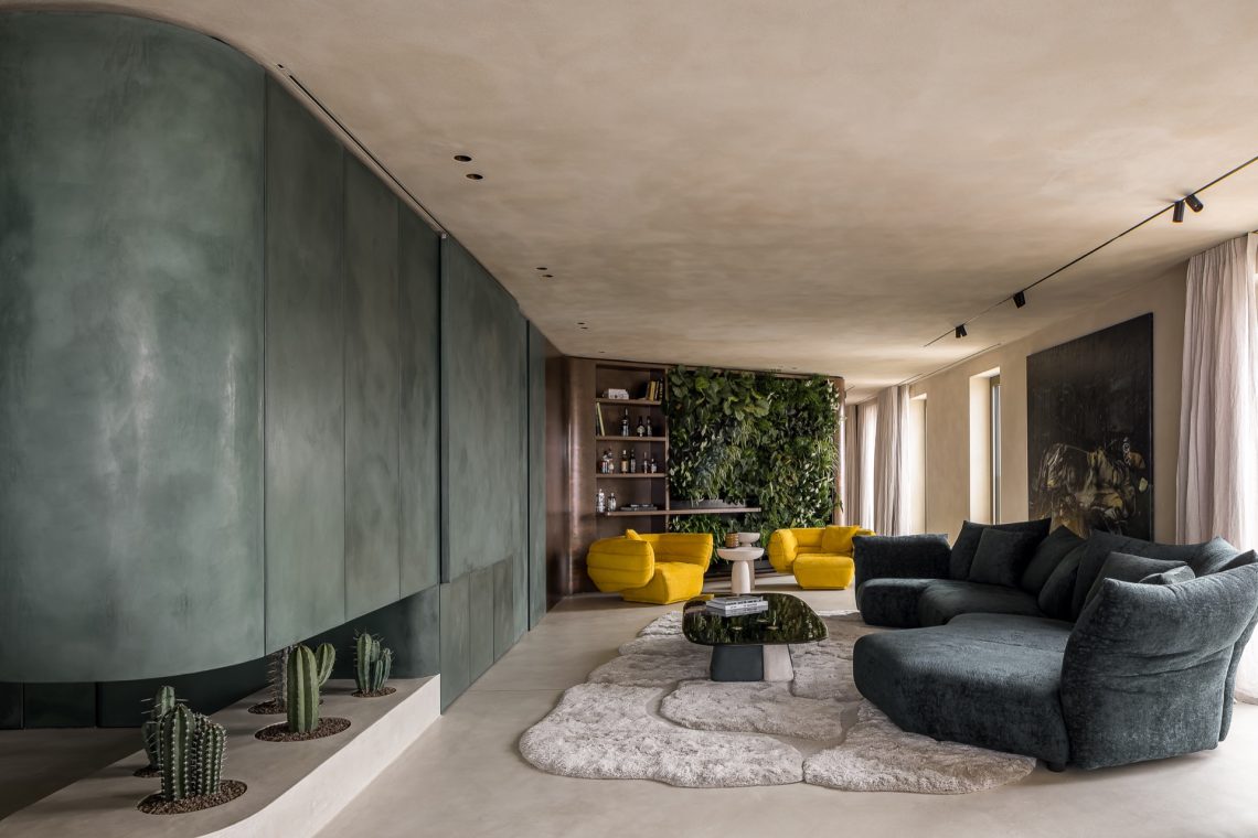
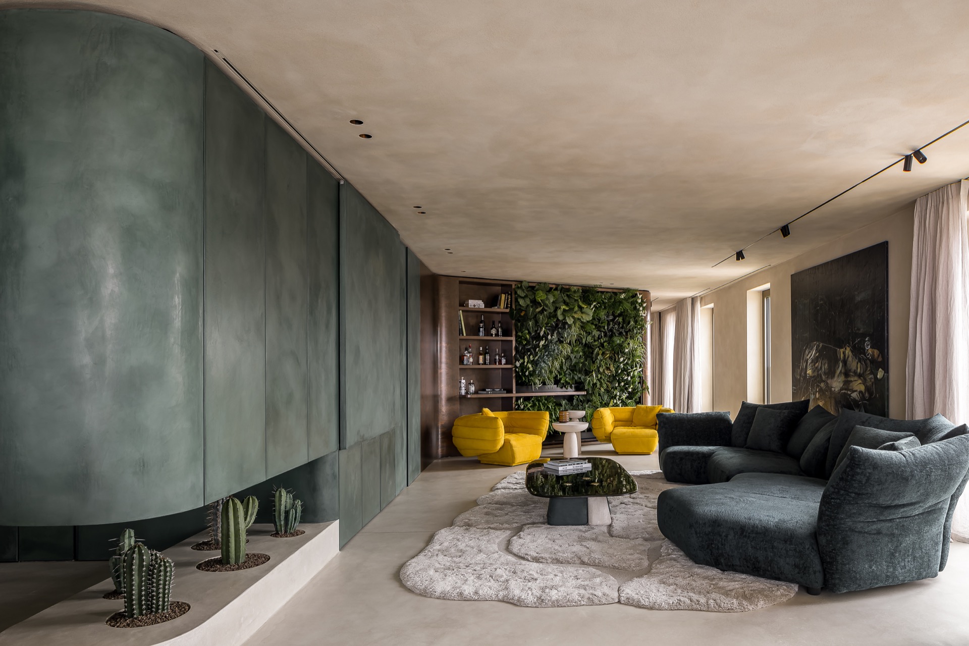
Green leaves take over one wall before the room settles into anything else. The interior with vertical garden wall is built around that dense planted surface, then pulled into place with pale plaster, glass, and custom joinery that keeps the lines calm. Warm indirect lighting runs under shelves and inside niches, so the greenery reads clearly without feeling isolated from the rest of the apartment. A mustard yellow chair interrupts the muted palette and gives the room a sharper edge.
A planted wall that sets the pace
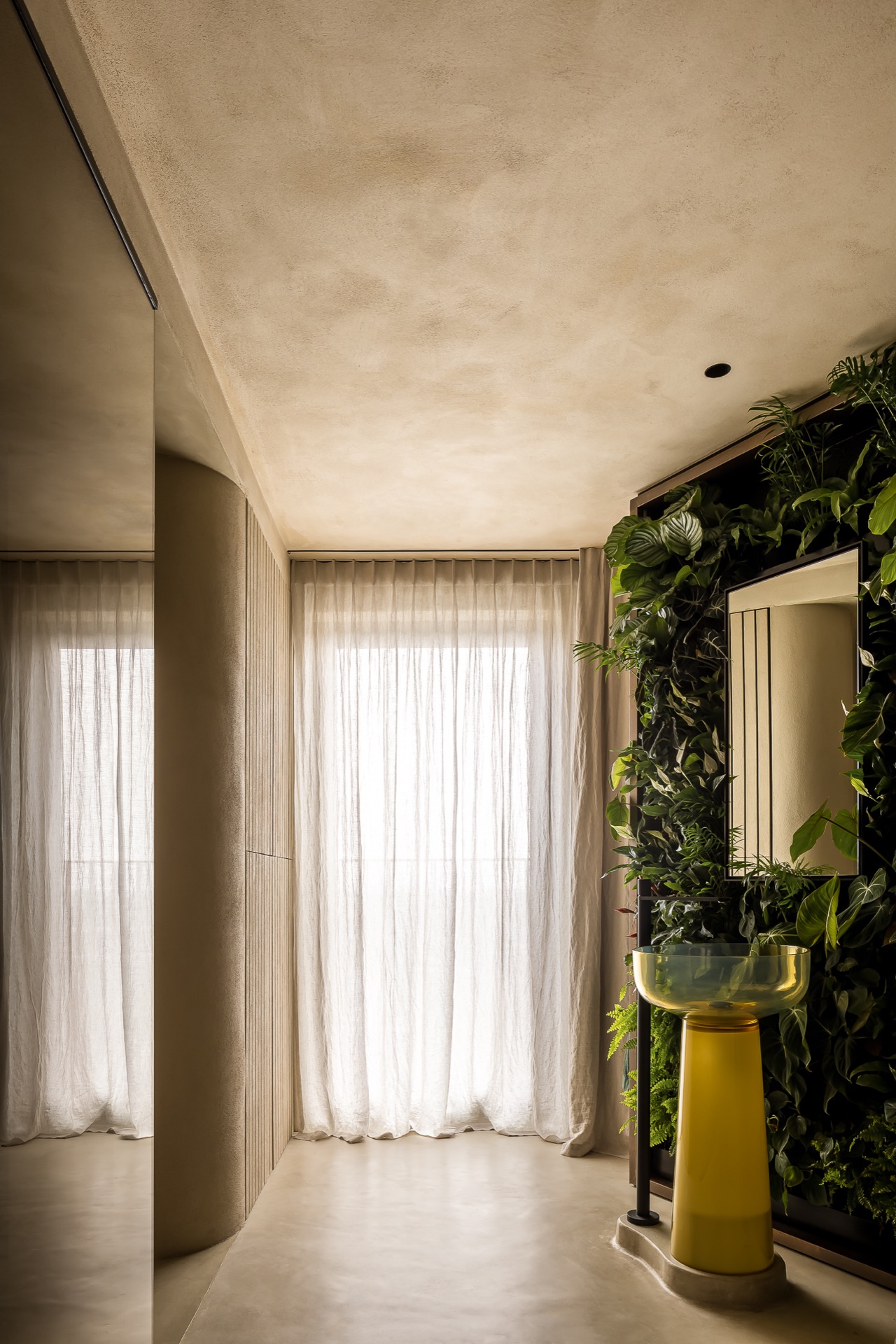
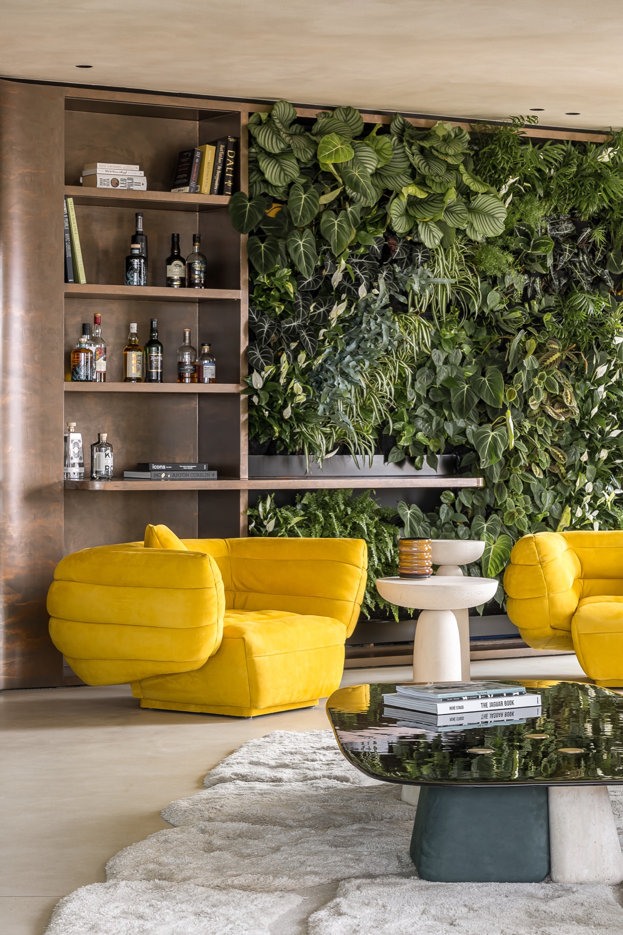
The vertical garden wall is not treated as a decoration at the end of the room. It sits in the middle of the composition, bordered by built-in niches and a narrow framework that gives the planting a clear outline. Leaves fill the surface densely, with small breaks where shelving and structural edges appear. That contrast matters. The planting does not soften the architecture into the background; it meets straight panels, matte surfaces, and sharp junctions head-on.
From the living area, the wall reads as a fixed part of the apartment rather than a loose gesture. The planting surface is paired with measured built-in elements, including niches that hold objects and draw light into recesses. This is what makes the interior with vertical garden wall feel tied to the room planning rather than added later. The greenery stays visible from several angles, so the eye keeps returning to it as circulation shifts between seating, storage, and the adjacent zones.
Joinery that works in narrow bands of light
Custom joinery runs through the apartment as a quiet counterweight to the planted surface. Handleless cabinet fronts keep the wall planes flat, and the integrated storage avoids broken lines. The built-in niches with lighting do more than display books or objects. They carve out small pockets of glow inside the darker surfaces, giving depth to the cabinetry without needing ornament. In the evening, those lit recesses become the most legible details in the room.
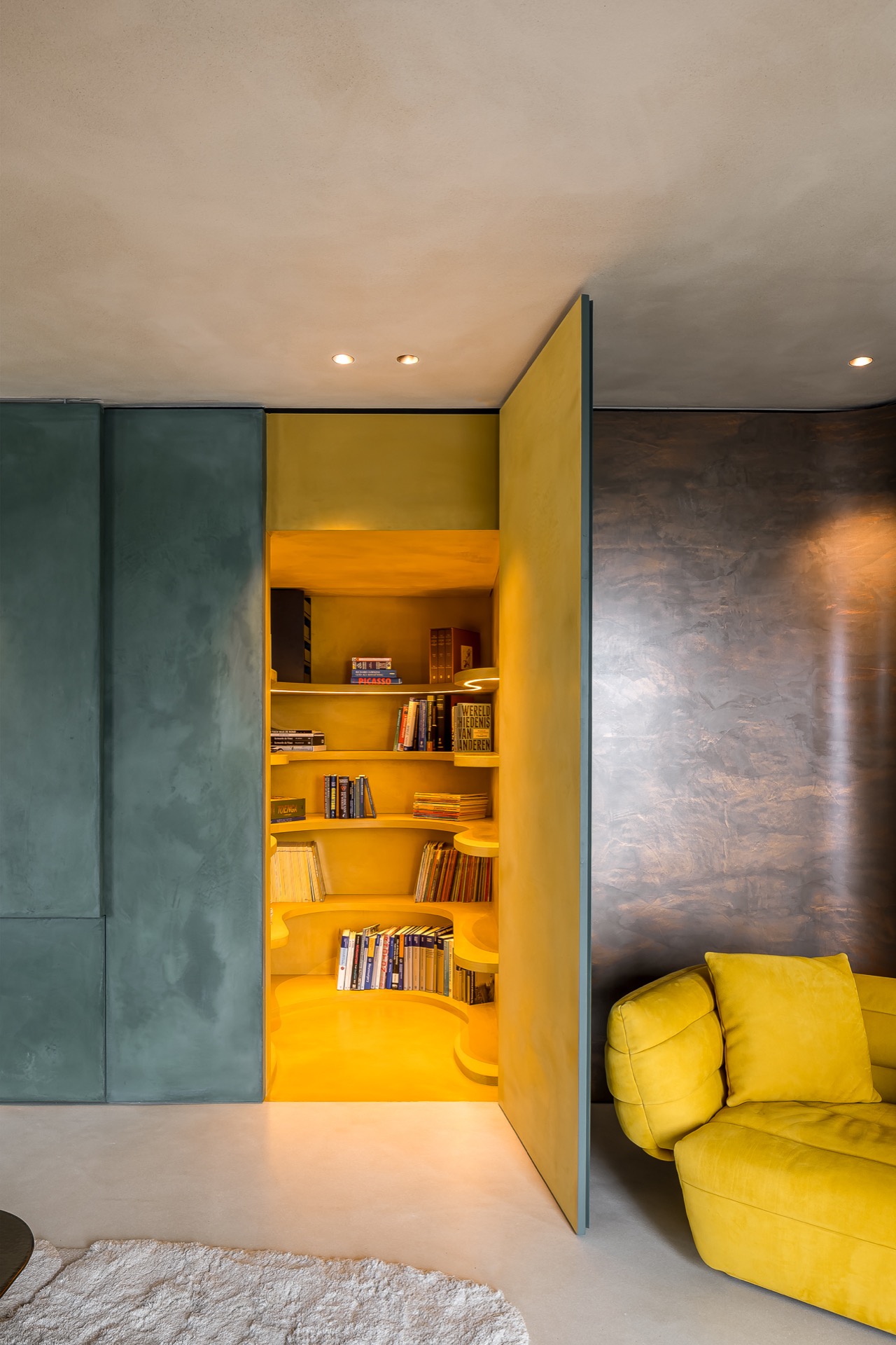
A smaller opening in the joinery behaves almost like a reading niche, with a warm LED line tracing the interior edge. Nearby surfaces shift from yellow-toned walls to grey-brown panels, so the light has a defined border. It is a compact move, but it changes how the apartment is read. Instead of one continuous wall of storage, the cabinetry opens and closes in sections, letting the interior with vertical garden wall sit beside practical storage without crowding it.
Warm indirect lighting around the cabinet wall
Lighting stays low and even. Spot lines on the ceiling pick up the edges of the room, while indirect light washes across the joinery and the planted wall. That soft spread makes the matte finishes more visible than they would be under a harsher scheme. It also keeps the apartment from flattening out once daylight drops. The built-in niches with lighting hold their own against the darker panels, and the room keeps its depth after sunset.
There is little visual noise in the ceiling. Small fixtures and rail-like lines stay close to the surface, leaving the walls to carry the main character of the apartment. The result is not dramatic in the usual sense. It is more measured: light finds the edges of the storage, catches the leaves of the vertical garden wall, and leaves the remaining surfaces in a soft shadow. That rhythm suits the restrained palette and the custom joinery.
Glazing, curtains and the slow shift from day to evening
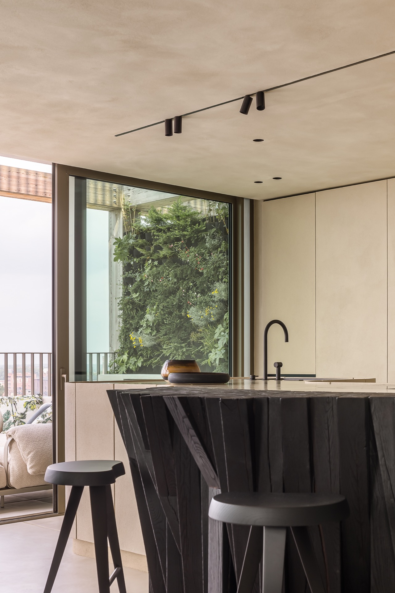
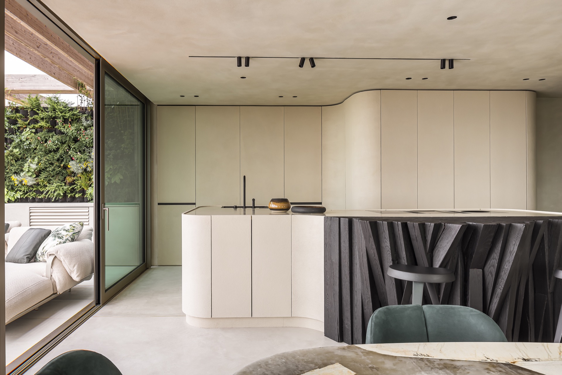
Large glazing introduces another layer of calm. The openings are dressed with light curtains by large windows, and the fabric breaks the hard outline of the glass without blocking the view out. In the kitchen and adjacent work zone, the glazing frames a green planted screen beyond, so the apartment picks up another band of greenery outside. The effect is less about spectacle than continuity: one planted surface inside, another beyond the glass, both held by straight window lines.
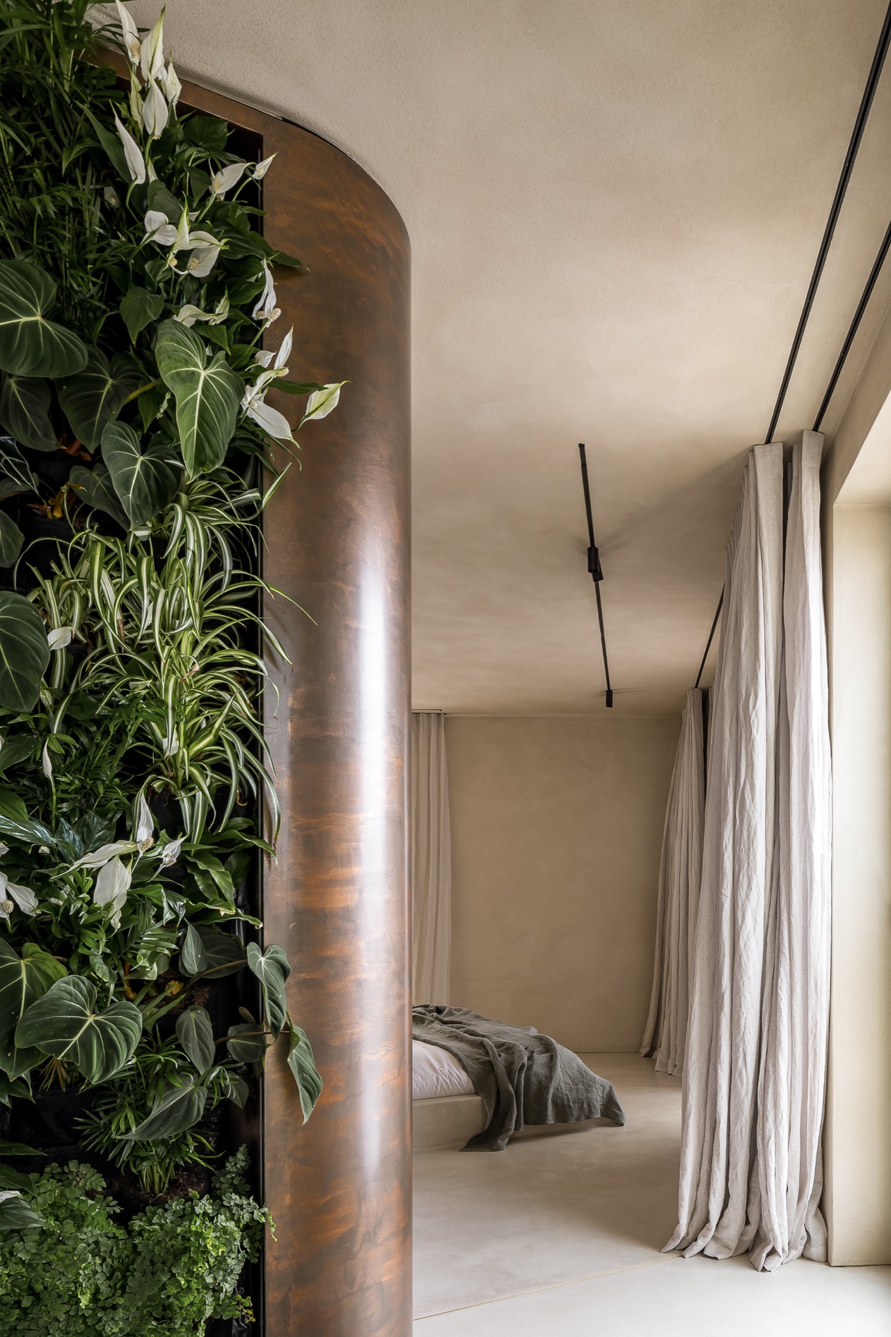
The curtains also change the way the interior is read in daylight. Their pale folds soften reflections on the glass and keep the room from feeling too sharp. In the bedroom zone, white curtains and a vertical planted frame sit close together, and that pairing is enough to alter the pace of the space. The apartment remains open, but the window treatment gives the room a slower, more settled edge.
Soft window treatment against hard panel edges
Fabric is used sparingly, which makes each curtain fall more noticeable. The light curtains by large windows are not decorative in a loose sense; they control the transition between bright glass and the darker cabinet walls. In the bedroom views, the folds stand against a metallic vertical element and a planted frame, so the material contrast is immediate. Soft textile, reflective surface, and dense greenery sit side by side without competing for attention.
This is also where the apartment’s palette becomes clearest. Greens from the planting, ecru and beige from the textiles, grey-brown from the wall panels, and the yellow accent in the seating all stay within a narrow range. The result is not bland. It gives each material room to show its own surface, whether that is a fabric curtain, a matte wall, or a glossy fixture in the kitchen area.
A mustard yellow accent that breaks the restraint
The mustard yellow accent arrives through the seating, and it is more pointed than decorative. Against the planted wall and the muted joinery, the yellow chairs give the room a clear focal note. They also echo the warmer light in the niches, so the colour does not sit apart from the rest of the apartment. It cuts through the greens and greys in one stroke, making the seating area easier to read within the larger interior with vertical garden wall.
That same discipline shows up in the dining and bar zone, where a tall handleless cabinet wall stands beside a darker, wood-clad counter element. A glazed opening leads outward to more planting, but the interior keeps its own structure through straight lines and flat panels. The apartment never depends on one material alone. It is the spacing between surfaces, the measured light, and the planted wall that give the rooms their particular order.
How the rooms hold together without repeating themselves
Across living, kitchen, and sleeping areas, the apartment relies on repetition of form rather than repetition of effect. Straight cabinet fronts, recessed lighting, planted surfaces, and light curtains appear in different combinations. One room uses the vertical garden wall as a backdrop for seating; another uses it as a view from the work zone; a third brings it into the bedroom as a softer divider beside the window. The materials stay consistent, but the arrangement changes from room to room.
That shifting layout is what gives the project its depth. The interior with vertical garden wall is not a single visual statement stretched across the apartment. It is a series of related moments: a plant-filled wall with niches, a handleless cabinet wall with light embedded inside it, a curtain edge at full window height, and a mustard chair that cuts through the palette. Each piece stays legible on its own, yet together they keep the apartment focused on light, surface, and planted texture.
Want to see more of Space Invaders? View the page of Space Invaders for even more great projects and company information.


NEW 2026 Jubileum Edition The Best Interior Designers Benelux
Order Now €125
NEW 2026 Jubileum Edition The Best Interior Designers Benelux
Order Now €125