1930s Facade with Louvre Shutters
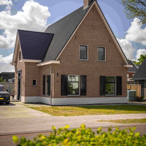
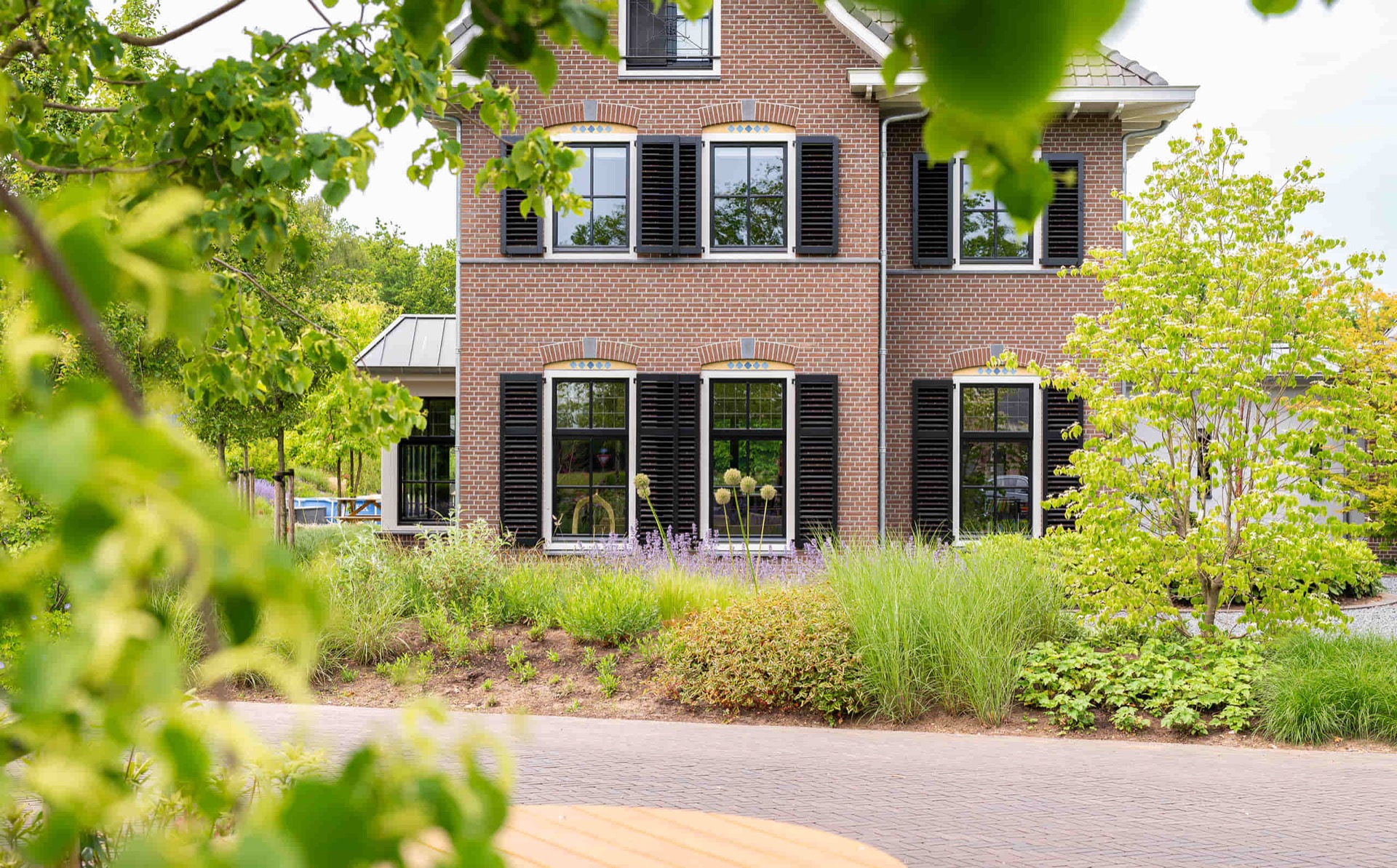
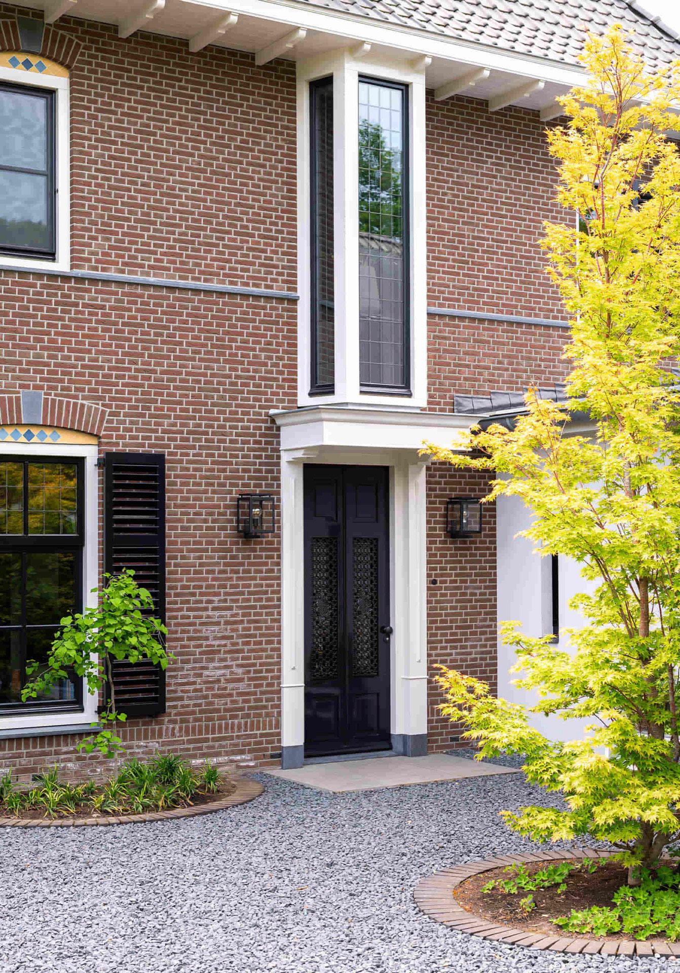
The red brick front and the black louvre shutters set the tone immediately. White surrounds sharpen the openings, while the timber windows and matching front door follow the same measured line across the house. In the first view, the 1930s facade with louvre shutters is not treated as decoration but as a series of fitted parts: shutters beside the windows, glazed door panels at the entrance, and crisp profiles around each opening. The result is defined by repetition, shadow, and the contrast between dark timber and light trim.
Brick openings framed by black shutters
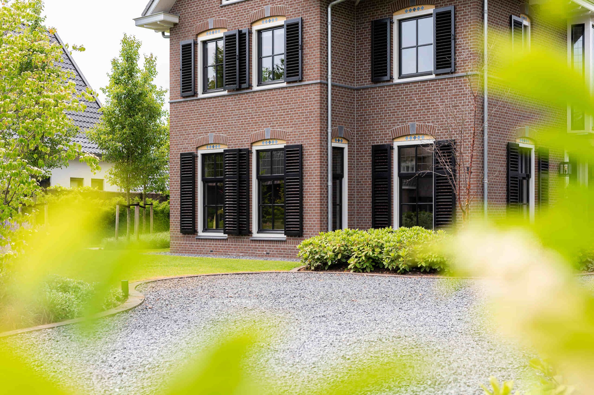
Across the front elevation, the louvre shutters windows sit tight against the brickwork and give the facade a clear rhythm. Their dark slats read strongly against the pale window surrounds, and the white trim keeps each opening visually separate from the next. The windows are laid out with a steady symmetry, so the shutters do more than cover glass; they shape the whole face of the house. In several images, the black louvre shutters appear on paired openings, where the repeated vertical lines draw attention to the width of the openings and the depth of the reveal.
Seen closer, the window shutters detail becomes part of the architecture rather than an add-on. The timber profiles, the casing around the frames, and the shutter leaves are all aligned to the existing masonry. That alignment matters in a house like this, where the brickwork and the openings already carry much of the visual weight. The shutters sit within that structure and keep the exterior legible from a distance and from a few steps away.
White trim, blue tile inlay, and the shaped arches above the windows
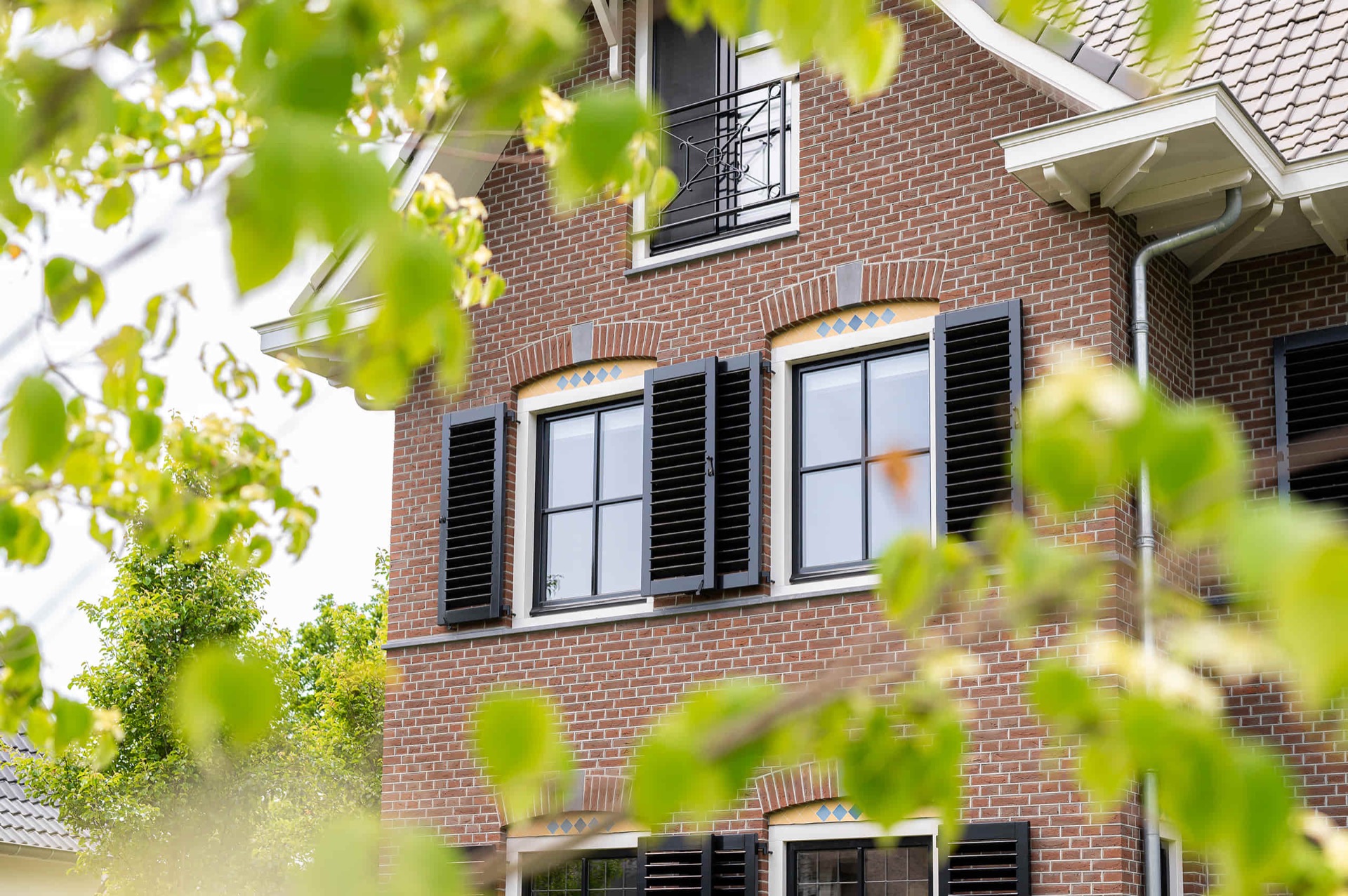
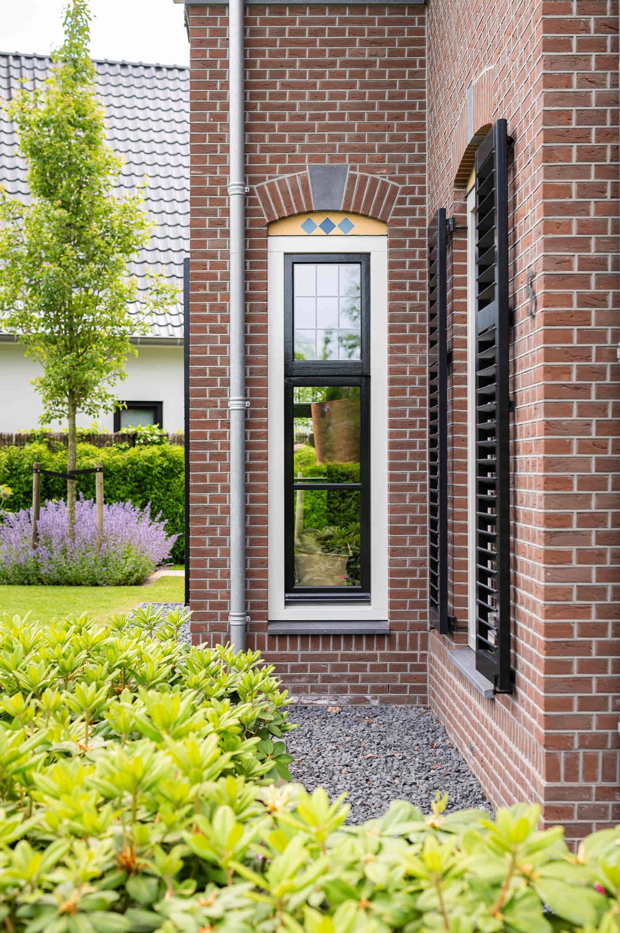
Above several openings, the brickwork turns into decorative arches with blue tile inlay. These bands give the upper part of the elevation a patterned edge without breaking the calm surface of the wall. The blue and red tiles are small in scale, but they are easy to read in the close images because they sit inside the curve of the arch and sit just above the white frames. The detail is precise and clearly visible, especially where it runs above the windows with black shutters beneath.
The decorative arch tile inlay works as a marker between the masonry and the timber joinery below. It repeats across different views, from the front facade to the side and courtyard-facing images, and gives the house a consistent language. White pilasters and trims around the openings keep the arches from feeling too heavy. Instead, the brick, tile, and painted surround together form a layered edge that is easy to read in daylight.
A front door that follows the same material language
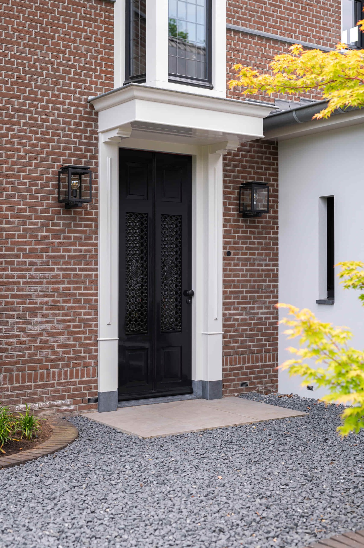
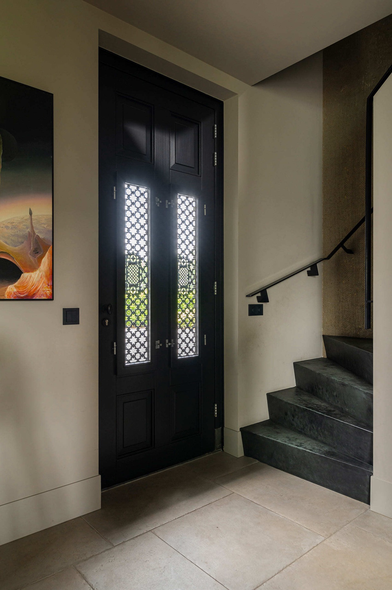
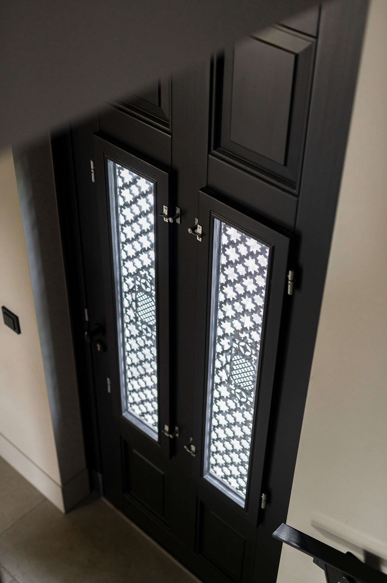
The entrance keeps the same dark-and-light contrast. The black glazed front door sits inside a white surround, and the glass pattern adds another layer to the composition without introducing a new colour. In the entrance image, the door is paired with light paving and a strip of gravel, so the threshold feels clearly marked. The custom timber windows and door do not compete for attention; they repeat the same finish and keep the front elevation coherent in form, proportion, and tone.
Inside the hall, the glazed doors continue that line. Black frames, glass panes, and a dark stair finish appear together in a narrow sequence of reflections and edges. The view is more enclosed than the facade, yet the same discipline is visible in the way the doors are set and in how the light falls across the floor tiles. The black louvre shutters may belong to the exterior, but the joinery language carries through once you step inside.
Detail shots that show how the joinery meets the masonry
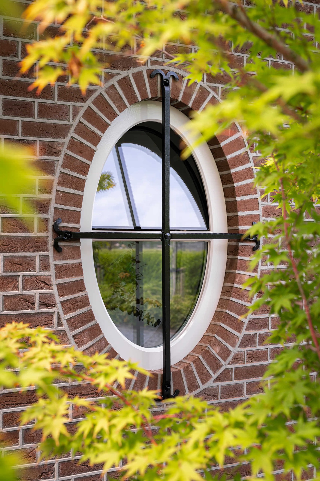
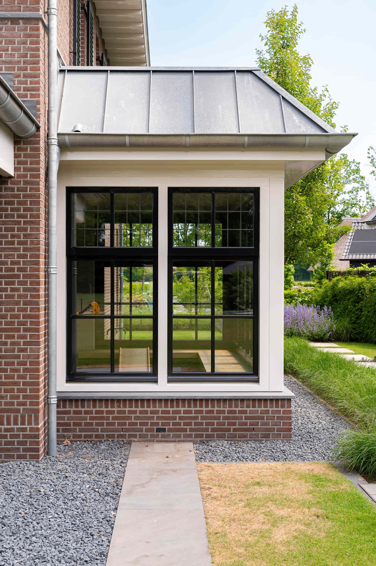
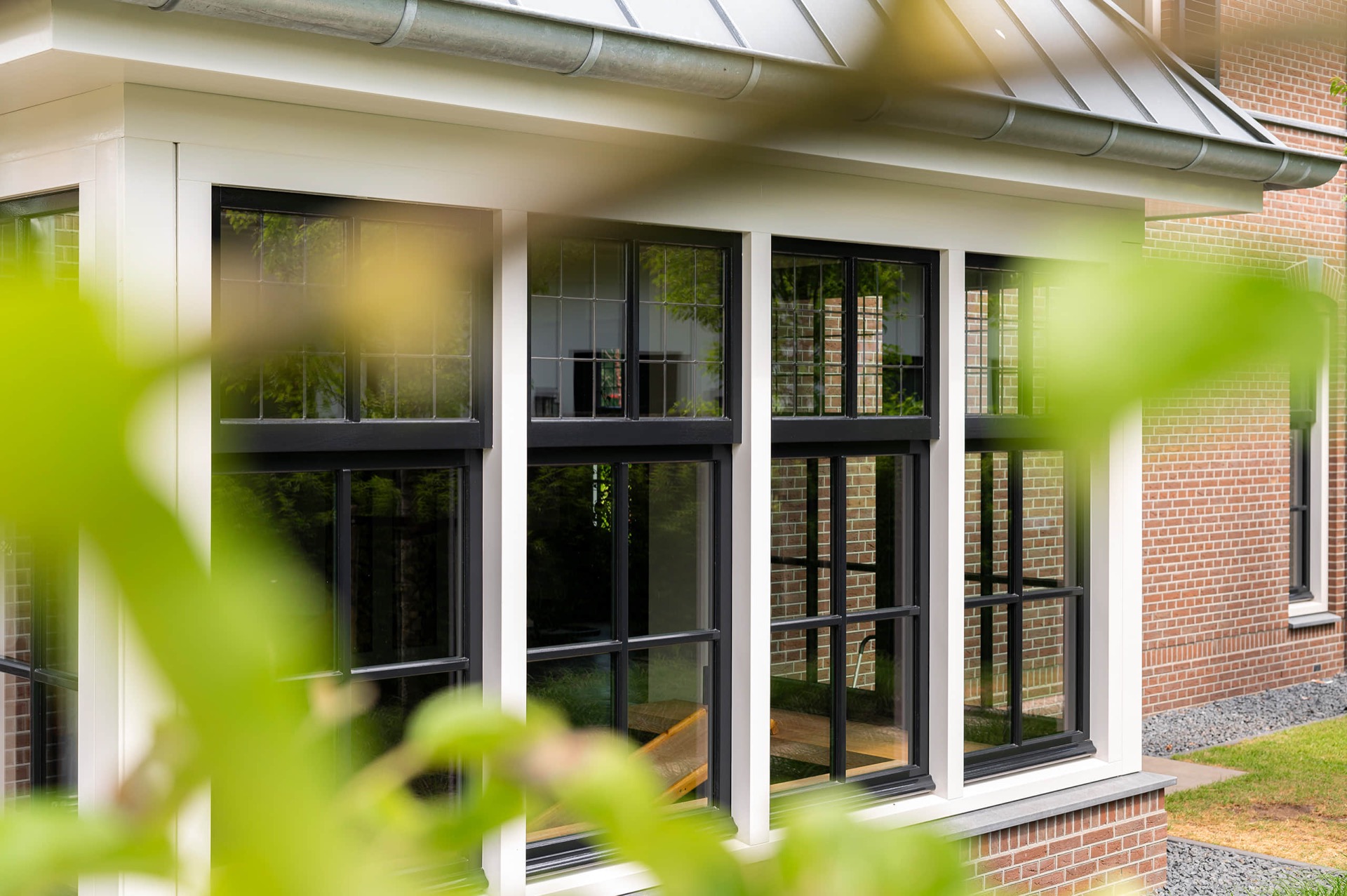
Several images focus on the junction between timber and brick, and that is where the project becomes especially readable. The window shutters detail shows the shutter leaves sitting next to the frame, while the white surround creates a clean boundary against the brick wall. In the close-ups, the slats are clear enough to see as layered pieces, not just as a dark surface. The same close reading applies to the window openings, where the profiles, hinges, and shadow lines are visible in relation to the wall.
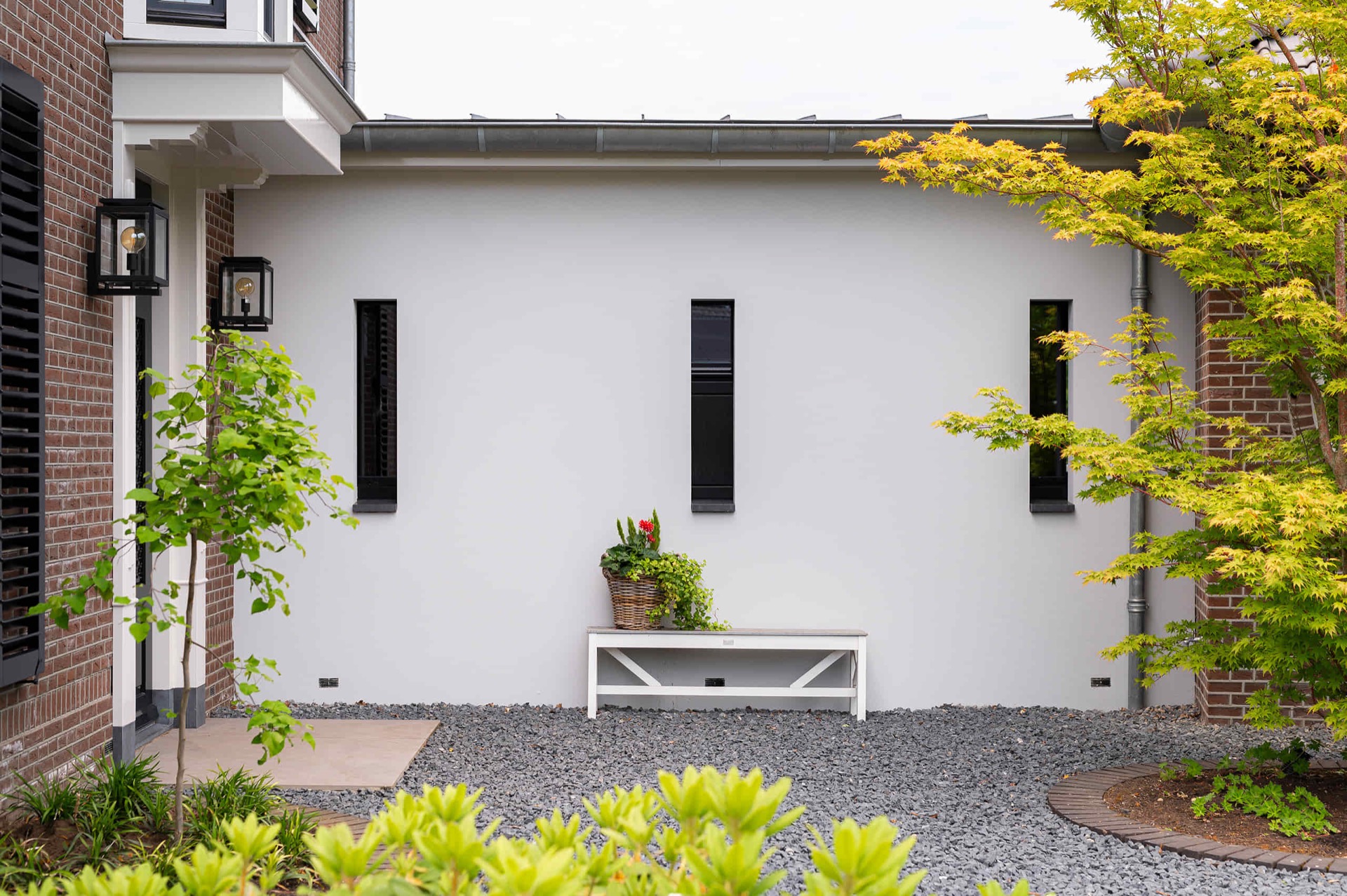
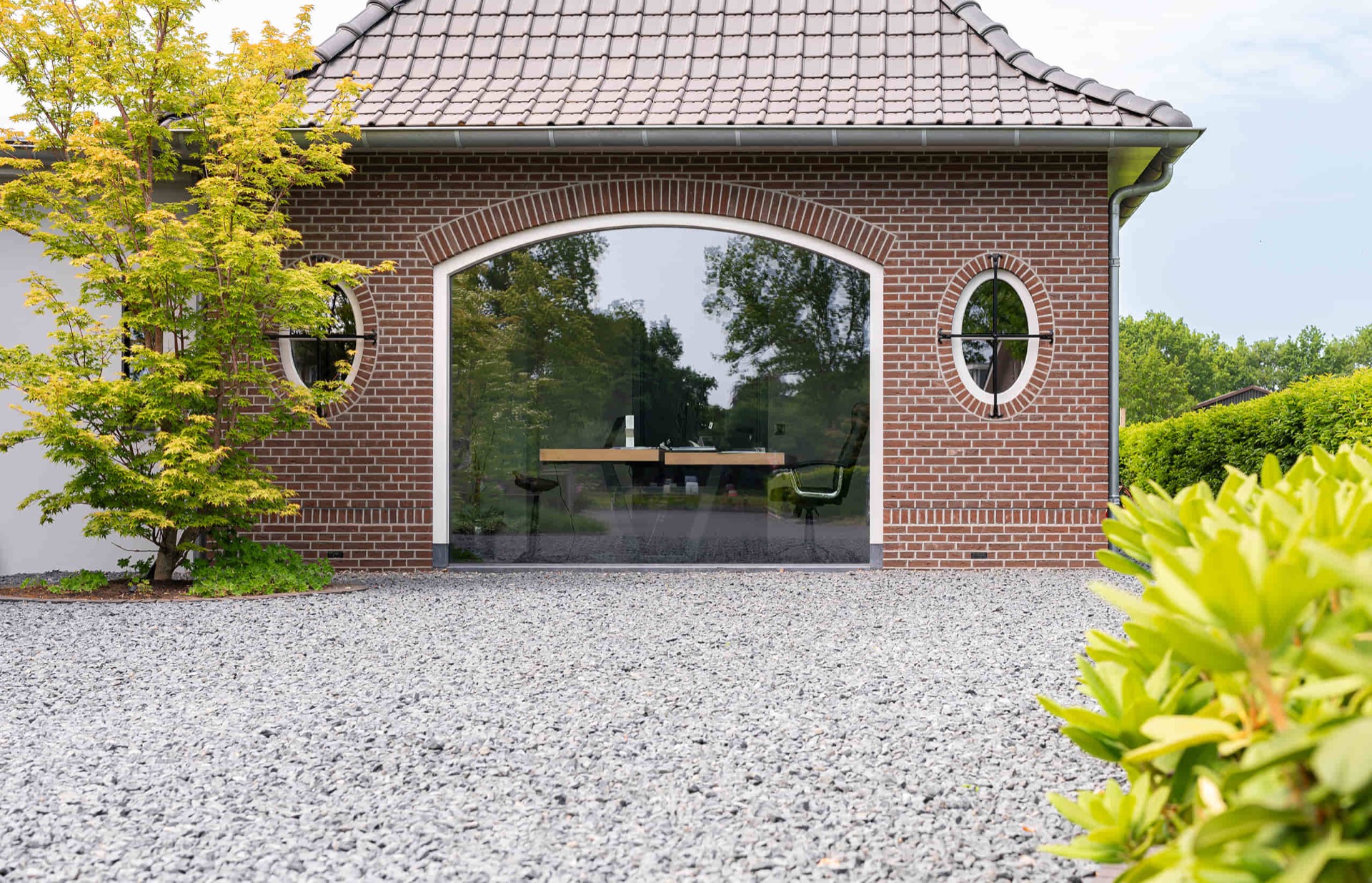
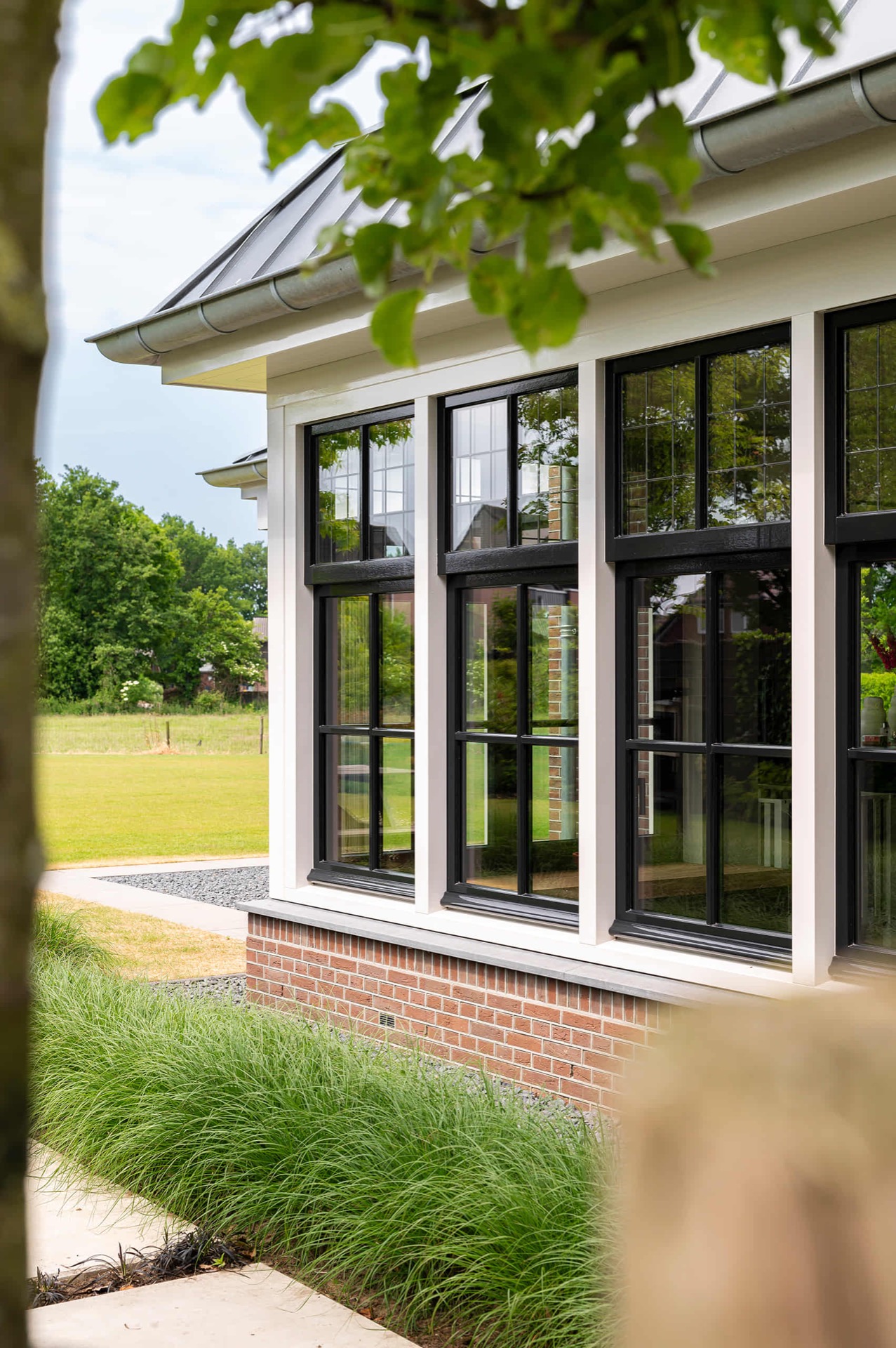
The wooden outdoor shutters also appear in side views where the facade meets the garden path and planted edge. Gravel, stepping stones, and low planting keep the base of the house visually open, so the shutters and frames remain the focus. A visible rainwater pipe runs down part of the elevation, which adds another straight line to the composition. Nothing is hidden, and the materials are allowed to sit in plain sight.
Interiors with black frames and a view to the garden
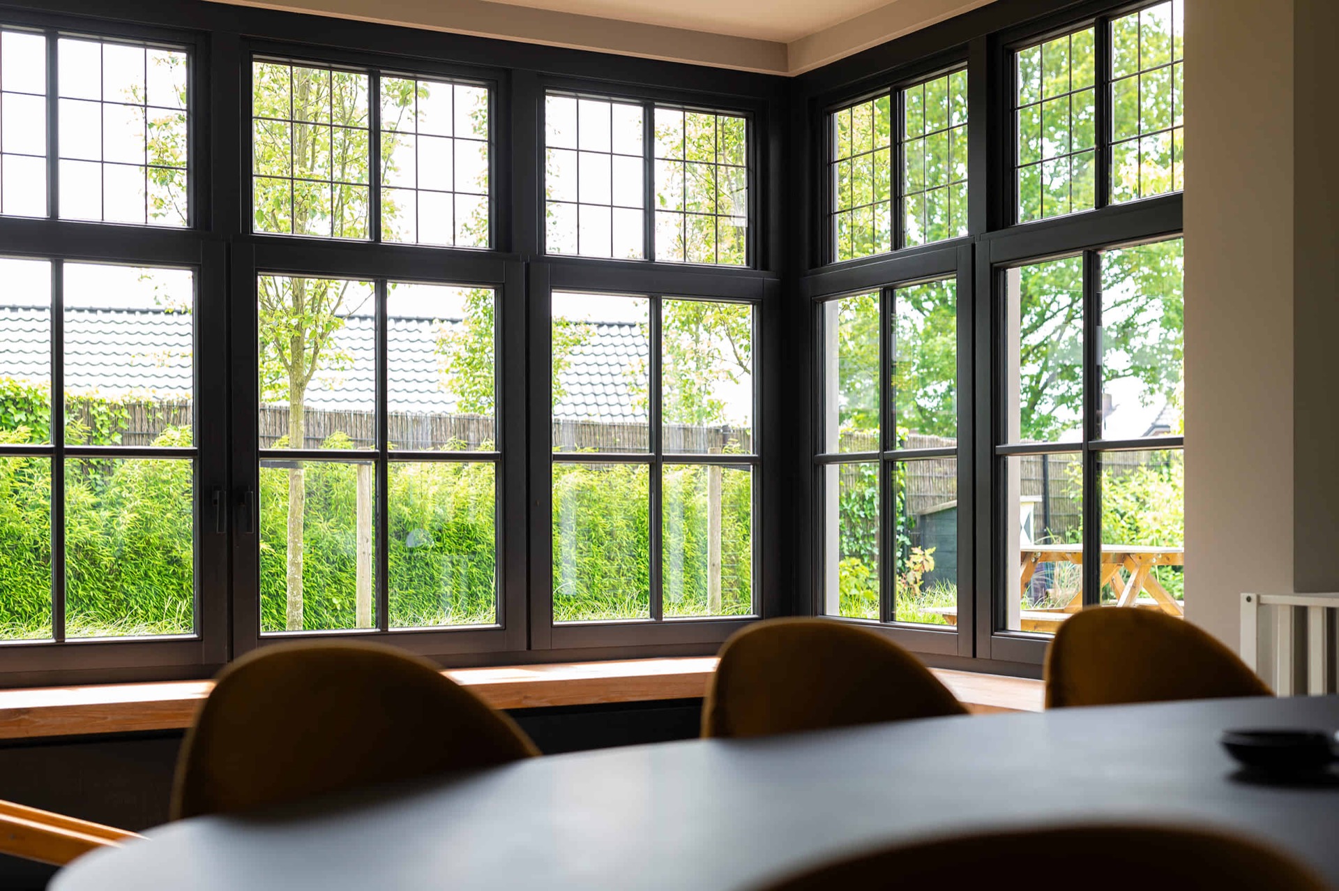
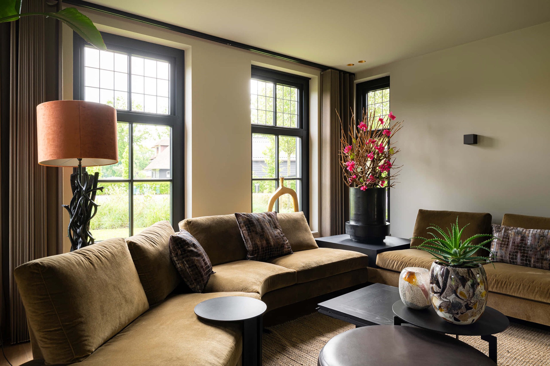
The interior images shift the emphasis from the brick front to large black-framed openings and a green view beyond. In the living spaces, the windows are broad, and the black profiles cut sharply against the pale walls. Light moves across the glass and the frames without much interruption, which makes the garden visible from deep inside the room. The shutters are outside, but the same controlled palette continues through the interior glazing.
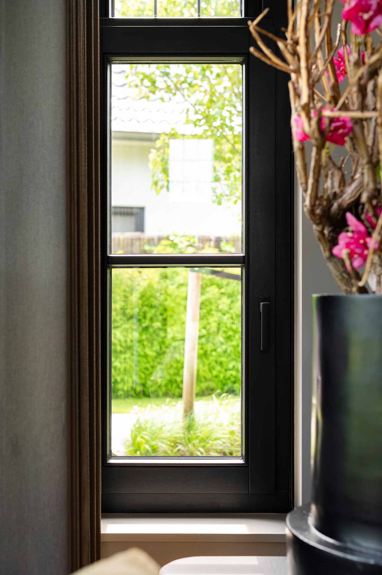
One room shows curtain tracks and a low overhang above the windows, while another image gives a closer look at the black frame profile and the garden outside. These views are less about furnishing and more about the way the opening sits in the wall. The custom timber windows and door outside find their counterpart here in the interior frames, where the dark finish ties the rooms back to the outer shell of the house. The result is a calm sequence of openings rather than a single focal point.
How the house is read in sections
The photographs move from front elevation to entrance, then into hall and living areas, so the house is understood in parts. That progression matters, because the 1930s facade with louvre shutters is not only a frontal composition. It includes the entrance door, the window profiles, the arches with tile inlay, and the interior glazing that looks back onto the garden. Each image adds another piece to the same set of materials: brick, painted trim, black timber, glass, and tile.
What holds those pieces together is not ornament alone, but repetition. The black louvre shutters appear in multiple windows; the white surrounds return around each opening; the decorative arch tile inlay reappears where the masonry curves above the frames. Seen together, these elements give the house a clear exterior identity, while the interior images confirm that the same disciplined approach continues past the threshold and through the glazed rooms.
From the street, the house reads as a brick facade with strong dark accents. Up close, the timber joinery, the glass patterns in the door, and the shaped brick arches become more specific. That shift from overall view to detail is where the project works best. It shows how louvre shutters windows, a matching front door, and carefully set frames can be used to sharpen an existing 1930s style without changing the basic character of the house.
Want to see more of Bronkhorst Machinale Houtbewerking? View the page of Bronkhorst Machinale Houtbewerking for even more great projects and company information.



NEW 2026 Jubileum Edition The Best Interior Designers Benelux
Order Now €125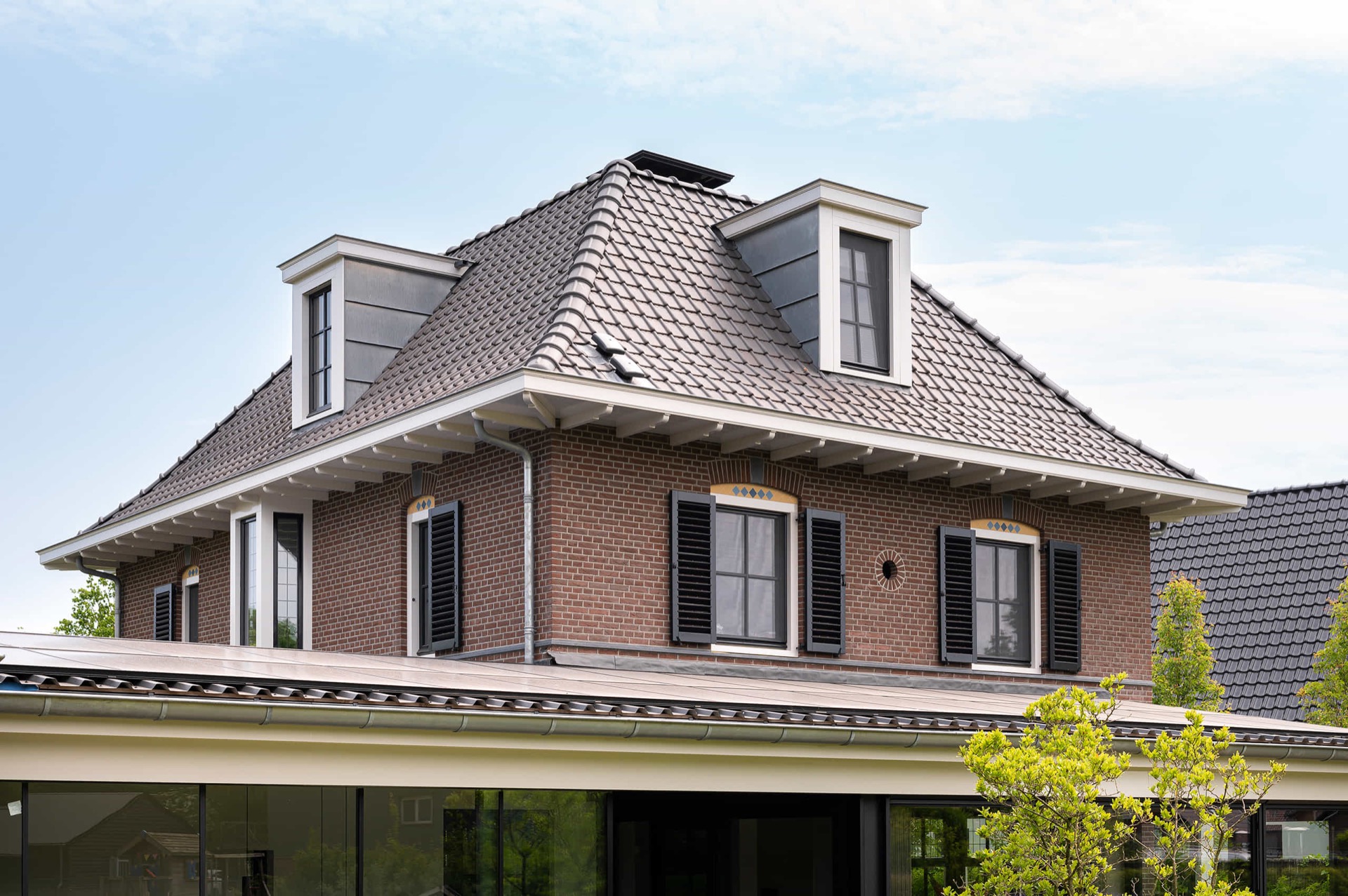
NEW 2026 Jubileum Edition The Best Interior Designers Benelux
Order Now €125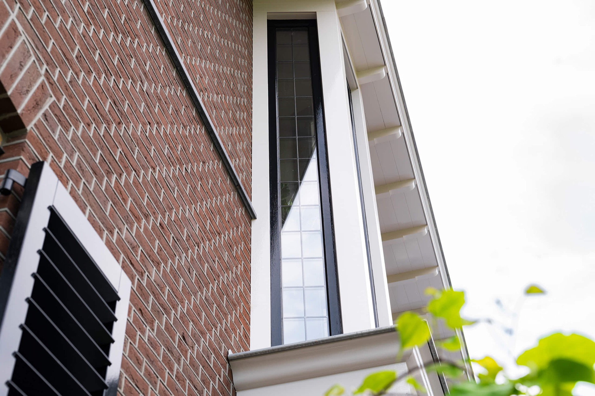
NEW 2026 Jubileum Edition The Best Interior Designers Benelux
Order Now €125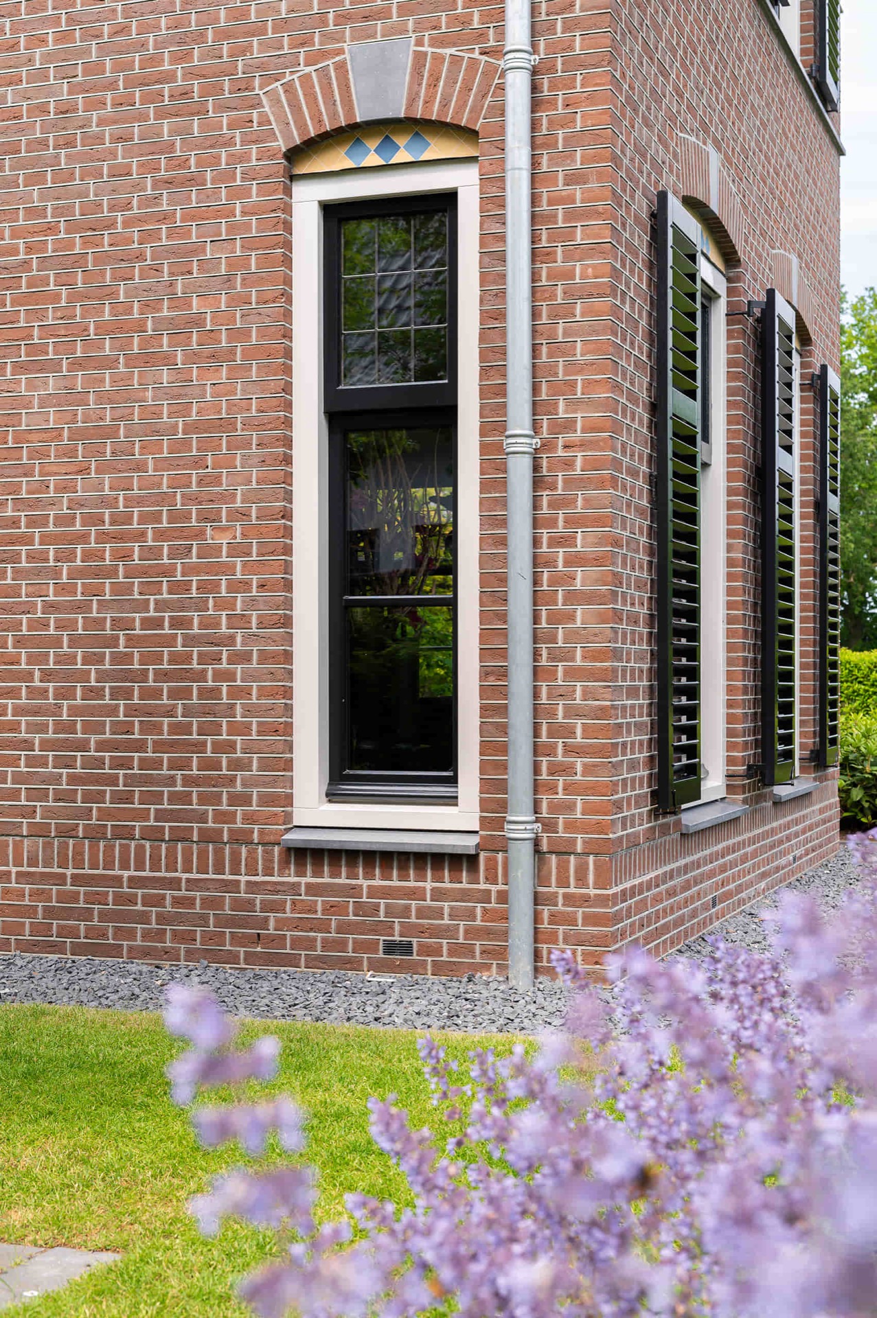
NEW 2026 Jubileum Edition The Best Interior Designers Benelux
Order Now €125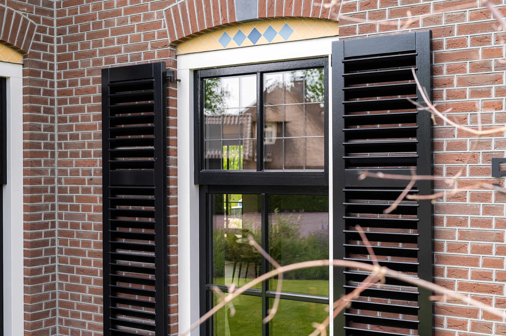
NEW 2026 Jubileum Edition The Best Interior Designers Benelux
Order Now €125