1920s villa interior with wallpaper and a new living kitchen
The kitchen changed first, and the difference is immediate. What had been white and echoing now carries pattern, depth and a softer sound. In this 1920s villa, acoustic wallpaper was used to solve two problems at once: the room felt less sterile, and the reverberation was brought down. The existing kitchen stayed in place, as did the island, but the island shifted a few meters so cooking and dining could share one larger room. A bigger table now sits where circulation once dominated.
Wallpaper takes the edge off the room
Wallpaper is doing more than dressing the walls here. It breaks up the hard white surfaces and gives the kitchen a visual weight that the room was missing. The change is most noticeable around the work zone, where the darker wall and extractor hood sit against the lighter cabinetry. Rather than adding another layer of decoration, the wallpaper changes how the room is read: it absorbs some of the sharpness in the surfaces and lets the kitchen feel less exposed.
The move also makes practical sense in plan. By sliding the island away from its previous position, the room opens out toward the table. The result is not a showpiece kitchen set apart from daily life, but a place where pans, plates and conversation can occupy the same square footage. Sound deadening wallpaper is part of that shift, though the visible effect is just as important: the walls no longer recede into blankness, and the room holds itself with more presence.
A table shaped against the straight lines
The new table changes the center of gravity. A white rectangular table was replaced by a handmade oval end grain wood table, and the shape immediately softens the geometry around it. In a house full of straight edges, corners and fixed lines, the oval reads as a deliberate pause. The grain on the end timber gives the surface a different kind of movement, one that is visible even before anything is placed on it. It sits between the kitchen and dining functions without forcing either one to dominate.
That table is also a response to use. With the island moved, there is now room for a larger dining setting, so the table can hold family meals and guests without feeling squeezed between circulation routes. The planning is simple on paper, but in the room it changes the way people meet each other: from the stove to the tabletop, the distance is shorter and the boundaries are clearer. The oval shape keeps the composition from becoming too rigid.
Red linen curtains and the colour of the windows
Across the windows, red linen curtains shift the mood without overpowering the light. Their surface is described as crunchy, which suits the way they hang: not limp, not formal, but with enough body to frame the openings. They replace the earlier white curtains and give the room a stronger edge against the pale walls and the dark accents in the furniture. In daylight, the fabric takes on a slightly dry texture; in the evening, it deepens the room’s colour notes.
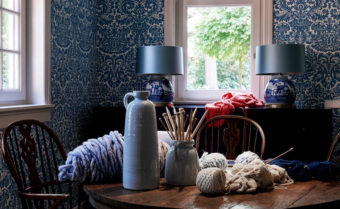
The same sense of restraint appears in the living room and dining areas, where ornamental wallpaper in blue sets a patterned backdrop behind the furniture. It is not loud, but it is active. The pattern holds the wall together and sits comfortably with the large windows, the wooden table and the lamps that drop warm pools of light onto the surface below. Seen from across the room, the wallpaper links the seating area to the dining setting without flattening either one.
An art deco hallway with a clear point of reference
In the hall, art deco wallpaper picks up its cue from the stained-glass window in the toilet. That connection gives the entrance a line of reference that continues from one room to the next, even if the motifs change. The pattern brings ornament into a passage that would otherwise be defined mostly by movement. Here, wallpaper works as an architectural surface, marking the threshold rather than merely decorating it.
The house already had the right clues for that approach. Bay windows, round exterior walls, small and large windows, and the detailed brickwork of the 1920s villa all point to a building with enough character to support pattern. The wallpaper does not compete with those features; it answers them. In that sense, the hallway becomes a measured introduction to the rest of the interior, where older shapes and new interventions are kept in view at the same time.
Heirloom chairs and furniture given another round
Not every piece was replaced. The owners were encouraged to bring back furniture they already loved, and that decision gives the rooms a more personal register than any newly bought set could. Grandmother’s chairs were reupholstered in a cool fabric, and their presence now sits comfortably beside the fresh wallpaper and new table. The chairs carry use in their proportions; they are not treated as relics, only as well-made pieces that could continue.
That idea of reuse is felt throughout the interior. A chair has a long memory in a home: study, rest, conversation, daily pause. Here, the reupholstered seats remain visible as part of the room’s working life, not as sentimental extras. Their new fabric lets them stand up to the stronger colours and patterns around them, while the older frames keep the room anchored to what was already there before the renovation began.
Built-in storage and the quieter corners
The photographs show that the project is not only about the main rooms. Built-in bookcases open up small bays for books and objects, and a reading corner with two blue armchairs gives the interior a slower register. These spaces matter because they sit between function and pause. A shelf line, an alcove, a low table: each detail gives the room another way to be used without turning it into a formal display.
Other views show the same careful use of contrast. White balustrades with regular cutouts run beside dark stair carpet; a bathroom wall is covered in pattern, while a stone basin edge keeps the surface grounded. Even the bedroom-like setting, with its deep textiles and open shelving, follows that logic. Pattern appears where a flat surface needs energy, and plain wall where the furniture already carries enough weight.
Why the villa keeps its character
The exterior cues matter because they explain why this interior can carry ornament without feeling overloaded. The brick facade, white rendered sections, window frames and garden edges all belong to the same architectural language as the rooms inside. The villa reads as a building with clear openings and solid masonry, so the renewed interior can lean into texture, line and repeated pattern rather than stripping everything back.
Seen from the dining room, through the windows and red curtains, the garden becomes part of the composition as well. The view of lawn and hedges is controlled and direct, just like the interior changes. The renovation does not overwrite the house’s original framework; it gives that framework a new rhythm through acoustic wallpaper, ornamental surfaces and furniture that has been kept in use. The result is a home where the old structure remains legible, but the rooms now hold daily life with more ease.
Photo credits
Photography: Carin Verbruggen and Ferry Drenthem Soesman
Want to see more of Wonderstruck? View the page of Wonderstruck for even more great projects and company information.




NEW 2026 Jubileum Edition The Best Interior Designers Benelux
Order Now €125


NEW 2026 Jubileum Edition The Best Interior Designers Benelux
Order Now €125


NEW 2026 Jubileum Edition The Best Interior Designers Benelux
Order Now €125