1930s-Inspired Villa Interior
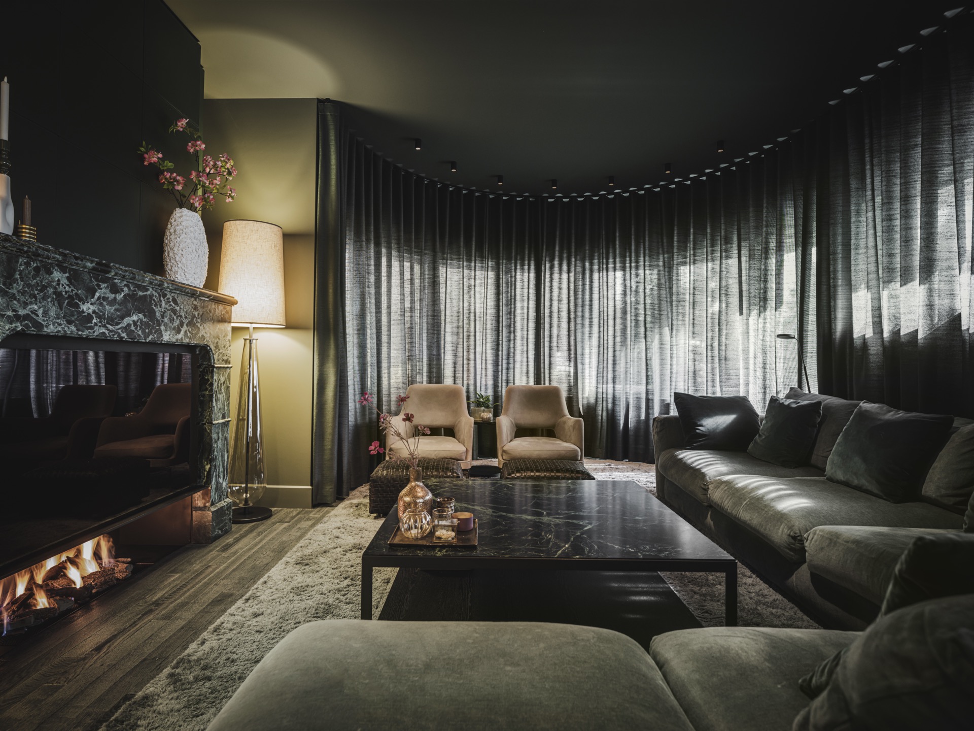
A veined marble fireplace, dark curtains, and a wide run of glazing set the tone in this 1930s-inspired interior. The rooms draw from the period without copying it line for line. Instead, the spaces rely on clear proportions, heavier materials, and a careful use of light. The result is a villa interior where the classic shell is met by restrained detailing, from the fireplace surround to the ceiling spots that pick out the room after dusk.
Living room with a marble fireplace and dark curtains
The living room is anchored by the marble open fireplace, which sits low and solid against the darker wall surfaces. Its veining is visible even from across the room, especially in the close-up views where the firebox and stone surround take up most of the frame. Long dark curtains soften the edges of the large window section beside it, while grey upholstered seating keeps the arrangement calm and grounded. The room reads as a place built around the fireplace first, with the rest of the furniture arranged around that line.
Daylight moves across the floor and onto the upholstery through the large windows, where the glass opens the room toward the garden. The contrast between marble, textile, and wood is what gives the space its character. Nothing is overworked. A low table, a few controlled surface changes, and the dark curtain panels are enough to frame the room. In this setting, the lounge area open fireplace is less a decorative object than the point from which the entire seating layout seems to unfold.
Material contrast in stone, wood, glass, and fabric
The most visible tension in the interior comes from the material contrast: polished stone against matte fabric, dark timber against pale reflections in the glazing. One image shows a green-black marbled tabletop with a metal edge, echoing the veined fireplace surround nearby. Another view places the sofa, fauteuil, and curtain line close together, so the room feels layered without becoming crowded. These surfaces do not compete. They simply meet at clear edges, which keeps the 1930s-inspired interior legible from one angle to the next.
That same material logic appears in the dining area, where wood wall panels give the room a vertical rhythm. The panels sit behind the table and under a decorative pendant with multiple round shades, so the eye moves from wood grain to metal frame to light points. It is a small sequence, but it defines the room. The surface finish matters here because it breaks the long wall into measured sections and gives the dining zone a quieter register than the living room next door.
Light placed with restraint
Accent lighting and ceiling spots play a visible role in the evenings, especially around the lounge and dining zones. Rather than flood the room, the fittings pick out the edges of the seating area and bring depth to the dark wall surfaces. A sculptural ceiling light with several round caps hangs above the table and adds a clear focal point without taking over the room. Its geometry stands out against the softer shapes of the chairs and curtains, which makes the room feel composed through light rather than decoration.
The large windows remain important even when the lamps are on. They frame the exterior greenery and keep the rooms connected to the garden, while also explaining why the darker curtains are part of the composition instead of an afterthought. In one view, daylight falls across the sill and the stone finish beneath the glazing; in another, the curtain folds form a dense vertical field beside the fireplace. This balance between glass and textile gives the interior its depth and keeps the 1930s-inspired interior from feeling flat.
A kitchen defined by stone and sharp lines
The kitchen continues the same material language with marble countertops and a precise finish. The stone surface catches the light differently from the wood wall panels and the darker joinery, so the room gains contrast without needing extra ornament. High-end appliances are mentioned in the source text, but the visual reading stays focused on the worktop, the clean edges, and the way the kitchen sits next to the dining area. It is a room that handles use through layout and surface, not display.
Seen together with the dining zone, the kitchen feels closely linked to the social part of the house. The wall paneling, pendant light, and table arrangement give the space a measured pace, while the marble top introduces a harder line. That interplay is what makes the kitchen feel consistent with the rest of the 1930s-inspired interior: the finishes are refined, but the room still reads as lived in, with clear paths and distinct functions.
Bedrooms and bathrooms with a quieter register
Beyond the main living spaces, the bedrooms shift the mood toward stillness. The source description points to rooms that focus on rest, and the visual language supports that idea through softer surfaces and fewer strong contrasts. There is no need for a dramatic gesture here. The rooms rely on proportion, muted tones, and a controlled amount of detail so the eye can settle. That restraint matters after the more expressive fireplace and dining zones, and it gives the upper part of the house a slower pace.
The bathrooms continue that quieter tone with finishes that suggest a spa-like experience. The image set does not overexplain the rooms, and that helps. What stands out is the way the villa moves from public rooms with dark curtains and stone to private spaces where surfaces are simpler and the lighting is more subdued. The difference is clear without becoming theatrical. It is this shift in register that lets the 1930s-inspired interior hold together across different parts of the house.
Garden and spacious terrace beside the house
Outside, the garden and spacious terrace extend the project with a more open frame. The source text refers to greenery and privacy, and the imagery supports that with a view through the windows toward planting and exterior light. The terrace gives the house a usable edge, a place where the interior finishes meet a rougher outdoor setting. Rather than becoming a separate scene, the garden sits close to the glazing and keeps the relationship between inside and outside visible from the main rooms.
From the living room, the transition reads clearly: dark curtains, marble, and upholstered seating inside; leaves, daylight, and open air beyond the glass. That sequence is simple, but it gives the house its rhythm. The garden and spacious terrace are not pushed forward as the main event. They work as the calm extension of the rooms, finishing the project with the same measured attention to surfaces, lines, and light that shapes the rest of the 1930s-inspired interior.
Want to see more of François Hannes? View the page of François Hannes for even more great projects and company information.





NEW 2026 Jubileum Edition The Best Interior Designers Benelux
Order Now €125


NEW 2026 Jubileum Edition The Best Interior Designers Benelux
Order Now €125


NEW 2026 Jubileum Edition The Best Interior Designers Benelux
Order Now €125