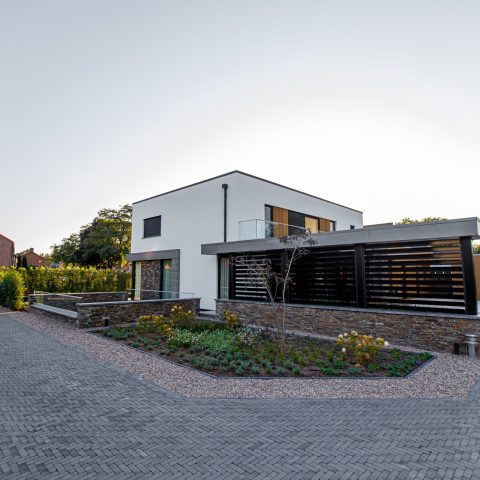
Covered terrace with glass frontage and a wood slatted ceiling
A wood slatted ceiling sets the pace before the seating even begins. Beneath it, the covered terrace with glass frontage reads as a clear outdoor room: glass panels draw the edge around the canopy, steel columns carry the structure, and large-format terrace tiles keep the ground plane calm and even. The result is less about decoration than about how the parts meet — timber above, glass at eye level, and a solid tiled floor underfoot.
Outdoor living under the canopy
The seating area under canopy sits close to the house, but the structure gives it its own frame. Transparent panels run along the terrace side, so the view stays open while the space remains protected. Light filters through the slatted ceiling detail rather than dropping in all at once, and the rails visible in the overhead construction make the ceiling read as a working part of the design, not just a finish. The wood above and the steel columns below create a clear line from roof to floor.
Large-format terrace tiles extend that order across the sitting area. Their light tone keeps the surface quiet beside the darker lines of the frame and the reflections in the glass. Nothing here feels crowded. The furniture sits low against the structure, leaving the ceiling and the glass frontage to define the room. That is what gives this modern veranda its character: the enclosure is light, but the edges are precise.
A glass front that keeps the garden in view
The covered terrace with glass frontage works because the transparency is consistent. From one angle the panels read almost like a continuous screen; from another, the reflections break up the view of the garden and the adjoining building volume. Red roof tiles and white masonry appear beyond the terrace line, adding a clear contrast to the timber and glass. The terrace stays visually connected to the house, but the structure still has its own identity.
In the daylight images, the glass frontage does more than close the room off. It allows the steel columns to sit clearly in the composition, and it makes the wood slatted ceiling easier to read as a sequence of parallel lines. The garden room becomes a place where structure is visible rather than hidden. That openness is especially noticeable in the terrace-side perspective, where the canopy, the glazing and the tiled floor align in one long view.
Garden borders, lawn and the edge of the terrace
Outside the canopy, the garden with borders and lawn gives the project a more formal edge. A broad stretch of grass sits next to the built terrace, and the planting borders mark the transition from hard surface to softer ground. The terrace does not spill randomly into the garden; it meets the lawn with a clean line, which lets the glazed room remain readable from a distance.
The wider garden views show the covered terrace as one part of a larger outside setting. The light grey tiles continue the same ordered feel seen under the canopy, while the lawn provides an open field of green beside them. Borders run along the edge, shaping the view without closing it down. In that framing, the garden room looks anchored rather than added on.
Steel columns and the rhythm of the structure
The steel columns are one of the clearest visual notes in the project. Their slim vertical lines keep the canopy from feeling heavy, even where the roof plane stretches across the terrace. They also separate the glazed panels into readable bays, which gives the whole structure a measured rhythm. Seen against the wood above and the glass beside them, the columns make the modern veranda feel built from simple, legible parts.
That rhythm continues in the ceiling. The slatted roof detail runs in parallel bands, and the integrated shading or rail elements sit within that pattern instead of interrupting it. Because the overhead construction is exposed, you can see how the canopy works as a layered piece of the terrace rather than a closed box. The detail shots make this especially clear: timber, rails, glass and frame all remain visible at once.
A glance back to the bedroom with the wall fireplace front
One interior image shifts the focus away from the terrace and into a bedroom where a bed sits in front of a wall with a fireplace front. The room is quieter, but the same attention to surfaces remains visible. Finished wall sections surround the fire opening, and the bed is placed close enough to register the relationship between sleeping area and built-in wall element. It is a brief snapshot, yet it adds another layer to the project.
Seen next to the covered terrace, the bedroom image keeps the page from becoming only about one exterior moment. It shows another part of the same architectural language: clear lines, restrained material shifts and an emphasis on built-in surfaces. The fireplace front is not treated as a separate object; it sits within the wall, much like the terrace structure sits within the garden edge. That continuity of placement is what links the images, even as the spaces change.
Why the terrace reads so clearly in the photographs
The strongest images work because they isolate the main ingredients. One view focuses on the glass frontage and the wood slatted ceiling; another tightens in on the ceiling detail and the rails above; a third steps back to include the lawn and borders beyond the terrace. Together they show how the garden room is assembled, not just how it looks from one angle. The project stays legible because each material keeps its own role.
That legibility is also what makes the terrace memorable. Glass keeps the perimeter open, timber gives the overhead plane its texture, steel holds the span, and the large-format terrace tiles pull the whole composition down to ground level. In the wider garden, the borders and lawn provide the outside frame. The covered terrace with glass frontage sits neatly in that sequence, with every part doing visible work.
Want to see more of Livium? View the page of Livium for even more great projects and company information.



NEW 2026 Jubileum Edition The Best Interior Designers Benelux
Order Now €125


NEW 2026 Jubileum Edition The Best Interior Designers Benelux
Order Now €125


NEW 2026 Jubileum Edition The Best Interior Designers Benelux
Order Now €125