Custom kitchens and fitted wardrobes in a historic building
A row of pale cabinets, a kitchen island with a stone-look worktop, and ceiling spotlights set the tone inside the apartments. The shell may be historic, but the interior reads in a different register: light walls, dark window frames, clean joinery and storage that disappears into the room. Custom kitchens and fitted wardrobes are the most visible thread through the project, shaping how each apartment is used day to day.
Where the kitchen becomes the centre of the plan
In the main living areas, the kitchen is not treated as a separate room at the back of the plan. It sits in view, sometimes as a wall run with an inset niche, sometimes as a composition around a kitchen island. The photographs show integrated appliances, a built-in oven, and a wine cooler set into the cabinetry, with worktops that hold the room together visually. The lighting stays discreet: recessed spotlights, smooth ceilings and no unnecessary fittings competing with the surfaces below.
That directness suits the apartment transformation. Five homes now occupy the building, and the kitchen layouts help define each one without overloading the rooms. The larger ground-floor apartment has the most space to work with, while the upper apartments are organised more compactly. In both cases, the custom kitchens and fitted wardrobes support the same idea: clear circulation, storage built into the walls, and surfaces that do their work without drawing attention away from the living space.
Joinery that settles into the room
The fitted wardrobes are not presented as separate furniture pieces, but as part of the architecture of each apartment. Their lines are straight, their doors flat, and their placement tied to the rooms around them. In the photographs, that approach keeps circulation areas open and leaves the floor plane readable, even where the plan includes bedrooms, bathrooms and hallways in a tighter sequence. It is a practical use of bespoke joinery, but also a visual one: less clutter, fewer interruptions, more wall left for light to move across.
Material contrasts do most of the work. White walls sharpen the edges of the joinery, wood flooring softens the transition between kitchen and living zones, and darker accents in the glazing or seating bring weight to the composition. The effect is not decorative in the obvious sense. It comes from the way the cabinetry meets the walls, how the niches are framed, and how a run of storage can sit quietly beneath a ceiling line with spotlights above it.
Bright apartment interiors shaped by storage
The project images show a clear preference for a light interior finish. Large wall surfaces are kept pale, while the kitchens introduce a stronger material presence through timber fronts, grey undertones and worktops with a stone or concrete look. That restraint helps the rooms feel open even when they contain a substantial amount of built-in storage. In the living spaces, the joinery never reads as a detached add-on; it sits within the room’s geometry and follows it.
This is where the interior design for apartments becomes visible in a practical way. The ground-floor home includes three bedrooms, two bathrooms and several walk-in closets, while the apartments above each have two bedrooms and two bathrooms. The penthouse has three bedrooms, one bathroom and private lift access. Across these different layouts, the same logic returns: storage is integrated, kitchen elements are measured to the room, and the finish remains calm enough to let the plan read clearly.
What the photos show in the kitchen zones
One of the kitchens is centred by a broad island with a sink and tap, framed by white surfaces and a continuous ceiling with spotlights. Another image shows a kitchen wall tucked into a recess, with the seating area pulling the eye outward into the living room. Elsewhere, timber-fronted cabinets and a tall built-in oven create a more enclosed composition. These are not decorative gestures. They are the visible results of custom kitchens and fitted wardrobes being drawn to suit different apartments rather than repeated mechanically from one floor to the next.
The bespoke joinery also gives the rooms their measured edges. Tall cupboards absorb the practical parts of daily life, while the open areas stay free for movement and furniture. In a project like this, that matters more than a statement finish. The apartments have to function in several ways at once: sleeping, cooking, storing, and receiving daylight through openings that were reshaped during the wider renovation. The joinery answers that brief by staying built-in, not independent.
A glass extension that shifts the light at the back
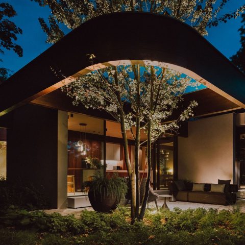
At the rear, a new black insulated aluminum curtain wall replaces the older glazed opening and draws a hard line against the historic masonry of the building. In the images, the contrast is immediate. The dark frames pick up the geometry of the opening, while the surrounding terrace and glass extension bring daylight deeper into the plan. It is the clearest point where old and new meet in the project, and it gives the apartments a stronger connection to the outside without diluting the interior language.
Three balconies were added at the rear, and a generous roof terrace now sits on top of the existing extension. From inside, the glass volume extends the sense of depth; from outside, it gives the rear elevation a sharper reading. The partner contribution remains inside the apartments, but the effect of these changes can be seen in the way the kitchens and living rooms relate to the openings. More light means more room for pale surfaces, timber fronts and the quiet rhythm of built-in storage.
Entrances, stairs and the route through the apartments
The entrance has been moved back to its original side, and a new stair with lift now sits in the existing stairwell. In the hall image, the route upward is marked by a wooden stair, white walls and a plain run of lighting. The detail is restrained, almost matter-of-fact, which makes sense in a building where so much else is carrying the visual load. That same simplicity helps the custom kitchens and fitted wardrobes stay central once you enter the apartments themselves.
Seen together, the hall, stair and kitchen spaces form one continuous sequence rather than separate moments. The apartment transformation depends on that sequence working cleanly: arrive, move upward, step into a bright living space, and find the storage and kitchen elements already in place. For a project of five homes, that kind of clarity matters. It leaves room for the individual layouts to differ while keeping the interior finish consistent in tone, light and detailing.
The result is a building where the historic envelope sets the frame, but the daily experience is shaped by interiors that have been carefully drawn around storage and cooking. Custom kitchens and fitted wardrobes carry that responsibility throughout the apartments. They organise the rooms, hold the visual line, and give the project its most legible interior signature.
Photography: Anne van Houwelingen
Want to see more of Maxim Winkelaar | Design Follows Personality? View the page of Maxim Winkelaar | Design Follows Personality for even more great projects and company information.




NEW 2026 Jubileum Edition The Best Interior Designers Benelux
Order Now €125