Detached house renovation with extension
A raised roofline, a pared-back brick volume and a line of gravel underfoot set the tone here. The detached house renovation starts by stripping away the parts that had accumulated around the original volume, leaving the gabled roof, the brick shell and the garden relation as the main subjects. The new house extension does not push itself forward; it continues the house in a measured way, with a shaded canopy in blackened timber drawing a horizontal line across the southern side.
What was removed, and why that mattered
The first move was subtraction. A bay window, an older rear extension, the back canopy and the decorative façade elements were removed so the original structure could read clearly again. That decision gives the brick house renovation its quiet force: walls, roof and openings are left to do the work. The new volume follows the same line as the house and the garden shed is treated as part of that extension, so the added parts sit as a continuation rather than an extra layer.
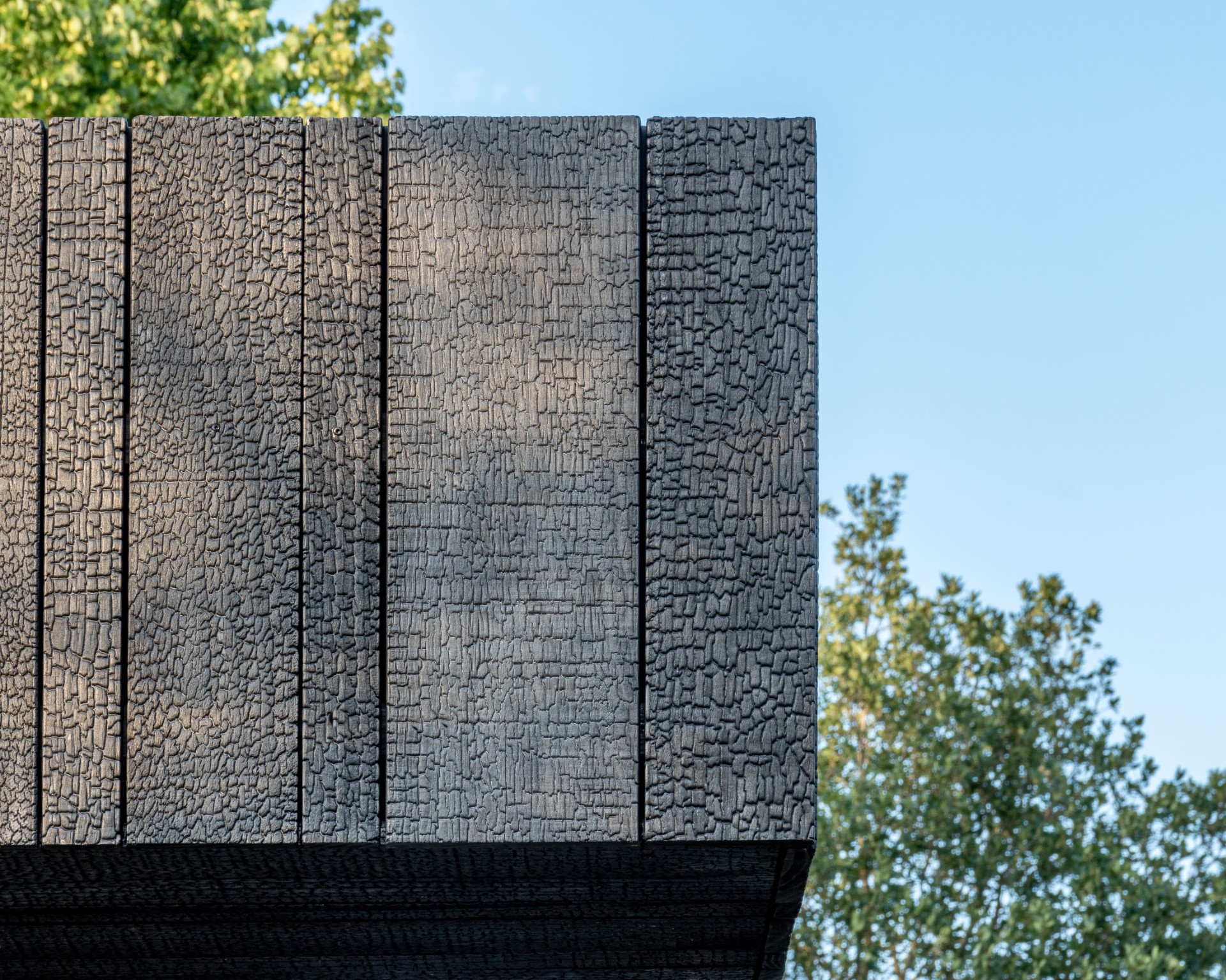
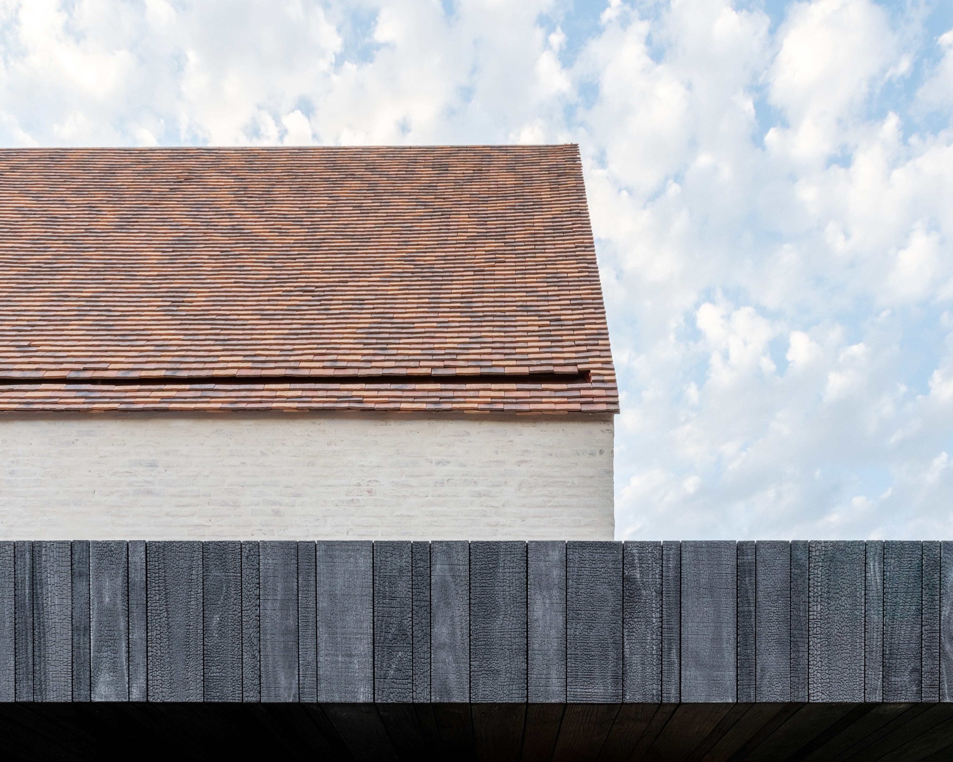
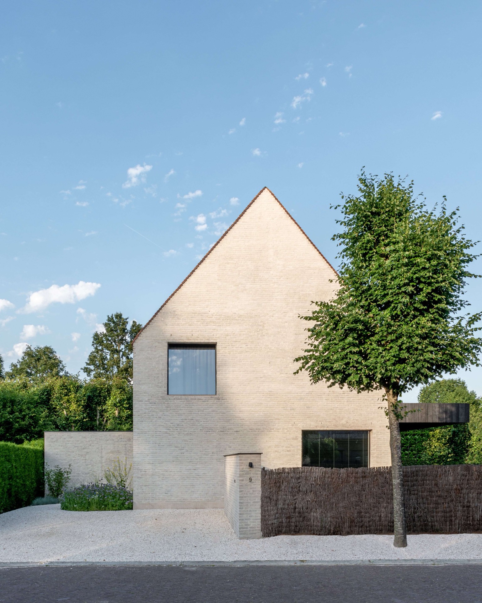
Blackened wooden planks shape the canopy, and the darker surface sharpens the edge of the extension against the lighter brickwork. It also acts as a sun screen on the south side. The canopy line is carried through the extension, which gives the addition a longer reading from the street and from the garden. Alongside it, a hedge and a new garden privacy wall define the boundary without closing the plot off completely.
A new entrance, moved closer to the parking zone
The entrance was relocated to the north side, near the parking area. That shift reduces the amount of paving needed outside and frees more of the plot for the private garden zone. From the house, the orientation opens toward east, south and west, and the interior layout follows that movement of light. The result is not a dramatic rearrangement, but a practical one: fewer hard surfaces, a shorter route in, and more of the front garden brought into the private realm.
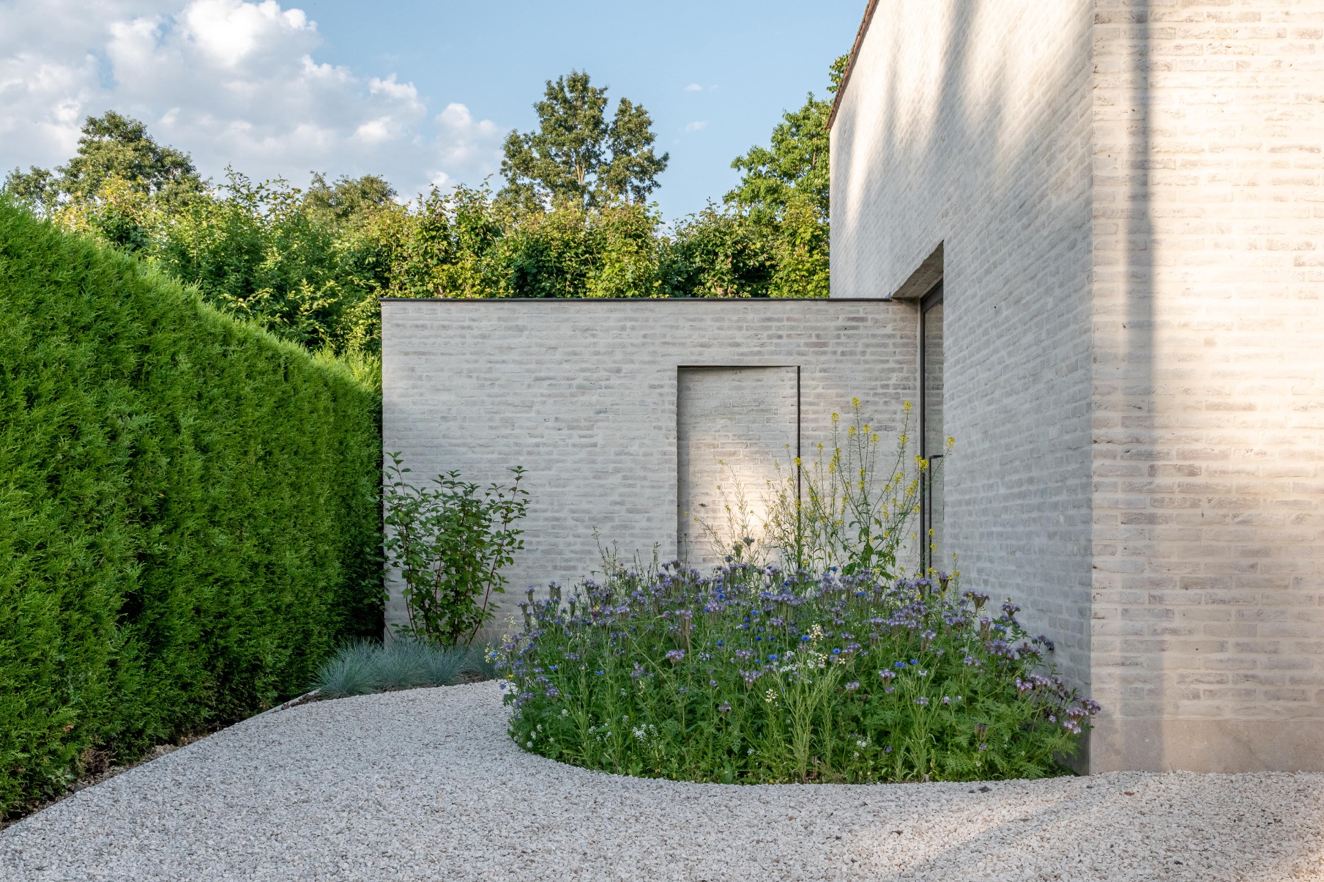
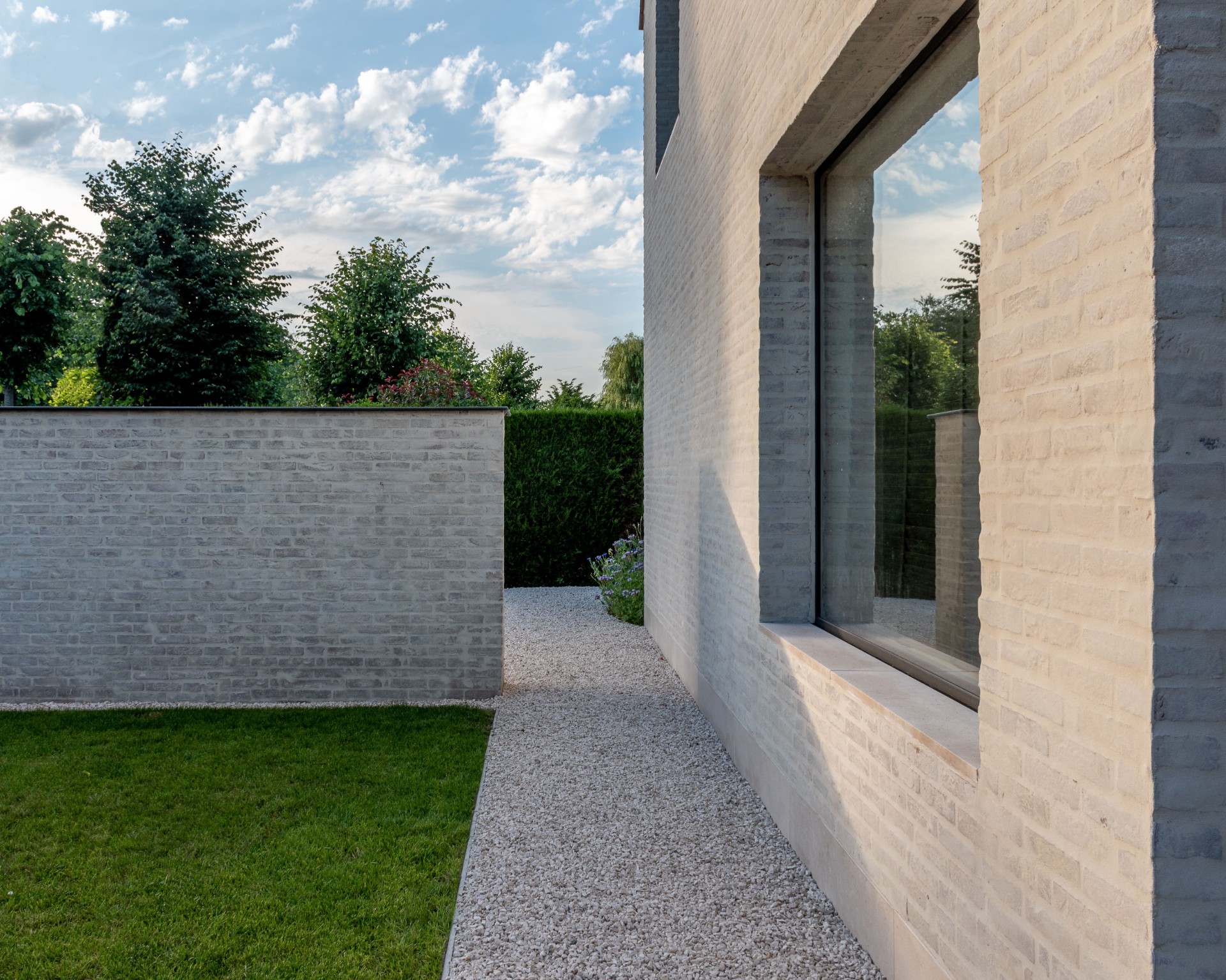
The garden privacy wall forms a firm edge between the parking zone and the enclosed garden. In the photos, that edge reads as a tall brick plane beside gravel and planting beds, with dark elements giving it a sharper profile. The wall is strict where it needs to be, yet it still lets the garden read as a distinct place, separate from the public side of the plot. Gravel path landscaping reinforces that shift, keeping circulation narrow and visually light.
One metre higher, and suddenly the attic can be used
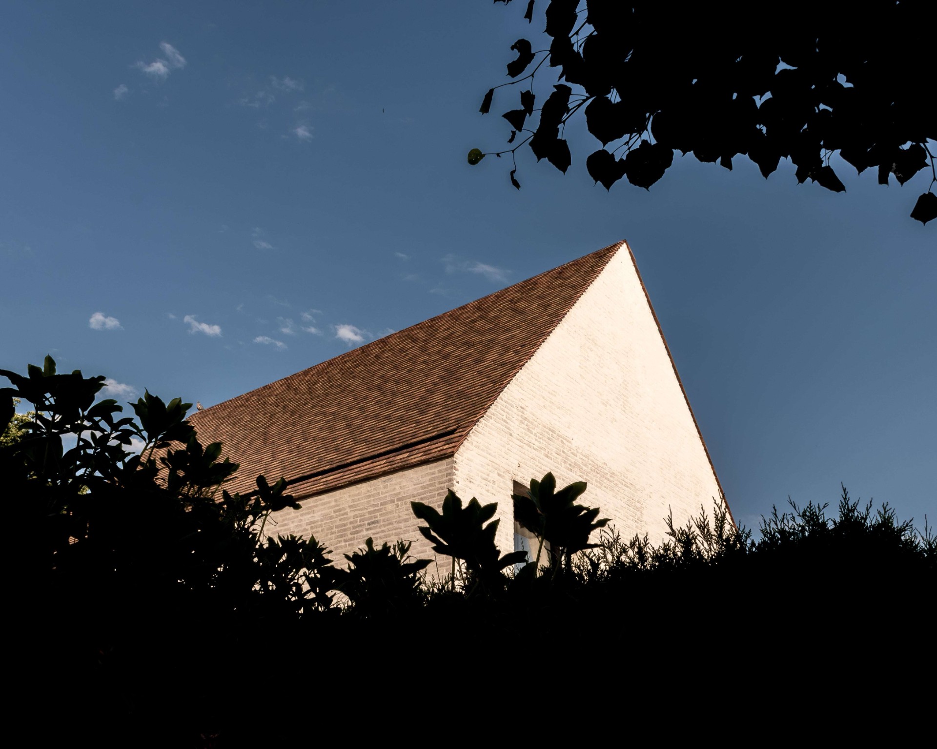
The poor condition of the existing roof made room for a structural change. The new roof build-up rises by about one metre, enough to turn the attic from inaccessible void into usable space. That adjustment changes the house without inflating it. The gabled roof remains recognisable, but the increased height gives the upper level a new role in the layout. It becomes part of the detached house renovation, not a hidden leftover above it.
From the outside, the roof keeps its familiar pitched profile and red-brown tile surface. In the images, the slope is read against light brick and dark boundary elements, which makes the roofline feel more deliberate. The extra height is subtle in the street view, but inside it means the house can extend upward as well as outward. For a project that relies on preserving what can stay, that one-metre change carries a lot of weight.
Details that stay out of sight
The detailing is where the house becomes most precise. Sills, roof edges and water drainage are concealed rather than left to interrupt the view. That means the eye can travel along the brickwork, the canopy and the roof without landing on technical breaks. The approach is restrained, but it is not minimal for its own sake. It is about removing visual noise where the construction would otherwise show through too loudly.
This same discipline can be seen in the junctions between materials. The dark profiles around the large openings sit thin against the brick, and the canopy is allowed to read as one continuous element instead of a set of separate parts. The brick house renovation gains clarity from those choices. Nothing is overstated, and the house avoids the patchwork effect that often appears when older volumes are expanded too quickly.
Brick, timber and dark profiles
The material palette is plain at first glance: brick, timber, metal and roof tiles. Yet the way those elements are placed gives the project its character. The brickwork carries the main volume, while the blackened timber canopy cuts across it and the darker profiles frame the openings. In the garden, gravel softens the base of the walls and keeps the circulation dry and readable. The contrast is strongest where the light brick meets the dark boundary wall.
That material contrast also appears in the close-up views of the garden edge, where repeated brick courses, darker joints and vertical elements create a measured rhythm. It is not decorative in the usual sense. The pattern comes from the construction itself, and it gives the privacy wall enough presence to stand beside the house without competing with it. The extension uses the same language, just in a quieter register.
Inside, the house follows light rather than habit
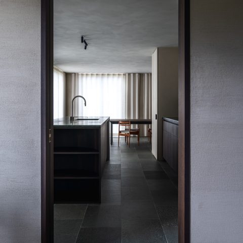
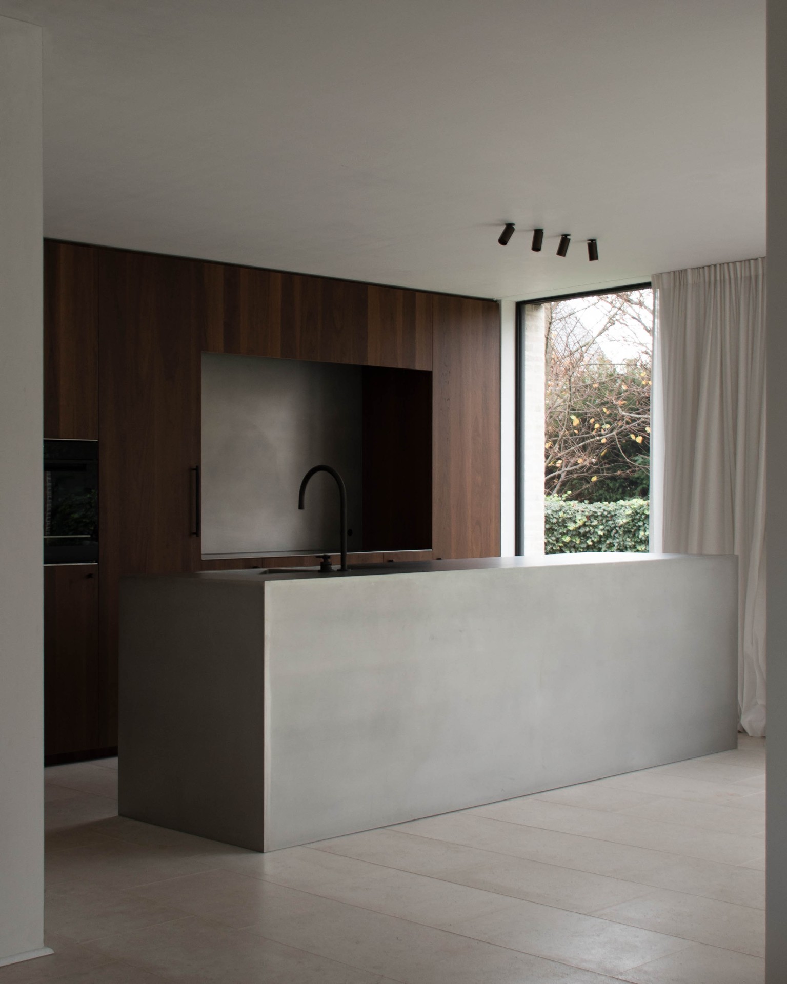
The interior layout was shaped around the available orientation. Rooms are placed to catch light from east, south and west, and the new attic level extends that logic upward. Large glazing brings in a clear view of the garden, while custom timber joinery gives the interior a firm edge. The photos show a kitchen and living zone with a wooden wall element, a large opening and a pale floor surface that reflects daylight rather than absorbing it.
That interior reading matters because it ties the detached house renovation to the outside changes. The reduced paving, the shifted entrance and the enlarged private garden zone are not separate moves; they support the way the rooms now sit in relation to the site. The house uses its plot more deliberately, with the threshold, the garden wall and the glazed openings all working in sequence. The architecture stays modest, but every move is visible in the plan and in the light.
A garden edge that does more than mark a line
The new boundary is not just an enclosure. It organizes arrival, shields the garden and shapes the view from the house. A hedge softens part of the edge, while the brick wall holds the more exposed side near the parking zone. Together they define the private garden without making it feel cut off. In the exterior images, the wall, the planting beds and the gravel path form a compact composition beside the house.
That combination of elements keeps the garden legible through the seasons and across the site. The gravel path landscaping provides a dry route along the walls; the planting breaks up the hard line; the brick keeps the boundary rooted in the house itself. Seen as a whole, the project is not about adding more, but about setting clearer limits so the original detached house renovation and its house extension can read with less interruption.
A classic house, edited with precision
What remains after the renovation is a house that still belongs to its pitched-roof type, but no longer carries the clutter that had built up around it. The extension, the raised roof and the new garden boundary all work through proportion rather than gesture. The result is a brick house renovation that feels exact in the way its parts meet. The canopy shades the south side, the entrance sits close to the parking zone, and the attic now has a use that was not possible before.
The project’s strength lies in that restraint. It does not try to mask the original house, and it does not drown it in new material. Instead, the detached house renovation sharpens the outline of the existing volume, extends it where needed and clears the ground around it. The house reads more clearly from the street and from the garden, with the gabled roof, the brick walls and the concealed details carrying the composition.
Want to see more of Stael Architect? View the page of Stael Architect for even more great projects and company information.

NEW 2026 Jubileum Edition The Best Interior Designers Benelux
Order Now €125