Dike villa with a thatched roof: a fully basemented layout focused on garden & water
Riet softens the roofline before the house drops away into the dike. From the road side, the volume reads as a compact dike villa with a thatched roof; from the garden side, it opens, steps, and stretches toward the water. That shift is the starting point of the design. The front is composed of three smaller volumes, which keeps the house in step with the scale of nearby farmhouses and dike dwellings. At the rear, large panes of glass and two terraces pull the rooms outward and make the level change part of daily life.
A front face made of three smaller volumes
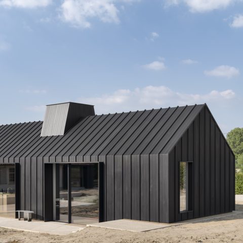
The street side stays measured. Three compact volumes sit under one thatched roof, and that broken-up outline keeps the house from feeling oversized beside the low buildings around it. White render, dark brickwork, and oak structure give the elevation a clear rhythm. Nothing is forced into display. Instead, the dike villa with thatched roof presents itself through proportion: a low eave line, a restrained opening pattern, and a roof that sits with the landscape rather than above it. The architecture reads quietly until the rear side comes into view.
That rear elevation is where the project changes speed. Large glazing on the garden side pulls daylight deep into the house, while the terraces mark the edge between interior and outdoors. The glazing is not treated as a single gesture; it sits alongside masonry and timber so the openings feel embedded in the house, not added to it. In the image set, the glass spans across patio zones and sheltered outdoor areas, giving the rear side a layered depth that is very different from the front.
Building into the dike creates the level difference
The dike level difference shapes the plan from the ground up. Because the house is set into the dike, the front and rear facades sit at different heights. To absorb that shift, the home is fully basemented. Seen from the street, that lower level disappears into the mass of the house. From the garden side, it opens up to the river level and becomes part of the main living sequence. What is hidden on one side becomes legible on the other, and the section does most of the work here.
That lower level is not treated as a storage zone. It receives daylight through peilkozijnen and garden doors, so the fully basemented home with daylight feels connected to the outside rather than cut off from it. The plan places a work room and guest accommodation here, which suits the quieter edge of the house. Light enters low across the floor, catching the masonry, the door frames, and the line where the terrain drops away. The architecture uses the dike level difference to make the basement useful, not secondary.
Rooms that sit close to the waterline
From the rear, the basement floor reads almost like a ground floor. That is where the house becomes especially clear. The glass doors, the lower terrace edge, and the direct relation to the garden give the rooms a different register from the front. It is easy to understand why this part of the house was intended for work and guests: it has daylight, access, and a sense of distance from the main living level above, without feeling separate from the rest of the house.
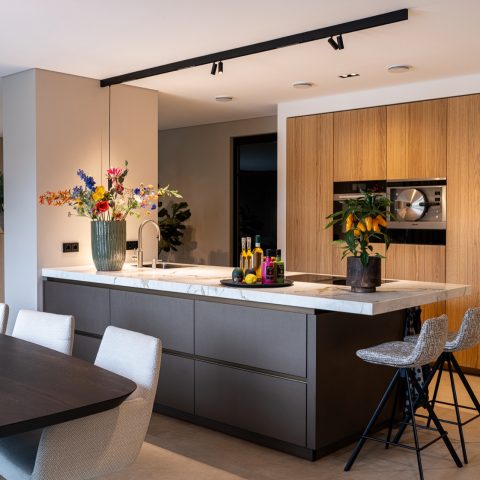
On the real ground floor, the kitchen takes the central position. It looks toward the garden and the river, and that orientation gives the room its role in the house. This is where daily movement gathers: walking in from outside, setting things down, sitting together, and looking out across the landscape. The layout still allows people to withdraw to other rooms, but the kitchen remains the point where the house comes together. The view is not a backdrop; it is part of how the room works.
Two terraces, glass, and a clear edge to the garden
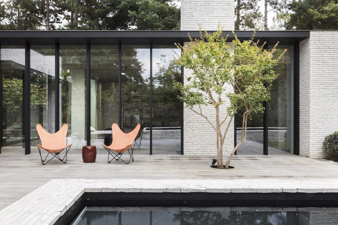
The rear side is shaped by patio terraces by the garden. There are two of them, each catching the house from a slightly different angle. One sits beside the glazed rear volume, while another extends the sheltered outdoor zone and reinforces the connection to the plot. In the photos, paving runs right up to the threshold, and the terraces sit close to the house rather than far out in the garden. That proximity matters. It makes the outdoor rooms feel tied to the house plan, not appended to it.
Large glazing on the garden side turns those terraces into usable extensions of the interior. The openings are generous, but the house never becomes all glass. Dark brickwork anchors the lower parts, and timber frames add a measured edge. The result is a rear elevation that is open without losing weight. In one image, a covered terrace is held by wooden posts and glazed panels; in another, the patio is bounded by planting and paved surfaces. Each outdoor zone has its own border and its own light.
Materials that hold the house together
Fris stucwerk, oak structure, mixed brickwork, and a thatched roof villa profile give the house its material mix. The render brightens the mass, while the darker brick tones settle the lower parts into the ground. Oak beams are visible in the exterior expression and around the sheltered openings, where they create a strong frame against the glass. The thatch draws the upper line into one continuous sweep, but it is the contrast between smooth render, rough brick, and timber that gives the house its depth.
The material palette works because it is consistent with the plan. The front volumes are small and restrained, so the roof can sit low and broad over them. At the rear, where the house opens to the garden, the same materials are used to hold the glazing in place. The mix of surfaces keeps the house from reading as a single flat image. Instead, it changes with the route around it: rendered wall, brick base, timber frame, glass opening, terrace edge.
Inside, the project keeps the same sense of clear placement. The lower level belongs to work and guests, the ground floor to the kitchen and shared time, and the rear side to views, terraces, and the water edge. That arrangement makes the dike villa with thatched roof easy to read in section and in daily use. It is a house shaped by the dike, but also by the way light reaches the lower rooms and the way the garden side opens at the back. Photograph by Dick Ruumpol.
Want to see more of JUMA architects? View the page of JUMA architects for even more great projects and company information.



NEW 2026 Jubileum Edition The Best Interior Designers Benelux
Order Now €125


NEW 2026 Jubileum Edition The Best Interior Designers Benelux
Order Now €125


NEW 2026 Jubileum Edition The Best Interior Designers Benelux
Order Now €125