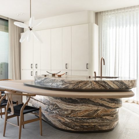
Home renovation kitchen in character: black natural stone and wood
The first thing you notice is the dark kitchen block against the pale floor tiles. Black fronts, a black natural stone worktop, and wooden details set the tone straight away. Light comes in from the large windows with green frames, so the room never feels closed off; it reads as a kitchen dining combo with a clear view outward and wooden beams overhead. The visible mix of surfaces gives this home renovation kitchen its direction without needing much else to say.
Dark fronts and stone that keep the room steady
The worktop runs as a hard, even line across the kitchen, and the black stone gives the cabinets a sharper edge. At the sink, the black basin and steel-look tap continue that same restrained palette. Nothing here is decorative for its own sake. The materials do the visual work: stone absorbs light, the dark fronts recede, and the lighter floor tiles open space around the cooking area. That contrast is what makes the room read clearly from the first glance.
Wood softens the harder surfaces, but only just. It appears in the cabinet wall, the table, the ceiling beams, and the frame around the hood, so the room stays grounded in one material family. The result is not a heavy kitchen. The wood breaks up the black surfaces and gives the long room a clearer rhythm, especially where the cabinetry meets the open dining area. In this home renovation kitchen, the material shifts are visible rather than explained.
A kitchen dining combo with room to move
The table sits close to the cooking zone, which makes the kitchen dining combo read as one continuous space instead of two separate rooms. A hanging light marks that shared zone from above. It drops the eye to the centre of the room, where the black worktop, the table surface, and the pale floor tiles meet. The arrangement keeps circulation simple: cabinet wall, work zone, dining table, and windows all stay within one clear line of sight.
That openness matters because the room carries several strong elements at once. There is the dark block of cabinetry, the long stone top, and then the window wall with green frames. Rather than competing, they are spaced so each part can be read. The table does not interrupt the kitchen; it extends the room’s use into the same visual field. For a home renovation kitchen, that makes the layout easy to understand at a glance.
Built-in appliances set into a wood cabinet wall
One of the quietest moves in the room is the tall cabinet wall with the built-in oven. The oven sits inside wood-fronted storage, with a dark control panel that links it back to the kitchen’s black surfaces. Nearby, the hood is framed in wood as well, turning a technical element into part of the cabinet line. These built-ins keep the wall legible and stop the appliances from breaking the surface into fragments.
The wood cabinet wall gives the room height. It rises beside the lower run of black fronts and creates a stronger vertical counterpoint to the long worktop. Seen together, the oven stack and hood frame turn the kitchen into a sequence of panels, openings, and edges. That linear approach suits the length of the room and keeps the home renovation kitchen visually calm without flattening the detail.
Green window frames and wooden beams in the background
Daylight falls through the large windows with green frames, and those frames are one of the few stronger color notes in the room. They sit behind the kitchen rather than on it, which lets them work as a backdrop instead of a highlight. The roedeverdeling in the glazing adds another layer of line work, echoed by the beams overhead. Together they frame the kitchen without pulling attention away from the cabinets and stone.
The ceiling beams and the window grid make the room feel measured. They set up a repeated pattern of horizontal and vertical lines that matches the straight cabinet fronts. Even when the camera moves toward the details, the structure remains clear: beams above, windows at the edge, dark joinery below. In that sense, the home renovation kitchen is not only about color contrast, but also about how the room is held together by repeated lines.
Details that keep the kitchen practical in appearance
The sink area shows how restrained the finish is. A black sink, a steel-look tap, and the same black stone worktop create one continuous working surface. There is no visual break between the tap and the counter, which keeps the zone compact and readable. The darker basin disappears into the worktop more than it stands out from it, while the metallic tap gives just enough reflection to catch the light from the windows.
Elsewhere, the furniture remains straightforward. Cabinet doors, handles, and appliance fronts all follow the same measured lines, and the pale wall surface keeps the room from feeling boxed in by dark material. The dining table adds a softer wood note, but it stays aligned with the rest of the room rather than acting as a separate object. That consistency is what makes this home renovation kitchen feel considered in use, not just in appearance.
A long house with older layers behind the kitchen
The kitchen sits within a long building that was described as coming from different periods, and that layered character is useful context for the room. The source text also mentions an 18th-century front with four large sliding windows, wooden shutters, a cornice, and two dormers, along with a garden wall and gate with brick piers and sandstone caps. Those details belong to the broader building story, but they help explain why the kitchen is read against a deeper background than a single-period house.
That older setting makes the current interior choices easier to place. The black fronts, stone top, and timber accents do not mimic the historic details; they sit beside them in a way that keeps the kitchen clear and contemporary. What comes through in the images is the interaction between a long, layered structure and a room fitted with straight cabinetry, a framed hood, and large windows. The home renovation kitchen takes its place inside that tension.
The room ends up being most persuasive when it is seen in parts: the stone worktop, the cabinet wall with the oven, the wood-framed hood, the green window frames, and the beams above. Each element has a practical role, but each also carries the room’s visual rhythm. Nothing is overdrawn. The kitchen works through line, material, and light, and that is what makes the sequence of black, wood, and glass easy to read across the whole space.
Want to see more of Restyle XL? View the page of Restyle XL for even more great projects and company information.




NEW 2026 Jubileum Edition The Best Interior Designers Benelux
Order Now €125


NEW 2026 Jubileum Edition The Best Interior Designers Benelux
Order Now €125