










Home renovation with microtopping and polished travertino concrete
Microtopping sets the tone as soon as the floor catches the light. In this home renovation, the surface reads clean and even, but never flat. The same material appears in the bathroom and on the floors, where it meets copper-colored fittings, a glass shower partition, and walls with a marbled grain. The result is less about decoration than about how each finish answers the next one in the room.
Microtopping in the bathroom and across the floors
The bathroom uses microtopping where water, wall, and floor meet, so the eye moves from one texture to the next without a hard break. Around the shower zone, a glass partition keeps the space visually open while the surrounding surfaces stay restrained and tactile. Copper-colored faucets stand out against the lighter wall finish and the marble veining wall, giving the room a clear point of contrast without adding clutter. The microtopping bathroom treatment is also visible on the floors, where the finish runs through the interior with a steady, matte look.
That surface choice matters because the room is already full of strong visual signals: the grain of the wall finish, the reflection on the glass, and the metallic shine of the fittings. Instead of competing with them, the microtopping floor softens the transition. It gives the bathroom a measured base that lets the fixtures read more clearly. In a space this open, the difference between polished and rougher textures becomes the main subject.
Texture painting interior surfaces with a quieter rhythm
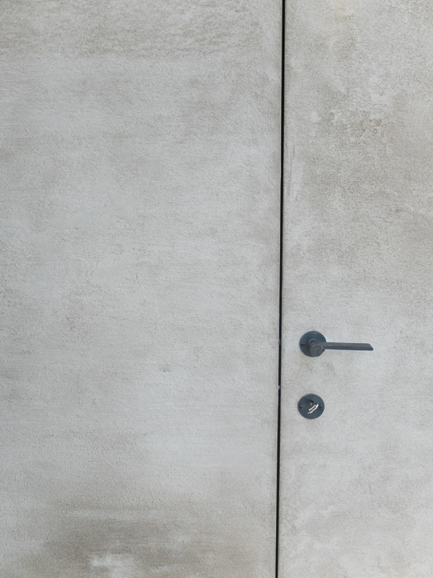
The project also uses texture painting interior techniques to shape the feel of the living areas. On the lower level, the walls were finished in polished travertino concrete, a surface that sits somewhere between stone, plaster, and a soft mineral wash. It brings a denser visual field to the ground floor and stands apart from the lighter planes seen elsewhere in the home. The shift from smoother surfaces to more worked walls is easy to read, especially where daylight lands on the finish.
Seen together, the wall treatments do not try to dominate the room. A matte lime paint look walls effect appears in the images, with pale surfaces that hold light rather than bounce it. Near them, the marble veining wall introduces movement through line and pattern. This is where texture painting interior work becomes most visible: not as a single feature wall, but as a series of decisions that change how light settles across the room.
Material contrast that stays visible
The strongest contrasts in the project are close-range ones. Copper-colored faucet hardware sits against stone-like surfaces. A glass shower partition cuts through the bathroom without closing it off. The floor finish keeps the room grounded while the wall texture carries more visual weight. None of these elements is isolated. Each one becomes clearer because the surfaces around it are less outspoken.
That approach gives the home renovation a direct, readable interior language. The rougher finish of the treated walls, the smoother wash of the microtopping floors, and the polished travertino concrete on the lower level all speak to one another through texture rather than ornament. Even when the finishes are subtle, they remain distinct. The eye keeps moving from grain to sheen, from matte to reflective, from wall to floor.
Open rooms, large windows, and the way light lands
The living spaces are open, and the large windows with dark profiles make that openness obvious. Daylight reaches deep into the rooms and throws shadows across the floor, which is useful in a project built around surface changes. Microtopping responds differently to light than the matte wall finishes do, so the rooms never feel visually static. The view of the interior keeps changing as the light shifts across the day.
In the kitchen zone, the long island anchors the space. A stone worktop sits over the base, while pendant lights hang above it and mark the center of the room. The setting stays restrained: white wall planes, broad openings, and a floor finish that carries the same calm tone from one zone to the next. The kitchen does not announce itself with excess detail. It is defined by proportion, by the island in the middle, and by the way the surrounding finishes stay in step with it.
Where the lower level changes texture
On the lower level, polished travertino concrete gives the walls a different register. The surface looks more solid and more mineral than the lighter finishes upstairs, and that change can be felt even without adding new colors or patterns. It is a practical way to keep the level distinct while staying within the same material family. The lower level does not need a separate visual language; the polished travertino concrete already marks it out through texture alone.
The detail matters because the project is built on controlled contrasts rather than bold gestures. The wall finish on the lower level, the microtopping on the floors, and the bathroom surfaces all work through touch as much as sight. You see where the surface has been worked. You also see where it has been left quiet. That difference keeps the interior readable from one room to the next.
Minimal built-ins and clear circulation
Elsewhere in the house, the built-in storage stays visually quiet. A white cabinet wall with integrated vents runs along one side, and a rounded opening leads to glazed doors. These elements do not interrupt the room; they shape the route through it. The same applies to the door panels and the broad white surfaces nearby. They form a backdrop for the stronger finishes, allowing the textured materials to carry the project.
The open circulation also helps the materials connect. From the bathroom to the living areas, the home renovation keeps returning to the same tactile vocabulary: microtopping bathroom surfaces, microtopping floors, texture painting interior walls, and polished travertino concrete below. The rooms differ, but the finishes are in conversation. That is what gives the interior its calm structure: not a single statement surface, but a sequence of textures that stay legible as you move through the house.
Small details that hold the composition together
Some of the most telling details are the smallest ones. The copper-colored handhold and accessories in the bathroom sit on a matte wall and gain emphasis precisely because the surface behind them is quiet. The glass shower partition keeps the room open, but it also frames the textures inside the shower zone. In the kitchen, the pendant lights hover above the island and create a second rhythm across the room, separate from the floor and wall finishes below.
That is why this home renovation reads so clearly in images. Every finish has a specific role. The microtopping floor carries the eye forward. The bathroom walls add grain. The polished travertino concrete marks the lower level. The matte lime paint look walls and the marble veining wall keep the interior from feeling one-note. Nothing shouts, yet nothing disappears. The project is held together by surfaces that are easy to read, close up and from across the room.
A project defined by surface, not ornament
What stays with you is the sequence of materials rather than a single dramatic feature. Microtopping bathroom surfaces, microtopping floors, and polished travertino concrete each appear in a different part of the house, but they are linked by the way they catch light and define the room. The open-plan layout, large windows, and restrained built-ins give those surfaces space to do their work. In the end, the interior is shaped by finish, edge, and reflection.
Want to see more of Texture Painting? View the page of Texture Painting for even more great projects and company information.




NEW 2026 Jubileum Edition The Best Interior Designers Benelux
Order Now €125


NEW 2026 Jubileum Edition The Best Interior Designers Benelux
Order Now €125


NEW 2026 Jubileum Edition The Best Interior Designers Benelux
Order Now €125


