Fly house: central fireplace, sunken living room and mezzanine vide in a rectangular floor plan
A single fireplace sets the pace for the rooms around it. In this compact volume, the house with central fireplace and rectangular floor plan is organized as a clear sequence: the sitting area, dining zone and open kitchen gather around the fire, while level changes keep the plan from feeling flat. The result is direct and easy to read. You move from one zone to the next, but the hearth keeps every space in view.
Rooms arranged around the fire
The living areas around the fireplace are placed inside the rectangular footprint without wasting space. The hearth sits at the center, so the seating area, dining table and open kitchen all relate to the same point. That choice gives the interior a strong order, but it also leaves room for small shifts in height and sightline. Instead of one broad room, the plan breaks into distinct parts that still stay connected. A compact volume can feel static; here, the central fire keeps it active.
From the first glance, the layout reads as a controlled grouping of domestic functions. The kitchen opens toward the dining area, which in turn meets the sitting area near the fire. The plan remains rectangular, yet the rooms do not line up as a simple corridor of furniture. Each part claims its own place. The fire is the anchor, and the surrounding zones turn around it rather than away from it.
Level changes shape the daily route
The strongest spatial move is the shift in floor levels. The sunken living room lowers the seating zone and gives it a more enclosed feeling without adding walls. A few steps change the mood immediately: the seat pit pulls the room closer to the ground, while the rest of the house stays visually open. That change is subtle, but it defines how the family room is used and experienced.
At the breakfast nook, the ceiling opens upward through a mezzanine vide and landing connection. The upper floor is not hidden away; it looks back into the heart of the house. Light moves through the opening, and the upper landing becomes part of the daily view. This connection gives the morning area its own identity, even though it remains tied to the main living level. In a plan based on clear geometry, the vide adds a vertical pause.
A seat pit next to the hearth
The sunken living room does more than mark a difference in height. It creates a lower field for the sofa and chairs, making the fire feel closer and the room more inward-looking. Because the seating area drops below the surrounding level, the edge of the living zone becomes readable at once. The change is small enough to keep the plan compact, yet strong enough to make the room feel distinct.
The opening above the breakfast area
The breakfast nook sits beside the mezzanine vide and landing connection, so it receives light from above as well as from the façade. The framed opening enlarges that effect. It gives the nook a clear edge and draws attention upward, toward the upper floor. The space is simple in plan, but the vertical link makes it feel more layered than a conventional eating corner.
Light enters through a single framed opening
The front of the house is mostly closed, which makes one large framed window stand out even more. This opening brings morning light directly into the breakfast area, where it is strongest in the early hours. Because the rest of the front remains restrained, the frame reads like a cutout rather than a broad gesture. It marks the interior from outside and the vide from within. The window is not only about view; it also explains the section of the house.
On the opposite side, the back facade is fully opened. Living spaces and bedrooms face southwest, so the house is set up to take in light and long views later in the day. That orientation changes the atmosphere from room to room. The front controls exposure, while the back opens wide to the garden side. The contrast between closed and open is not decorative. It follows the way the rooms are used and where the sun reaches them.
North at the entrance, southwest in the rooms
The entrance, toilet, wardrobe and staircase are grouped on the north side, close to the more enclosed front edge. That placement keeps the practical parts of the house in a quieter strip, leaving the principal rooms free to face the better light. The stair rises beside the entry sequence, while the storage and toilet stay tucked into the same zone. It is a compact move, but it makes the rest of the plan feel open by comparison.
In the living areas and bedrooms, the southwest orientation brings daylight deeper into the rooms. The direction matters here because the opening strategy is not uniform. One side of the house is held back; the other is released. The plan uses that difference to separate arrival, circulation and daily life. Even without adding complexity to the footprint, the house gains a clear internal rhythm.
Openings, surfaces and the view to the garden
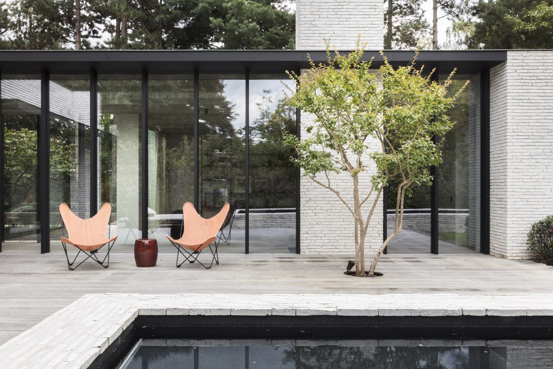
From outside, the house reads as a compact white volume with dark window openings and strong rectangular cuts. The front remains controlled, but the rear glazing stretches wider and lets the interior meet the garden more directly. In the images, the landscape is shaped with gravel, lawn and narrow planted beds, which echoes the strict lines of the house. The exterior setting stays orderly, but the large openings loosen the edge between inside and outside.
Inside, the large glass panels keep the living room connected to the garden while the floor finish and low seating emphasize the horizontal line of the room. The interior does not rely on ornament. It uses proportion, framed openings and the shift between closed and open surfaces. That approach gives the house its character: a rectangular plan that is calm on paper, but active in section, light and movement. The fireplace remains at the center of that reading from start to finish.
Photo credit: Annick Vernimmen.
Want to see more of JUMA architects? View the page of JUMA architects for even more great projects and company information.



NEW 2026 Jubileum Edition The Best Interior Designers Benelux
Order Now €125


NEW 2026 Jubileum Edition The Best Interior Designers Benelux
Order Now €125


NEW 2026 Jubileum Edition The Best Interior Designers Benelux
Order Now €125