










Interior with curved opening and custom joinery
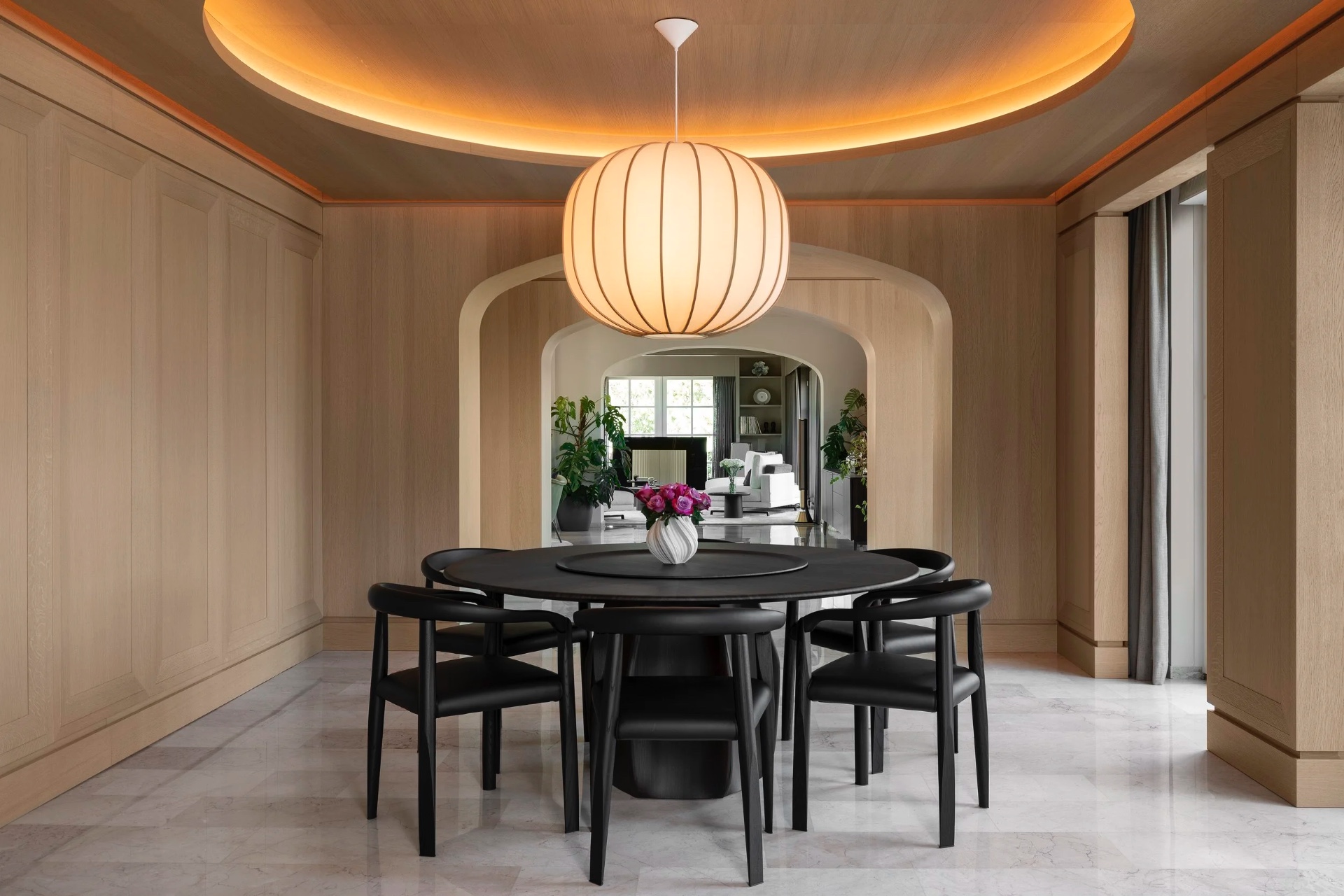
A curved opening catches the eye before the room does. Light slips in from the large glazing, slides over the stone-look flooring and lands on warm wood around the passage. The route toward the living area is not a straight cut through the plan; it has been turned into a visible transition. In this interior with curved opening, openings, joinery and finishes keep answering one another, so the space reads clearly without feeling hard.
The curved passage shapes the route into the living room
The rounded opening does more than soften a wall. It interrupts the direct line between dining area and living room and gives that move a clear frame. The recess around the opening reads almost like a piece of furniture, with wood lining the curve and easing the sharp edges of floor and window frames. That contrast is quiet but deliberate. Large windows keep the walls light, while the stone finish on the floor adds weight underfoot and gives the passage something solid to land on.
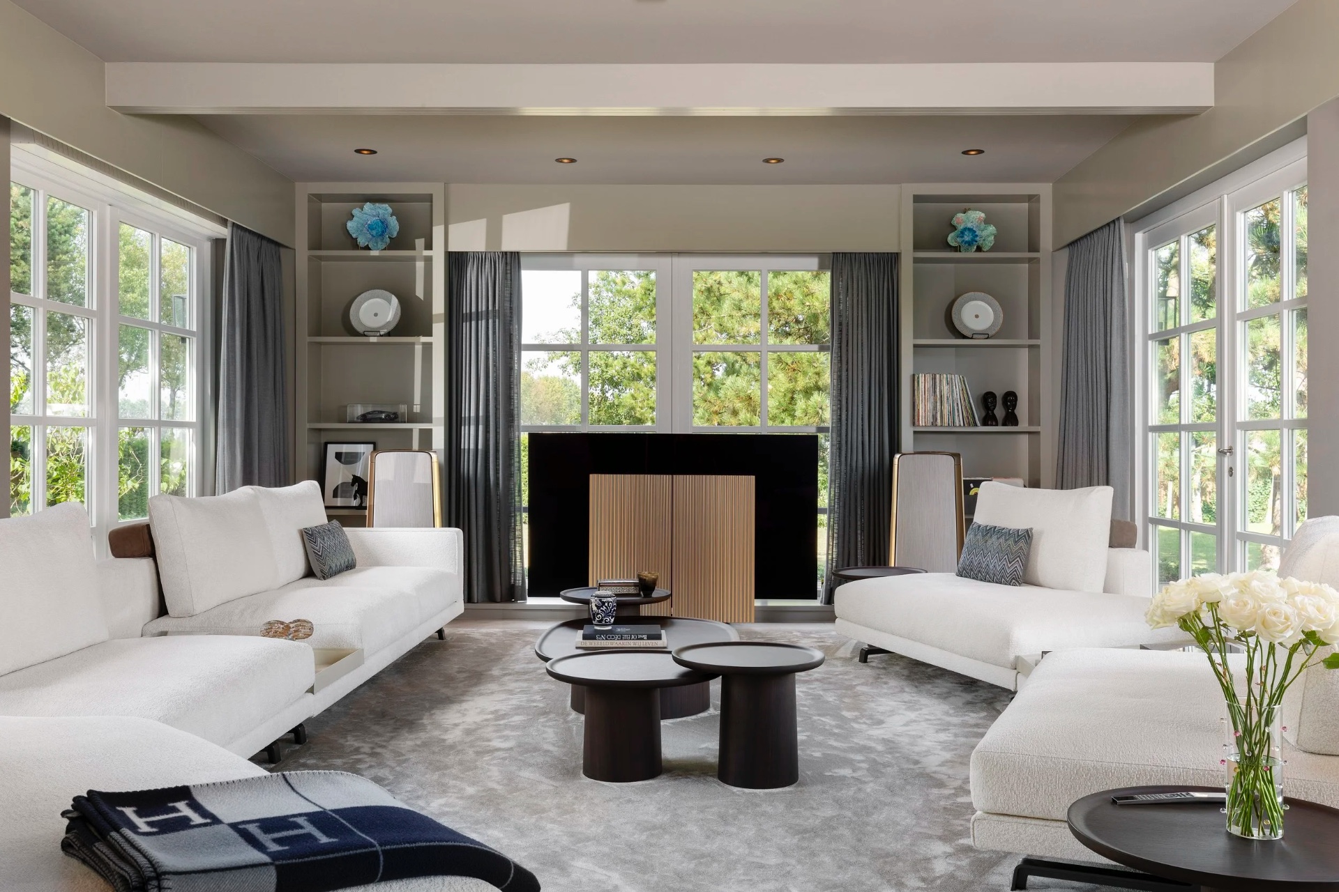
Seen from another angle, the same interior with curved opening works with a tight set of contrasts: grey curtains filtering the daylight, pale stone around the fireplace zone, and straight custom surfaces next to the rounded wall cut-out. Nothing competes for attention. The opening, the glass and the joinery each take a clear role, and the route through the house feels directed rather than decorated.
Custom TV wall and fireplace wall hold the living space together
The custom TV wall gives the living room a fixed centre. A central screen sits in a clean frame, while vertical ridges, open niches and fitted shelves set up a steady rhythm across the wall. Storage is built into the composition, but the wall never turns busy because the details stay recessed and ordered. The lighting sits back in the planes, so the joinery is read as layers rather than as separate units. With the tall windows nearby, the wall stays calm even though it contains a lot of work.
The fireplace zone continues that same language in lighter stone-look material. Its surround sits back enough to let the wood panels remain visible, and the pale surface keeps the hearth from feeling heavy. Glass, stone-look flooring and curved lines are brought together here without any need for decoration. The effect is strongest at dusk, when the built-in niches and the shallow light sources become more legible than the objects they contain. That is where the interior with curved opening shows its discipline: through the spacing of elements, not through excess.
Built-in niches keep the wall open
The built-in niches are small, but they do a lot of work. They break up the length of the custom wall and create pauses between the screen, the storage and the open shelving. Because the recesses are fitted into the same joinery language, they do not read as add-ons. They sit flush, with crisp edges and concealed lighting that gives depth to the wall at night. The plinths and trims continue neatly, which keeps the whole composition low and controlled.
Daylight, curtains and stone-look flooring set the tone
Daylight enters through generous windows and stretches across the stone-look flooring before it reaches the joinery. The floor carries the room visually, with a pale surface that reflects enough light to keep the interior open. Grey curtains soften the window edges and give the frames a more graphic outline. Instead of filling the room with objects, the project lets light and material do the work. The result is measured and specific: wood against stone, soft fabric against glass, rounded passage against straight wall planes.
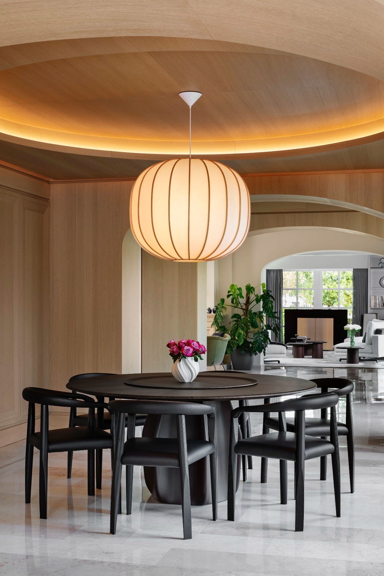
The dining area follows the same logic. A round pendant light hangs above the table and repeats the curved language of the passage without copying it exactly. Its warm glow is concentrated over the tabletop, so the dining zone becomes easy to read as a separate place inside the larger room. At the same time, the opening toward the living room stays visible in the background. In this interior with curved opening, the light fixture is not just a detail; it helps mark the change in scale between one zone and the next.
A round pendant light anchors the dining area
The round pendant light sits low enough to define the table surface and high enough to keep the view open toward the living room. Its circular form echoes the rounded passage, but in a more compact and domestic way. Underneath, the table area remains spare, so the pendant can carry the focus without competing with the joinery or the glazing. The composition works because the line of sight is never blocked: from the dining table, the curved opening, the floor finish and the large windows all stay part of the same sequence.
Marble-look bathroom keeps the same material language
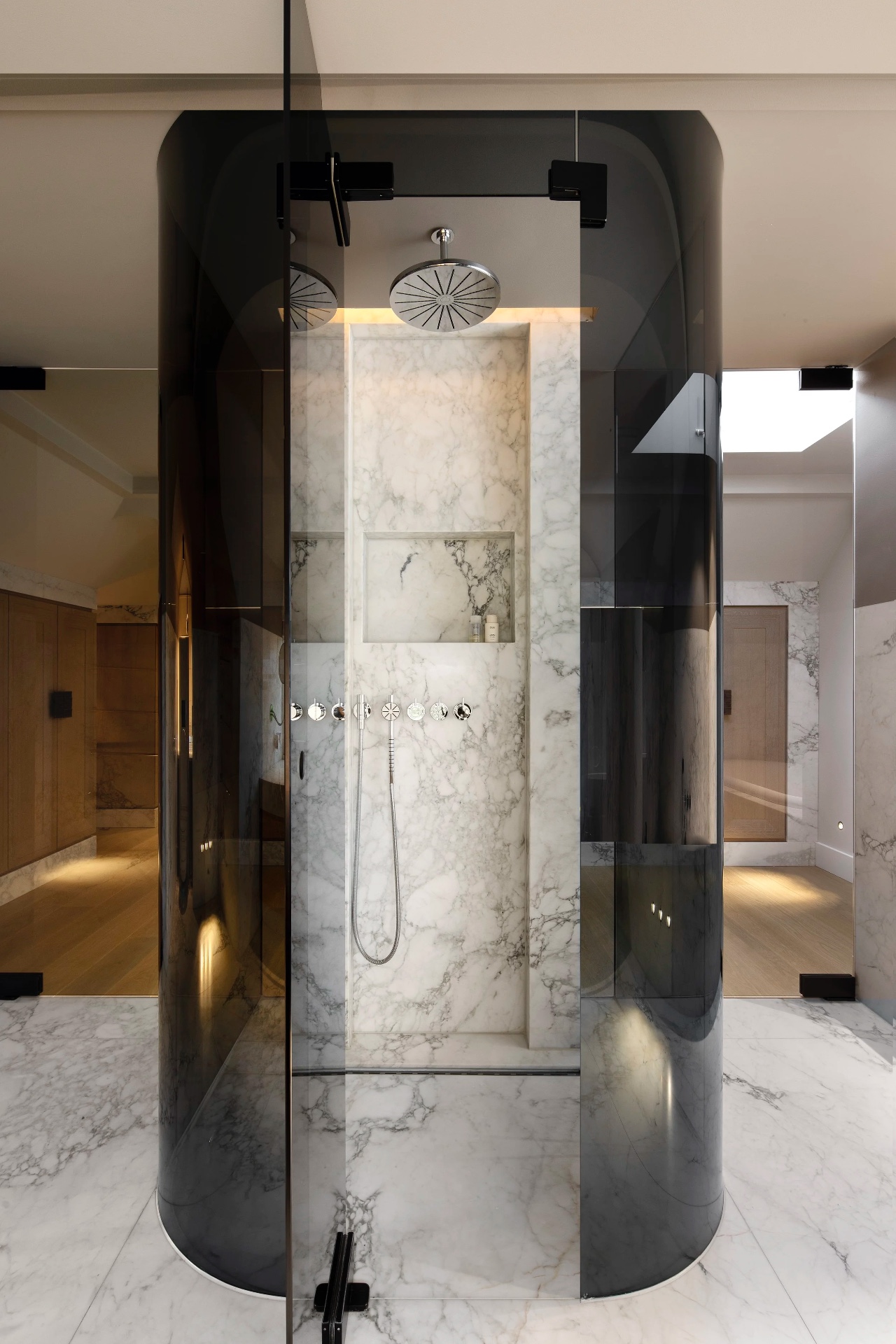
The marble-look bathroom extends the project’s material palette into a smaller volume. Light veining runs across the walls and floor, giving the room a continuous surface instead of separate panels. In the walk-in shower with glass panel, the transparent division keeps the shower zone open and lets the stone pattern remain visible. Black hardware adds a sharp note against the pale tile, but the room stays controlled because the fixtures are kept simple and the surfaces do most of the talking.
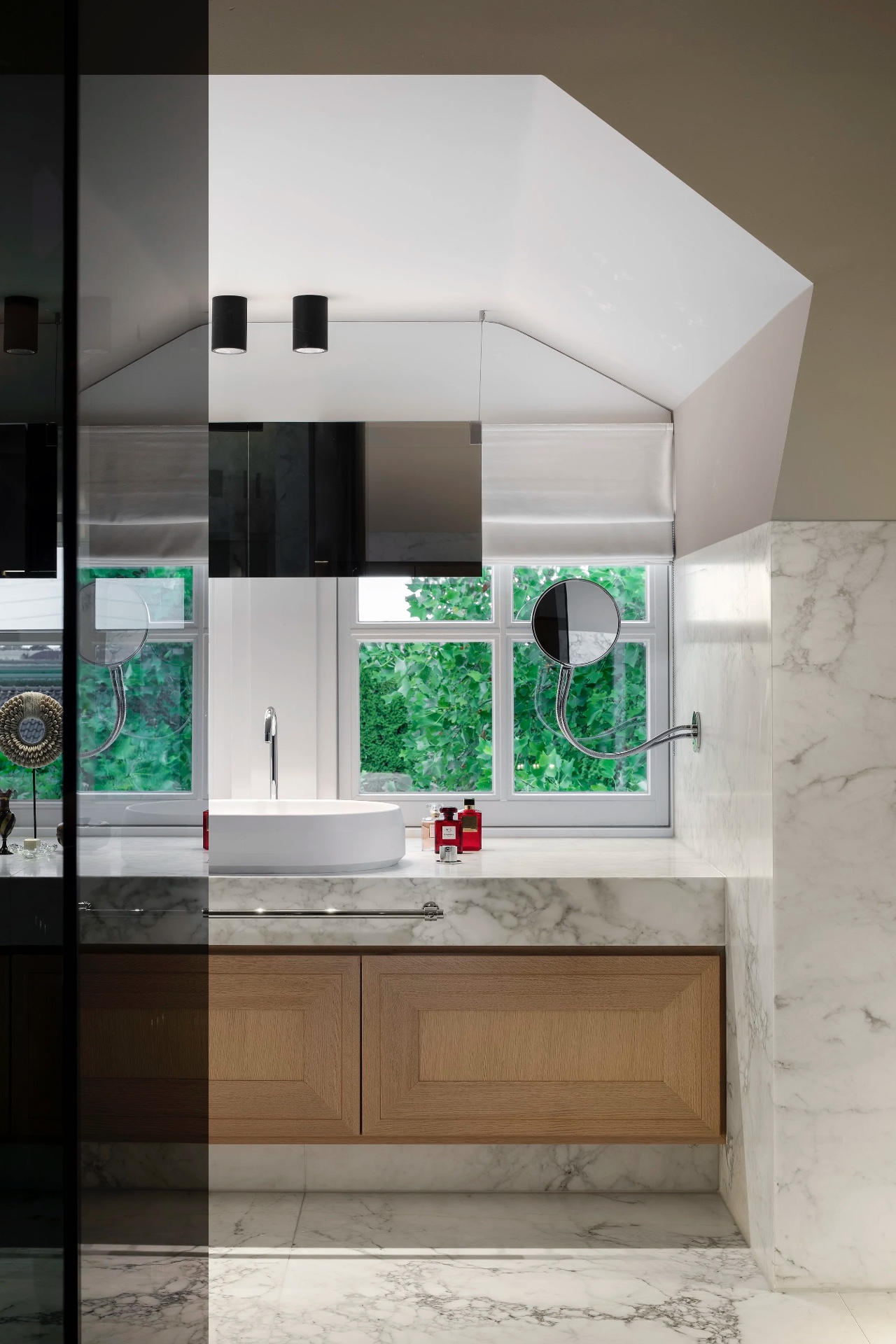
Another bathroom view adds a bathtub beside a glass partition, again with marble-look tile on walls and floor. The wooden vanity softens the colder sheen of the stone and gives the room a more grounded edge. Under the windows, indirect lighting skims the cabinet and makes the grain and front lines easier to read. The round mirror above the double basin rounds off the composition, while the black accents tie the fittings back to the darker lines elsewhere in the interior. It is a compact example of the same approach seen in the living spaces: clear forms, fixed surfaces and light used with restraint.
Double basin, round mirror and dark fittings
At the vanity, the details become more precise. The double basin stretches the horizontal line of the unit, while the round mirror interrupts that line with a softer shape. Black fittings and hardware mark the edges of the room and sharpen the pale stone around them. The wooden cabinet keeps the bathroom from reading as a single field of tile. It gives the marble-look bathroom a steadier base and makes the wall feel more like fitted furniture than a wet room finished after the fact.
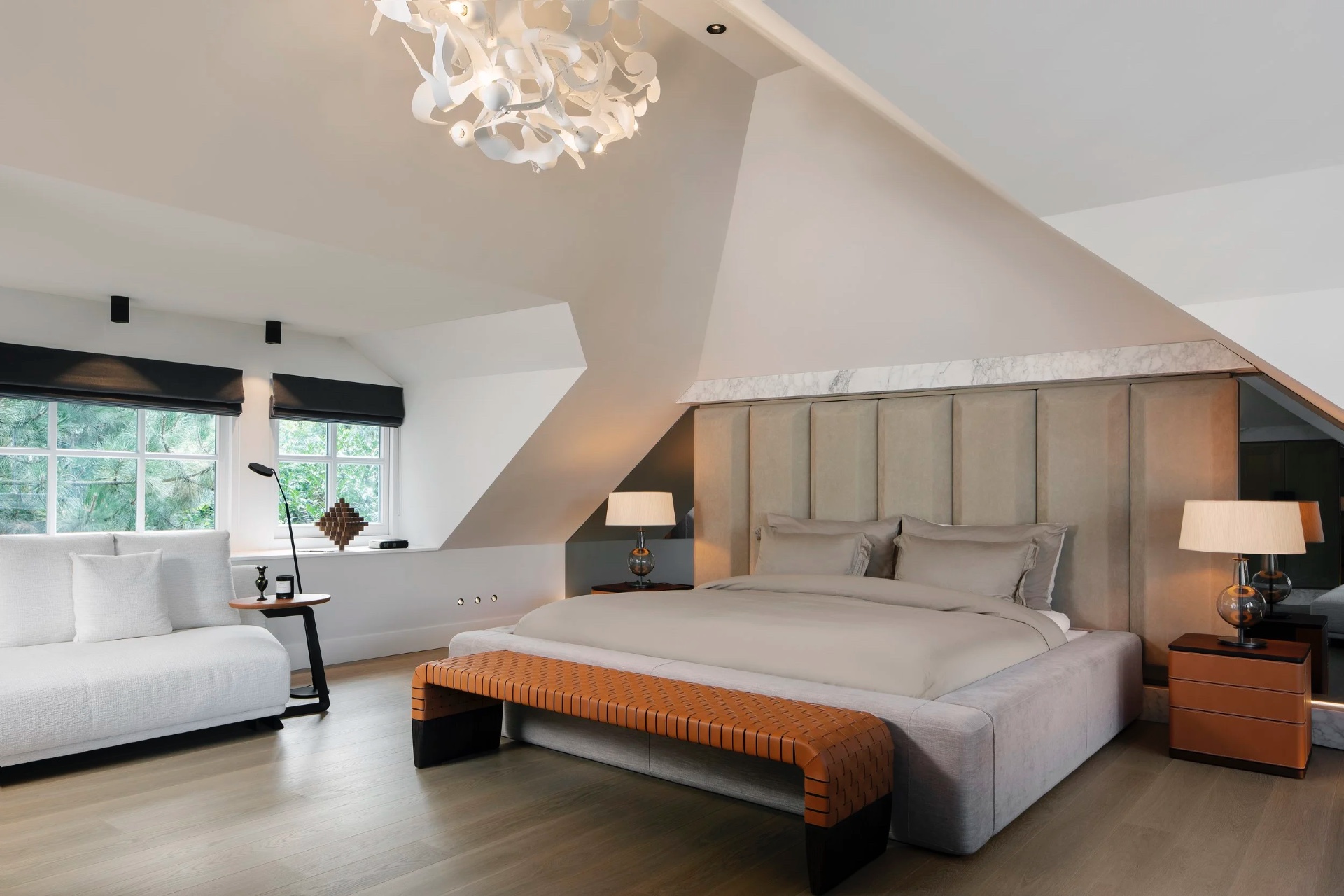
The bedroom continues the same preference for measured surfaces. A sloping ceiling shapes the room, and the built-in panels follow that angle instead of fighting it. Two windows bring in daylight, while recessed spots run along the ceiling and keep the lines visible after dark. The upholstered bed sits into the wall treatment, so the room stays contained rather than crowded. Here too, the interior with curved opening finds an echo: not through the same shape, but through the same attention to edges, joints and the way one surface leads into the next.
Across the whole project, the strongest moments come from transitions rather than from isolated features. The curved passage into the living room, the custom TV wall with built-in niches, the stone-look flooring under the daylight, and the marble-look bathroom with its glass panel all belong to one material conversation. Wood softens the geometry, stone gives it weight, and the glazing keeps the rooms connected to each other. The result is an interior where the route through the house is as important as the rooms themselves.
Want to see more of Guy de Vos? View the page of Guy de Vos for even more great projects and company information.


NEW 2026 Jubileum Edition The Best Interior Designers Benelux
Order Now €125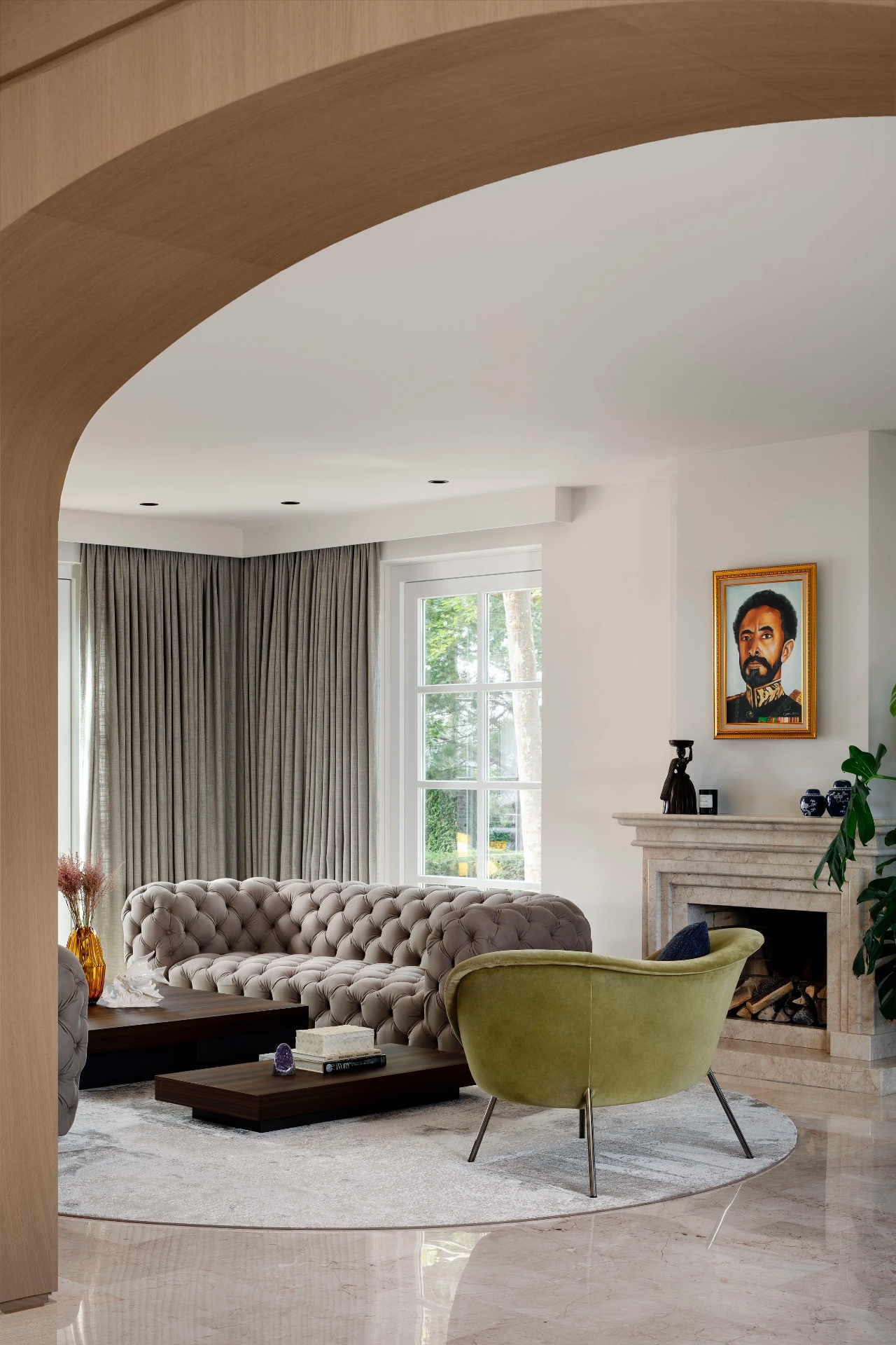
NEW 2026 Jubileum Edition The Best Interior Designers Benelux
Order Now €125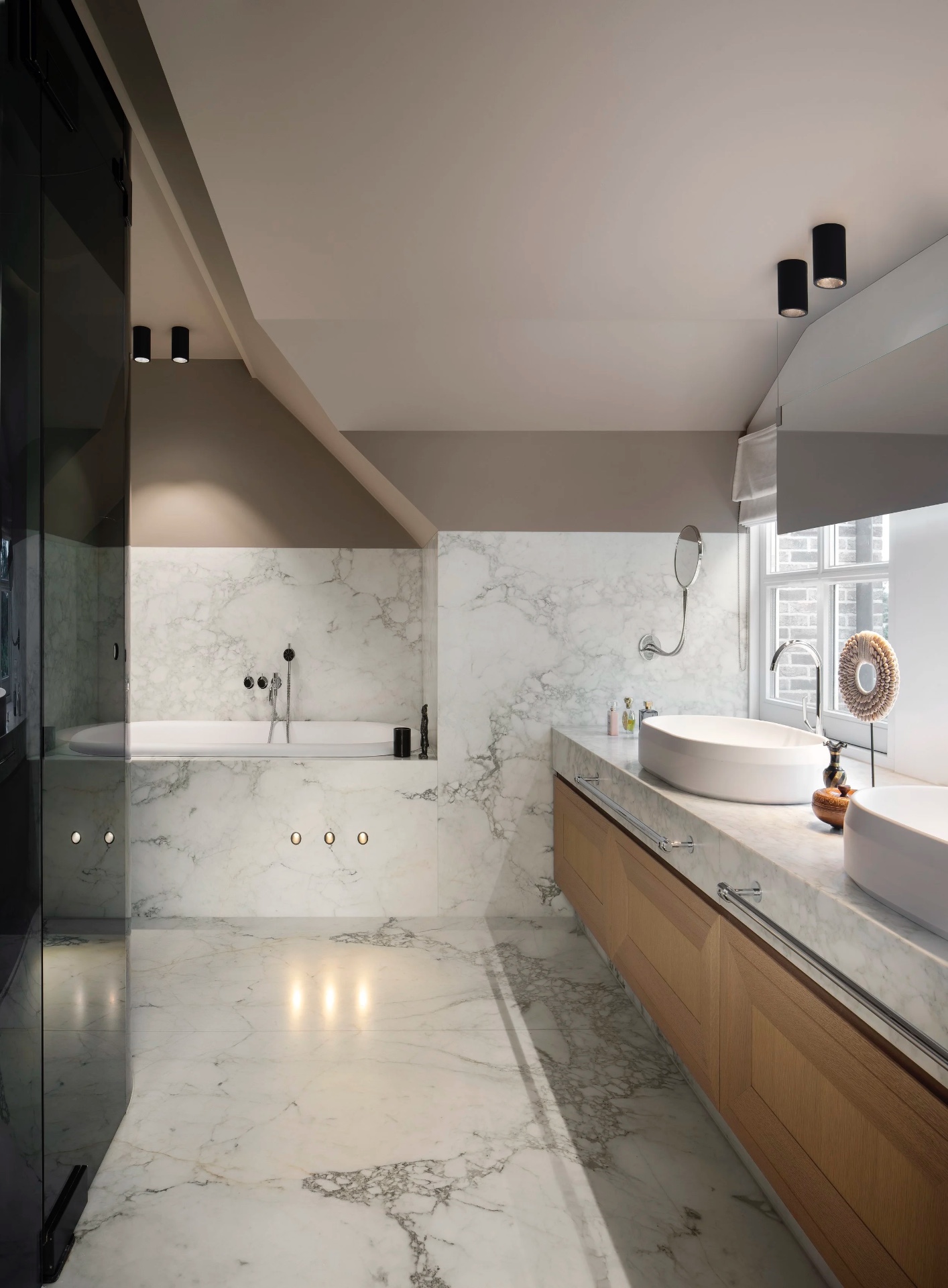
NEW 2026 Jubileum Edition The Best Interior Designers Benelux
Order Now €125


