Loft-style home with box-in-box layout and plan libre concept
Large panes set the tone before the plan is even read. Light reaches deep into the open living space, while the compact service rooms stay tucked away from the main route. The brief asked for the feel of a loft, but with the practical ease of a new-build home, and that tension shapes every move here. Breakfast can face the east, lunch can turn south, and the evening settles around the larger rooms instead of the corridor.
Open rooms, kept free for living
The first decision was to separate what needs to stay compact from what deserves space. Storage, a home office, and the technical rooms are gathered tightly, so the square metres that would have been lost to circulation can work harder in the living areas. That shift gives the open living space with large windows room to breathe. The kitchen, dining zone, and sitting area read as part of one field, but each still has its own edge, set by volume rather than by walls.
Two standalone boxes sit inside that larger field. They do not break the open plan; they organize it. One reads as a solid volume within another volume, a box-in-box interior concept that keeps the plan open while still giving the technical functions a clear place. The result is a plan libre layout that is not only carried by structure, but also by the way the practical rooms are folded into the composition. The house gains openness without losing legibility.
Two boxes inside one larger volume
Seen from the inside, the volumes act like pieces of furniture scaled up to architectural size. Their edges define routes and pauses, and they prevent the large room from turning vague. A day office, storage, and the kitchen sit within this structured core, leaving the rest of the floor available for movement, dining, and sitting. In a house shaped by a loft-style home with box-in-box layout, that distinction is essential: the plan stays open, but it never becomes empty.
Daylight enters across the glazing and catches on the lighter interior surfaces, making the volumes read even more clearly. The glazing also reveals how the rooms are arranged around each other rather than along a corridor. That is where the plan libre layout becomes visible. It is not a slogan here; it is a way of using the building’s depth, the position of the service zones, and the line of the openings to keep the larger rooms unbroken.
Sliding openings that pull the outside in
Along the south side, large sliding doors disappear into the facade line and open the interior toward the garden. The threshold stays low and direct, so the room reads almost like a continuation of the terrace rather than a space shut away behind glass. This indoor-outdoor connection with sliding facade elements is strongest in the living areas, where the wide openings expand the sense of depth and let the house register the changing light over the day.
The openings are not treated as isolated windows. They stretch the room horizontally and pull views across the floor plate, which suits the open living space with large windows already established inside. In the morning, the east-facing side catches the first light; later, the south side takes over. By evening, the house shifts again, with the open rooms holding the last sun while the compact functional zones remain quietly in the background.
An upstairs terrace that cuts into the volume
Upstairs, privacy is created not by closing everything down, but by carving out an enclosed terrace. It links the polyvalent room with the parents’ bedroom, so the upper floor gains a shared outdoor pause between the private rooms. The terrace sits as an interior court in the plan, giving the upper level a place where air and light can enter without exposing the whole floor. That move softens the transition between sleeping and flexible living.
The children’s rooms also open onto this enclosed terrace upstairs. A canopy shields them from the stronger southern sun, while the north side remains fully closed and holds the rooms that do not need daylight. That split is clear and practical. The quieter rooms gather on the shaded side; the more exposed rooms face the protected terrace. The upper floor therefore reads as a careful arrangement of openings and closures rather than a simple stack of bedrooms.
Light, shade, and the edges of the upper floor
The canopy gives the upper level a firm horizontal line. It marks the terrace, but it also controls how light lands on the rooms behind it. In plan terms, this is where the loft-style home with box-in-box layout changes scale: the ground floor feels open and expansive, while the upper floor turns more intimate through enclosure and shade. The contrast between those two levels is part of the project’s character, and it is drawn directly into the layout.
Because the north side stays closed, the house does not waste openings where they are not needed. The non-light-sensitive rooms sit behind that quieter wall, allowing the more active and social rooms to claim the glazed sides. This is one of the sharper moves in the house. It keeps the envelope disciplined, and it lets the enclosed terrace upstairs do more than simply offer outdoor space; it becomes the hinge around which the upper floor turns.
A facade drawn with white and black lines
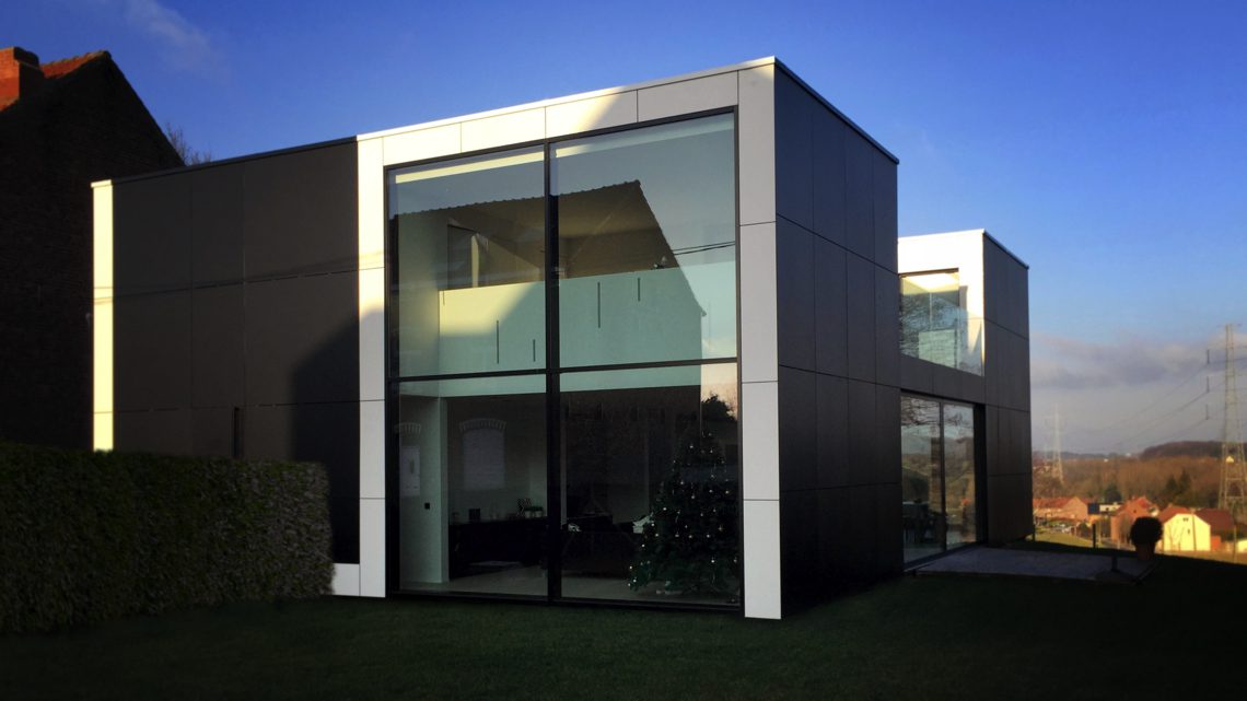
Outside, the house is held together by a strict line pattern in white and black facade cladding. The composition is restrained and exact, with the cladding making the volumes read as distinct bands and planes. Large glass areas interrupt that pattern, but they do not soften it. Instead, they sharpen the contrast between closed surface and transparent opening. The entry door follows the same logic, aligned to the line work so it reads as part of the composition rather than an afterthought.
The facade is less about decoration than about control. Horizontal and vertical lines steer the eye across the volume, while the darker panels keep the mass grounded. From certain angles, the glazing reflects the sky and nearby trees, and the opening set against the panel field becomes even more pronounced. That same clarity supports the whole project: a loft-style home with box-in-box layout on the inside, and a composed, graphic envelope on the outside.
Materials that make the volumes read clearly
White accents trace the edges of the openings, while the darker panels set back the larger surfaces. The contrast is strong enough to separate the parts of the house without needing extra ornament. In the interior, the hard floor surface and the white kitchen fronts keep the rooms bright and direct, so the open plan does not lose definition. Glass, panel, and light surfaces each take on a specific job, and the building’s logic stays easy to read from room to room.
What holds the project together is not a single gesture but the way each one supports the next: compact functional zones, two boxes set inside one larger volume, a plan libre layout that uses its structure well, and an upper level shaped by an enclosed terrace. Together they build a house that feels open where it should, contained where it must be, and clear in every line it draws.
Want to see more of CASTOR FIBER architectuurstudio? View the page of CASTOR FIBER architectuurstudio for even more great projects and company information.



NEW 2026 Jubileum Edition The Best Interior Designers Benelux
Order Now €125