Luxury Color Blocking Interior with Dark Blue Walls and Blush Accents
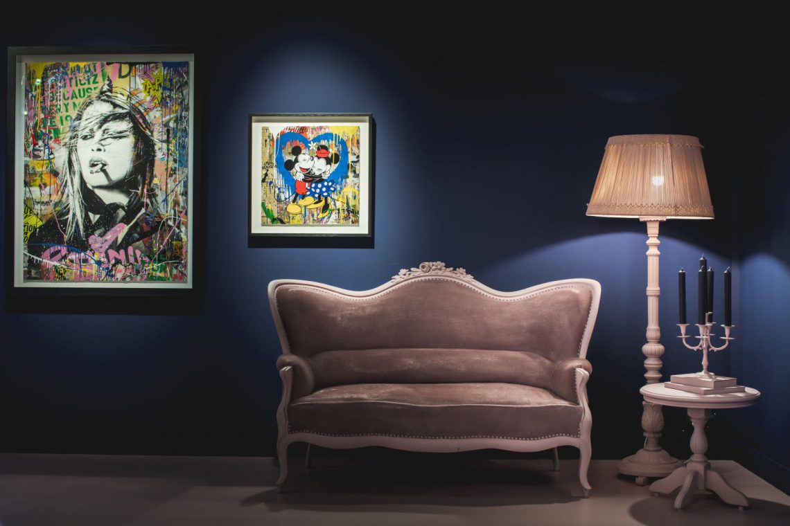
Dark blue walls set the pace from the first step inside. Against that deep background, blush pink appears in measured blocks, softening the room without dissolving its structure. The result is a luxury color blocking interior built from just two complementary colors, where framed art, upholstered seating, and small reflections in glass all stay legible. The palette does the organizing; the objects can speak without competing for attention.
Two colors, one clear reading of the room
The idea is direct: color blocking reduced to a restrained pair of tones. Warm dark blue holds the larger wall planes, while blush works as the connecting note that runs through the space. That contrast is visible in the way the art sits on the wall and in the way the furniture picks up the softer shade. Instead of mixing many finishes, the room relies on color to guide the eye from one surface to the next. It is a luxury color blocking interior that feels edited rather than assembled.
That choice gives the walls a strong graphic presence without turning them into a backdrop that disappears. The dark blue reads as quiet and dense, which makes the framed pieces stand out more clearly. Blush, by comparison, is lighter and more mobile; it appears where the room needs a visual bridge. The whole composition stays open because the palette is limited. Nothing has to shout to be seen.
A gallery wall built for framed art
The art walls work like a gallery wall with framed art, but without the stiffness of a formal exhibition room. Several works are grouped across the blue surface, with gold, black, and lighter frames catching the light in different ways. Some images are shown in close-up, others in wider arrangements, which gives the room a collected rhythm rather than one fixed viewpoint. The walls become surfaces for looking, not just for hanging.
Lighting supports that reading. Spot and pendant fixtures meet the wall at different heights, and a soft lamp glow lands on the furniture below. The framed pieces stay visible even when the room grows darker around the edges. This is where statement lighting for art matters: it keeps the eye moving between frame, wall, and seat without flattening the space. The lighting also reveals how the painted surfaces absorb light instead of reflecting it everywhere.
Framed work, repeated at different scales
The close-ups show how varied the framed art presentation can be within one scheme. Large compositions share the wall with smaller pieces, and each frame creates a slightly different edge against the blue. The arrangement avoids rigid symmetry. Instead, it reads as a series of pauses along the wall, each one marked by a frame, a reflection, or a change in proportion. That unevenness keeps the gallery wall with framed art from feeling decorative in a predictable way.
Seating that carries the same palette
Classic tufted seating anchors the room at a lower level. The upholstery appears in taupe and warm neutral tones, but the shapes belong to a more traditional language: buttoning, high backs, and armrests with clear outlines. These pieces sit easily in front of the blue walls because they do not try to dominate them. They give the room a place to pause, which is useful in a setting where the art is meant to stay in view. The classic tufted seating also adds another surface for the light to touch, especially along the raised seams and knotted details.
In some views, the sofa profile sits directly beneath a large framed work. In others, a matching chair or a lower seat introduces a quieter line beside a lamp or small table. The furniture does not break the color scheme; it extends it. Even when the upholstery shifts away from blush, the room still reads as one palette because the wall color and the art framing keep returning to the same conversation. That is what gives the luxury color blocking interior its order.
Light over fabric, wood, and glass
The images also show how the room handles material contrast. Soft upholstery sits beside wooden lamp bases, and glass surfaces catch small flashes of light near a buffet or display area. Those details are not loud, but they keep the palette from becoming flat. A pleated lampshade, a polished edge, or a frame corner is enough to shift the eye. The dark blue background makes those changes easier to read, while the blush accents prevent the room from feeling severe.
Where the palette becomes a spatial move
The strongest feature of the scheme is not the colors themselves, but the way they shape movement. A dark blue plane can hold a cluster of framed works, then give way to a lighter floor and a softer seating zone. Pink appears less as decoration than as a connector between those zones. Because the palette is so limited, the room reads in layers: wall, frame, seat, light. Each layer has a clear task, and none of them has to compete for effect. The luxury color blocking interior depends on that discipline.
Seen as a whole, the project balances gallery presentation with domestic scale. The wall composition is precise, but the tufted seating and shaded lamp light keep it grounded. That makes the room useful as well as visually sharp. It can hold art close up, but it also leaves enough breathing room for the furniture to remain part of the story. The result is a restrained interior with a strong sense of direction, built from two complementary colors and reinforced by framed art, lighting, and classic upholstery.
Want to see more of Yume Atelier by Mariska Jagt? View the page of Yume Atelier by Mariska Jagt for even more great projects and company information.



NEW 2026 Jubileum Edition The Best Interior Designers Benelux
Order Now €125


NEW 2026 Jubileum Edition The Best Interior Designers Benelux
Order Now €125