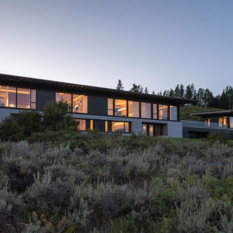
Minimalist villa interior with wood and concrete
Wood paneling for walls sets the tone from the first view, but the material never reads as decoration. It runs beside concrete surfaces, pale floor tiles and a stripped-back ceiling plane, so the room feels defined by lines rather than ornament. Light moves across the timber, then drops onto the harder surfaces below. The result is an interior that keeps its attention on material contrast, with each finish left close to its own texture.
Wood and concrete holding the room together
The clearest exchange is between the wood paneling and the concrete interior. Timber wraps walls and built-in elements, while the concrete holds the structure visually in place. That contrast appears again in the kitchen, where wood fronts meet a lighter worktop and a darker wall behind. The surfaces are not dressed up to soften one another. They stay legible, and that is what gives the rooms their calm. Even in the living and dining areas, the same pairing keeps returning in different proportions.
Across the project, wall paneling appears as part of the architecture rather than as a separate layer. Vertical grain, flat joints and fitted edges keep the surfaces tight to the room. The concrete and wood interior gains depth from those shifts in tone and texture. A light stone-like floor stops the palette from becoming too heavy, while the ceiling stays visually quiet. The materials do the work; the furnishings do not need to carry the space.
A clean ceiling finish with light set back into the plane
The ceiling is handled as one continuous surface, with recessed spotlights set into it rather than added below. That clean ceiling finish is visible in the kitchen, the living area and along the circulation spaces. In several rooms, the ceiling steps back from the glazing, which gives the upper edge of the room a lighter reading. It also leaves the walls and structural surfaces more exposed, so the concrete below remains present instead of being concealed by layers of trim.
Light follows the same disciplined line. Small spotlights are placed in rows, while linear accents appear in niches and fitted frames. The effect is not theatrical. It is measured, and it keeps the focus on the surfaces underneath. In the hall and stair zone, the light tracks the route through the house, catching the edge of a wall, a ceiling break, or a change in material. Those details are subtle, but they shape how the rooms are read from one end to the other.
Ceiling lines that stay low and clear
Several views show the ceiling as a series of flat planes rather than a single large gesture. That approach suits the stripped-back material palette. The rooms never rely on mouldings or layered trims to define themselves. Instead, the edges are crisp, the openings are clean, and the light is fitted into the structure. This kind of ceiling treatment gives the interior a clear horizon line, especially where the rooms open toward large glass surfaces.
Large glass with curtains to control daylight
Large glass with curtains appears throughout the project, and the soft fabric changes the light before it reaches the room. Some curtains are pale and nearly weightless in the frame; others are darker and sit deeper against the glass. They filter the brightness without turning the openings into a feature on their own. What matters is the way they let the rooms shift from open glare to a more muted light, while the concrete walls and wood surfaces keep their clarity underneath.
The glass openings also explain the sense of space. In the living zone, the room reads wider because the curtain line slips beyond the edge of the furniture area. In the stair views, the glazing pulls daylight across the steps and the adjacent wall. The same move repeats in the bedroom, where the curtain edge softens the transition between the wall and the window. These are quiet interventions, but they keep the interior from feeling closed in by its own materials.
Glazing, fabric and the edge of the room
The relationship between the glazing and the curtains is especially clear in the window zones. The fabric does not hide the glass; it frames it. In some images, the curtains sit in front of a darker wall or beneath a concrete beam, which makes their lighter folds more visible. Elsewhere, they fall beside wood paneling and turn the window area into a clear transition point. The room changes at that edge, from reflective glass to soft textile, from light to shadow, from open view to contained interior.
Kitchen, hall and stair details seen as one interior
The kitchen is not isolated from the rest of the house. It uses the same wall paneling, the same restrained ceiling treatment and the same material contrast seen elsewhere. A wood-fronted run of cabinets sits against a darker background, and the lighter work surface adds another level to the palette. Nearby, the hall and overloop continue that order with narrow walls, glazed doors and a concrete surface that stays visually present. The rooms connect through material, not through decoration.
The stair zone gives the interior its strongest change in level. Darker steps and a concrete-like structure make the route feel solid, while the adjacent glazing keeps the area open to daylight. From several angles, the stair sits beside curtains that soften the openings and stop the light from becoming harsh. That combination of hard and soft surfaces repeats the project’s main idea in a more vertical way. It is visible, not explained: the stair, the window and the wall all work in the same frame.
In the living and dining areas, the ceiling drops slightly and the lighting becomes more concentrated. The room keeps its open volume, but the fit-out draws the eye to the edges: a niche, a wall break, a line of spots, a panel of wood. The project never drifts into excess. Instead, it relies on precise joins and measured surface changes. That is where the interior feels most deliberate, especially in the way the concrete and wood interior carries from one room to the next.
Material detail over decorative effect
The project’s restraint is visible in the way the finishes are allowed to stay rough or plain. Concrete is not polished into something soft. Wood paneling is used where a wall needs warmth in tone, but it remains flat and structural in appearance. Even the floor works as a neutral base, letting the ceiling and wall lines stay prominent. This keeps the rooms from competing with each other. A bedroom wall, a kitchen run or a corridor surface can all speak in the same material language without repeating the same move twice.
The text source refers to Vektron ceilings and Kreon products, and that attitude is visible in the result: a preference for clean edges, sober detailing and lighting that sits inside the architecture. The project does not try to disguise the structure. It makes use of it. Wood paneling for walls, recessed spotlights and large glass with curtains all help define the same measured interior, where each room stays connected by line, shadow and surface rather than by display.
Want to see more of Kreon? View the page of Kreon for even more great projects and company information.



NEW 2026 Jubileum Edition The Best Interior Designers Benelux
Order Now €125


NEW 2026 Jubileum Edition The Best Interior Designers Benelux
Order Now €125


NEW 2026 Jubileum Edition The Best Interior Designers Benelux
Order Now €125


NEW 2026 Jubileum Edition The Best Interior Designers Benelux
Order Now €125