Modern brick house with large glazing and a luxury minimalist interior
The brickwork sets the tone before the interior ever appears. Narrow joints and a repeated window rhythm give the house a steady, measured face, while the larger glazed openings break that surface and pull daylight toward the rooms inside. The result is a modern brick house with large glazing that feels defined by openings as much as by walls. Through the glass, the composition shifts from solid masonry to white planes, timber, and a restrained light scheme.
Brick, glass, and a clear window rhythm
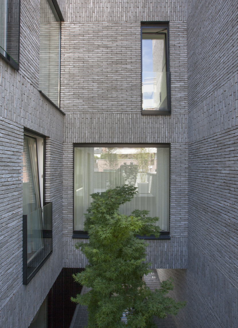
Seen from outside, the facade works as a sequence of solids and voids. Brick surfaces run across multiple planes, and the dark window frames keep the openings crisp against the masonry. In some views, a patio-like inner space appears between the brick walls, with a large glass frontage facing inward. That courtyard impression changes the house from a closed volume into one that opens toward its own center. It also keeps the modern brick house with large glazing readable from several angles at once.
A corner detail shows how the material palette stays consistent. Brick continues around the edge, while vertical strips of glass cut through the surface and catch reflections. Planting sits close to the wall in several images, softening the hard line of masonry without changing the architecture’s restraint. The repetition of openings, especially where the windows stack in a regular pattern, gives the exterior a measured pace rather than a showy gesture.
White surfaces and built-in storage shape the interior
Inside, the mood changes quickly. White wall volumes, open niches, and built-in shelves dominate the field of view, so the rooms read as composed rather than furnished. The white custom millwork and niches do more than store books or objects; they carve out smaller pauses within larger wall planes. In one room, those openings sit beside a fireplace-like recess, making the wall feel both practical and ordered. Against that white background, the warm wooden flooring becomes the main horizontal line in the space.
The interior stays close to a minimalist white interior, but it is never flat. Wide timber boards bring a warmer tone underfoot, and the floor boards run straight through hallways and living areas, linking the rooms visually. Curtains at a window opening temper the hard edges of the glazing, while the daylight from those openings keeps the walls bright without adding ornament. Because the millwork is built in rather than added later, the room surfaces stay clean and easy to read.
Open niches and quiet storage
The open niches appear in several views as shallow framed boxes set into white walls. Some are arranged like shelving, others like display recesses, and all of them keep the wall from becoming a blank plane. These details matter because they hold the eye without crowding the room. The built-ins also create narrow shadows at the edges of each opening, which makes the white surfaces feel more dimensional. That contrast is subtle, but it gives the interior a clear rhythm.
Warm timber under a restrained light line
Light is handled with the same discipline as the millwork. Linear ceiling lighting appears as a clean strip or a soft glow at transitions, tracing the room edges instead of competing with them. In the kitchen and living areas, that line helps define the perimeter of the space and keeps attention on the architecture itself. The warm wooden flooring then grounds the composition, preventing the white surfaces from becoming too stark. Together, the timber and the lighting establish the interior’s pace.
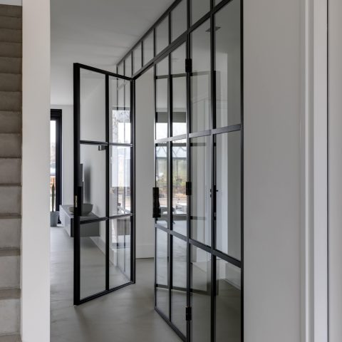
A hallway image shows how this approach continues in smaller spaces. White walls, a timber floor in long boards, and a curtain beside a window opening create a simple passage with natural light running through it. Nothing is overworked. Even the transition from one room to the next depends on surface changes rather than decorative breaks. That makes the modern brick house with large glazing feel carefully edited from room to room.
Kitchen details kept close to the wall
The kitchen reads as a long, quiet arrangement rather than a separate showpiece. White fitted kitchen details run along one wall, and the cabinetry stays low and compact in the frame. A wooden element sits in the foreground, adding a softer tone to the otherwise pale composition. The sink zone, with its tall faucet and straight worktop line, keeps the surface practical in appearance. Above and around it, the light line reinforces the length of the room instead of introducing visual clutter.
This kitchen treatment fits the broader interior language. White fronts, straight edges, and limited contrast allow the timber floor and the linear lighting to do more of the work. The space is readable at a glance, which matters in a house where the rooms already carry strong spatial cues from the large glazing and the built-in wall systems. Here, the details stay close to the architecture, not on top of it.
A bathroom built from texture and reflection
The bathroom changes the surface language again. Small mosaic tiles cover the walls in a warm tone, while a tall natural stone bathroom accent panel adds a vertical break beside the shower zone. A transparent glass edge near the shower keeps the room from closing in too much, so the materials remain visible from different angles. This is where the luxury mosaic bathroom reads most clearly: in the layering of small tile, larger stone, and clear glass.
The contrast between the mosaic field and the stone-like panel gives the room a strong but controlled composition. Instead of adding color, the bathroom relies on texture and proportion. The stone accent stands like a slim vertical plane, and the mosaics spread around it in a denser pattern. That arrangement makes the room feel more architectural than decorative. It is one of the few places in the house where the surfaces do most of the visual work.
Daylight, corners, and the way the house opens inward
Several images show how the house turns toward an internal opening or courtyard-like space. Large glass surfaces face that area, and the brick walls frame it on more than one side. In daylight, the contrast between the dark frames, the white interiors, and the brick shell becomes especially clear. This inward-facing view helps explain the project’s character: the house is not only about the outer wall, but also about the space gathered behind it. That glass facade opening/courtyard look gives the building a quieter center.
What stays with you is the precision of the sequence. Brick outside, glass in the openings, white built-ins inside, timber below, and controlled light above. Each part is legible. The modern brick house with large glazing does not rely on a single gesture; it is built from repeated details that keep the rooms connected while still allowing each one to read on its own. That is why the project feels consistent without becoming repetitive.
Across the facade, the hallways, the kitchen, and the bathroom, the same discipline holds. Masonry, glazing, timber, tile, and stone are all used in clear bands or planes, never mixed too freely. The house gives you long views, then close material moments: a niche edge, a floorboard seam, a tile pattern, a strip of light. Those small shifts are what shape the experience of moving through the interior and looking back at the exterior.
Want to see more of UAU collectiv? View the page of UAU collectiv for even more great projects and company information.



NEW 2026 Jubileum Edition The Best Interior Designers Benelux
Order Now €125


NEW 2026 Jubileum Edition The Best Interior Designers Benelux
Order Now €125