Modern clinic interior with functional reception
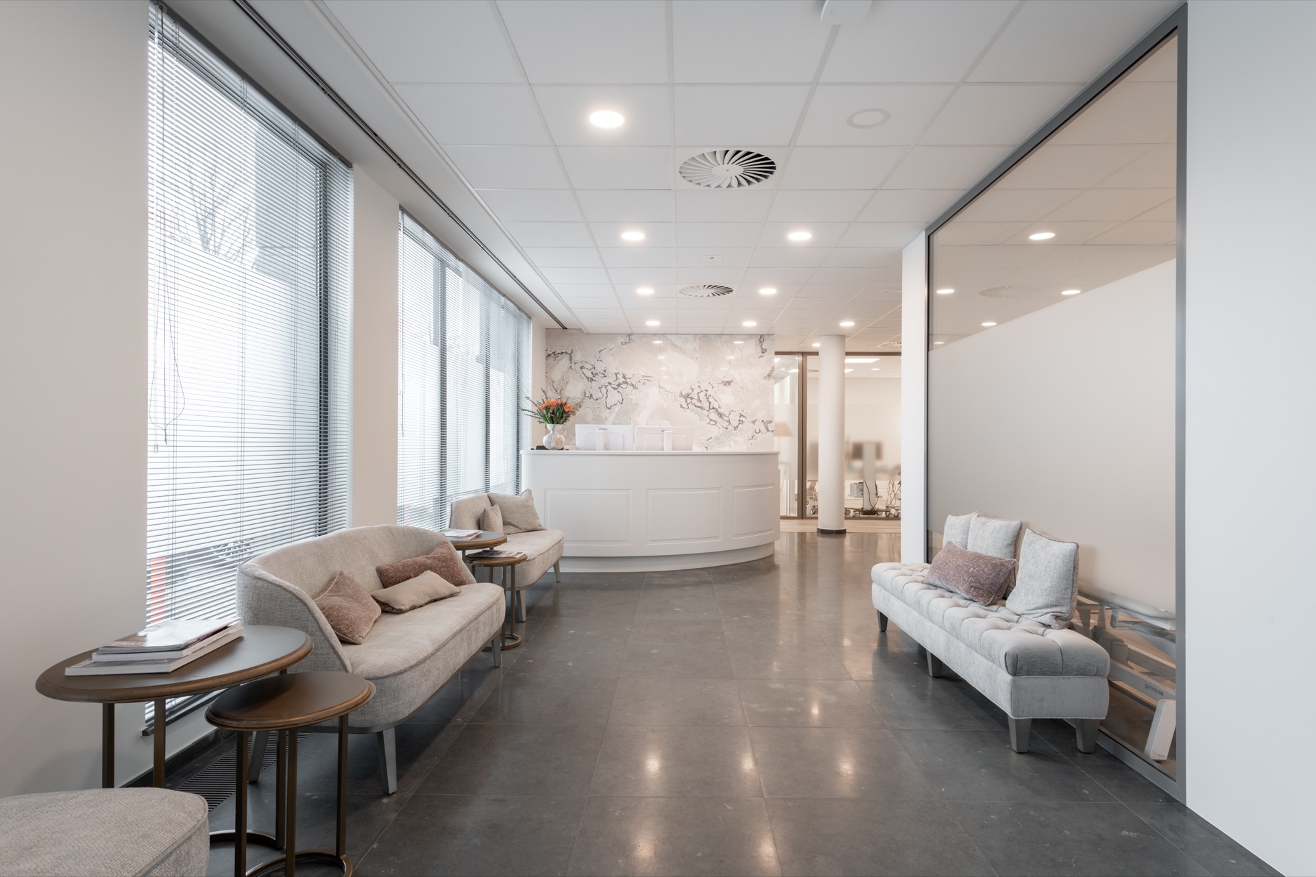
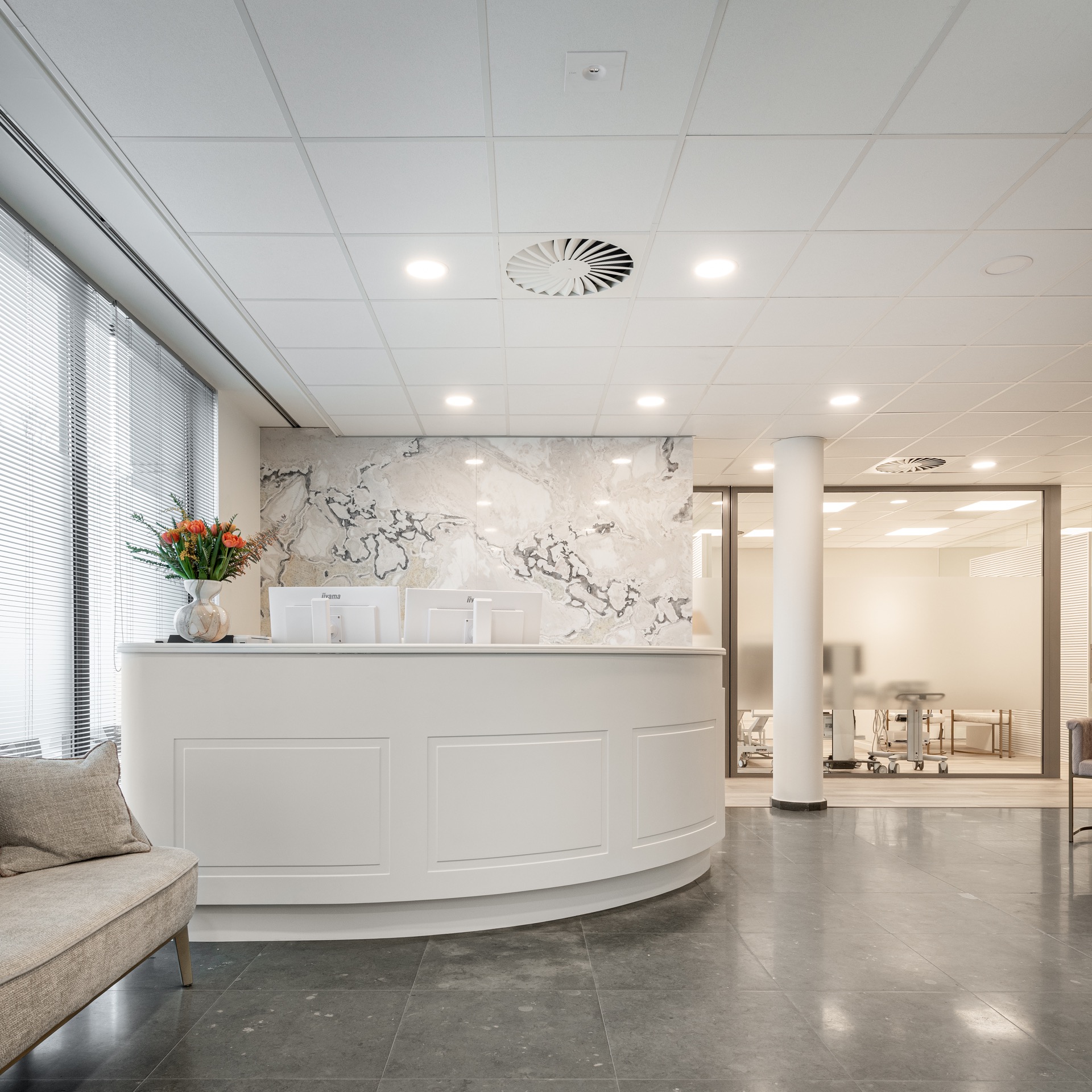
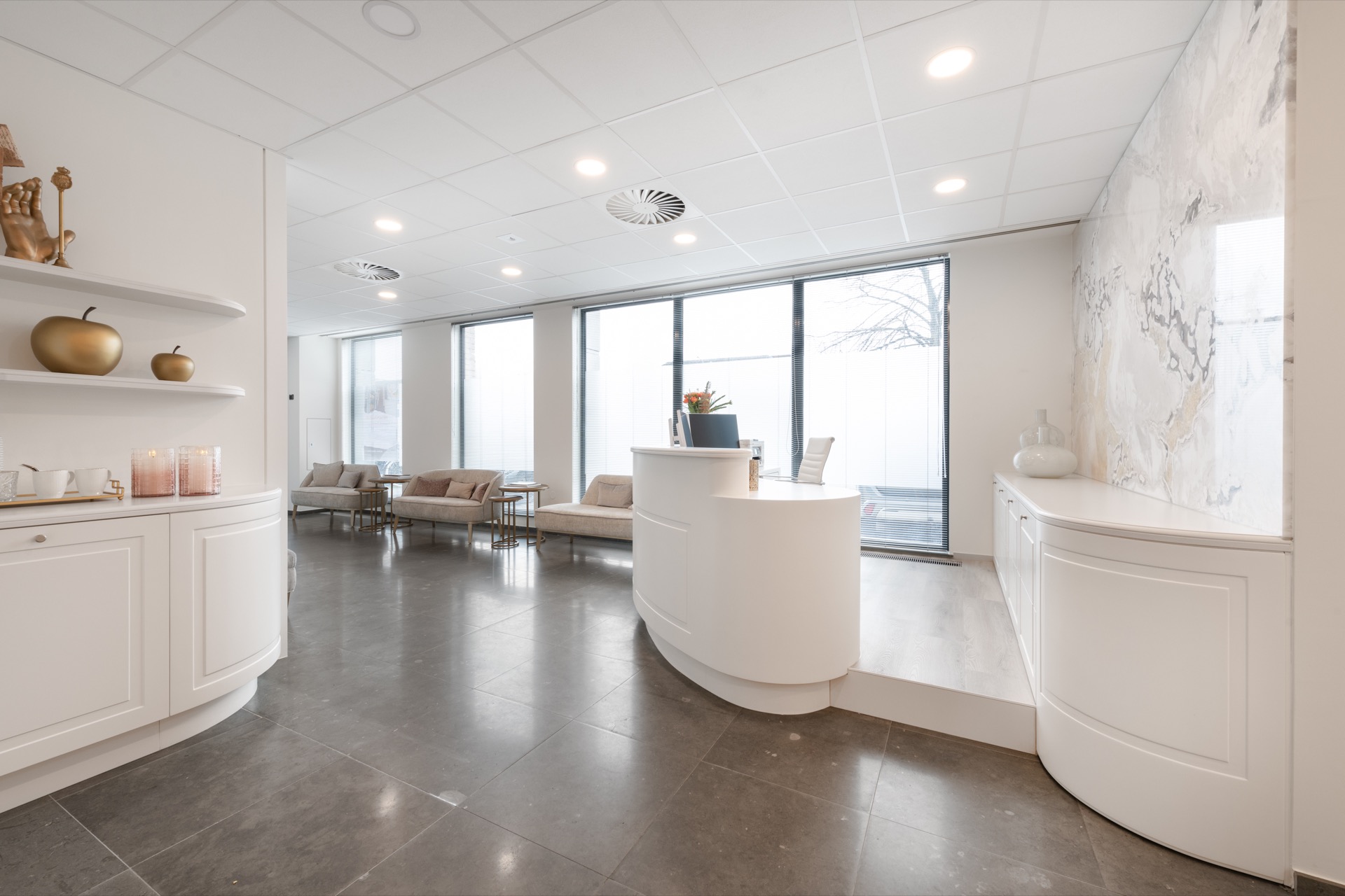
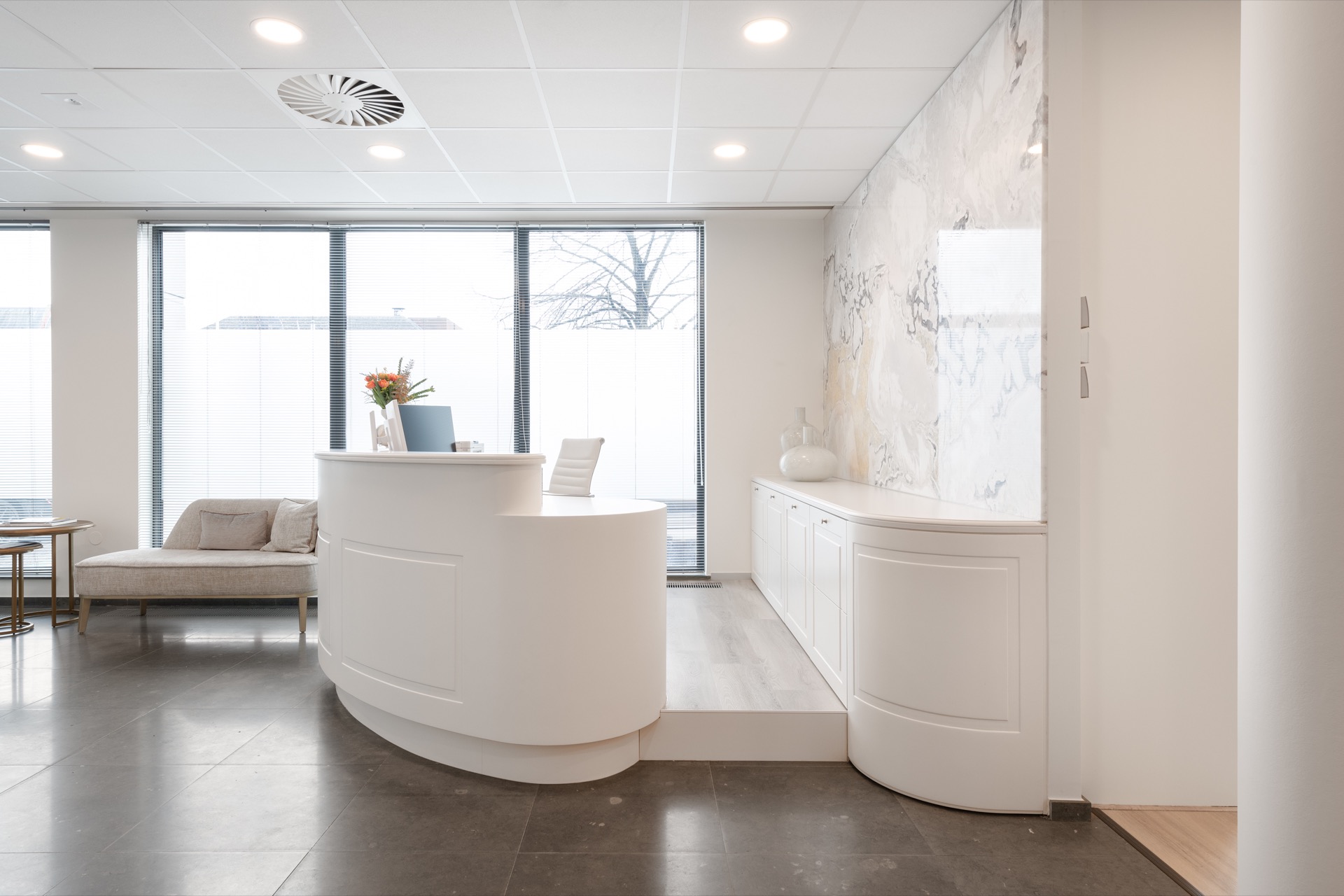
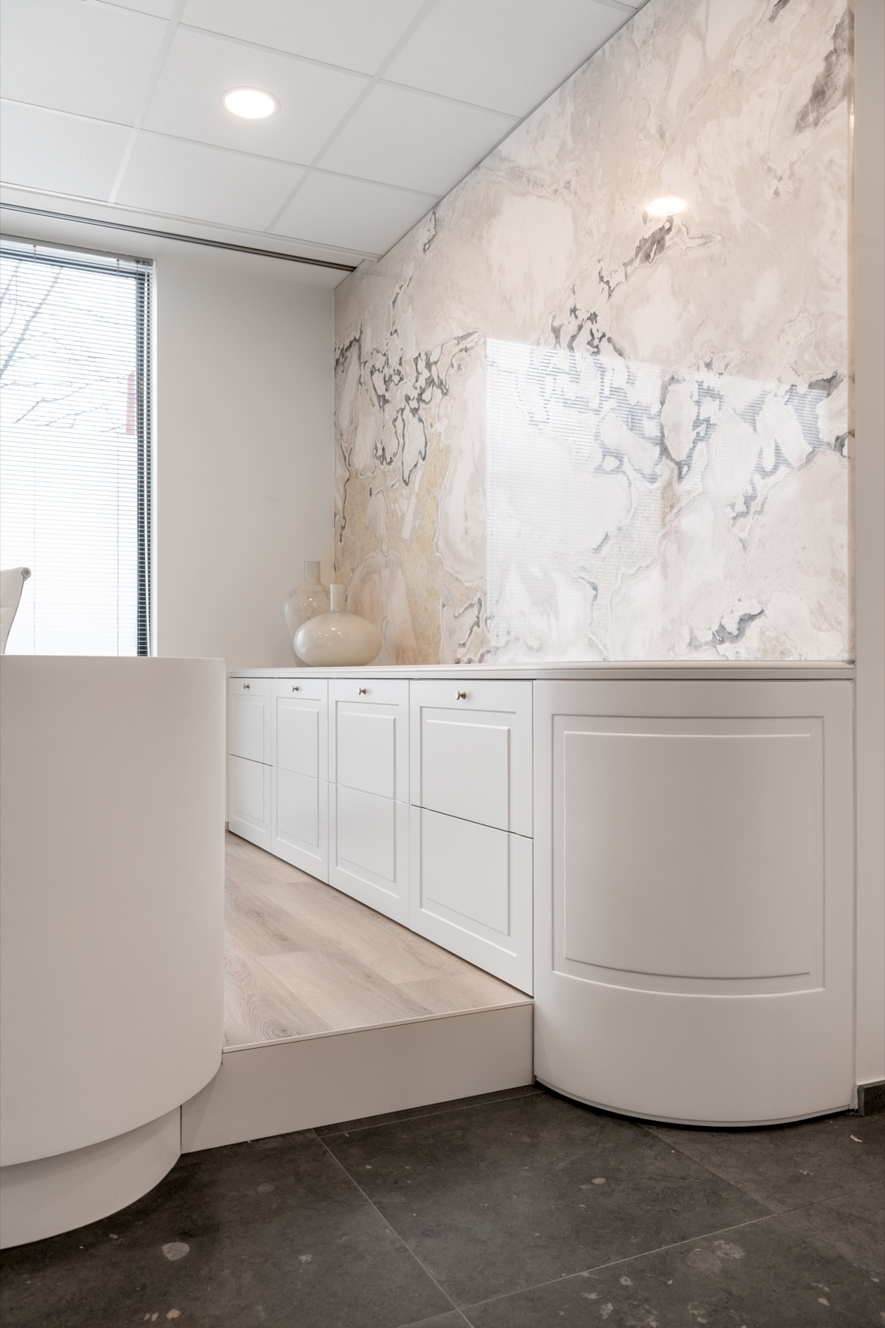
The first thing that registers is the white reception line cutting through the room, set against a marble-look wall panel and a ceiling full of recessed lights. The waiting area is broad and clear, with a low counter, paneled wall finishes and large windows filtered by horizontal slats. It reads as a modern clinic interior that keeps the route simple: arrive, sit, wait, move on.
A reception zone shaped by light and surfaces
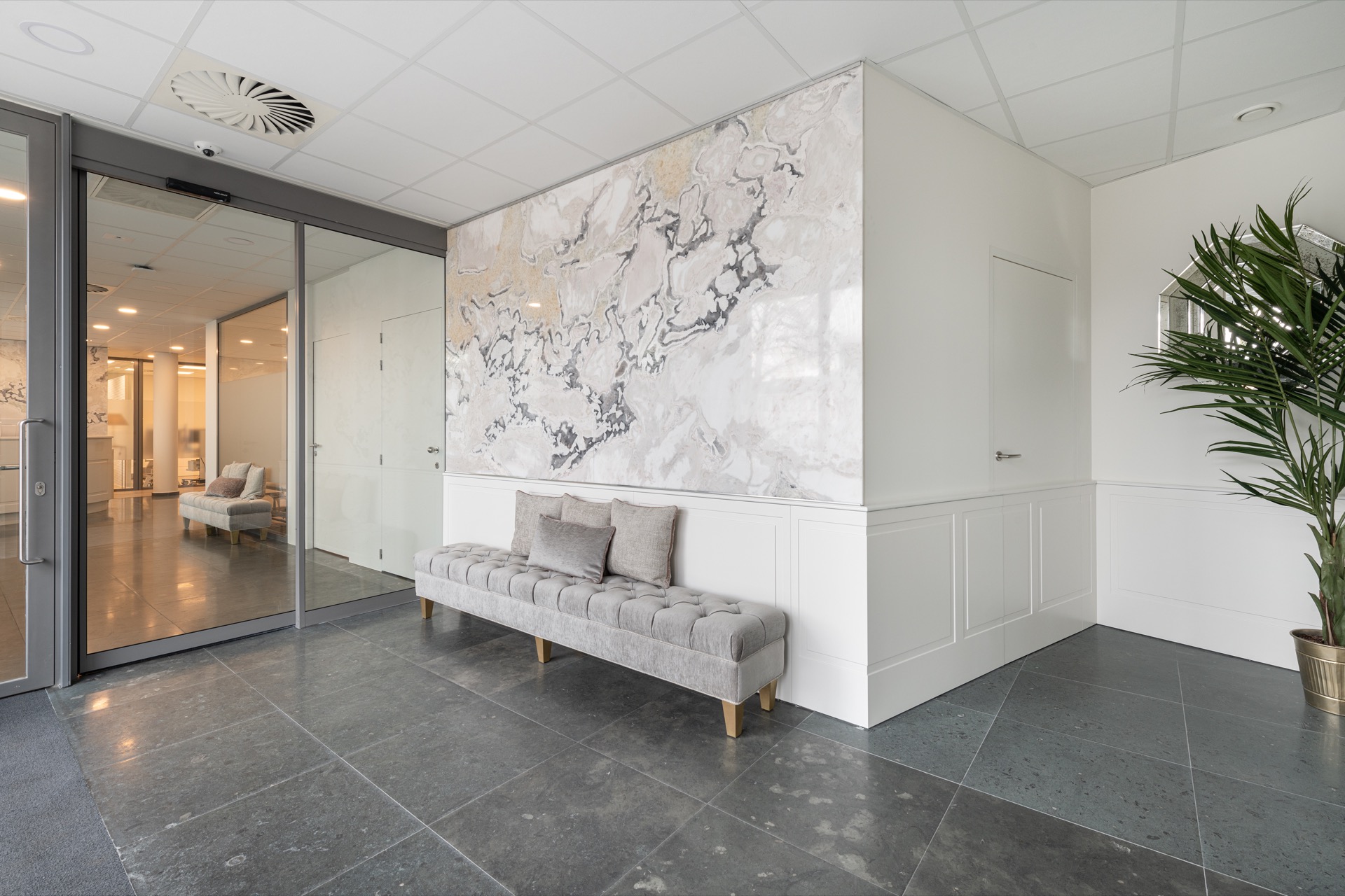
The waiting room and reception sit together as one continuous space, but the material shifts give each zone its own role. A rounded reception counter softens the geometry of the room, while the marble-look accent wall sets a brighter backdrop behind it. White paneling runs along the lower walls and cabinetry, breaking up the volume without making it busy. The effect comes from the arrangement of planes more than from decoration.
Above, the suspended ceiling recesses the technical layer of the room. Small downlights and round ventilation grilles sit in a measured grid, keeping the ceiling visually calm despite its function. That ceiling line also helps frame the reception area below. The light falls evenly across the counter, the wall panels and the seating area, so the room feels legible at a glance.
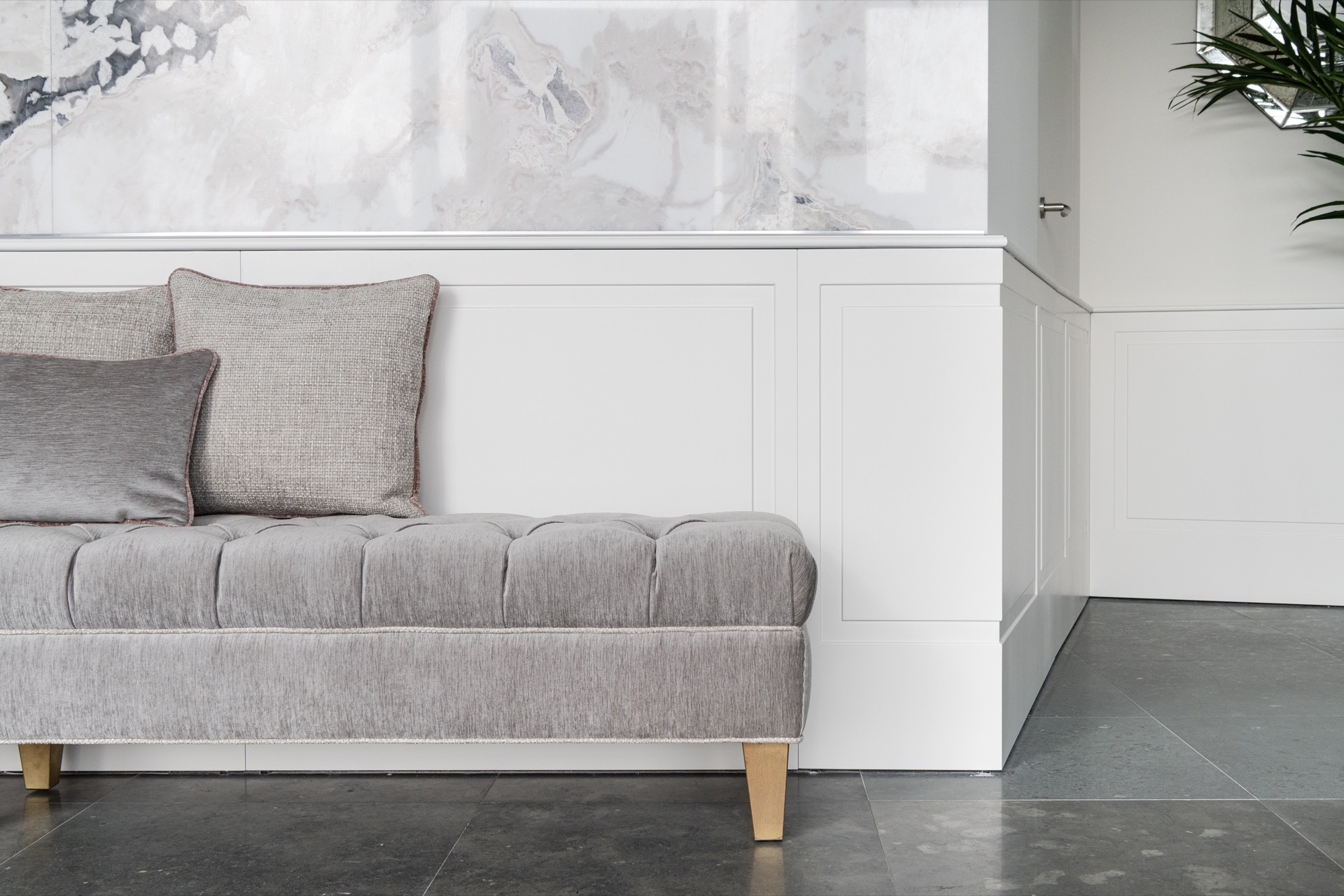
White joinery and paneled walls hold the room together
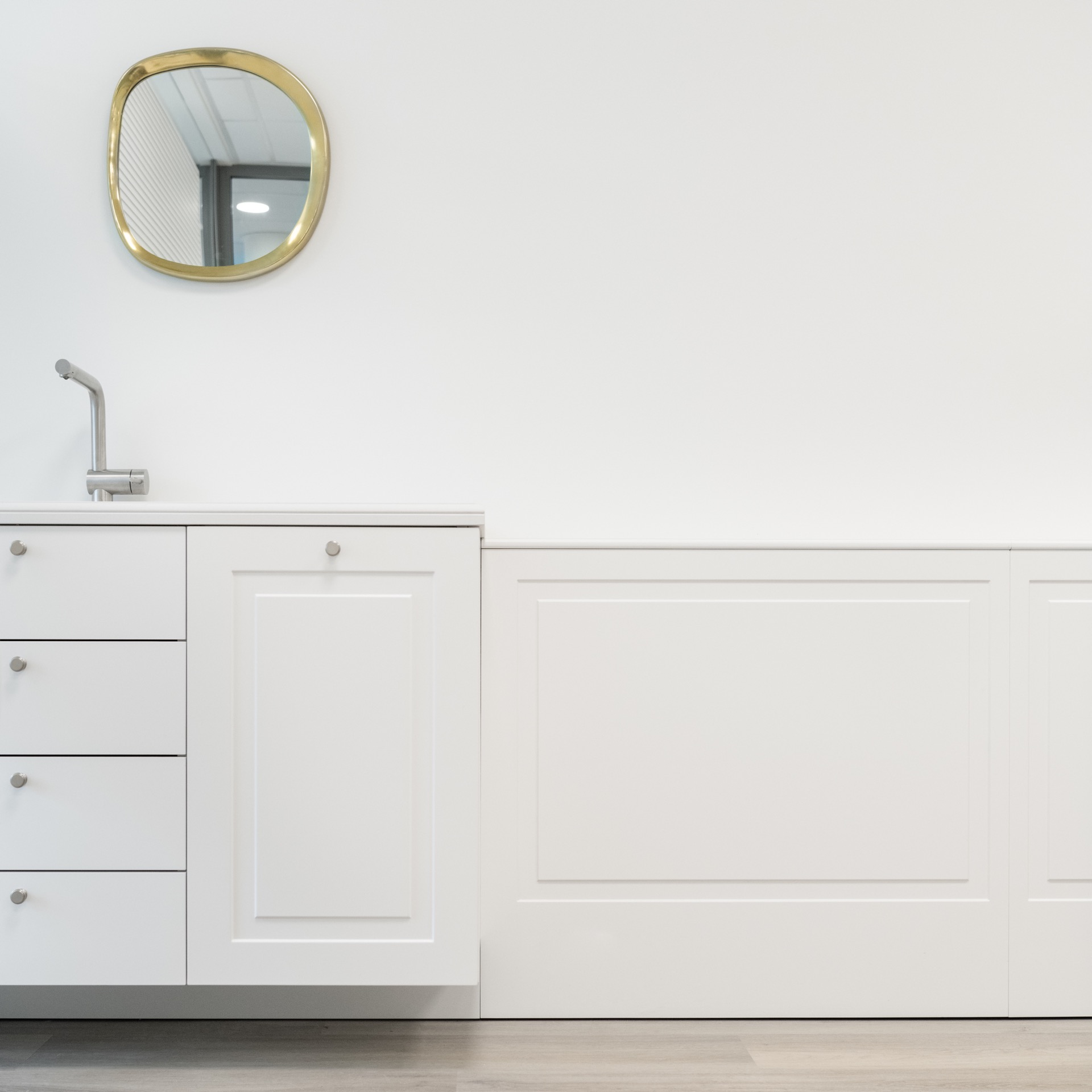
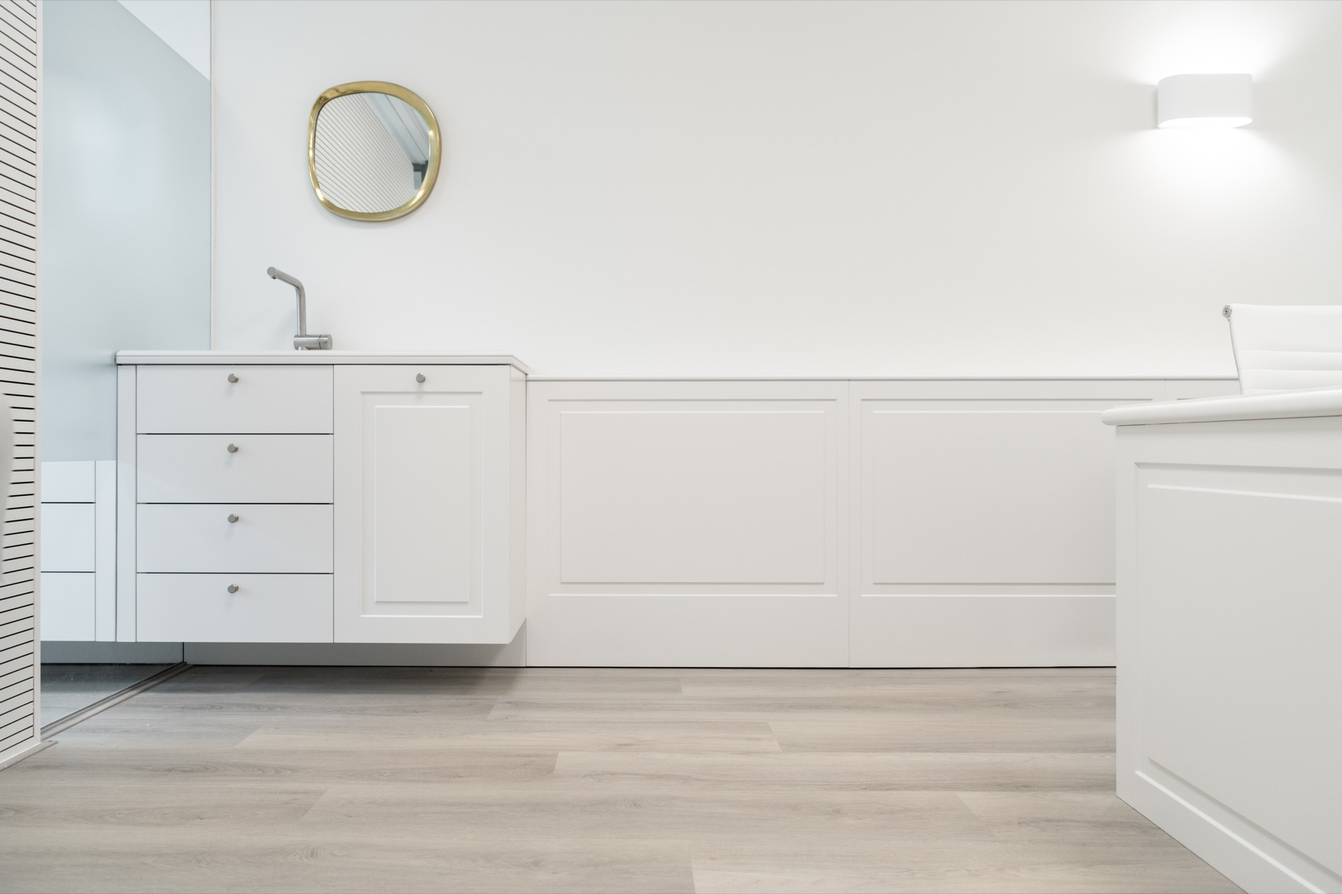
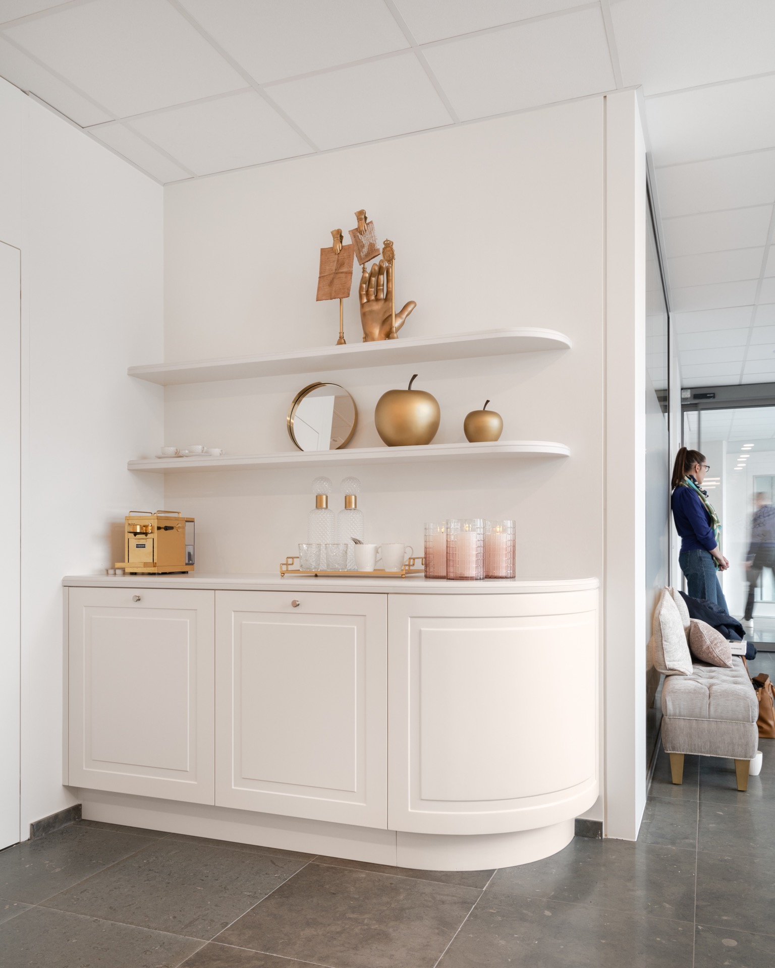
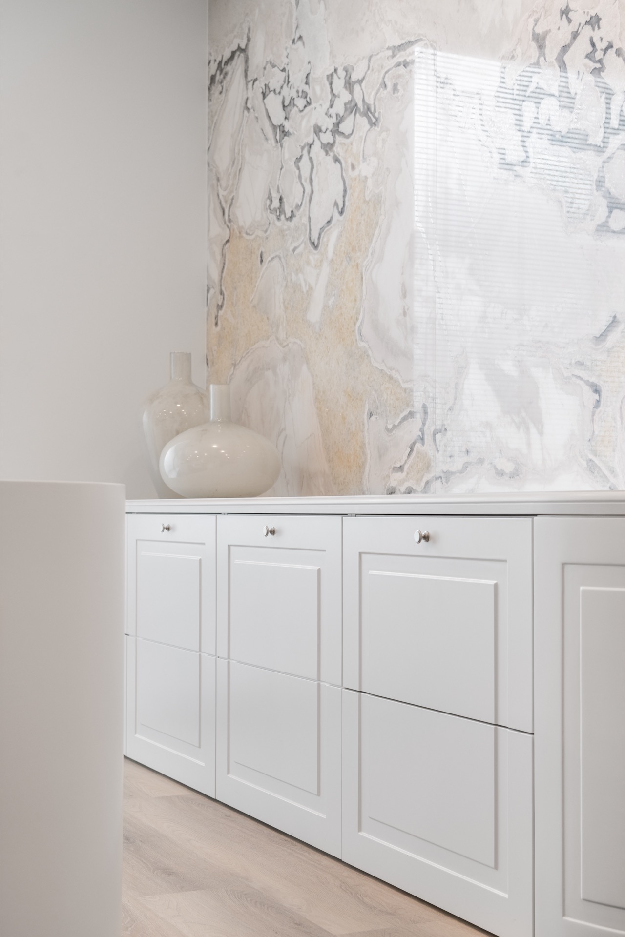
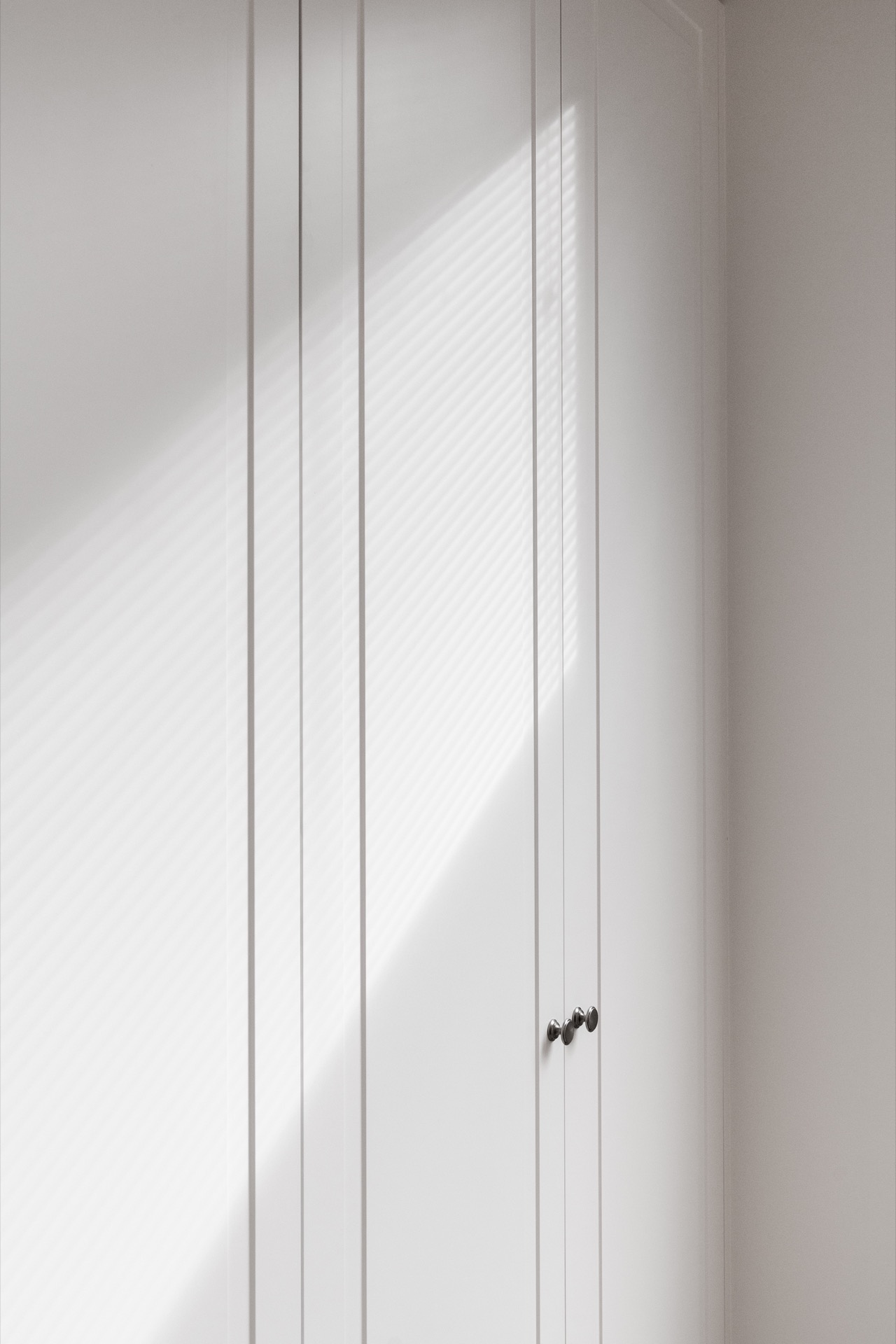
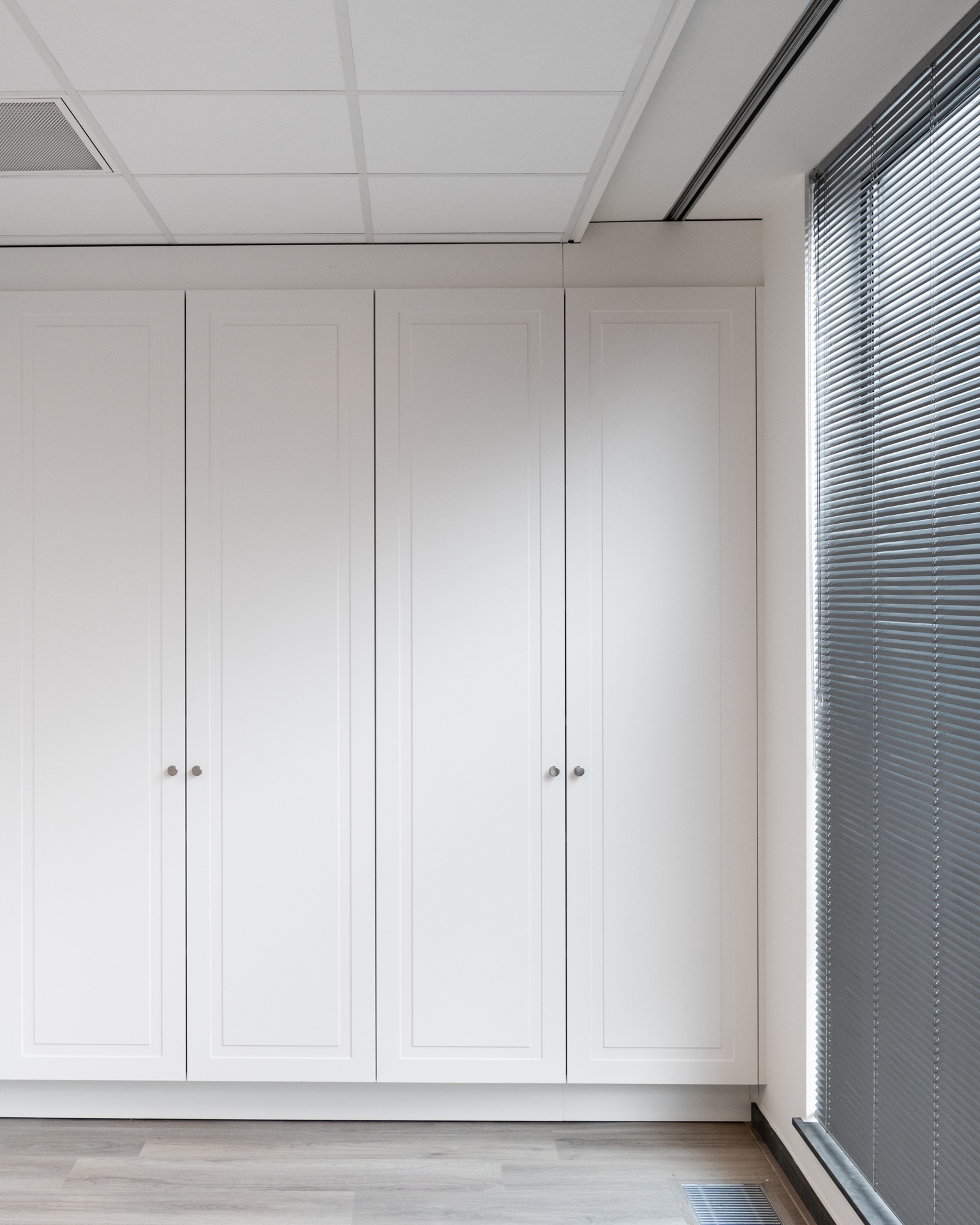
White paneled cabinetry appears throughout the practice, not as an isolated storage element but as part of the interior language. Cabinet fronts, wall panels and built-in units repeat the same profile and trim, so the eye moves from one surface to the next without interruption. The detailing is precise enough to give the room structure, yet restrained enough to let the larger shapes stay in view.
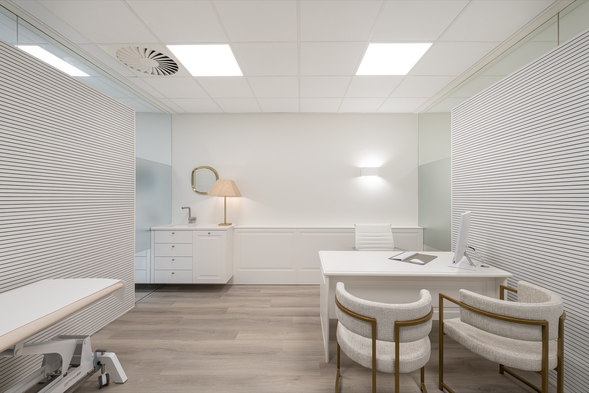
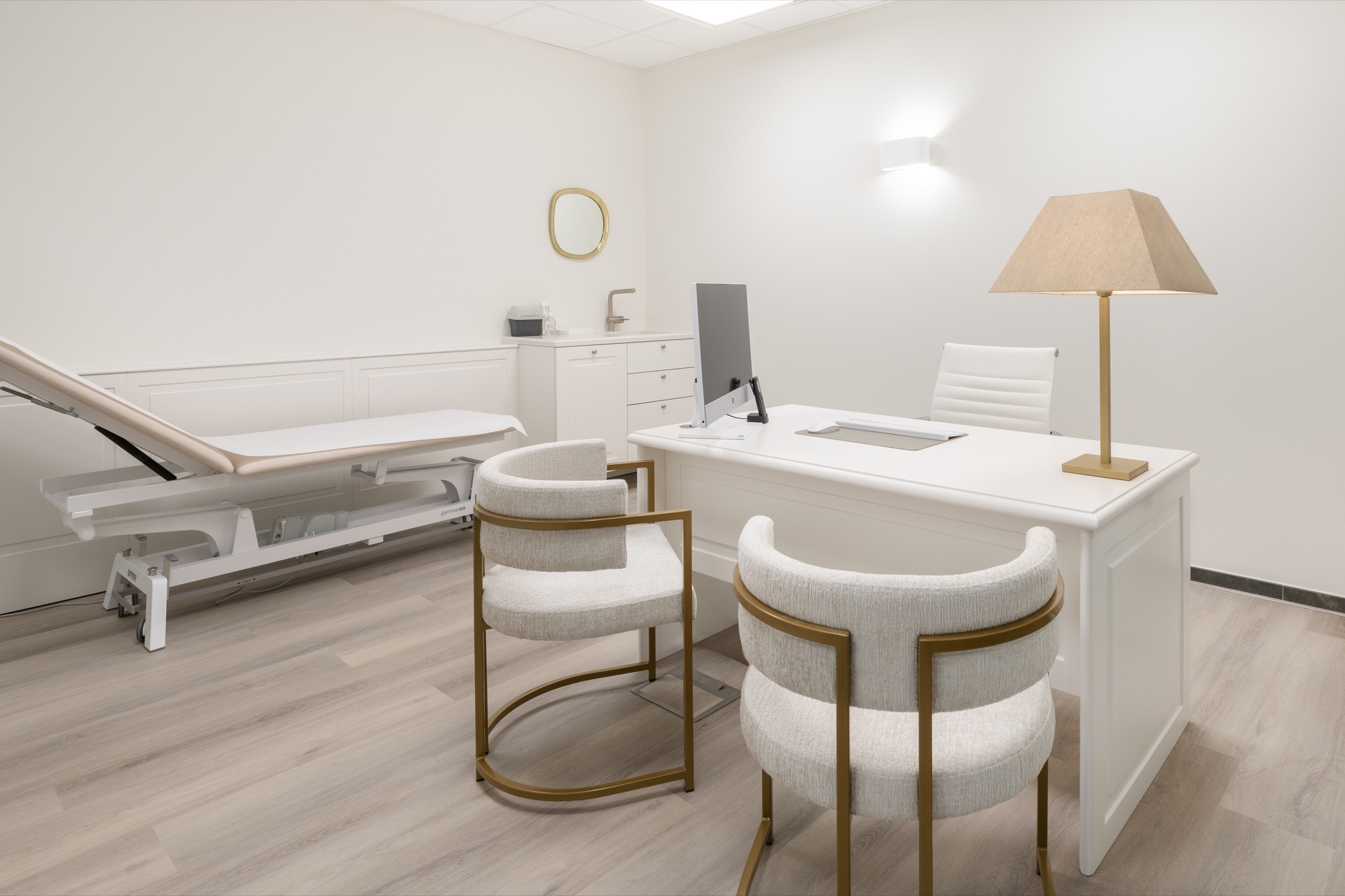
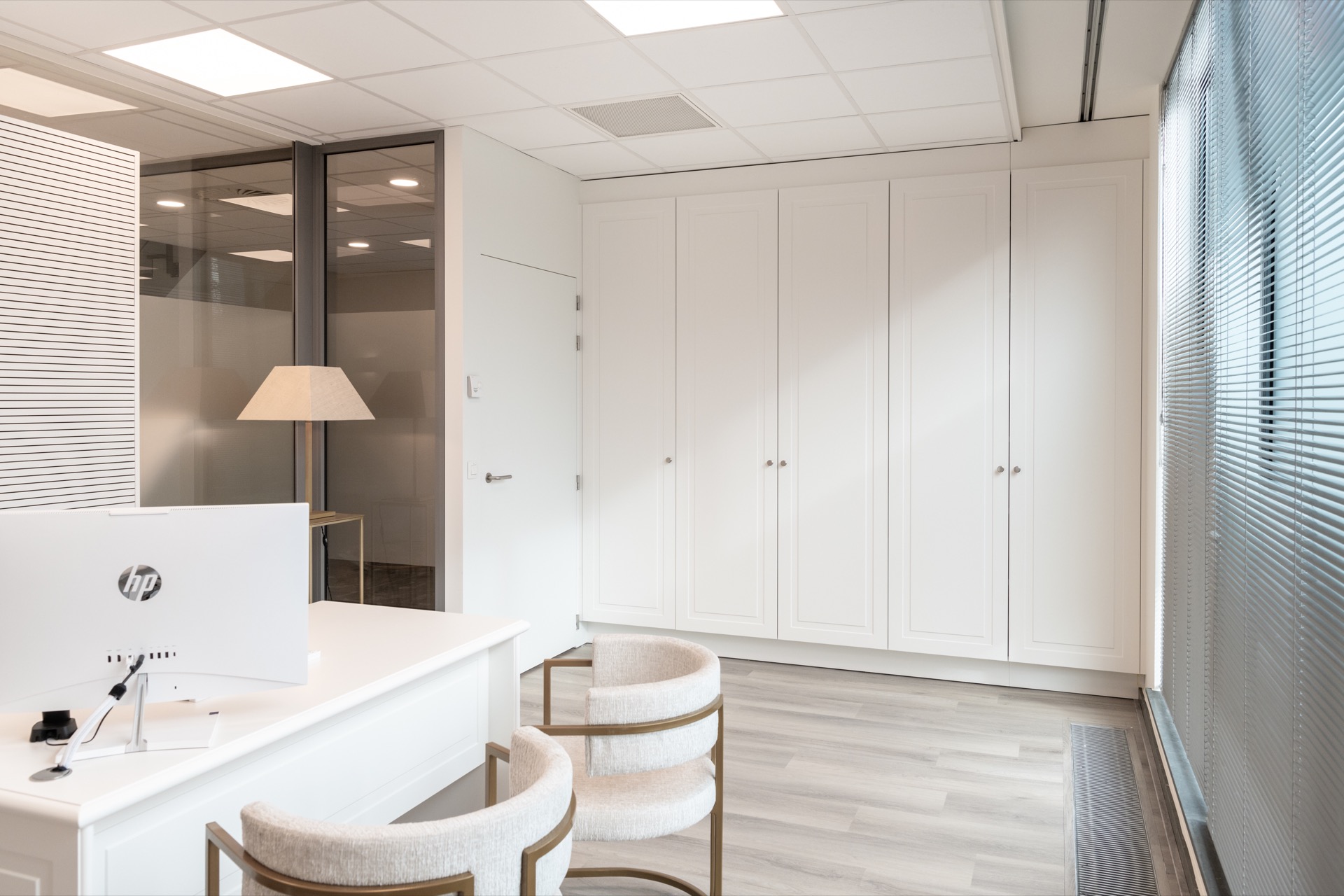
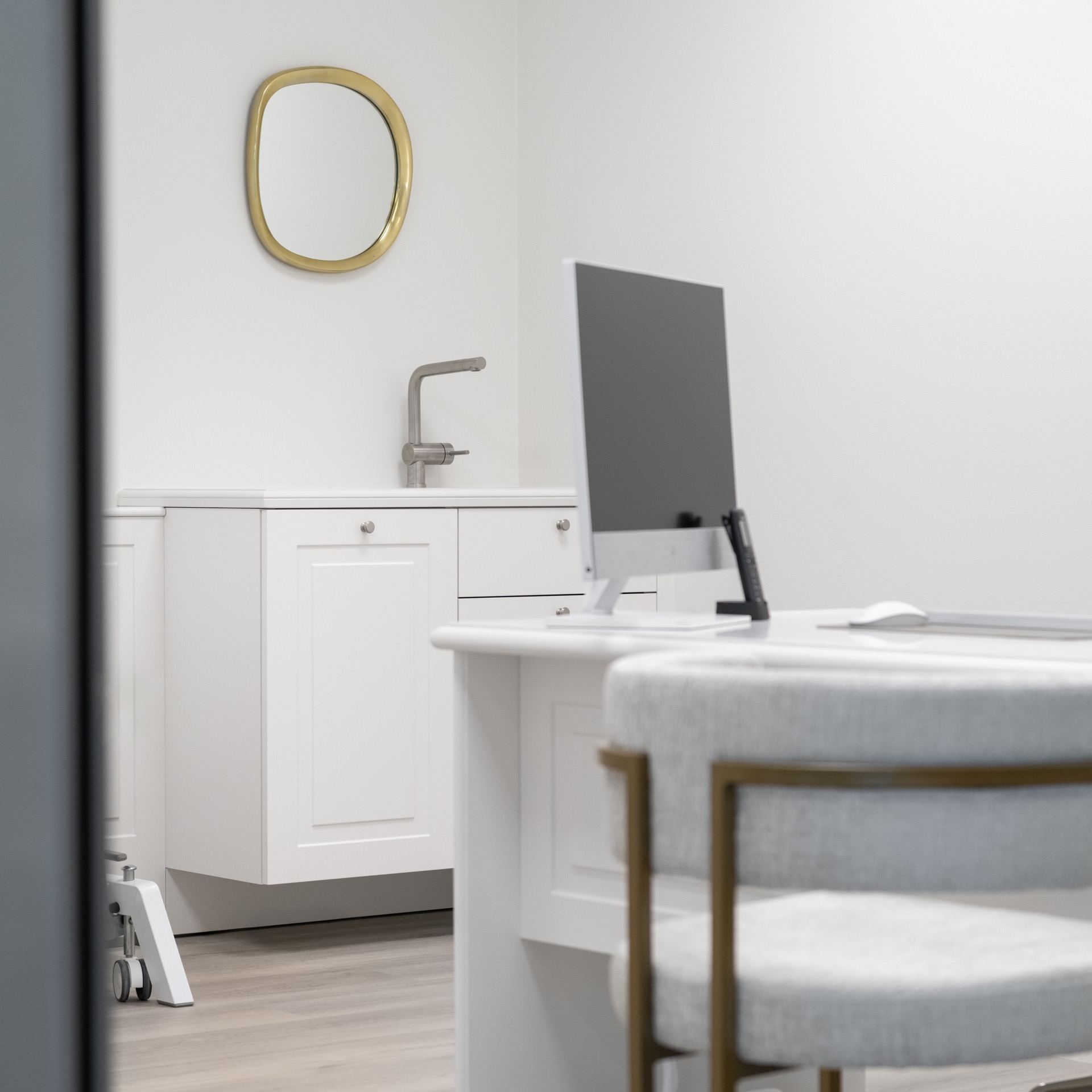
In the consultation and treatment rooms, that built-in approach continues. A white work zone sits beside integrated storage, with panelled fronts and fitted elements keeping equipment out of sight. The spaces are not staged as decorative rooms; they are arranged around use, with the storage built into the walls and the furniture kept close to the perimeter. That makes the floor area feel open, even in rooms that carry a lot of function.
Privacy is handled with slatted screens
Horizontal slats appear as a privacy wall in the consultation areas and along window zones, where they soften views without shutting the room down. The lines add a steady rhythm beside the smoother cabinet fronts and painted wall panels. Because the slatted privacy wall sits between open and enclosed conditions, it becomes part screen, part spatial filter. It is a small gesture, but it changes how the rooms are read from the corridor and from within.
The same logic shows up at the windows, where the slatted treatment mediates daylight rather than blocking it outright. Strong brightness is broken into a softer wash across the white joinery and the floor. That matters in a clinic setting, where the visual field needs to stay clear and readable. The slats give the room some depth without pulling attention away from the reception counter or the fitted storage.
From waiting area to consultation room
The waiting room and reception establish the tone of the project, but the more private spaces continue the same material discipline. In one room, a white-framed treatment table sits beside a compact cabinet run with paneled fronts. In another, a wash area is tucked into a built-in wall with a round mirror and a metal tap, keeping the sink zone compact and easy to read. The rooms rely on straight runs, rounded corners and controlled openings rather than visual noise.
A marble-look accent wall appears again near the working areas, carrying the same pale veining that anchors the reception. It gives the rooms a point of orientation, especially where the white cabinetry could otherwise disappear into the background. Because the surface is repeated across several zones, the project feels edited rather than accumulated. Each part serves a clear move: welcome, wait, consult, store.
Built-in storage keeps the floor clear
Storage is handled as part of the architecture. Low cabinets, paneled doors and integrated shelving sit flush with the walls, leaving little protrusion into the circulation paths. The rounded elements at the counters and corners soften the transition between zones, while the cabinet profiles keep the room from feeling blunt. In practice, that means the eye can move from one function to the next without getting caught on excess furniture.
Seen together, the fitted units, paneled wall lines and ceiling lights give the project its structure. The visual order comes from repetition of detail rather than from ornament. That is what makes this modern clinic interior read as controlled and practical at once: the reception is clearly marked, the waiting area is easy to sit in, and the consultation rooms are arranged around work surfaces, privacy and storage.
A clinic interior built from clear lines
The strongest impression is not one single feature but the way the features lock together. White joinery repeats along the walls. The marble-look accent surface gives the room a fixed point. Recessed ceiling lighting keeps the upper plane quiet. Slatted screens divide the private areas without sealing them off. Each move is visible, and none of them fights for attention. That is why the project reads cleanly from the first step into the waiting room and reception.
In a modern clinic interior like this, clarity comes from the relationship between surfaces. The floor runs uninterrupted beneath the seating zone. The counter is rounded where people meet it. The storage sits back into the wall. Even the ventilation is absorbed into the ceiling grid instead of becoming a distraction. The result is an interior where the reception, waiting area and treatment rooms follow the same visual logic, each one carrying the next forward.
Want to see more of STOLM Totaalinterieur? View the page of STOLM Totaalinterieur for even more great projects and company information.

NEW 2026 Jubileum Edition The Best Interior Designers Benelux
Order Now €125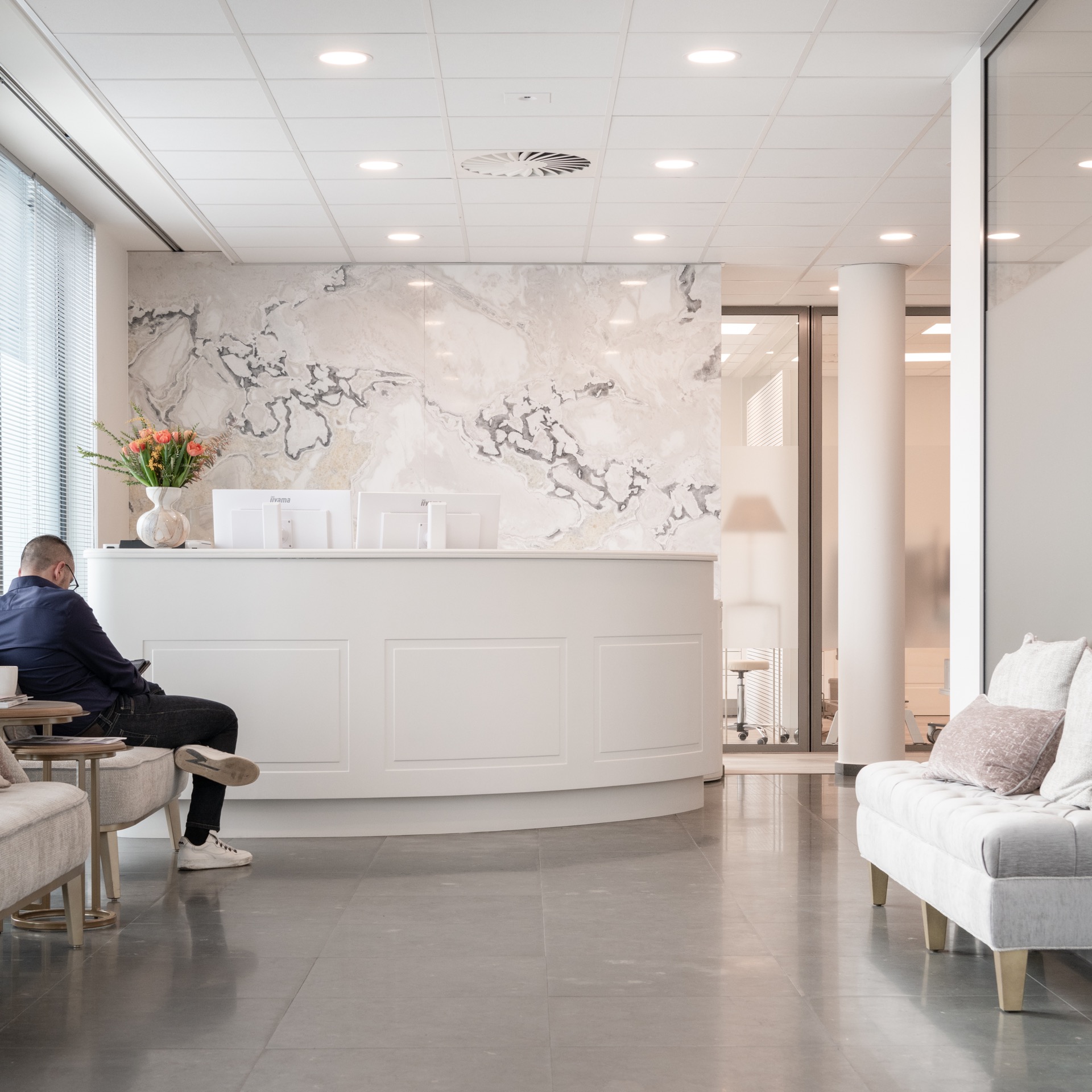
NEW 2026 Jubileum Edition The Best Interior Designers Benelux
Order Now €125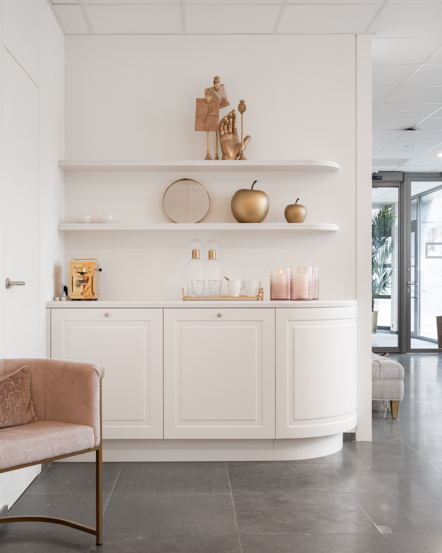
NEW 2026 Jubileum Edition The Best Interior Designers Benelux
Order Now €125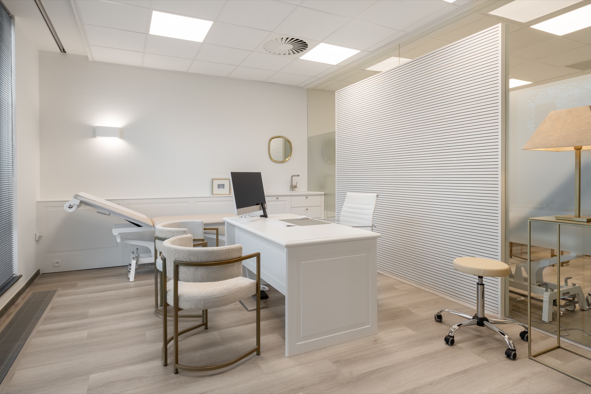
NEW 2026 Jubileum Edition The Best Interior Designers Benelux
Order Now €125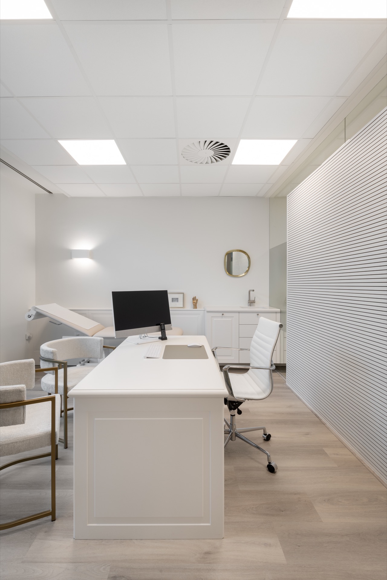
NEW 2026 Jubileum Edition The Best Interior Designers Benelux
Order Now €125