










Modern house between outside and inside
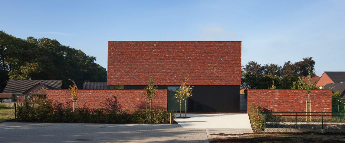
The red brick mass is cut open by broad glass sections, so the view moves straight through the house toward planting and paved outdoor space. That shift between closed wall and clear opening sets the tone for the project. Inside, pale surfaces, wood accents and large tile floors keep the rooms quiet, while indirect ceiling lighting draws a clean line across the upper edge of the space.
Brick walls shaped around the openings
The exterior reads as a brick house first, but the wide glazed openings quickly change that impression. Dark window bands sit low in the composition, giving the facade a grounded look and letting the openings carry more visual weight. The brickwork stays dominant around each cut-out, which makes the glass feel precise rather than spread across the whole volume. In several views, the house is seen from close range, so the masonry pattern and the strong horizontal lines become part of the experience.
One of the clearest impressions is the way the openings frame the outside rather than separating from it. Planting appears directly beyond the glass, and the paved ground plane runs tight to the building edge. The result is an indoor-outdoor connection that is easy to read from both sides. Instead of a decorative gesture, the glass works as a practical transition: it pulls daylight in, while the brick keeps the outer shell visually stable and dense.
The terrace as a measured threshold
The terrace is not treated as an afterthought. It sits beside the house with straight paving, sharp borders and planted strips that break up the hard surfaces. In one view, a side walkway runs along a glazed opening and a textured wall, turning a narrow passage into part of the route through the property. The materials stay restrained, but the layout does a lot of work: it guides movement, marks the edge of the house and keeps sightlines open to the garden.
Because the paved areas are aligned so closely to the building, the terrace reads as an extension of the interior floor rather than a separate zone. The perimeter is defined by simple changes in level, edging and planting. That quiet structure gives the outdoor areas their clarity. You notice the relationship between wall, glass and ground before any decorative element appears, which suits a modern house built around direct transitions.
Light on the underside of the ceiling
Inside, the most obvious line is the indirect ceiling lighting. It runs along a straight edge and leaves the ceiling itself visually calm. That detail matters because it keeps the rooms from feeling fragmented. The light band emphasizes length and direction, especially in the kitchen and living area, where the overhead plane remains almost blank while the lower surfaces carry the material contrast. It is a modest move, but it changes how the room is read at night and in the darker corners of the day.
The floor under that lighting is made of large dark tiles, so the room has a clear base. Against that surface, the lighter walls and pale built-ins stand out without becoming high contrast or decorative. The interior stays spare in the best sense: few interruptions, no unnecessary shifts in material, and enough texture in the wood to keep the room from turning flat. The overall effect is measured, with every surface doing a visible job.
Minimalist interior with wood accents
Wood accents appear as paneling and kitchen fronts rather than as loose decoration. They sit against white wall surfaces and pale cabinetry, bringing a warmer tone into an otherwise restrained palette. The wood is not used everywhere, which keeps it readable. In the interior views, it appears where the room needs a change in scale or a clear edge, especially around storage and kitchen elements. That makes the material feel structural, even when it is part of the joinery.
The minimalist interior depends on that combination of white planes, wood and large tile floors. The rooms are open enough to give long sightlines, but the surfaces remain controlled. A view through one interior wall shows the exterior brick and planting beyond, so the house never loses the link to the garden. This is where the indoor-outdoor connection becomes more than a facade idea; it is part of how the rooms are organized and experienced from inside.
Kitchen and living area in one calm field
The kitchen sits in the same visual field as the living area, with the wood cabinetry anchoring one side of the space. The pale lower elements and dark floor keep the room from becoming visually busy. Instead of a strong contrast of functions, the arrangement allows the eye to travel from the cooking zone to the glazed opening and onward to the outdoor planting. The room feels open because its edges are legible, not because it has been emptied of detail.
Indirect light, the tile grid and the horizontal cabinet lines all reinforce the room’s length. A few strong materials do the work: wood, tile, glass and painted surfaces. That limited palette helps the interior stay consistent from the entrance through to the main living zones. It is also what makes the outside views matter so much. Through the glass, the greenery reads almost like an extra layer of material, placed just beyond the room.
Bathroom surfaces kept direct and clear
The bathroom follows the same discipline. A double vanity stretches across the wall, with paired taps and a long countertop that keeps the composition low and simple. The shower is enclosed by glass, so the room remains open in spite of its compact fixtures. Dark floor tiles give the bathroom a stronger base than the other rooms, which makes the pale wall surfaces and fittings stand out without visual noise.
What makes the space work is not ornament, but proportion. The vanity takes up enough length to feel settled, while the glass shower keeps the room from being split into separate pieces. Reflections on the glass and the tile surface add depth, but the room is still easy to read at a glance. The bathroom fits the larger project language: direct materials, clear lines and a focus on how each surface meets the next.
Views that keep the house connected to the garden
Several images return to the same idea from different angles: a modern house that stays visually open to its surroundings. One view looks from inside toward the exterior brick and planting. Another follows the side walkway beside the glazed opening. Another holds on the terrace paving and the strong edge of the house. Together they show a consistent relationship between the built volume and the ground around it, with glass used to extend the rooms without losing the solidity of the brick shell.
That repetition is useful because it shows the project from more than one room and more than one distance. The house is read through its openings, its terrace and its interior surfaces at once. Brick, glass, wood and tile are the main materials, and they stay in view throughout the sequence. The result is a house that can be understood through movement: from outside to inside, from hard surface to soft daylight, and back again.
Want to see more of Egide Meertens Plus Architecten? View the page of Egide Meertens Plus Architecten for even more great projects and company information.




NEW 2026 Jubileum Edition The Best Interior Designers Benelux
Order Now €125


