Modern interior with custom built-in cabinetry and stone–stainless finishes
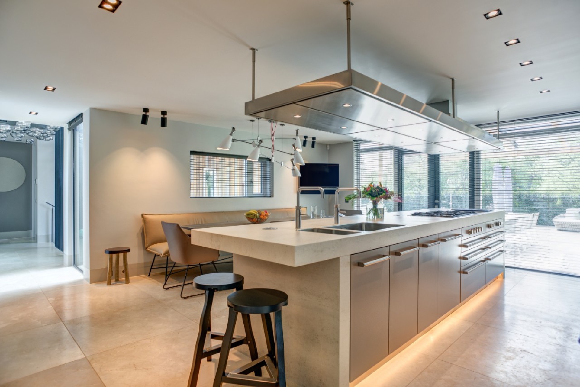
The first thing that reads in this interior is the material contrast: stone-look surfaces, stainless steel, glass, and dark joinery set out a clear line from room to room. In the kitchen, a stone-look kitchen island sits under a large stainless steel extraction hood, while the living area repeats the same controlled palette in the fireplace TV wall unit. Recessed ceiling spotlights keep the surfaces legible and leave the joinery to do the visual work.
A kitchen defined by steel, stone, and clean sightlines
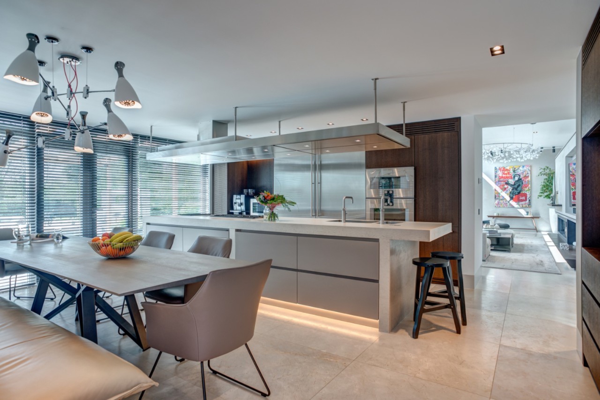
The kitchen opens with a wide island and a pale worktop that echoes stone without drawing attention away from the layout. Stainless steel kitchen elements stand out immediately: the hood, the appliance surfaces, and the cooler sheen around the cooking zone all sharpen the room’s geometry. Along the back wall, wood accents soften the harder materials, but the plan stays disciplined. Open sightlines toward the living area let the island read as a central piece rather than a divider.
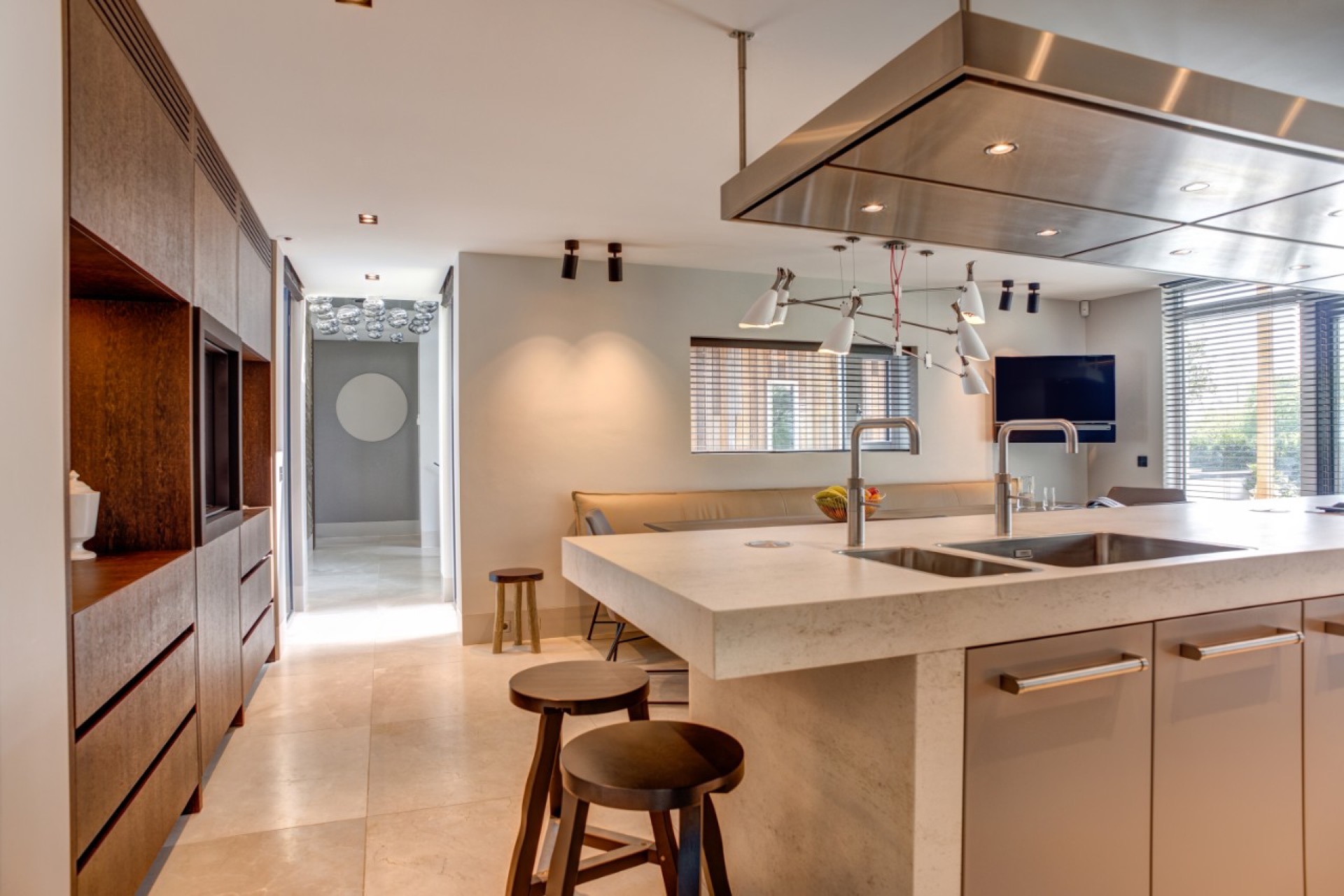
From another angle, the island becomes a working surface rather than a display object. The integrated sink zone sits within the stone-look finish, and the surrounding run of cabinetry keeps handles and trims visually quiet. That restraint matters here, because the eye keeps moving between the horizontal worktop, the vertical storage wall, and the stainless steel kitchen elements above the cook zone. The effect is not decorative noise; it is a room arranged to show edges, joins, and proportions.
Stone-look kitchen island with a practical center
The stone-look kitchen island is the clearest anchor in the room. It pulls together the cooking, washing, and preparation areas in one compact volume, with the pale surface catching light from both the ceiling spots and the hanging fittings above. The island’s edges stay crisp, and the surrounding floor gives it room to stand out. Where many kitchen islands feel oversized, this one reads as a measured block that supports the wider interior language rather than competing with it.
Living room surfaces built around the fireplace TV wall unit
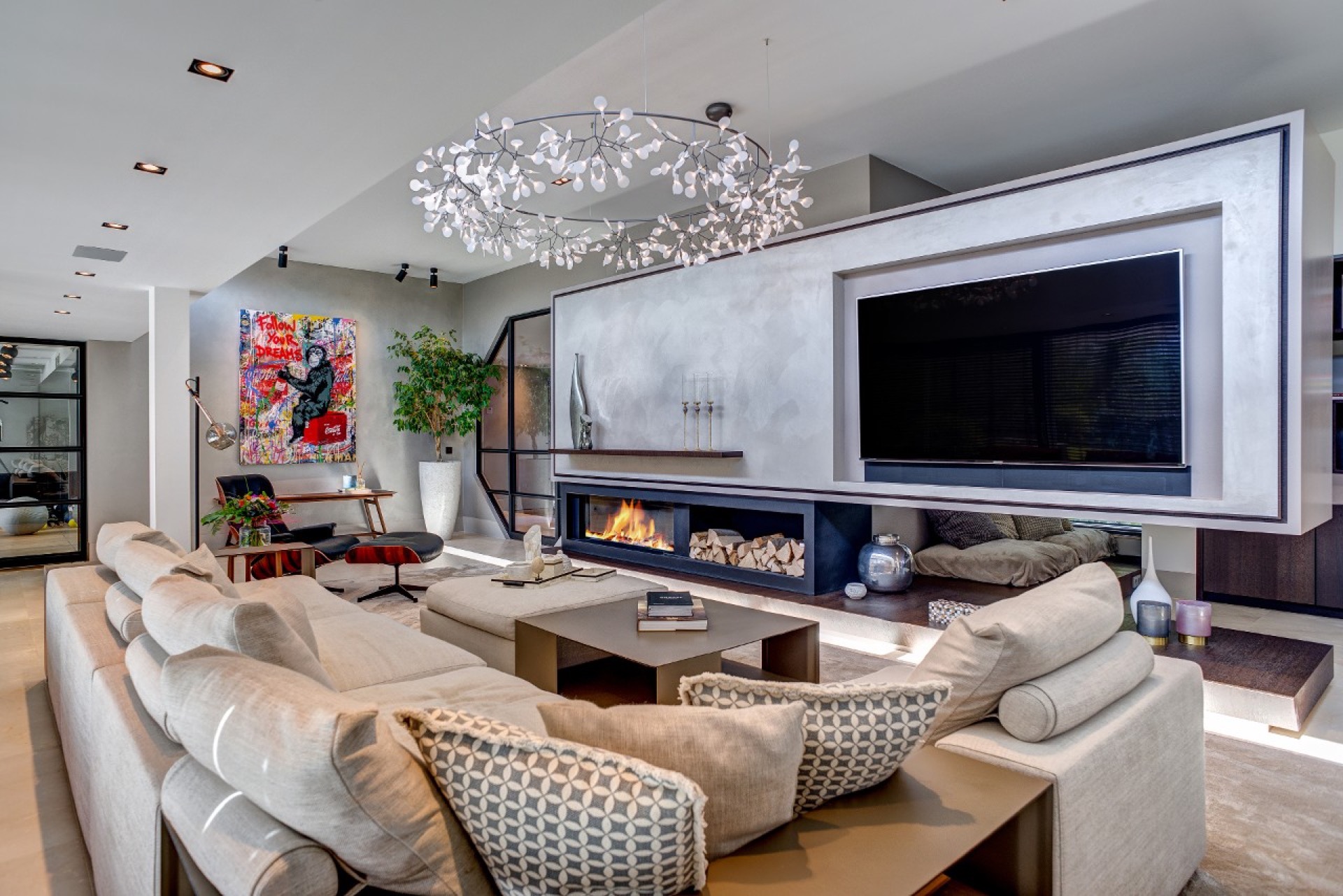
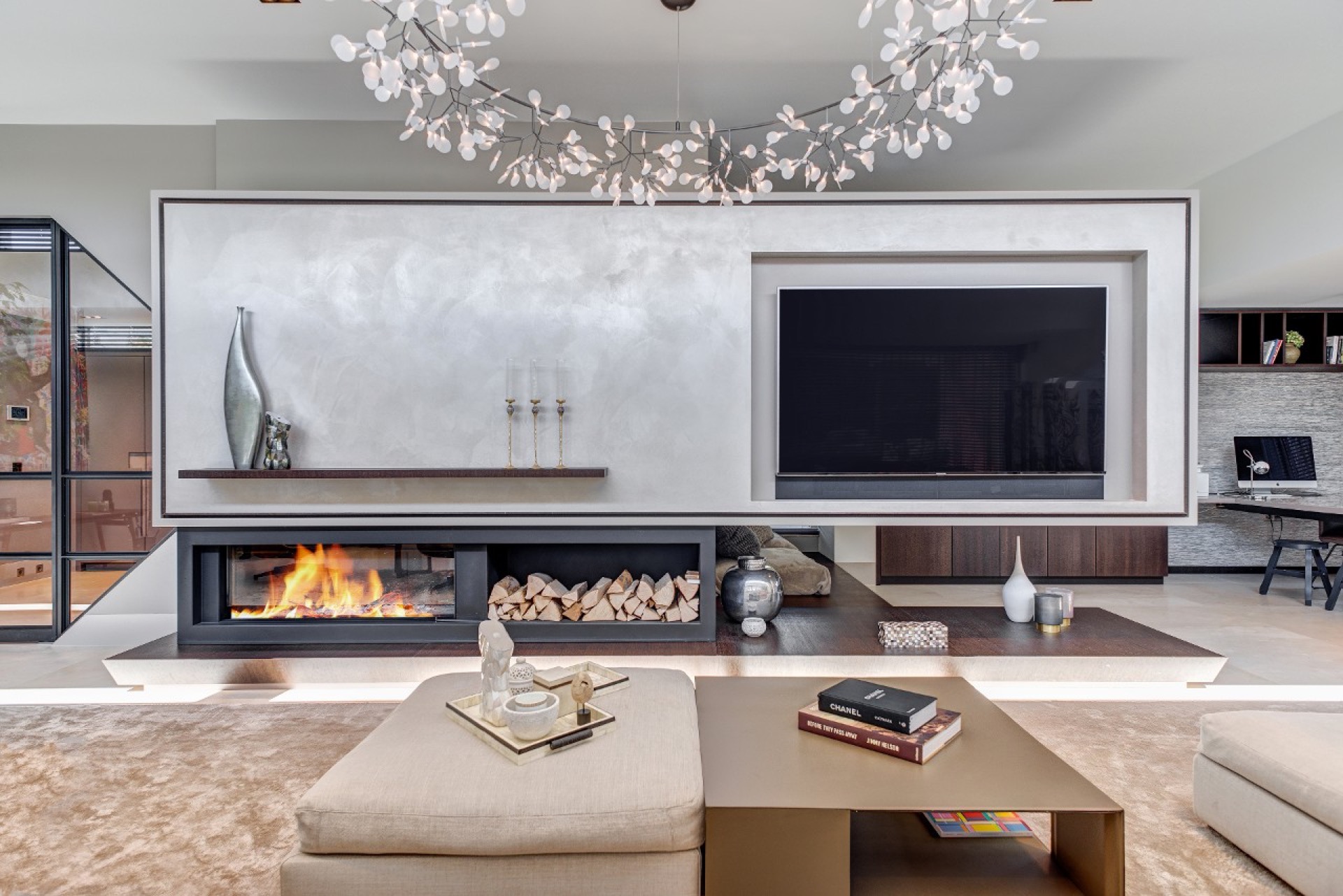
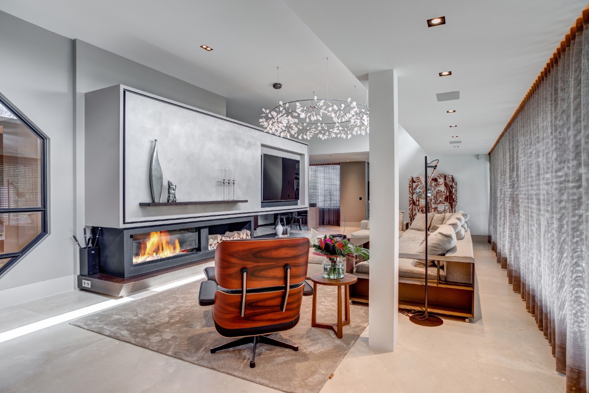
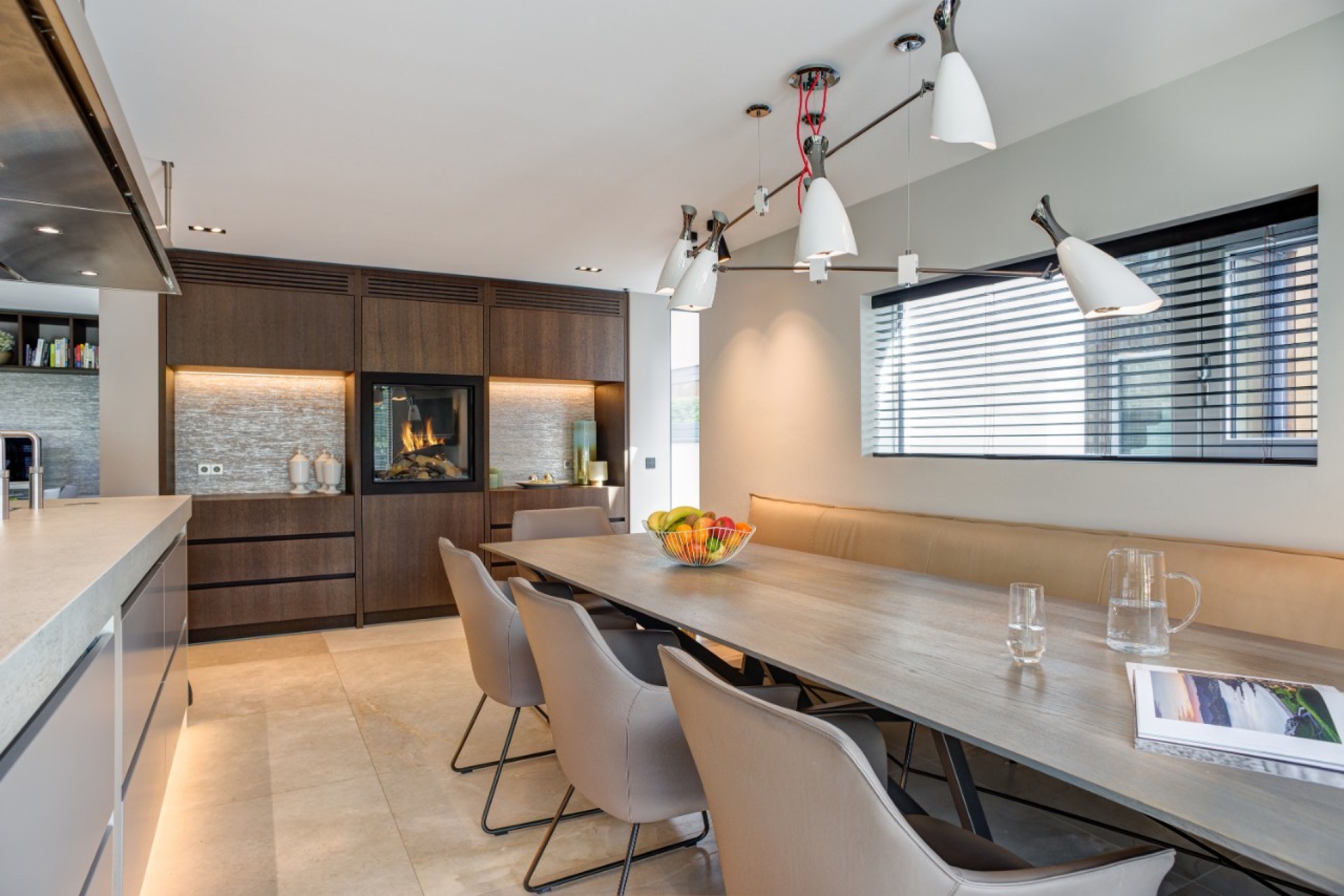
The living room shifts the material palette into darker territory. A central fireplace TV wall unit combines the fire opening, a large screen recess, and black framing into one strong wall composition. Instead of breaking the wall into separate features, the design keeps them aligned on the same axis. The result is a surface that holds the room together visually, especially where the open floor plan leaves long views across the interior. Inbuilt lighting around the wall brings depth to the recesses without overexposing them.
Seen together with the ceiling spots, the feature wall gives the living room a more measured light pattern than a single pendant or standing lamp could do on its own. The black zones around the fireplace and the TV niche create pauses in the wall, while the surrounding lighter surfaces keep the composition from flattening out. It is a good example of how a fireplace TV wall unit can do more than frame technology: here it also organizes the sitting area and marks the room’s main axis.
Recessed ceiling spotlights and a quieter light plan
Recessed ceiling spotlights run through the interior as a consistent line of lighting. They appear in the kitchen, the living room, and the hallway, where they pick out cabinet fronts, panel joints, and door openings. Because the fittings sit flush with the ceiling, the eye stays on the architecture below. This matters in a scheme that depends on straight lines and surface changes. The lighting does not announce itself; it reveals the joinery, the shadow gaps, and the shift from stone-look finish to wood and glass.
A bathroom built from glass, stone-look finishes, and reflective edges
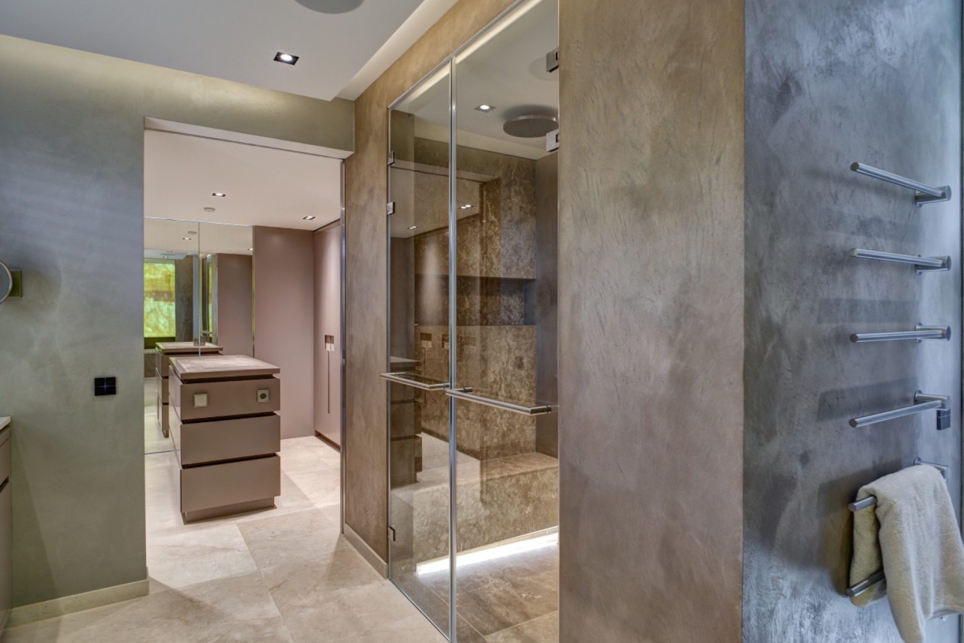
The bathroom uses a different set of tools but keeps the same discipline. A walk-in glass shower with stainless steel hardware sits against stone-look bathroom finishes, so the wet zone reads as one clean volume. The glass panel keeps the shower open to the room instead of boxing it in, and the pale surfaces around it catch the light from the ceiling spots. The room feels shaped by straight edges: the shower screen, the wall planes, and the crisp lines of the fixtures all follow the same logic.
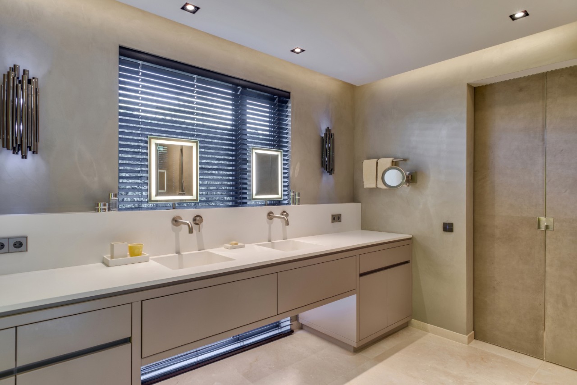
The double vanity continues that exactness. Two basins sit side by side beneath a mirror zone that glows around the perimeter, giving the wall a defined frame without heavy ornament. The stone-look bathroom finishes run across the floor and wall surfaces, which keeps the room visually calm even when viewed in detail. Stainless steel fittings add a brighter note, but they stay secondary to the larger planes of tile, glass, and the vanity front.
The hallway as a long storage wall
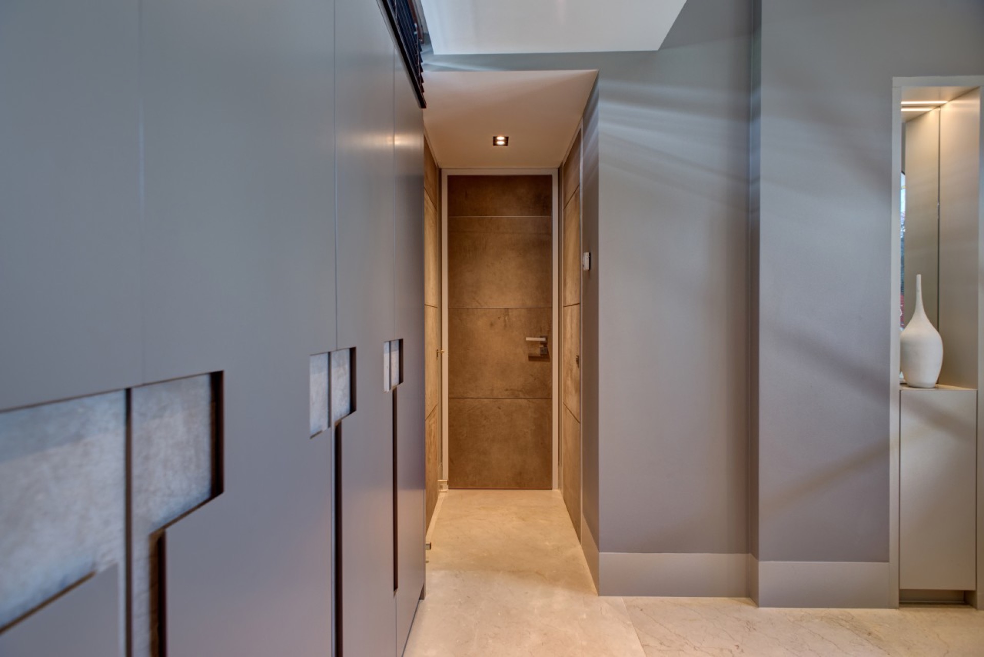
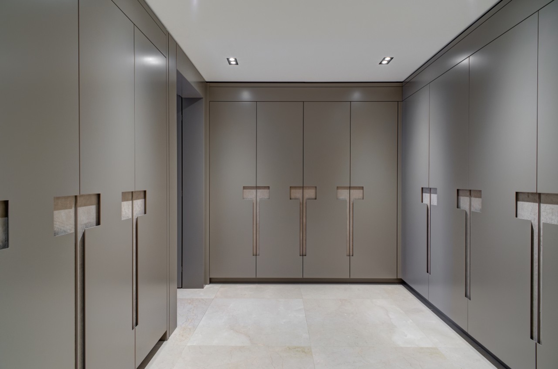
In the hallway, a built-in cabinet wall in hallway format turns storage into part of the architecture. Full-height fronts run along the wall with integrated handles or concealed grips, so the surface reads as a single plane until the light catches a joint or edge. That is what makes the corridor feel intentionally drawn rather than simply filled. The cabinet wall holds coats and everyday storage, but visually it works as a long, calm backdrop that guides movement through the home.
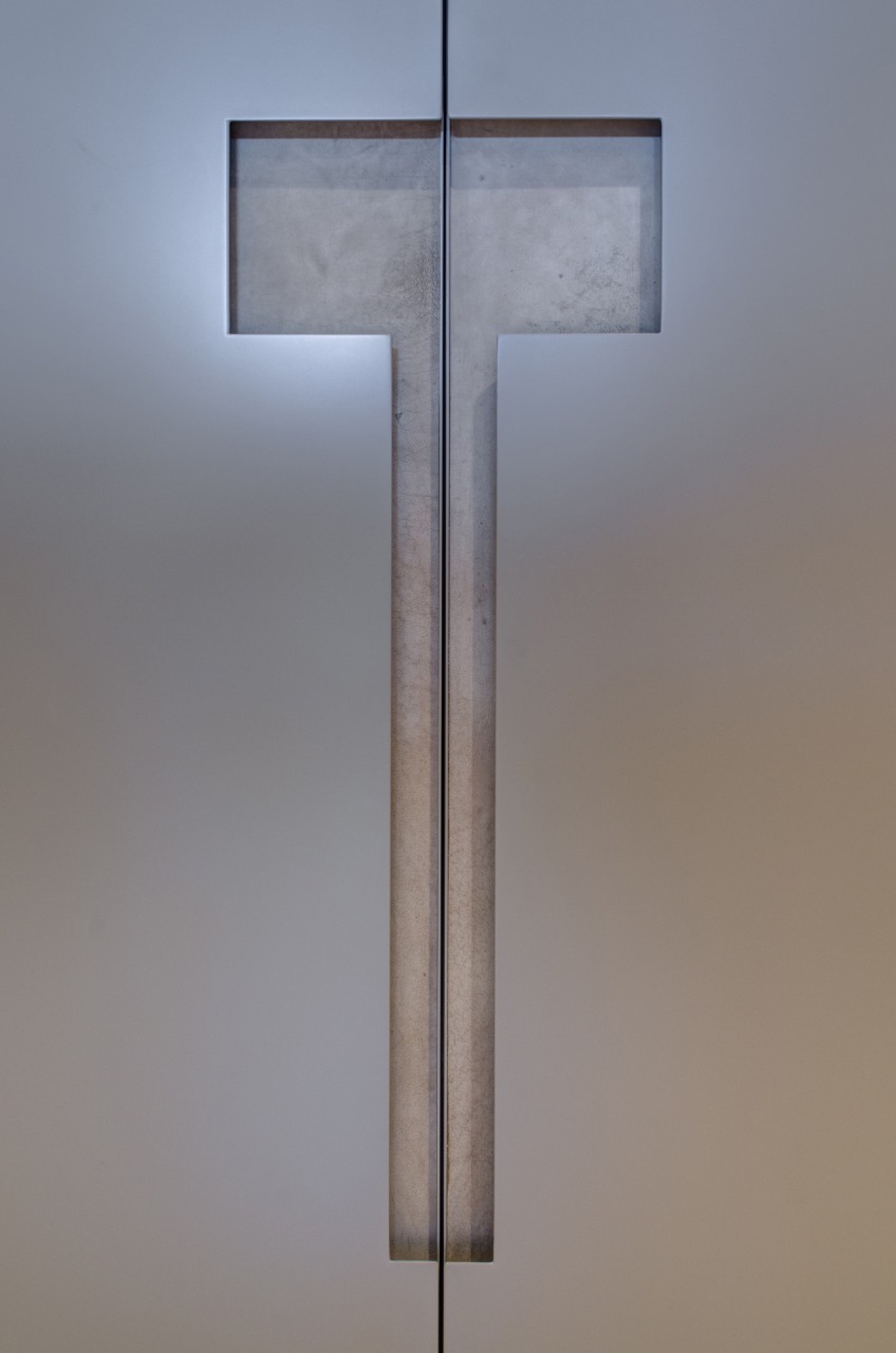
Close up, the joinery becomes more detailed. Rectangular cut-outs, shadow gaps, and framed recesses show up in the details, especially where the wall breaks around openings and transitions. These are small moves, but they define the project’s character more clearly than any broad statement could. The built-in cabinet wall in hallway is not just about hiding clutter; it is about extending the same measured language from kitchen to living room to bathroom without changing the rules halfway through.
Materials that repeat without becoming repetitive
Stone-look surfaces, stainless steel, glass, and wood veneer appear throughout the project, but each room uses them differently. In the kitchen, steel and stone dominate the working zone. In the bathroom, glass and stone-look bathroom finishes create a lighter, more reflective setting. In the hallway, the cabinetry absorbs the same palette into a single storage wall. The repetition is deliberate, yet the rooms never feel copied from one another because each area changes the way the materials are cut, joined, or lit.
That consistency is strongest in the details. A stainless steel edge beside a pale worktop, a glass shower screen with visible fittings, a cabinet front with a hidden pull, a TV niche cut into a dark wall: each detail carries the larger scheme without needing explanation. The project’s interest lies in those visible decisions. Seen room by room, the interior is less about a single gesture than about how custom built-in cabinetry, stone-look surfaces, and controlled lighting keep reappearing in new combinations.
Details that keep the interior precise
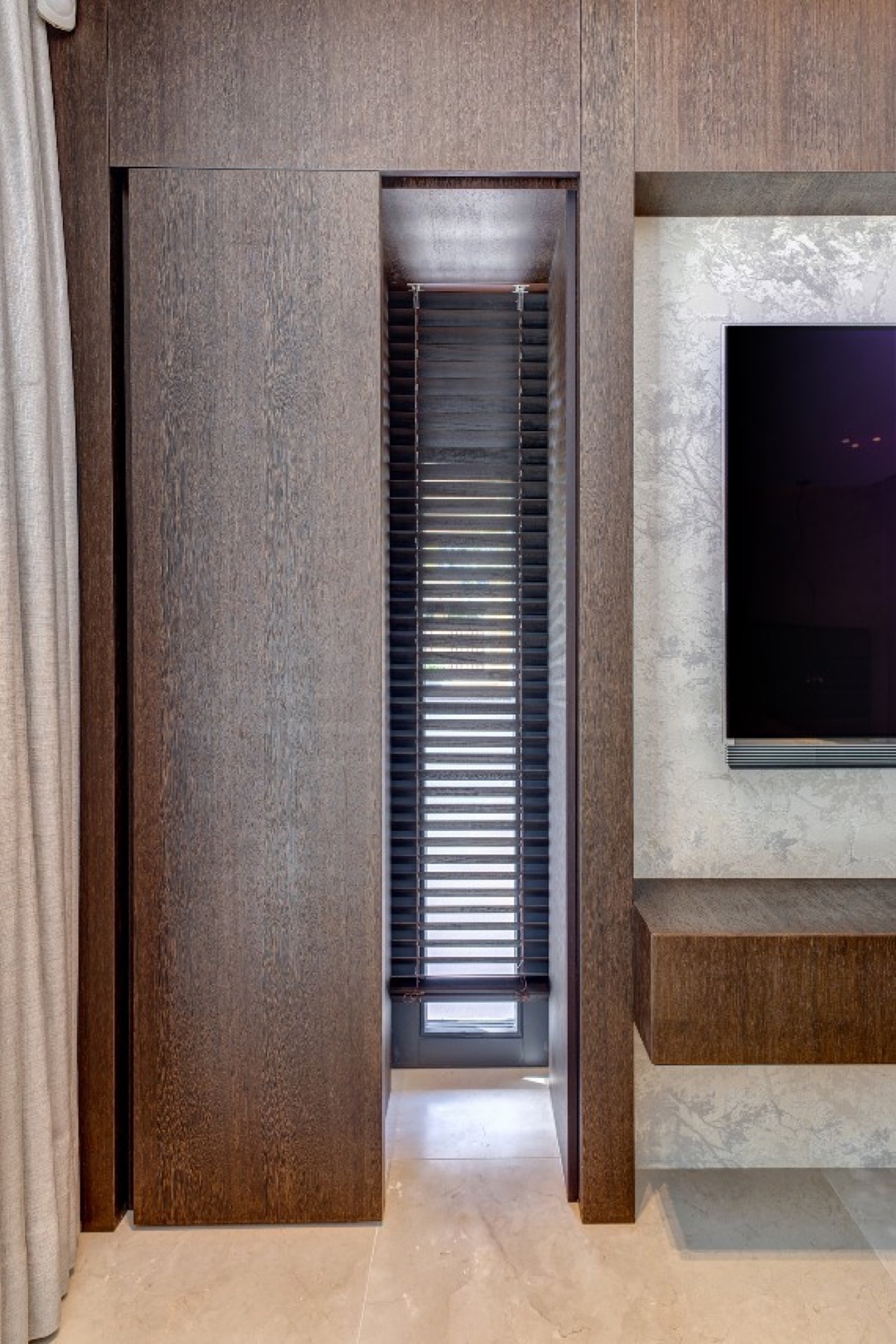
The image set also shows how the architecture handles corners and transitions. Broad frames, crisp trim lines, and rectangular openings give the rooms a drawn quality, as if each surface had been measured against the next. In the kitchen and hallway, that precision is reinforced by flush fronts and low-contrast joins. In the living room, the fireplace TV wall unit gives the main wall a focal point without adding extra layers. Across the whole project, the effect comes from sequence rather than spectacle.
What stays with you is the way the rooms share one visual language while keeping their own tasks. The kitchen works around the stone-look kitchen island and stainless steel kitchen elements. The living room holds the fireplace TV wall unit inside a dark wall plane. The bathroom opens with a walk-in glass shower and stone-look bathroom finishes. The hallway stretches that approach into a built-in cabinet wall in hallway. Together they form a modern interior with custom built-in cabinetry that is read through surfaces, light, and the exact placement of each line.
Want to see more of TK Studio? View the page of TK Studio for even more great projects and company information.


NEW 2026 Jubileum Edition The Best Interior Designers Benelux
Order Now €125
NEW 2026 Jubileum Edition The Best Interior Designers Benelux
Order Now €125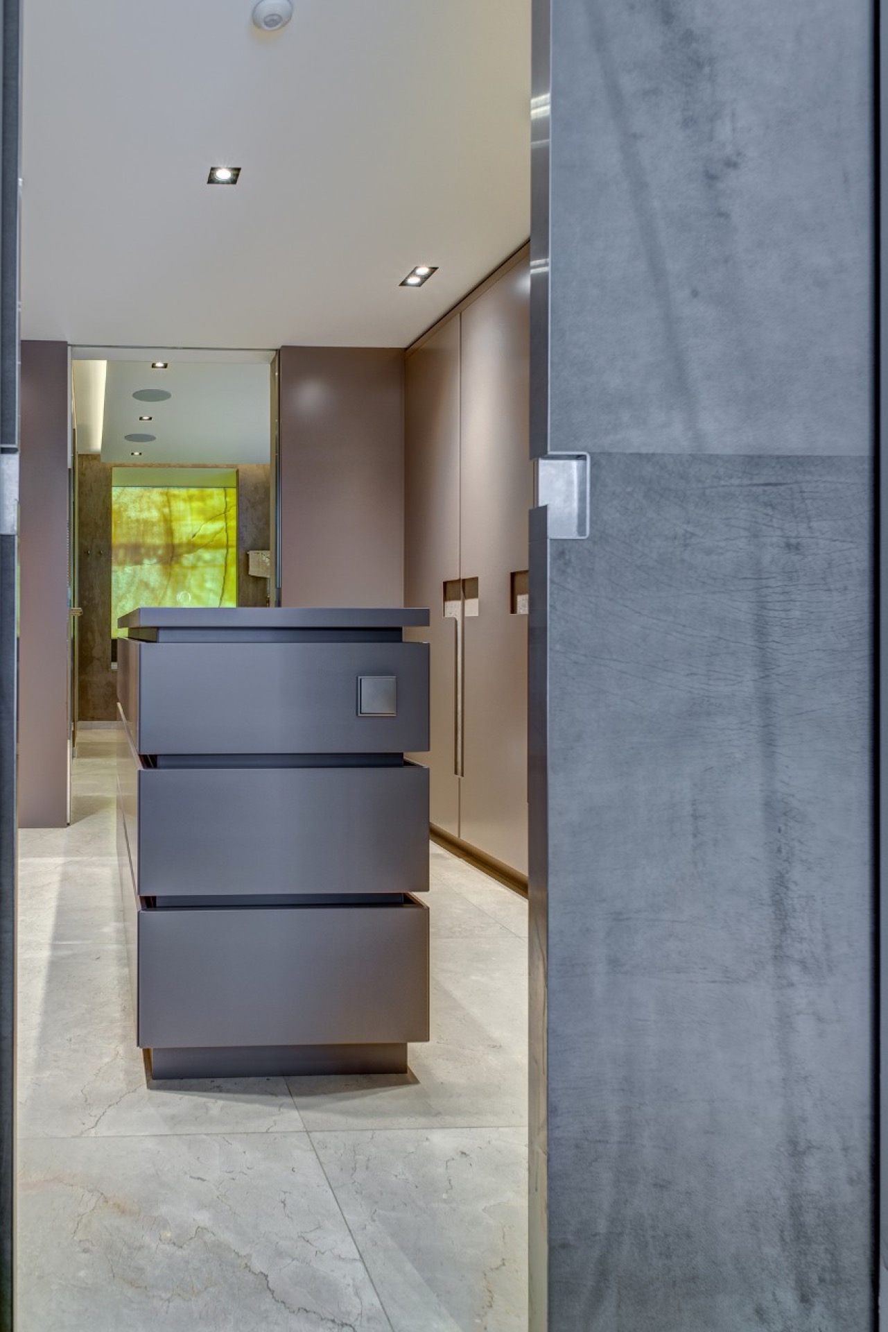
NEW 2026 Jubileum Edition The Best Interior Designers Benelux
Order Now €125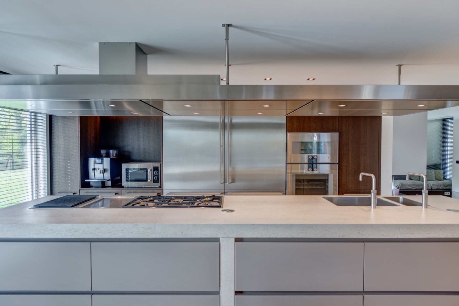
NEW 2026 Jubileum Edition The Best Interior Designers Benelux
Order Now €125