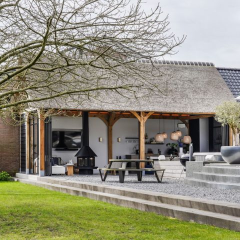
Modern luxury interior with open-plan living and stone accents
Light reaches deep into the rooms, bouncing off black-framed large windows, pale wall surfaces and a floor that shifts between stone and wood tones. The plan reads as one continuous modern luxury interior, yet each zone keeps its own edge: a living area anchored by stone, a dining space marked by a ring pendant dining light, and a kitchen that opens out into long work surfaces and built-in storage. Nothing feels overdrawn. The visual rhythm comes from materials, lines and the way the rooms connect.
Open-plan layout with clear sightlines
The first impression is scale. Open-plan living gives the space room to breathe, but it is the route through the house that makes the layout interesting. You move from lounge to dining area to kitchen without hard breaks, and the furniture is set to leave those transitions visible. Large glazing draws in daylight and keeps the edges of the plan open, while darker frames set a crisp outline against the lighter walls. The result is orderly without becoming rigid.
In several views, the seating area sits close to the windows, which makes the room feel tied to the outside rather than sealed off from it. A light rug cuts into the darker floor, and low furniture keeps the horizon line calm. The modern luxury interior depends less on ornament than on these moves: a wide opening, a pause in the circulation, a shift in surface. That is where the project gets its pace.
Stone accent wall fireplace as the focal point
The stone accent wall fireplace gives the living room its strongest surface. It rises behind the fire opening in a texture that catches light differently from the smoother walls around it. In one image the stone is shown with a relief-like finish, which adds depth even when the fire itself is not the main event. Nearby, a dark cabinet and a pale sofa keep the composition grounded, so the wall can hold attention without crowding the rest of the room.
Seen from another angle, the fireplace becomes part of a larger wall composition rather than a single isolated feature. The stone face meets softer textiles, including cushions and a throw, and that contrast stops the room from feeling hard or cold. This is one of the clearest examples of the project’s material approach: stone for weight, fabric for softness, dark wood for structure. Together they shape the room more effectively than decoration would.
Texture, shadow and the living room edge
The stone accent wall fireplace also changes the way the room reads at different times of day. In bright light, the texture stands out as a layered surface; in a dimmer view, it becomes a darker vertical mass behind the seating. The black framed large windows near the lounge add another frame to the scene, so the eye keeps moving between opening, wall and furniture. Even the rug works as a boundary, separating the sitting area from the circulation line without any physical barrier.
Dining and kitchen details set by light and repetition
The dining area is defined by a ring pendant dining light that hangs low enough to claim the table, but not so low that it blocks the view across the room. Around it, pale chairs and a round or oval table soften the geometry of the plan. Nearby glass panels and dark wall elements link the dining space to the kitchen, where the surfaces become longer and more functional in appearance. The mood changes from lounging to working, yet the materials stay related.
The kitchen with multiple sinks is one of the most specific details in the set. Long worktops hold several basins in a single run, and brass-colored taps stand out against the pale counter. The effect is practical in the visual sense: the length of the surface suggests shared use, while the repeated fittings create a measured rhythm. Built-in storage sits behind or below the counters, keeping the line of the kitchen clean even when the image reveals a lot of detail.
Another kitchen view shows the bar-like side of the same room, with integrated cabinetry, broad horizontal surfaces and darker paneling. The composition is not about showing every appliance. It is about how the kitchen holds the open-plan living structure together. From the dining side, the room reads as calm and connected; from closer in, the joins, sink placements and reflective taps become the main language of the space. That dual reading suits the project well.
Black-framed large windows and the way they shape the rooms
Black framed large windows appear throughout the interior, and they do more than bring in daylight. They give the rooms a sharp boundary, especially where pale curtains fall beside the glass or where a lounge chair sits directly against the opening. In one view, the glazing looks almost like a second wall, with the garden visible beyond it. In another, the window structure frames the seating group and keeps the room’s proportions clear.
These openings also expose the project’s material contrasts. A dark floor leads into a lighter seating zone; a stone wall stands beside smooth paint; a patterned surface interrupts an otherwise restrained room. The visual balance comes from that repetition of dark lines and light planes. The black framed large windows do not disappear into the background. They mark the perimeter and make the interior feel measured by the view outside.
Graphic walls, mirrors and smaller moments
Some of the most memorable details sit away from the main lounge. An entry corner with a round mirror, a wooden console and a geometric wall gives the arrival sequence a sharper graphic note. The wall pattern is bold, but the wooden furniture keeps it from reading as pure contrast. A nearby stair or transition zone continues that black-and-white logic, with patterned surfaces and a dark floor guiding movement through the house. These are small scenes, yet they give the larger interior its punctuation.
Elsewhere, a lounge corner with large windows, heavy curtains and a patterned rug brings more texture into the picture. The upholstered pieces sit low, leaving the light and the window structure visible. This is where the modern luxury interior feels most layered: not because of excess, but because of the way fabrics, frame lines and printed surfaces overlap. The room does not flatten into a single style statement. It keeps shifting from one surface to the next.
The pool terrace closes the sequence outdoors
The final images move outside to a rectangular swimming pool terrace, where the water sits in a clean geometry beside the paving and the lawn. Sun loungers line the edge, giving the terrace a clear use without adding clutter. The house remains present in the background through pale walls, dark openings and a sheltered overhang, so the exterior still feels connected to the interior sequence that came before it. It is a visual pause after the denser room shots.
What makes the outdoor view work is the same discipline found inside: straight lines, clear borders and materials that do not compete for attention. The pool, terrace and lawn are arranged as simple planes, which echoes the open-plan logic of the rooms. Seen together, the interior and exterior images form one continuous story of surface, light and structure. The modern luxury interior ends here, with the water and terrace extending the room logic beyond the glass.
Want to see more of Studio de Blieck Interior Design? View the page of Studio de Blieck Interior Design for even more great projects and company information.





NEW 2026 Jubileum Edition The Best Interior Designers Benelux
Order Now €125


NEW 2026 Jubileum Edition The Best Interior Designers Benelux
Order Now €125


NEW 2026 Jubileum Edition The Best Interior Designers Benelux
Order Now €125