Modern villa with large windows and a luxury minimalist interior
Daylight reaches deep into the rooms here. Large glazing, white curtains and dark window frames set up the first contrast, while pale walls and built-in spots keep the rooms visually quiet. The result is a modern villa with large windows that reads through its openings as much as through its furniture, niches and wall planes. Across the interior, the same language returns: straight lines, dark accents, and spaces that are arranged around a clear focal point rather than decorated for effect.
Living spaces organized around light and fire
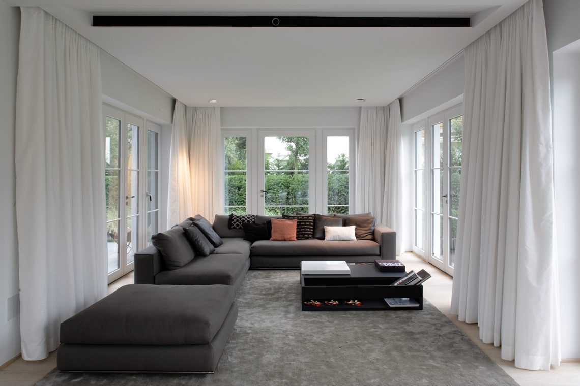
The living room is defined by a fireplace that anchors the seating area without overpowering it. A corner sofa, low coffee table and broad windows sit in a simple arrangement, so the eye moves from the fire to the glass and then out toward the garden. In one view, the white curtains soften the edges of the openings; in another, the darker window wall and vertical wall finish tighten the room and make the seating zone feel more deliberate. It is a good example of a modern luxury interior that relies on proportion more than ornament.
One of the strongest details is the niche around the fireplace. The opening is set into a darker wall zone, and the surrounding surfaces stay restrained so the hearth becomes the main line of movement in the room. This is where the living room with fireplace takes shape most clearly: not as a decorative feature, but as the point that orders the rest of the furniture and the circulation around it. Light from the glazing keeps the dark surfaces from feeling heavy.
Dark surfaces, straight lines and a quiet kitchen wall
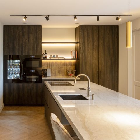
The kitchen continues that contrast, but in a sharper register. A run of dark cabinetry follows the wall, and the sink area is placed by the window, where blinds filter the daylight across the worktop. To one side, a built-in-looking niche holds appliances within the wall plane, which keeps the composition compact. The room does not rely on display; it uses a limited palette and a clear line of storage to make the space read as one composed block.
That darker cabinet line also explains the appeal of luxe kitchen with dark cabinetry as a search phrase, because the visual emphasis is not on gloss or excess but on restraint and depth. The contrast between the black fronts, pale wall areas and the strip of light at the window gives the kitchen its structure. The sink position matters here. It places an everyday function in direct contact with daylight, which breaks up the darker mass of the units.
A window-led work zone
The most convincing kitchen detail is the small shift between materials: dark fronts, a lighter counter surface, and the window with blinds immediately beside the sink. That sequence creates a readable work zone. The built-in niche beside it reinforces the feeling that storage has been absorbed into the architecture rather than added on top. It is a measured piece of planning, and it keeps the kitchen visually calm even with the strong dark finish.
Bedrooms and bathroom spaces shaped by contrast
The bedroom is softer in tone, but the same daylight strategy remains visible. A wide window runs behind the bed, with curtains pulled to the sides and a light wall base below. The bed linen is white, the cushions are dark, and a recessed wall detail holds the darker note in the room. Because the room is not crowded with objects, the window becomes the main surface. That is what makes it a convincing bedroom with large window: the opening does the work, and everything else stays in support.
The bathroom shifts the mood again with a freestanding oval bathtub placed as a sculptural object in the room. A dark door or wall plane sits to one side, and recessed ceiling lights give the space a clean overhead rhythm. The tub’s rounded shape interrupts the straight lines elsewhere in the project, which gives the room a small but important pause. It also shows how the project handles material contrast: light against dark, round against rectangular, open floor area against fixed wall planes.
The tub, the ceiling spots and the dark plane
This bathroom is about spacing as much as about fixtures. The oval bath needs room around it, so the floor remains visually open and the edges are kept clear. The dark wall beside it pulls the eye across the room, while the ceiling spots mark the perimeter without drawing attention to themselves. In a project full of straight lines, the bath is one of the few soft forms, and that difference gives the room its tension.
Hallway moments and the route through the house
The hallway and corridor are not treated as leftover spaces. A rectangular open fireplace sits inside a dark niche, and the surrounding wall planes are kept strict and clean. This makes the passage feel purposeful, even when it is narrow. The fire reads from a distance as a dark opening with a clear horizontal cut, and the adjacent doors or wall surfaces stay subdued so the niche remains the focus. It is a compact answer to the idea of a hallway with fireplace niche.
Elsewhere, the living room images show how circulation and seating overlap without confusion. The sofa sits close to the window wall, the coffee table stays low, and the ceiling lights are positioned so they do not interrupt the geometry of the room. That restraint is important throughout the project. It allows the darker details to stand out, but it also leaves enough quiet surface for the daylight to move across the walls.
The exterior reads through its openings
Outside, the house presents a light masonry skin with rectangular window openings and black frames. The composition is straightforward at first glance, but the rounded bay or entry zone changes the profile. Large glazing wraps that curved part of the volume and makes the entrance read differently from the flatter wall sections. The contrast between the straight openings and the rounded extension is subtle, yet it gives the whole building its strongest external gesture. It is a clear modern villa entrance bay/round entry zone rather than a decorative add-on.
The façade images also show the relationship between the white wall surfaces, the dark frame accents and the planted edge conditions around the entry. A gravel drive leads toward the front, and the curved glass area draws the approach toward the door side of the building. Seen together, the exterior and interior share the same idea: controlled surfaces, generous openings, and dark lines that make the daylight more legible. That is what gives this modern villa with large windows its character across room after room.
Want to see more of CO.STUDIO? View the page of CO.STUDIO for even more great projects and company information.





NEW 2026 Jubileum Edition The Best Interior Designers Benelux
Order Now €125


NEW 2026 Jubileum Edition The Best Interior Designers Benelux
Order Now €125