Modern villa with light interiors
White walls and a dark slate roof set the tone before the eye reaches the rooms inside. The house reads as a modern villa from the outside, but the interior shifts to pale wood, glass and restrained lines. Large windows pull daylight deep into the living spaces, while the garden lawn stays visible almost everywhere. That connection between room and landscape defines the project more than any single decorative gesture.
Modern villa exterior with a dark slate roof
The exterior uses a clear contrast: a light plastered volume against the darker roof line. The roof, finished in slate, gives the outline weight and keeps the mass of the house grounded. Below it, the openings are generous and set up strong views toward the garden. A terrace canopy runs along part of the facade, so the edge of the house reads as a layered threshold rather than a flat wall.
From the outside, the house feels composed through proportion rather than ornament. The glazed sections break up the white surfaces and make the interior legible at a glance. Even the garage openings sit low and dark, reinforcing the geometry of the elevation. In the landscaping, trimmed grass and planted borders soften the base of the building without hiding its lines.
Large windows bring daylight into the living areas
Inside, the first impression is light. Large windows stretch across the living areas and keep the garden in view, so the rooms never close in on themselves. Curtains and glazed partitions filter the brightness in some spots, but the main effect remains open and direct. The architecture does not rely on decoration to make the spaces feel active; it lets daylight do that work.
Light interior finishes keep the surfaces calm. Pale flooring runs through the rooms and reflects the daylight back upward, while the ceiling lines stay simple and precise. In one passage, double glass doors with black frames mark a transition without blocking sightlines. The result is a sequence of spaces that stay connected even when they serve different functions.
Living room details that stay quiet and clear
Wooden wall panels introduce warmth through texture, not contrast for its own sake. They line parts of the circulation and living areas, giving depth to otherwise white walls. In one room, a fireplace opening sits in a plain white surround, with the black firebox cutting a sharp rectangle into the surface. Nearby, built-in storage keeps the room free of visual clutter, so the focus remains on the window wall and the floor plane.
The living spaces also show how custom wood joinery can shape the rhythm of a house. Panels and built-ins are drawn with narrow verticals and crisp joints, echoing the straight ceiling lines above. Because the wood is used as a controlled accent, it works best in combination with the glass and pale finishes. That restraint gives the rooms their measured pace.
A white kitchen island anchors the open plan
The kitchen brings the strongest material contrast in the interior. White fronts and a white kitchen island sit against a natural stone countertop, with the work surface running as a solid, readable plane. The island is broad enough to hold the room together, but it does not dominate it. Large windows along the perimeter keep the kitchen tied to the garden and prevent the white cabinetry from feeling flat.
The cooking zone sits in clear view, with the hood and equipment forming a darker accent against the pale cabinetry. In one composition, a black fireplace niche appears beside the cooking area, adding a deeper note to the otherwise light kitchen wall. The mix of white, stone and black details keeps the room crisp without pushing it into display mode. Everything has a visible task: cooking, working, storing, opening the room to daylight.
Stone, glass and built-in storage
What makes the kitchen effective is the way its surfaces stay legible from different angles. The stone countertop catches light differently from the matte white fronts, and the glass around it extends the sightline toward the garden. Built-in storage continues the same logic in other parts of the house, including a hallway with a recessed bench under the windows and white cabinets set into the wall. These are practical insertions, but they also shape the walls themselves.
Another room shows how the project handles filtered light. Venetian blinds sit in front of the windows in a hallway or bathroom-like space, breaking the sun into narrow bands across the floor and cabinetry. The effect is subtle, but it gives the interior a slower pace than a fully open glass wall would. The house uses those shifts well, moving from broad daylight to controlled shade without changing materials every time.
Custom wood joinery carries the house from room to room
Custom wood joinery appears in panels, storage walls and built-in elements rather than as isolated furniture pieces. That choice keeps the rooms organized. The wood stops certain white surfaces from reading too hard, yet it never overtakes them. In the entrance and circulation zones, a wood-clad door and adjacent panelling set up a measured transition from one room to another, with the floor continuing underneath to keep the route easy to follow.
The same discipline appears in the staircase. Wooden treads rise against a white wall, and the black handrail gives the stair a thin graphic line. Nothing is overdrawn. The stair reads as a compact architectural move, connecting levels while keeping the surrounding wall surfaces clear. Because the materials are limited to wood, white paint and a dark rail, the form stays easy to read from nearby rooms.
Garden lawn and glazing keep the house open to the site
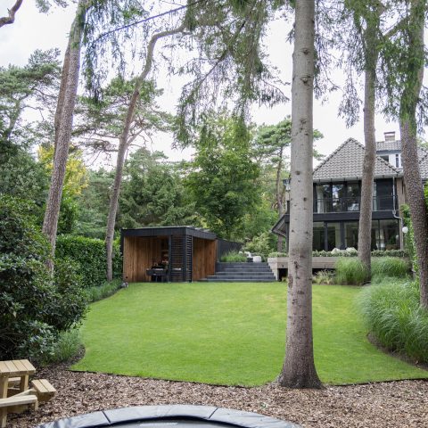
Outside, the lawn gives the villa room to breathe. The grass sits close to the glazed sections, so the interior does not feel detached from the plot. From the rooms with the widest windows, the garden becomes part of the composition: a green plane beyond the floor, edged by planting rather than hard boundaries. That visual link makes the house feel larger without adding more mass.
The terrace edge and the overhang along the facade create a useful middle zone between indoors and outdoors. It is a modest architectural move, but it matters because it extends the house’s logic into the garden. The project’s strongest moments come from these visible transitions: white wall to dark roof, wood to glass, kitchen island to window line, room to lawn. Each one is simple on its own, and together they give the villa its measured character.
Project images and the way they frame the design
The photography makes the project easy to read in layers. Exterior views emphasise the white volume, the dark slate roof and the trimmed garden edges. Interior images focus on the pale flooring, the custom wood elements and the kitchen island with its stone top. A few details recur across the series: black window frames, built-in storage, and the way daylight slides across walls and cabinetry. Those repetitions are useful because they show how consistently the materials were handled throughout the house.
Seen as a whole, the project is less about display and more about control of surface, light and route. The house keeps its palette narrow, but the rooms never feel repetitive because each space uses the same ingredients differently. In one place the wood panels absorb glare; in another, a glazed opening takes over; elsewhere, the staircase or the kitchen island becomes the anchor. That variation is what gives the modern villa its clarity.
Want to see more of OSCAR V? View the page of OSCAR V for even more great projects and company information.




NEW 2026 Jubileum Edition The Best Interior Designers Benelux
Order Now €125


NEW 2026 Jubileum Edition The Best Interior Designers Benelux
Order Now €125


NEW 2026 Jubileum Edition The Best Interior Designers Benelux
Order Now €125


NEW 2026 Jubileum Edition The Best Interior Designers Benelux
Order Now €125


NEW 2026 Jubileum Edition The Best Interior Designers Benelux
Order Now €125