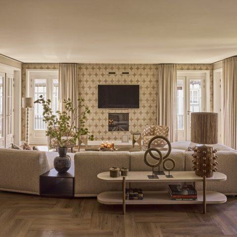
Warm minimal interior with built-in stone-look fireplace wall
A stone-look fireplace wall sets the tone immediately, with a black frame cutting into the light wall surface and a rail of spotlights tracing the ceiling above it. The room reads as a warm minimal interior rather than a stark white shell: neutral plaster tones, dark door frames, and a wooden floor keep the composition grounded. Nothing feels overdrawn. The fire sits in a recessed niche, so the wall holds the room instead of competing with it.
The fireplace wall as the first anchor
The built-in fireplace stone-look surface gives the living space its clearest line of focus. In one view, the surround sits inside a wider wall panel, while in another it is paired with vertical texture that breaks up the plane and catches the light differently across the day. The effect comes from restraint: a few materials repeated with care, and a narrow black outline that keeps the fireplace crisp against the warmer background.
Above, track lighting living room spots run in a simple line and shift attention from the hearth to the seating area. The lighting is visible, not hidden, which suits the room’s directness. It draws small pools of light across the floor, the table, and the edges of the furniture without flattening the space. The result is practical, but it also gives the ceiling a measured rhythm.
Warm surfaces, clear lines
Dark accents do much of the framing work here. Doors, trims, and built-in edges are finished in a deeper tone, so the warmer wall surfaces read more softly by contrast. That contrast is especially clear where a vertical wall structure or slatted panel meets the smoother painted walls. The texture changes are subtle, but they keep the room from becoming one long blank surface. A warm minimal interior depends on that kind of interruption.
Indirect wall lighting appears in the more compact zones, where a narrow glow lifts the surface instead of washing it out. It is visible in the softer wall niches and around the built-in areas, especially where storage and display merge into one composition. These details do not shout for attention. They mark the edges of the room and guide the eye from one surface to the next.
A custom book wall that gives the room structure
The custom book wall brings a different pace into the interior. Open shelves, framed niches, and light wood fronts sit against darker outlines, creating a measured grid rather than a closed cabinet wall. Some compartments stay open, others are used for storage, and the result is a built-in composition that feels tailored to the room’s proportions. The book wall also softens the longer wall run by breaking it into smaller, readable parts.
Seen from the sitting area, the built-in book wall works with the fireplace rather than away from it. Both elements are fixed to the architecture, and both rely on recesses, edges, and lighting to stay legible. That is why the room feels coherent without becoming rigid. The eye moves from the hearth to the shelves, then to the windows, then back to the darker frames that hold the composition together.
Storage that stays part of the architecture
Other built-in elements follow the same approach. A wardrobe-like niche, open shelving, and darker door surfaces are placed where they support the room’s circulation instead of interrupting it. The storage reads as part of the wall rather than as separate furniture. Even the small spotlights inside the niches matter, because they reveal depth and keep the built-in volumes from disappearing into shadow.
That mix of closed and open storage gives the interior a practical backbone, but the visual language stays calm. Flat fronts, open compartments, and straight joints carry the same logic from one room zone to the next. The room never needs decorative excess because the details are already doing the work: a shelf line, a frame, a cut-out, a reflected beam of light.
Large windows open the room to the garden
Large windows garden view is the quiet counterpoint to the darker interior edges. Curtains soften the glass, yet the outdoor scene remains visible, so the room always keeps a second layer beyond the furniture. The glazing stretches the living space outward and lets the eye rest on the garden after the concentrated detail of the fireplace wall and shelving. It is a clear move, not a dramatic one, and that is what makes it effective.
The connection between inside and outside is reinforced by the way the seating is set against the glazed wall. Daylight lands on the floor and the fabric of the sofa, while the darker frames around the openings keep the perimeter neat. From there, the garden becomes part of the room’s sequence: first the fireplace, then the seating, then the glass, then the planting beyond.
Light, texture, and a quiet shift in mood
The project moves beyond the living area into rooms where stone-look surfaces return in a different register. In the bathroom, a stone-look fireplace wall appears again, this time paired with tiled surfaces, a black opening, and warm wall lamps. The same logic remains visible: a strong wall surface, a recessed feature, and light that lands in controlled patches. Even the arched motif wall in bathroom photographs reads as a graphic gesture rather than decoration for its own sake.
Across the series of spaces, the material choices stay limited but precise. Wood, stone-look tile, dark frames, and soft neutral walls are repeated in different proportions. That repetition keeps the project legible from room to room. It also explains why the warm minimal interior reads as one continuous story, even as the details shift from the living room to the book wall, then to the bathroom and back toward the garden-facing windows.
A calm composition with a few clear focal points
What stays with you is not abundance, but control of the visible elements. The built-in fireplace stone-look wall, the track lighting living room layout, and the custom book wall each claim space without crowding it. Around them, the darker frames, vertical textures, and indirect wall lighting keep the surfaces active. The garden view closes the sequence with a softer horizon, so the interior never stops at the wall. It continues into light, glass, and planting beyond the room.
Want to see more of Valk Design? View the page of Valk Design for even more great projects and company information.



NEW 2026 Jubileum Edition The Best Interior Designers Benelux
Order Now €125


NEW 2026 Jubileum Edition The Best Interior Designers Benelux
Order Now €125


NEW 2026 Jubileum Edition The Best Interior Designers Benelux
Order Now €125


NEW 2026 Jubileum Edition The Best Interior Designers Benelux
Order Now €125


NEW 2026 Jubileum Edition The Best Interior Designers Benelux
Order Now €125