Modern house with a full-height lightwell
The first thing you notice is the strip of roof that runs across the house and gathers the volumes under one line. Beneath it, the modern house with a full-height lightwell opens and tightens at the same time: closed enough to hold privacy, open enough to pull daylight deep inside. The project sits on a corner plot with pine trees already in place, and the design works around them rather than flattening the site into a blank surface.
A corner plot shaped by existing pines
The house was positioned close to the building line along the main axis of the road, which gives the garden more depth at the back. That move also keeps the view toward the rear open. The trees on the plot were mapped first, then folded into the plan so as many as possible could remain. Their trunks and canopies are not treated as background; they help set the spacing of the volumes and the rhythm of the openings. Seen from outside, the result is calm and measured, with the house sitting low and long beside the greenery.
The plan is divided into four volumes, threaded together by a long canopy connecting volumes. Two taller blocks hold the main functions. Between them, a full-height lightwell across two floors cuts through the house and brings daylight into the center without allowing direct sun to rush in. It is a simple move with clear effects: rooms stay bright deeper inside, but the light feels filtered rather than exposed. On the upper level, a bridge crosses between the two main parts and sits entirely within that glazed void.
Daylight that reaches across two floors
The lightwell is the house’s most striking spatial gesture. It rises through both storeys and turns circulation into part of the experience. Instead of a dark hallway, there is a vertical slice of light that links ground and first floor. The bridge on the upper level hangs inside that opening, so the crossing between the two volumes is visible from several points in the house. Because the glass is continuous over two floors, daylight falls far inside while direct sun is moderated. The effect is especially noticeable in the interior photographs, where white walls pick up a soft, even light from above.
That same canopy ties the four volumes together and extends the usable edge of the home. It provides covered parking, marks the entrance, and creates a sheltered terrace. The overhang is not just a roof strip added at the end; it is what makes the composition legible. From one side to the other, the house reads as a sequence of enclosed and semi-open parts, with the canopy acting as the line that binds them. In summer it keeps direct sun out of the rooms, while in winter the lower sun can still reach further in.
Facades read like roof planes
The front and rear of the two taller volumes, as well as the garage, are set at a 6° angle. That detail lets the elevations be read as roof surfaces as well as walls. It answers the requirement for a steep roof modern profile without turning the house into a literal copy of a traditional roof form. The slope is subtle, but visible enough to give the volumes a directional pull. The silhouette remains sharp, especially where the canopy cuts horizontally across the composition and the steeper parts rise behind it.
Openings are positioned with care so the house stays connected to the landscape without giving away too much of the interior. Deep window reveals give the openings a clear thickness. On the upper floors they frame the surrounding green and make the wall feel deeper than it is. That depth also increases privacy with deep window reveals, because the glass sits back from the outer edge and the separation between inside and outside reads larger. On the north side, the amount of glazing is limited to reduce heat loss. At the rear, sliding glass doors at the rear make it possible to open large parts of the wall toward the terraces adjoining the sitting room and dining area.
Openings cut for view and privacy
The rear elevation uses glass differently from the more enclosed sides. Two sets of sliding doors let the main rooms extend toward the terrace, so the living and dining spaces can open out when needed. This is where the house loosens its grip on the site. Elsewhere, the openings are narrower and more controlled, especially on the north side. The contrast between the two conditions is clear in the architecture: one face invites a broad connection to the garden, while another filters light and limits heat loss with smaller panes and deep reveals.
Solar panels on the roof are kept visually quiet by the way the roof edges are shaped. The rear roof upstands are lower, which helps hide the panels without affecting the light they receive. It is a modest but precise adjustment. Nothing is overdrawn. The roofline still reads as a clean part of the composition, and the panels do their work out of sight. Together with the long canopy and the angled volumes, they reinforce the sense that the house has been assembled from several parts that lock into each other rather than from one single block.
Wood cladding and large glazing in a wooded setting
The exterior skin is made of ceramic roof tiles and light-toned surfaces that echo the pine setting. In the photographs, the trees throw clear shadows across the walls, which makes the material read as part of the site rather than as a separate layer. The garage and garden walls are built in a long-format brick of the same color family, helping the volumes feel rooted rather than applied. Against that quieter mass, the canopy, window frames, and wooden plinth details introduce a reddish-brown note that keeps the composition from going flat.
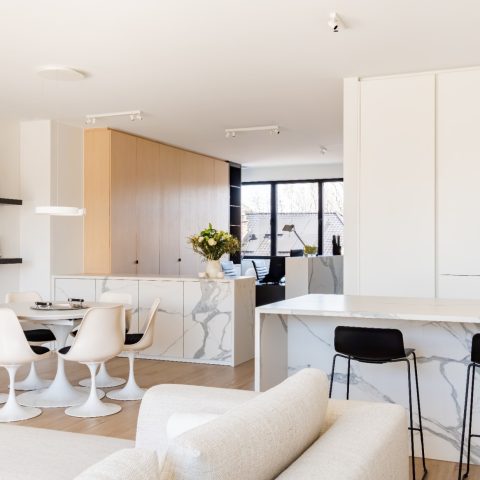
Wood cladding and large glazing appear together throughout the project. The wood softens the sharpness of the angled forms, especially around the canopy and the lower edge of the house. Inside, the same material language continues in the frames around the openings and in the darker wooden door elements. The interiors are spare: white walls, pale ceilings, and clean lines, with the lightwell and upper windows doing most of the visual work. A kitchen with restrained cabinetry sits under that daylight, where the surfaces stay quiet and the openings remain the focus.
Interiors arranged around a vertical slice of light
From within, the house feels organized around that central opening. The high glazing brings light down into the middle of the plan, so the circulation space never settles into shadow. Vertical windows, narrow wall recesses, and the bridge across the upper level make the interior read as a sequence of pauses and crossings. The white surfaces catch the daylight differently at each point, which gives the rooms a measured contrast without adding ornament. Even in the narrower parts of the plan, the eye keeps moving toward the glass.
The project’s strength lies in the way each decision supports the others. The corner plot required a careful position. The trees asked to be kept. The brief wanted a modern house with a steep roof, while the architects also pursued a flatter reading of the volumes. Those conditions are all visible in the final result: angled faces, a long canopy connecting volumes, deep reveals, and a central lightwell that shapes both the plan and the atmosphere of the interior. Nothing here is decorative for its own sake. Every line has a job to do.
Photography: Marcel van de Burg
Want to see more of Engel Architecten? View the page of Engel Architecten for even more great projects and company information.



NEW 2026 Jubileum Edition The Best Interior Designers Benelux
Order Now €125


NEW 2026 Jubileum Edition The Best Interior Designers Benelux
Order Now €125