Modern interior project with kitchen, living room and bathrooms
White walls, black hardware, and broad openings set the tone from the first view. The spaces in this modern interior project are drawn around daylight, with large windows bringing a clear edge to the kitchen, living room, and bedroom. Materials stay restrained, but they do the work: natural stone on the worktop and in the bathrooms, wood at the table and details, and tiled surfaces where the rooms need a firmer finish.
Kitchen surfaces kept clear and direct
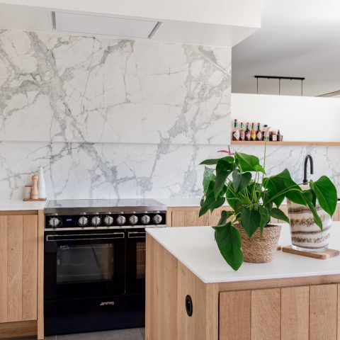
The kitchen is organized around a white run of cabinetry and a natural stone countertop that carries the cooking zone without interruption. A cooktop and oven sit cleanly into the composition, while small wooden pulls soften the cabinet fronts just enough to break the white plane. The result is a modern kitchen that reads plainly and lets the countertop remain the main surface. In this modern interior project, that calm of line is repeated rather than overdesigned.
What stands out most is the contrast between the pale cabinets and the darker fixtures around them. Black accents appear in the hardware and in the window and door frames nearby, so the kitchen does not feel isolated from the rest of the house. It connects to the larger interior through those repeated details, and through the way daylight lands on the stone surface and the matte cabinet fronts.
Living rooms shaped by windows and curtains
The living room uses its large windows as the main feature. Curtains soften the edge of the glazing, and a radiator sits below the opening, keeping the wall line practical rather than decorative. The furniture remains neutral and low, so the room keeps its attention on the frame of the window and the broad patch of daylight coming through it. For a bright living room, the arrangement is spare but effective.
Elsewhere, an open living area brings in a different kind of material reading. A visible concrete ceiling line runs above a long wooden table or work zone, giving the room a more structural feel. The wood adds length and warmth to the plan without trying to dominate it. Seen together, these rooms make the modern interior project feel open, but not empty; the furniture and finishes are placed with enough restraint to keep the architecture legible.
Bathrooms built from stone, tile, and dark fittings
The bathrooms rely on large stone plates and tiled floors rather than mixed finishes. In the shower area, the stone reads in wide sections, interrupted only by black fittings and the shower rail. That dark metal gives the room a sharper outline and keeps the pale surfaces from flattening out. It is a practical use of contrast, especially where water and light meet on the wall surfaces.
A separate bathroom with a freestanding bathtub uses the same language more softly. The tub sits against a light wall, with daylight entering from above through a roof opening. Below it, the grey tile floor gives the room a grounded base. The combination is simple: a freestanding bathtub, a clear wall surface, and enough daylight to pull the room away from the usual enclosed feel of a bathroom. In this modern interior project, the bathroom spaces stay consistent without becoming repetitive.
One room for washing, one for quiet use
The separate toilet room is pared back even further. A white wall plane, a grey tiled floor, and a wall-mounted toilet define the room in a few strong parts. There is no extra layer of finish to read through. The visible pipe points and the exact junctions between wall and floor keep the room honest about how it is built. It is a small space, but the detailing is clear enough to carry it.
Another bathroom view shows the same attention to daylight from the roof. The white surfaces catch the light first, then the tile floor anchors the room with a cooler tone. A metal tap and basin zone sit in front of the sloped ceiling, making the space feel more deliberate than decorative. These smaller rooms extend the modern interior project beyond the main living areas and show how the same material palette can shift from one function to another.
Bedrooms and circulation kept minimal
The bedroom is stripped back to white walls, a dark floor, and daylight from a skylight. That overhead opening does most of the work, pulling light down across the room without needing large window walls. The space feels measured rather than sparse. It is clear where the light comes from, and clear how little is needed around it. In a house with many fixed details, this room uses almost none of them.
Circulation spaces follow the same approach. A landing with white panel doors and a wooden handrail gives the transition areas a simple rhythm, while black handles and fittings keep the surfaces from becoming bland. The door detail in particular matters: black hardware against white paint creates a visible break that repeats across the interior. These are small moves, but they hold the project together more firmly than any decorative gesture would.
Brick and dark frames outside the interior
The exterior continues the same restraint with brick, lighter wall sections, and dark window frames. The facade is built from repeated openings, so the pattern of windows becomes part of the composition rather than a separate layer added afterward. Black frames sharpen the edges, while the brick gives the volume a more grounded surface. It is a straightforward reading of the house from the outside, with no extra gestures needed to explain it.
At the entrance, the brickwork meets a black door plane and metal hardware, creating a stronger point of arrival. The contrast is practical as well as visual: the darker elements sit into the wall, while the masonry carries the bulk of the elevation. That same sense of order carries through the project’s interior rooms, where white surfaces, stone, wood, and black accents keep returning in different combinations. The modern interior project feels consistent because each room repeats the same few decisions in its own way.
Why the details hold the page together
What gives the project its clarity is not a single standout gesture, but the way each surface knows its role. The kitchen keeps the stone visible. The living room lets the windows stay open. The bathrooms use dark fittings to define pale stone and tile. The bedroom gives daylight a quiet field to land on. Even the brick facade and black frames outside stay tied to the same palette. That repetition across rooms is what makes the whole sequence readable.
Seen room by room, the project moves from harder surfaces to softer ones and back again: stone, tile, wood, white paint, concrete, and black metal. None of them are overused. Each appears where it has a clear visual job, whether that is holding a countertop, framing a window, or setting off a door. For anyone looking at a modern interior project with distinct kitchen, living, and bathroom spaces, this one offers a calm but detailed route through the house.
Want to see more of Dauby: exclusive door, window and furniture hardware? View the page of Dauby: exclusive door, window and furniture hardware for even more great projects and company information.




NEW 2026 Jubileum Edition The Best Interior Designers Benelux
Order Now €125


NEW 2026 Jubileum Edition The Best Interior Designers Benelux
Order Now €125


NEW 2026 Jubileum Edition The Best Interior Designers Benelux
Order Now €125


NEW 2026 Jubileum Edition The Best Interior Designers Benelux
Order Now €125


NEW 2026 Jubileum Edition The Best Interior Designers Benelux
Order Now €125


NEW 2026 Jubileum Edition The Best Interior Designers Benelux
Order Now €125